
Let me guess, you’re trying to work out a real estate marketing strategy to maximize conversions for your landing page?
In the real estate industry, capturing leads online is critical to finding new clients.
If you’re searching for landing page design ideas that will get you sales, you’re in the right place.
I’m going to dissect 10 different real estate landing pages and tell you what I like, what I would change or test, and why.
Follow along and learn what you could do to convert your ad traffic more than ever before.
1. Homes.com
Homes.com is a site that allows you to browse rental properties and houses for sale and get information on recent home sales. Here is their landing page to download their First-time Homebuyer’s Mortgage Checklist:
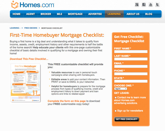
What I Like About this Page:
- The Encapsulated Form: The orange form stands out boldly on the page, not to be missed. Orange is a great color to attract attention and encapsulating the form in a different color makes it obvious where page visitors need to enter their information to convert.
- The Contrasting Call-to-Action: The black CTA button stands out from the orange and it’s easy to tell where to click to complete the conversion. I also like the CTA copy of “Get Free Checklist!” as it’s actionable, offers something, and uses the word “free” to push visitors towards clicking through.
- The Image of the Checklist: Although the image in the bottom left is fairly small, it’s always a great idea to visually show visitors the offer. An image makes the offer appear more tangible than just explaining it with text.
- The Bulleted Benefits List: A benefits list is a great way to easily convey to visitors what they will get out of your offer. Homes.com has perfectly created a short list of benefits (not features) that is easy to scan and understand quickly.
What I Would Change or Test:
- The Length of the Form: If a visitor has never converted with Homes.com before, asking for six mandatory fields is a bit overwhelming. The last thing you want to do is scare potential leads away right before conversion with a tedious or lengthy form. I would try limiting it to 3-4 fields that you absolutely need from leads now. If you need more information you can ask for more in the future.
- The Navigation Bar: A landing page such as this one, found from organic Google Search should have a single action. By having a bar at the top you distract visitors from the true goal of the page: to download the checklist.
2. First National Real Estate
First National Real Estate provides information and search opportunities for properties for sale and for rent. By searching for real estate guides on Google, we arrive at this as their landing page to download any of their guides:
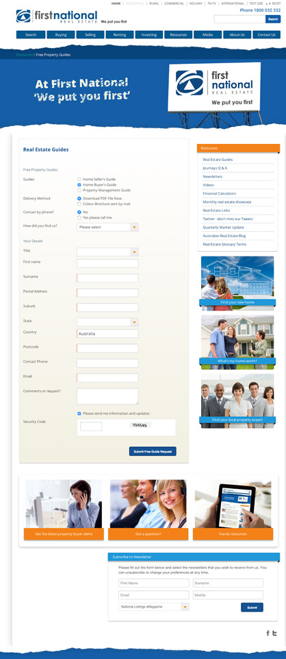
What I Like About this Page:
- Unfortunately there’s not much to like about this landing page. This does, however, mean that First National has a great opportunity to redesign their guide download page to maximize conversions.
What I Would Change or Test:
- The Number of Actions Visitors Can Take: Having the CTA for the free guide, a newsletter subscription form and many links navigating visitors away from the page reduces the chance of conversion. The page should have a sole purpose.
- The Guide Call-to-Action Button: While the color of the button does contrast with the beige form, it doesn’t instantly catch your eye. I would try moving it more into the middle and making the button bigger. It also doesn’t help that it is so far below the fold of the page.
- The Length of the Form: The call-to-action is way below the fold of the page, reducing the chance of conversions. First National could try reducing some of the excess space and making the form into a 2-column form. This would shrink the page dramatically. They should also try reducing some of the fields that aren’t mandatory and adding asterisks to those that are.
- The Copy on the Page: The page is completely full of form fields yet there is actually no copy explaining what potential leads will receive by completing the form. First National needs to explain what the Home Buyer’s Guide, Home Seller’s Guide or Property Management Guide are if they want to convince visitors to convert.
- The Captcha: I would recommend First National reconsider having a Captcha at the bottom of the form. If it is totally necessary for their business, then a captcha can be a great security feature. However, in this case visitors are just downloading a guide. It is a large barrier to entry and can make a huge impact on your conversion rate.
3. Pipeline ROI
Pipeline ROI is an inbound marketing solution for real estate and mortgage professionals. This is the landing page for their social media ebook:

What I Like About this Page:
- The Graphic: Having the “Social Media” as a bold, blue feature makes it stand out and conveys the topic of the ebook. The images in the background are also relevant to the topic of the ebook and add some visual appeal to the page.
- The Call-to-Action Button: The bright orange button stands out from the background of this landing page. Its rounded edges also help convey that that is where you’re supposed to click.
- The Length of the Form: Pipeline has only asked for 3 simple required fields which is about right for a content download like an ebook. It’s also nice that the subscription offer is a dropdown offer, making it clear that it’s optional and not required.
What I Would Change or Test:
- TheForm Color: I would test adding a different background color to the encapsulated form to grab visitors’ attention and make it stand out. Color can make a huge difference for conversions, so worth a test!
- The Paragraph: It’s great that Pipeline has included information and valuable benefits to the visitor downloading the ebook. However, this information is communicated badly in a far too long paragraph. You want visitors to be able to quickly scan and understand why they should convert on the content offer. Pipeline could easily turn part of this paragraph into a bulleted list and break the sentences up into separate lines to increase readability.
- The Location of the Call-to-Action: While it’s bright and eye-catching, this CTA is way below the fold of the page, meaning it’s not immediately visible to viewers. Pipeline should try re-formatting their page. For example, they could try shrinking the image in half and slicing the form in half, placing them side by side above the fold, right below the headline.
4. Vintage Oaks
Vintage Oaks is a custom community in the Texas Hill Country featuring land and homes for sale, surrounded by resort-style amenities. This is the landing page for their Real Estate Buying Guide:
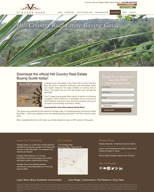
What I Like About this Page:
- The Image: The geographic-themed picture at the top of the page is inviting and intriguing to those interested in buying property in this community. It makes the design of the page more appealing and adds some flavor to the page.
- The Length of the Form: It grabs the right information from visitors but doesn’t ask for too much. Those looking to download a guide on this community are already fairly hot leads, so you don’t’ want to put any barriers between them and your contact list.
What I Would Change or Test:
- The Benefits Text: While the paragraphs are short, this page may experience higher conversions by displaying a list of the benefits of downloading the guide. The second paragraph would be very easy to change into a list, making it easier to scan and understand the value.
- The Call-to-Action Color: To maximize conversions you need your visitors to be drawn directly to that button. On this page there is little-to-no contrast between the button and the other colors of the page, so it blends in. They should try testing a different button color, perhaps a green which matches the banner image but contrasts with the form. I would also try increasing the size of the CTA text and centering it for optimization.
- The Size of the Image: While the image is great at intriguing visitors, I would try making it smaller so that the headline and form are more visible above the fold.
- Too Many CTAs: By having so many links at the top and bottom of this landing page, it distracts visitors from the page’s objective – downloading the ebook. To maximize conversions Vintage Oaks should try removing the navigation bar and removing all of the call-to-action links at the bottom of the page.
5. Vision Investment Properties
Vision Investment Properties Canada is a real estate investment company that provides high-income property investment opportunities.

What I Like About this Page:
- The Form: When I first glanced at this form I wondered why Vision was asking for leads’ phone numbers, as it’s not a necessity for an ebook download. However, only the email address is a required field in this list, leaving it up to the visitor to decide how much they want to give. I like this idea as it’s easier to convert, but leaves it in the visitors’ hands if they want to provide more information.
- The Graphic: The dark grey graphic in the middle of the page clearly conveys the offer and is the first thing you see when you arrive. It makes it clear what the topic of the ebook will be, so no guessing or searching is required.
- The Short Paragraphs and Bulleted List: They have nicely formatted this landing page to make it very clear to scan and understand. I love that they have included a “what you’ll learn” list to convey the benefits to the visitor as it takes just a couple of seconds to read and decide if to convert.
- The Call-to-Action: The bright blue against the all white and grey background makes it very easy to spot where to convert as soon as you land on this page.
What I Would Change or Test:
- The Call-to-Action Button Copy: Never use submit on your landing page form. Your CTA should always be actionable text, telling visitors exactly what will happen by clicking that button. Instead I would suggest that Vision to try something like “Get my free ebook now!”
- Lack of a Coherent Title: The title of the whole page is “Investment Property Opportunities” which is not consistent with the rest of the information on the page. Vision should try using a title like “Free Ebook: 3 Top Investment Cities for 2013” which would be more compatible with the message and focus of the page.
- Not Much Else: One of my favorite real estate landing pages that I have seen, the design is simple and organized and the objective of the page is obvious.
6. Andrew Green
Andrew Green is a real estate agent of Keller Williams Elite Realty in North Vancouver. This is the landing page visitors would arrive on from Google when searching for Vancouver real estate agents:

What I Like About this Page:
- The Banner Image: I like how Andrew has featured his face at the top of his landing page to increase relatability and trust. It’s also great that he has included his phone number in an easy-to-spot location on the page.
What I Would Change or Test:
- The Copy Layout: The grey image on the left distracts from the page’s text, and really has no purpose on the page. As opposed to the grey image on Vision’s landing page, this picture doesn’t tell us anything new or convey any value. Instead Andrew should try using a few concise paragraphs and a bulleted list explaining his experience and qualifications.
- The Unique Selling Proposition (USP): “Net More Money, In Less Time” doesn’t uniquely tell visitors why Andrew should be the agent they choose to use. By trying to come across as sophisticated, he has lost the true point of the USP. Instead he should try something stronger that conveys why he’s better than the next agent on your list.
- The Form: This form is too long and looks daunting and time-consuming to visitors. While he has only made two of the fields required, he should try reducing the form down to 4 or 5 fields. He should also encapsulate the form to make it stand out from the background, rather than being all white and blending in.
- The Call-to-Action: Andrew should use a bright, vibrant color to make his CTA button stand out. I would test using the same bright green he used in his banner to see if it leads to an increase in conversions. He should also change the CTA copy from “Send Message” to something more relevant to the offer of an educational conversation such as “Get in Touch”
7. Matt Morris
Matt Morris is a real estate agent for Windermere Stellar Real Estate in Vancouver, Washington. We found Matt’s landing page through an organic Google search looking for real estate agents in Seattle:
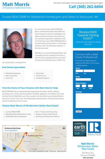
What I Like About this Page:
- The Picture: By showing your face to page visitors and potential customers you come across as more personal. It lets them feel as though they know you right from the start. Matt’s image is friendly and welcoming to visitors, leading to a more positive page experience.
- The Bulleted Lists: Matt has properly used bullet points to make the page appear less cluttered and easier to read. We like how he has highlighted his specialties and some of his skills in list format, making it easy for a prospective customer to see his qualifications.
What I Would Change or Test:
- The $500 Closing Costs Offer: Matt’s $500 savings offer in the top right stands out in its own encapsulated box, but it’s confusing where clicking this box leads to. It conflicts with the form’s offer below of getting information from Matt about buying or selling, as visitors are left to wonder if they will save $500 just by submitting the form. I would suggest Matt make these two separate offers more clear or remove this offer from the page altogether.
- The Form: When you first glance at this page, the form stands out as being a fairly long feature. This can negatively affect conversions as visitors to the page may see it as complicated or too time-consuming. He should try shrinking up the “Message” box which would shorten the form and try using watermark text or placeholders to label the form fields. This saves space and also makes the form look more professional.
- The Beginning Paragraph: As the first piece of information on the page, Matt should try reducing this paragraph or breaking it up into smaller, easy-to-read chunks. This increases readability and scannability, making it more likely that visitors will take the time to read it through.
- The Map: Having a large map at the bottom may not be necessary for this type of landing page. It steals the attention from other more important features on the page, and moving the address into this spot may be more effective for conversions.
8. Michael Gordon Real Estate Broker
Michael Gordon is an experienced real estate agent and broker in the Toronto area.
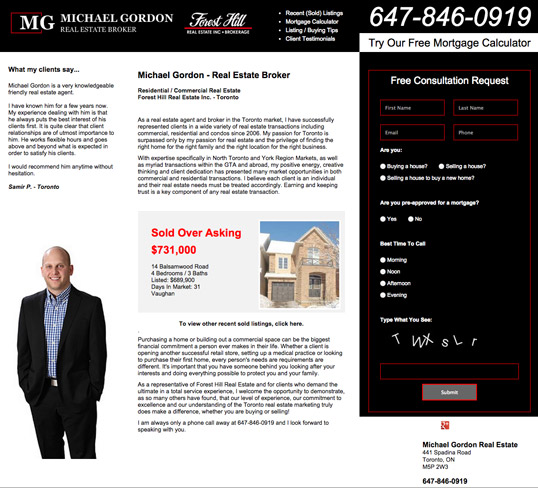
What I Like About this Page:
- The Customer Testimonial: The way the testimonial is written seems honest, sincere and credible. It also includes the person’s name making it seem more reputable.
- The Phone Number: I like how Michael has put his phone number in an obvious location, and made it very large and noticeable. When you land on his page it would be hard not to notice the name and phone number.
- The Picture: Including a photo of yourself as a real estate agent is definitely worth testing. You want visitors to be able to put a face to your name, and showing yourself on your landing page is one great way to do this.
- The Recent Sale: Michael has perfectly displayed one of his recent sales, complete with a photo. This increases visitors’ impression of him as a reputable agent. He has also included information about the home including how many days it was on the market.
- His Offer: A free consultation request is a great offer to have on your landing page as an agent or broker. It’s a way to capture new leads without being too salesy or aggressive.
What I Would Change or Test:
- The Biography : It’s great that Michael has included a bio about himself and his experience in the market. But, the 2 large paragraphs are not easy to read for a new visitor. I would suggest trying a bulleted list or breaking it down into smaller, shorter paragraphs.
- The Mortgage Calculator Call-to-Action: The white highlighted mortgage calculator offer distracts visitors from completing the form for a free consultation. Having these two offers directly on top of each other is confusing and may lead to fewer conversions from visitors.
- The Form : I would try changing the form from the black and red to a grey with red border or something less intense. For the form fields, I would test adding asterisks to the fields that are required, and making the layout more organized. The current form appears quite long and tedious. He could try using dropdown menus rather than multiple choice to shorten the field.
- The Captcha: Captchas are used almost exclusively to protect against bots – an unlikely scenario for Mr Gordon. I recommend he evaluate if he actually needs the captchas protection, as it is likely lowering his page’s conversions.
9. Whiffin and Wilson
Whiffin and Wilson are real estate consultants in Vancouver and West Vancouver, with experience in corporate and residential real estate. This is a landing page for their free home evaluation lead generation offer:
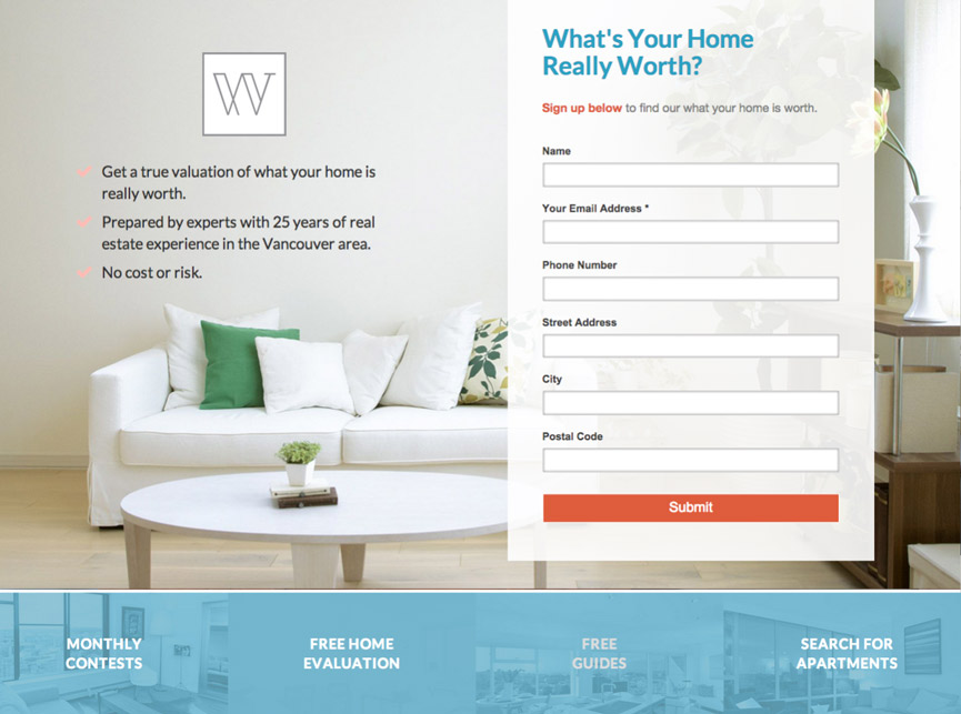
What I Like About this Page:
- The Sleek, Simple Design: Whiffin and Wilson have chosen to go with a simple landing page for their free home valuation offer. It is uncluttered and easy to quickly scan and understand.
- The Background Image and Logo: They have chosen an image that relates to the offer, but doesn’t distract visitors from the goal of conversion. The logo is small but noticeable to those reading over the page.
- The Form: It’s encapsulated and stands out from the background image. I like how it only asks for one required field of an email address, but gives those looking for a home valuation the chance to give more if they want to. I also like the headline on the form of “What’s your home really worth?” as using this question makes all visitors curious, increasing the chance of conversion.
- The Call-to-Action Button: They have chosen a dark orange color for their CTA button, which stands out from every other feature on the page. I also like how they have matched the color in the text above the form fields, relating the text to the button.
- The Bulleted List: They have included just enough information to convince visitors to opt-in. It discusses the offer and their experience to show visitors the value in the evaluation. It’s also easy to quickly scan, taking very little effort for visitors.
What I Would Change or Test:
- The Call-to-Action Copy: You should never use the word “Submit” as the copy for your call-to-action as it doesn’t tell visitors what will happen by them clicking on that button. Whiffin and Wilson should instead try out “Get my Free Home Valuation!” or “Value my Home!” as they are related to the offer and are actionable phrases.
- The Checkmark Bullet Points: The light pink checkmarks blend in with the background of this page. I would test using a brighter color, possibly the same orange they have used for their CTA button.
10. Agent Pronto
Agent Pronto is a free service that helps visitors find top real estate agents in their specific area. This is the landing page you arrive on from their Google Adwords Ad when looking for a real estate agent in Vancouver:
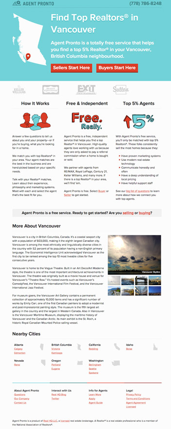
What I Like About this Page:
- The Bold Headline: When you arrive at this landing page and see the title, it’s clear what Agent Pronto does, and the service they offer. The headline also stands out clearly from the turquoise background and is reinforced with the map of British Columbia and the location tag over Vancouver.
- The Call-to-Action Buttons: The bright, contrasting red CTA buttons stand out clearly from the background and are clearly the focus of the above-the-fold area. They have also added call-to-action links below the fold, meaning visitors don’t have to scroll back up to convert.
- The Call-to-Action Button Copy: Agent Pronto has used actionable, convincing copy on their CTA buttons, making it clear where visitors need to click. Using “Sellers Start Here” and “Buyers Start Here” makes it obvious where to go, helping with conversions.
- Their Partners List: Displaying prominent partners like Keller Williams and Sutton improves the credibility of the service, making visitors more likely to convert. We would however, recommend centering the partner names or adding one more to balance out the page.
- The Icons and Columns of Copy: The bright icons above the copy of the page stand out and are relevant to the column topics, making visitors more inclined to read on. The copy itself gives page visitors a solid understanding of the company, their services, and how it works.
- The Bulleted List: The list under “Top 5% Agents” makes it much easier to read and scan quickly when deciding if the service is right for the visitor. Improving the readability of the page is crucial to maximizing conversions.
What I Would Change or Test:
- The Chunky Paragraphs: While the columns of copy are informative, Agent Pronto should try and reduce the amount of copy in this section. They should test adding more bulleted lists and reduce the size of the paragraphs to make them easier to read and understand.
- The Excessive Information on Vancouver: While it’s nice that they have given visitors information about Vancouver, it’s definitely excessive. Most people landing on this page likely already live in the city or are well-informed about it, if they are planning to move to the Greater Vancouver area. I would suggest they try reducing it down to a single small paragraph or removing it all together. Using valuable landing page space to talk about the Vogue Theatre and the Vancouver Art Gallery is unnecessary in this situation.
- The Nearby Cities Links: Visitors arrive on this page when searching for Vancouver real estate agents. Therefore, it’s unlikely they will be looking to learn about any of these other cities listed. They’re an unnecessary distraction from the conversion objective.
- The Links at the Bottom: All of these links distract from the main focus of the page. If Agent Pronto wants to optimize their landing page for conversion, they should try removing all of these links which lead visitors away from the page.
Conclusion
An optimized landing page includes many different components that take time and expertise to nail on the head. I hope that these critiques have given you some ideas in terms of real estate marketing to better optimize your landing page and also some sort of landing page design inspiration. Sometimes it takes a little bit of brutal honesty to make you realize that you can do better.
If you have any opinions on the landing pages discussed or even disagree with me, feel free to join in on the conversation below.
For further reading check out the following:
- 40 Real Estate Lead Generation Strategies
- Social Media for Real Estate Agents: 21 Tips
- 3 Landing Page Examples Critiqued to Hell and Back
P.S. Looking to create a contest to boost your real estate landing page engagement? Check out Wishpond’s Facebook Contest App and get some inspiration from these Facebook Contest Ideas.