Ready to make more sales? Then you’ll want to copy these crazy effective retargeting ads examples.
Retargeting ads are my favorite type of ad and they should be yours too. Why? They’re targeted at you based on the websites you visit.
Everything about retargeting ads, from the design to the offer and funneled down to the call-to-action can and should be personalized. The retargeting examples I’ll be showing you are good but with a few tweaks, they’d be hitting the bullseye.
Today, I’m going to share my thoughts on 5 retargeting examples found across Twitter, Facebook, and the web.
Although knowing the theories behind retargeting ads is important, seeing them in action is what will make your retargeting ads truly great.
I’ll be going over three things you should focus on in your retargeting ads and then get into some retargeting ads examples.
What Makes Someone Click On a Retargeting Ad?
Before we jump into the retargeting ads examples, I want to share with you the three things that contribute to making a retargeting ad successful. This will help you hone in on what you’re doing right, and what you need to improve on.
Target the Right Audience With the Right Offer
You could retarget everyone that comes to your website with the same ad but this is a bad idea. You should be personalizing the ads they see based on their interest in your products and services. This will ensure that you’re showing the right offer to the right audience.
An Eye-Catching Image/Banner
Your banner or image needs to draw the viewer’s eye toward your ad. It should be engaging enough to encourage someone to stop what they’re doing (reading a blog, chatting with their friends) and draw their attention to your message.
Call-to-Action
Your call-to-action should be simple, yet actionable. It is meant to guide the viewer towards the directed action you want them to take (clicking your ad and converting on your offer). The CTA on a banner ad is an image within the ad of a button with actionable text.
5 Best Retargeting Ads Examples
Now that you know what you should be looking for, let’s get rolling with some retargeting ad examples!
1. Twitter Retargeting Ad Example: Kelley Blue Book
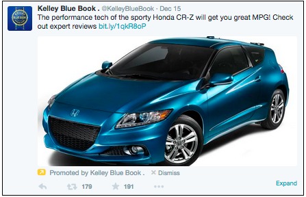
Targeting the right audience (with the right offer): I’ve been actively looking to purchase a car for the past few months. Specifically, my concerns have been around finding a car that has good fuel consumption and has enough space for all my gear. I saw this one and was immediately intrigued as it fits exactly what I’m looking for.
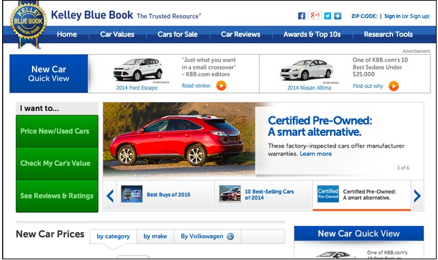
A problem occurred when I clicked through and was brought to their homepage. I scrolled up and down the screen, unable to find the car that was featured in the retargeting ad. It should’ve directed me to the page that the car was on. This way, I would’ve checked out more details (making me want to buy it more) where instead I got frustrated and hit the back button.
An eye-catching image/banner: I like the car they chose as it’s bright and bold against the white background. There’s no call-to-action on the banner but it doesn’t matter as you don’t click the banner on Twitter instead you click the bitly link above the image. The cool part about the bitly link if your ability to customize it. Instead of having a generic bitly link it could’ve read bit.ly/HondaKelleyBlueBook.
Call-to-action: Their CTA, “Check out expert reviews” is great because, since I’m still trying to figure out the right car for me.
2. Facebook Retargeting Ad Example: Expedia

Targeting the right audience (with the right offer): I’ve been actively searching for a car so I can go away on weekend trips. The problem is, I generally won’t know if I’m able to go until the last minute, or maybe it’s just my spontaneous nature. This offer from Expedia, knows exactly what I’m looking for, ‘Last Minute Deals’ and ‘Deals’.
An eye-catching image/banner: The perspective (from the view of the guest walking into the room) really helps me feel like I’m there. I also like that they’ve shown three types of terrain, ocean on the left, mountains in the middle, and forest on the right. This helps show all of the places I’d be able to go and how Expedia could help me do it.
Call-to-action: The CTA, “Book Now” is simple, straightforward, and to the point. It’s gently pushing me to check out their deals and get myself into a hotel.
Since I like last-minute deals, I clicked the ad. Today I was retargeted with this ad:
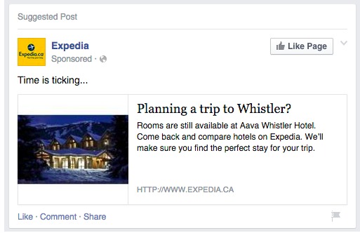
I searched for hotels in Whistler and was given limited options because of the time of year I’m looking to book. I only clicked on one of the hotels, the Aava Whistler Hotel. The body, “time is ticking” is great as it creates urgency as I know there are only a few days left until the new year. They could’ve made this ad better by increasing the size of the image to help me visualize what I’m going to be missing if I don’t book.
3. Site Retargeting Ad Example: Handy

Targeting the right audience (with the right offer): As my family will be visiting over the holidays I was looking for a cleaning agency to make sure my place is in order. I visited a few websites but the only one I’ve seen retargeting ads from was Handy. The offer, $29 for my first 2-hour clean definitely caught my attention.
An eye-catching image/banner: The design of this banner is incredibly appealing and consistent with the pages on their website. The background image featuring crisp white and clean furniture helps me visualize how clean my home could look with their help.
Call-to-action: The call-to-action, “Book Now” uses implied urgency to entice me to click the ad and make a booking. It could be improved by changing the color of the button. Although it stands out, it could stand out more if it was say, orange.
Top tip: Although I think this retargeting ad is a good example they didn’t set frequency caps. I saw this ad a minimum of 50 times over the course of two days. You need to make sure you set frequency caps so that your ad you’re not annoying your potential customers.
4. Site Retargeting Ad Example: Altitude Sports

Targeting the right audience (with the right offer): This retargeting ad was shown to my co-worker whose feet feature a new pair of shoes almost daily. In particular, I’ve noticed that she seems to have a thing for wellies (Hunter boots) as she has at least two pairs of them.
This retargeting ad was created by the eCommerce store Altitude Sports which has kinds of products and brands for sale. The great part about this ad is that the majority of products featured in the retargeting ad are the items she loves most, Hunter Boots.
An eye-catching image/banner: Although I like that they’ve placed the product she’s most likely to be interested in as the prominent image, the banner itself is boring and unimaginative. It doesn’t give the user any reason to click it. There’s no offer, it’s just a collection of their products.
Call-to-action: There is no call-to-action on this banner ad (but there should be). I did some investigating and found that they’re currently having a sale of up to 50% off select items. Because of the sale, I’d recommend a call-to-action that reads, “Shop the sale now”.
5. Site Retargeting Example: Freshdesk
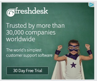
Targeting the right audience (with the right offer): This ad was targeted toward a different co-worker who has been tasked with finding a new helpdesk system. A system that is both easy to use and offers our customers the best highest levels of support. I feel like this is clearly being communicated in this retargeting ad.
An eye-catching image/banner: I love the image of the girl dressed as a superhero. It does two things, it reaffirms that this software is so simple a child could use it and shows that with this system you’d be a superhero for your customers. The green color of the ad really plays on the name of the company, “Freshdesk” because green is directly related to nature. The main thing I would change is the amount of text on the ad itself. Although saying that it’s trusted by more than 30000 companies worldwide, it doesn’t really add any value to the offer. The ad should focus solely on the software being simple and easy to use.
Call-to-action: Although a ‘30 Day Free Trial’ sounds great, it’s not actionable. They should change it to “Start [My/Your] 30 Day Free Trial” and if no credit card is required write that above the CTA button.
Conclusion
So there you have it, 5 retargeting examples to give you some inspiration. What are your thoughts on the examples I’ve used? It would be interesting to hear about some of the ads you’ve been retargeted with. Please, share your stories in the comments below!
Related Reading
- 24 Amazing Facebook Giveaway Examples
- Facebook Landing Pages: 38 Ideas, Tips and Examples
- 5 Facebook Landing Page Template Examples Critiqued
- Social Media Marketing Plan: An 11-Step Template
- 10 Terrific Instagram Tools for Business
Wishpond’s Facebook Contest Apps make it easy to create sweepstakes, photo contests, Instagram hashtag contests & more.

