
This is the third part of our series on creating an optimized marketing funnel with ebooks. You’ve created an informative and well-designed ebook. It looks awesome and it’s full of valuable content (That was Article #1).
You’ve come up with a strong promotional strategy and visitors are starting to flock to your landing page (That was Article #2)
But then the worst happens. Those potential leads don’t convert.
All of that work for nothing.
After spending countless hours designing and promoting your ebook it’s crucial you get something in return.
You need an optimized landing page to ensure you capture every possible lead.
A landing page should never be an afterthought to your ebook strategy. Yet as it turns out, 44% of clicks for B2B companies are directed to the business’ homepage, rather than a designated landing page. Not great.
An optimized landing page gives potential leads one action to take to get your content. But designing a landing page that’s maximized for conversion isn’t all that simple.
In this article I’ll show you how to design an ebook landing page and in the process examine real life examples from industry leading organizations.
What Exactly is the Purpose of a Good Landing Page?
Your landing page should serve the purpose of gaining information and converting visitors into leads. That’s it.
The last thing you want is to distract potential leads with too many links or a cluttered website.
Let’s break down the elements of an optimized ebook landing page with some examples:
Ebook landing page example #1: Hubspot
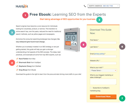
1. The Headline
The headline of your ebook landing page needs to grab the attention of visitors and inform them of the purpose of this page. Your headline should match what was clicked to arrive there, whether that was a Facebook Ad, Google Ad, a link from a blog article, a popup, whatever. It needs to clearly explain what your ebook is about.
In this case Hubspot has chosen their headline to be the title of their ebook. When you arrive at this page, the headline catches your eye and gives you enough information to decide if you want to read more and move towards conversion, or leave the page immediately.
2. The Subheading
The subheading is where you get to explain to visitors a bit more about what’s included in the ebook and the benefits it will give them. It should support your headline by giving more detail about your ebook.
In this case Hubspot has told visitors what will happen to them by reading this ebook. Their message and value is very clear and easy to understand, convincing potential leads to read the rest of the page and learn more – the exact purpose of the subheading.
3. The Ebook Description
The ebook description is your chance to explain why you wrote this ebook, why your visitor needs to download it and the value it will provide them. This is where you get to show them the value in your content and outline the various topics covered. Ensure you give enough information to give a strong glimpse of the ebook, but don’t write too much and make the page text-heavy.
Hubspot has properly broken this page down into small, chopped up paragraphs. It’s not too hard to read and provides a good synopsis of the ebook and value it contains. It describes SEO and how it has changed, and then personalizes the description by entering your company name, a very cool feature. You can see the personalization where it says “And since the consumer searching landscape has changed, the way wishpond gets found must change.”
4. The Benefits List
A benefits list is usually connected to the ebook description mentioned above, but serves to break the information down into easy to scan points. By using 3-5 benefits statement you are telling visitors the benefits of the ebook to them, rather than simply listing features. Instead of drowning readers with text, you’re clearly explaining how your ebook is the solution they’ve been looking for.
While not actually a benefits list, in this case Hubspot has smartly bulleted the different expert influencers included in the ebook. Someone who glances at this landing page will have their eyes drawn to that list, to see experts’ names like Rand Fishkin and Dharmesh Shah. Obviously having influencers involved in this ebook is a key selling point and contributes a lot of value, so grabbing the attention of page visitors with this bulleted list is a great method for conversions.
5. The Ebook Image
Many marketers forget the importance of visually displaying their ebook on their landing page. A large proportion of people prefer visuals to text, so an image of your actual offer gives them more incentive to convert. Whenever possible you should show the cover of your ebook, giving potential leads that extra push to learn more or opt in. An image is easier to quickly digest, so ensure it is relevant and conveys the title or topic of your ebook. Hubspot has conveyed the topic of their ebook very clearly through this small, simple image. Glancing at the page you can tell exactly what the topic is from the small graphic. Showing the title and a small image conveying “experts” is all they need to visually display the value of their content.
6. The Lead Capture Form
The lead-capture form is crucial to your ebook landing page as it’s where you get to gain information from visitors, turning them into actual leads for your business. The design of your form can also make or break the download rate of your ebook.
Your lead-capture form needs to be an easy task for potential leads to fill out, or they will be sure to drop out before conversion. A recent study by HubSpot actually analyzed over 40,000 landing pages and found that conversion rates improved by nearly half when text entry fields were reduced from 4 to 3. You need to find a happy medium between getting enough info from leads while also making it short and not intimidating to those arriving at your page.
Hubspot has created a lead-capture form that gets a good amount of personal information without coming across as too lengthy. They have gotten the full name, email and website of the lead while also gaining some insight into that individual’s biggest marketing challenge. They have also only made the first 5 fields mandatory, although some may argue asking for their role is one field too many. The form also stands out from the rest of the page by being yellow and encapsulated.
7. The Call-to-Action (CTA)
Arguably the most important feature on your ebook landing page, your call-to-action needs to be attention-grabbing and easy to find. Make sure your button is clear in a contrasting color and always above the fold of the page when possible. Never use words like “Submit” or “Click here” on your call-to-action button. The copy of your CTA needs to be actionable, telling potential leads exactly what will happen when they click the button.
Hubspot’s CTA stands out in bright orange from the yellow form and the white background. It’s easy to locate as soon as you land on the page. Although it is below the fold of the page, it doesn’t have to battle with other features to grab your attention. They have also used urgency in their CTA copy by saying “Download Now” telling potential leads that by clicking the button they will be receiving a copy of the ebook immediately.
Ebook landing page example #2. Mobify
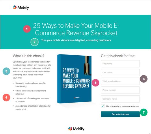
1. The Headline
As I stated earlier, the headline of your ebook landing page needs to be attention grabbing and informative. It needs to stand out and give potential leads a quick glimpse at what your offer is.
Mobify has done this correctly as the white text of their headline stands out clearly from the turquoise background. They have also chosen to go with the title of their ebook as the headline, so potential leads know the offer the second they arrive on the page.
2. The Subheading
The subheading’s purpose is to support the headline and give visitors a bit more information about what the ebook entails. Mobify has done this by using this feature to explain how their revenue will skyrocket from reading this ebook, turning mobile visitors into converting customers. This statement explains the headline and gives visitors a bit more insight about why they should read on and download this piece of content.
3. The Ebook Description
The description is where you get to actually introduce what’s included in your ebook and the value it contains. Mobify has done this perfectly, even using the subtitle “What’s in this Ebook?” It then gives a few short sentences introducing the topic to visitors, hinting at their needs and explaining why they should want to read it.
4. The Benefits List
The benefits list breaks the page up, making it easy for visitors to read and understand the value included in your ebook. Mobify’s 4 benefit statements tell potential leads why they should want to download the ebook by showing the topics covered and the things they will learn. A visitor who quickly skims the page can glance at the list and get a full understanding of how they could benefit from the book, and if it’s worth their time to convert.
5. The Ebook Image
The image of your ebook is the perfect way to visually show potential leads the offer when they first arrive at your page. Mobify has picked an image of their book that is large and a bright color so that it grabs the attention of visitors. The dark blue book with the proper title and an image of the rocket conveys what the ebook is about clearly without visitors having to exert any effort.
6. Lead-Capture Form
The lead-capture form allows you to capture personal information from visitors and convert them into leads.
Mobify’s form involves 5 form fields, grabbing enough info from each individual without being too lengthy or overwhelming at first glance. I like how they have also made the opt-in to receive more resources optional, leaving the choice up to the lead. You can also see the form when you first land on the page, without having to scroll and look for it. My only recommendation would be that they encapsulate the form, possibly making it a different color so that it stands out more from the rest of the page.
7. The Call-to-Action (CTA)
The smallest yet most important element on your page, the call-to-action is where your visitors take action, converting to become leads for your business. As I mentioned above, the CTA button needs to be bright and attention grabbing.
Mobify has properly chosen a contrasting button color from the background and used actionable CTA copy to tell visitors that they can get access to the ebook by clicking. While it is just below the fold of the page, the CTA button is fairly easy to spot. My only recommendation would be making it a brighter blue color to match that of the header at the top of the page.
Additional Landing Page Tips
You’re now well on your way to creating an ebook landing page that will maximize your downloads and present you with a list of interested, valuable leads.
But I realized there are just a few more things you should always remember…
1. Remember the goal of your landing page: You need to give page visitors just one action to take on your page and have a singe focused goal, getting ebook downloads. Remove any other navigation from your page rather than providing other links like a typical website. The more actions there are to take, the less attention visitors will give your ebook offer.
2. Don’t ask for information you don’t urgently need: If this is your first interaction with a visitor, you don’t want to feel as though you’re asking for a marriage proposal on the first date. An ebook download should only require 3-5 form fields, so leave it as minimal as possible. If they’re a valuable lead you can gain more information from them down the line, but always start off slow.
3. Testimonials: If applicable, a testimonial from a real lead or customer who has read your ebook is a great form of social proof. While not used by Hubspot or Mobify, if you want to convey the value of your ebook, a testimonial conveys trust and credibility. Just be sure to include a picture of the source and their name (plus company or city) to ensure it comes across as honest.
4. A/B Testing: Even when you think your landing page is optimized, it’s possible you’re missing something or making a crucial error without even realizing it. A/B testing is one of the most important aspects of creating your landing page. It allows you to split test aspects of your page to see what you’re doing well, and which elements need improvement. It’s the only way to truly tell how well your page is converting, and you need to be doing it regularly. Learn how to A/B test your landing page to maximize conversions here!
Conclusion
Your landing page is the perfect opportunity to give visitors information and convince them that your ebook is the solution to their problems or the information they need to reach success.
Optimized design and content on your page is the key to maximizing the downloads and conversions for your ebook. Check out how Mulesoft optimized the landing page design of their form to create an excellent page to download their e-book from.
Many marketers do not realize the value in an independent landing page for their ebook, as one page with one focused goal can be the difference between a bounce and a new valuable lead for your business.
Related Reading:
- The Ebook Design Kit for Marketers Who Can’t Design for S**t
- How to Promote Your Ebook
- Landing Pages: Optimizing your Landing Page for Lead Generation
- Landing Pages: The Fundamentals and Conversion Principles
- 8 Landing Page Design Best Practices