
How many barriers are between your website visitor’s arrival and the result they want from you?
That question is a huge part of UX, and it’s an essential one when designing your company’s online funnels.
- Are there barriers in design? Is it hard for your visitor to find what they’re looking for?
- Are there barriers in what your visitor has to give in return for what you’re offering? (see Chapter 5 for more on cost/benefit analysis).
- Are there technical barriers like browser limitations, broken links or bad gateways?
- Are there language barriers like jargon, serving only to confuse your site traffic?
- And so many more…
This chapter will dive into optimizing your site by making it simple, easy-to-use, and easy to convert on.
#36. Ease-of-Use
We all acknowledge that ease of use is an incredibly important element of website design and conversion rate optimization, and it’s been mentioned a few times throughout this guide.
But did you know that your target market may actually influence how easy you need to make your website design and platform?
This is also one of those times when I need to fall back on the academic journals (for fear of coming across as misogynist)…
“Evidence exists to indicate that women’s use intentions are more strongly influenced by ease of use [than men]. […] While men tend to use simplifying heuristics, women, in general, try to perform a comprehensive and detailed analysis of all information, up to the limits of their information processing capacity [Cleveland et al. 2003]. [Needless to say that] the online environment makes a large amount of information available. Because women typically try to pay attention to more information sources than men, women may be more prone to information overload than men. Men may be better equipped to deal with the increased amount of information available online because they may use their simplifying heuristics to limit the amount of information to be processed. In contrast, women may attempt to make use of all available information.”
This isn’t because either gender has a better understanding of technology, computers, or the internet, but simply because men and women interpret and deal with information in different ways.
Psychological Case Study:
In a study from Econsultancy, they found that the revenue generated from site searchers was significantly higher than non-searchers. Even though less than 10% of people were performing searches, close to 40% of the site’s revenue came from those searchers. Visitors who used the search option converted at 4.63% versus an average of 2.77% (about 180% more effective).
Based on this knowledge, e-commerce site Black Forest Decor ran an A/B test several years ago on their homepage’s search bar.
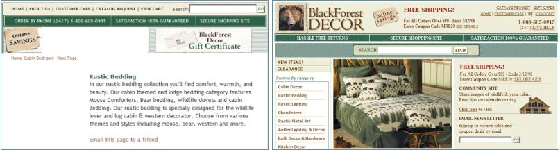
The control is on the left and the variation on the right.
They changed 4 primary elements of the search field:
- Increased the size of the search box by 72%
- Moved it to the center of the page
- Changed the CTA from “Go” to “Find”
- Encapsulated the search box with contrasting color
The total sum of these changes resulted in a 20% jump in conversions for people using onsite search, an 84% jump in average revenue per customer using search and a 34% increase in website conversion rate.
How you can use this psychological factor for conversion rate optimization:
- Limit your nav bar to make primary options easier to interact with.
- For e-commerce sites (in particular) make your search bar a focus point of your homepage.
- Test a chat help box (particularly for SaaS businesses) on your product pages.
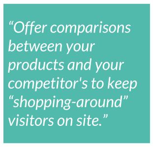
- Offer comparisons between your products/service and competitors to keep “shopping-around” visitors on site.
- If you have a female target market, consider limiting even more the amount of information you display on each page. If you need to communicate a lot of information, break it into clearly-defined segments or multiple pages to make it easier to absorb
#37. Law of Past Experience
Your prospective customers aren’t blank slates. They don’t come to your site experiencing the internet for the first time. They have beliefs, assumptions and biases you can’t control (but can anticipate).
The law of past experience (also called the concept of mental models) is the idea that our past experiences affect how we interpret our current ones.
Now, that’s common-sense. Of course our past influences the way we interpret the world. If we, as a kid, had a bad experience with a neighbor’s dog we’re far more likely to be scared of dogs in our adult life.
But that’s the crux: our past experiences are individual to each of us. What may influence one of your prospective customers won’t influence another in any way. Not all your target audience had a bad experience with dogs.
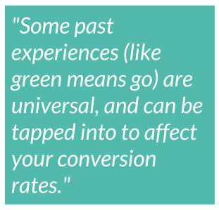
That said, some past experiences (like green means go or baby ducks are cute) are universal, and can be tapped into to affect your website’s conversion rates.
Psychological Case Study:
E-commerce company Fab was looking for ways to increase the clickthrough on their “add-to-cart” buttons (as most e-commerce companies are…)
They had somewhat recently created a new “add-to-cart” icon for their CTA, showing a shopping cart icon and small “+” sign next to it. Check out their control and two variations below:
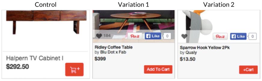
You’ll note that their Control and Variation 2 are non-traditional “add-to-cart” buttons, while Variation 1 is the standard (synonymous with Amazon’s own checkout process).
The traditional button (Variation 1), increased CTA clickthrough by 49%, however, Variation 2 was the real shocker. Simply adding descriptive text and creating a button with the words “Add To Cart” increased clicks by 49%.
This is the law of past experience: new isn’t always better. Sometimes breaking from the norm can throw your site visitors off and tosses your conversion rates into the gutter.
How you can use this psychological factor for conversion rate optimization:
- Consider your innovative next A/B test carefully before diving in. Are you introducing something which your users or visitors might not recognize? Are you _too_ innovative?
- The balance between “traditionally understandable” and “pushing the edge” is a tough one to walk. Don’t dive in headfirst without doing research and proving your hypothesis.
#38. Keep it Easy
Keep it Simple, Stupid, has been a motto of the US Navy engineers since the 1960s, and it refers to the simple idea that “most systems work best if they are kept simple rather than made complicated; therefore simplicity should be a key goal in design and unnecessary complexity should be avoided.”
So, while you absolutely need to keep the complicated psychological factors within this guide in mind, from divestiture aversion to the connotation of the color green, you need to remember that your website visitors are, above all else, lazy.
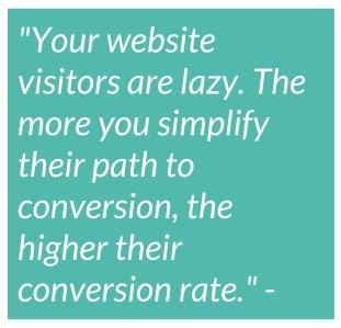
The more you can simplify their path to conversion, the higher the chance of them converting.
Psychological Case Study from Wishpond:
Last year we ran a test on one of our sign-up pages to simplify the conversion “ask” of our visitors.
Essentially, we placed a small script – something like $(‘input[type=”email”]’).focus(); – into our landing page code. This makes it so that when someone lands on your page, their cursor is already placed within the entry form (pre-selected, if you will)
All they have to do is start typing their lead information (without having to move the mouse the inch or so it’d take for them to click the field themselves).
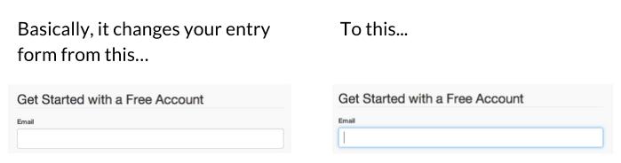
The page’s conversion rates saw a 56.4% increase.
How you can use this psychological factor for conversion rate optimization:
- Eliminate distractions from your landing pages, particularly the Navigation bar or multiple CTA’s. Focus on a single conversion Ask.
- Implement auto-submit, auto-select, and pre-filled form fields to facilitate the conversion process (alongside limiting the number of form fields you have).
- Test using [click popups](https://corp.wishpond.com/website-popups/) instead of individual landing pages for email-gated content to keep the conversion process faster and easier.
Further Reading on Simplifying the Process:
- Convert More Visitors By Improving Your Internal Site Search
- 5 Psychological Principles of High Converting Websites (+ 20 Case Studies)
- 7 Advanced Tricks to Optimize Landing Page Conversion (Free Ebook)
Conclusion: Use Psychological Factors to Boost Conversion Rates
Free Checklist: Download a free 5-step checklist to optimize your sales funnel using conversion psychology (plus 2 bonus factors not included in this guide)
Each and every theory and principle in this guide is simply that, a theory and a principle.
They’re a great place to start your marketing and A/B testing strategies, but it’s still crucial that you actually run the tests.
“Results will vary” is one of the most important things to remember when you’re optimizing for conversion.
So get out there and tap into the irrational, the subconscious, the quirks and nuances of being human which make us act and buy. Get out there and start trying things!
And let me know how it goes!
To head back to the Table of Contents, click here.