This is the fourth installment in our landing page article series. First you’re hearing of it? Check it out the intro article.
Previously reviewed: Photographer Landing Pages
Interested in learning how to create your own ad campaigns for personal trainers?
Let me guess, you’re wondering where to direct your ad traffic.
You’ve heard of landing pages, but they sound pretty daunting. Maybe you’re thinking about directing your ad traffic to a homepage or your “contact us” page… Don’t!
This negates the point of creating an ad campaign. You want leads from these campaigns, right?
What you’re looking for is a Landing Page Builder. They make it easy for anyone to create an optimized landing page. But first, there are some best practices you should know before you dive in.
That’s what this series is for! In this article I’ll cover some essential ad campaign tips tailored towards personal trainers.
I’ll mostly be focusing on landing pages, but I’ll also give you some quick Google AdWords tips and notes (it’s the most popular advertising platform on the web).
Let’s cover some AdWords tips first as it’s the first interaction the web user has with your campaign.

6 tips for personal trainers creating Google AdWords campaigns:
- Google’s Keyword Planner will help you figure out which keywords personal trainers should use in their campaign.
- Match the keywords a Google user searches to the headline copy you use. Learn more about this strategy here: Dynamic Keyword Insertion (DKI)
- Emphasize a unique selling point. What makes your ad more clickable than others? Is it a seasonal offer? Do your clients get a free meal guide with your services?
- Use urgency copy to emphasize your offer. Use phrases like, “get results now,” or “only for a limited time.”
- Employ location targeting to only target people in certain cities, radiuses, postal codes and more.
- Use ad extensions to improve the click through rate (CTR) of your ad. For personal trainers, I would suggest exploring these four extensions: calls, location, reviews and sitelinks.

7 tips for personal trainers creating landing pages:
- Use a landing page builder to make your job a whole lot easier. These builders usually feature templates and are mobile-optimized.
- Your ad’s headline should match your landing page’s headline. This is good for the success of your campaign – plus this consistency is beneficial to your landing page’s bounce rate.
- Make sure your landing page has a conversion goal. Why have you created this campaign? Are you looking to build an email list for your weekly newsletter or are you looking for potential clients?
- Lay out the benefits of your personal training business in an easy-to-read bullet point list.
- Keep your form fields to the minimum. People are intimidated by lengthy forms. Try to keep your fields lower than five.
- Use your own photos instead of stock photos. When stock photos are obvious, they tend to decrease the trust your visitors have in your landing page.
- Mobile optimization is key. The good thing is, most (good) landing page builders automatically include this function.
I think we’re ready to go through the reviews.
In this article I used the search terms: “personal trainer vancouver.” Let’s take a look!
1. Revamped Fitness
Revamped Fitness is a gym in Vancouver that offers a few different services: muay thai, personal training and a variety of training equipment.
Let’s check out the ad:

At a glance I’m able to tell that this gym is in fact in Vancouver. I would consider putting “/PersonalTrainer” or, “/VancouverTrainer” at the end of the display URL to increase relevancy.
The description is yawn. I would put an exciting deal or unique selling point about their personal trainers in the copy.
I see they’ve employed a location extension. These are important for personal trainers working at an exclusive locations because clients will have to commute to them.
Decent ad, but there’s a lot of room for improvement. Let’s say we click-through.
Here’s the landing page that appears:
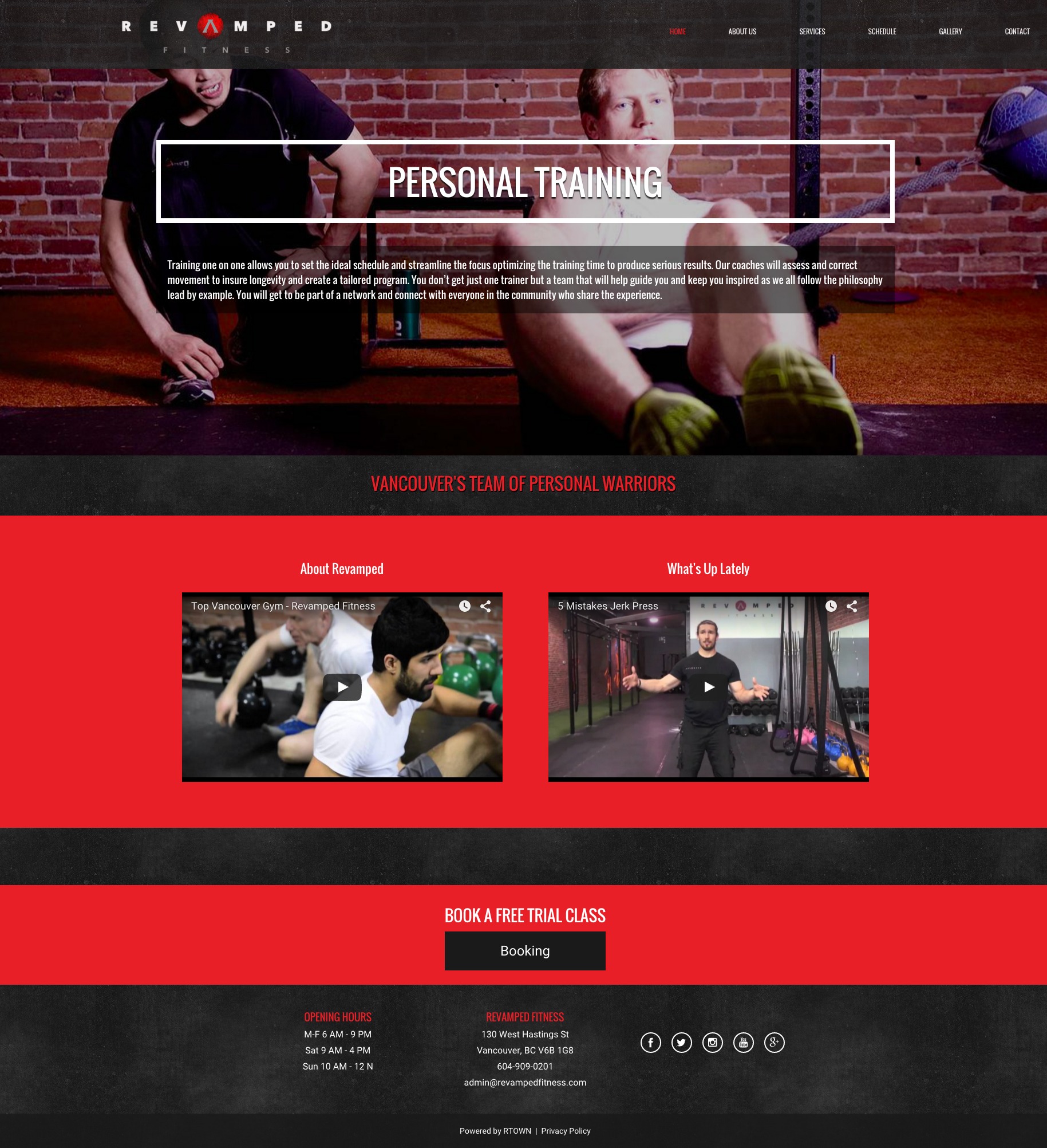
Hmm…there’s a few rotating images in the banner. I have a feeling that this isn’t a landing page and is more of just a page on their site.
I see we don’t have a form, just a CTA button at the bottom of the page.
What I like:
- The images. Revamped Fitness has taken the time to create their own visual content which is more reassuring to landing page visitors than obvious stock photos. These unique photos both look professional and reinforce trust.
- The use of whitespace. Revamped Fitness understands that landing pages need their space. Spaces in between page elements help draw focus to important aspects – such as the CTA.
- It’s optimized for mobile. I took a look at this page on my phone and it’s fully mobile-optimized and even has call CTA buttons at the top and bottom of the page. Great work!
What I don’t like:
- It’s too general. This landing page promotes the fitness centre in general and not just personal training. It should be specific to personal training – create a separate landing page based around this only.
- It lacks a unique selling point (USP). At first glance, I can’t find anything particularly unique about this gym. After some time (longer than an average visitor would stick around) I figure out that they have a lot of activities at their fitness centre, but this is not that relevant to personal training.
- The navigation bar. This is my fourth critique in this series and I’ve found that 9/10 landing pages have navigation bars. These are horrible for conversions! They lead your potential conversions away from your page (which is optimized for conversions).
- The call-to-action (CTA) button. This CTA button is below the fold and lacks contrast with the page.
- The row above the footer There should be next to nothing in a landing page’s footer. For personal trainers, all there should be is privacy policy and the name of landing page host. All of the social buttons are just temptation to navigate away from the page (just like the navigation bar).
What I would test:
- A contact form. I would test a variation with a form on the right hand side of the page, somewhere either above the fold or just below.
- A two-step opt-in form. These appear with just a description and a CTA button on the landing page. When people click-through, an opt-in form pops up on the page. These have been known to increase conversions.
- Altering the CTA copy.The copy “Booking” is also a strange choice – I would go with something like, “book my free class now” to create urgency and confirm exactly what the lead will get by clicking that button.
- Placing another CTA button above the fold. It would be for the same offer, of course. I would just like to see a CTA above the fold.
- Increased subheadline font size. The font should be larger – you shouldn’t have to strain to read it (it’s perfect on mobile, though).
- Removing one video. I would only include one video on this landing page showcasing the personal trainers available.
- A customer testimonial. Customer testimonials really help to convince visitors that your business can be trusted.
Consensus: This is a homepage, a really nice homepage but still a homepage. I would start by creating a landing page with a similar layout to their homepage, minus the navigation bar, with a more clear subheadline and more CTA contrast.
2. Evolution by Ariana
Evolution by Ariana is run by Ariana Fotinakis, a personal trainer and nutrition counsellor in Vancouver.
Here’s the ad that appeared for the search terms, “personal trainer vancouver.”

What kind of “training?” I personally wouldn’t click on this ad because it’s vague. It needs to be more specific.
I’d also like to see all of the keywords in the ad’s headline. “Your Personal Trainer in Vancouver” would do.
The display URL should also have some of the keywords. “/VancouverTrainer” would be appropriate at the end of www.evolutionbyariana.”
A discount would make this advertisement more alluring – I would suggest offering a free consultation or a discount on personal training itself. Alongside the offer, I would include copy enforcing urgency like, “hurry, only 1 spot left this fall!”
Now let’s check out the landing page we’re directed to:

This lead generation landing page has all of the essential elements of a high-converting page, but they need to be executed differently. Let’s go through the details!
What I like:
- Number of form fields. 4 is a good number, I generally recommend 5 or less. I like that they’ve indicated the mandatory fields with asterisks. This makes the idea of filling out the form less intimidating.
- Use of a customer testimonial. Customer testimonials are a great way to add trust to a landing page. They are especially important for personal trainers, as word-of-mouth and reputation are important aspects of the business.
- The effort. It looks there was some effort put into creating this page (or site). I applaud that, but there are several things I would change.
What I don’t like:
- The multiple offers. On this page we have two offers: a contact form and a restaurant guide for Vancouver. The restaurant guide is oddly placed in the top right hand corner of the page, I’m assuming this appears on every page of the site.
- The formatting issue. Whoops, the CTA button on the form has cut off the copy.
- The blocks of text. I had a hard enough time trying to get through the copy on this landing page, it’s unnecessary to include an essay about your business. Pick out the essential information (what you offer, what makes your offer unique, etc) and ditch the rest.
- The navigation bar. I think I’m desensitized to seeing navigation bars on landing pages. But that doesn’t mean it should be here… get rid of this conversion killer.
- No obvious mention of Vancouver on the landing page. Right away you should be able to tell that this personal trainer is located in Vancouver. By putting “Vancouver” in the headline, you should be able to decrease the bounce rate.
- No USP. One of the most important best practices for creating a high-converting landing page is highlighting a unique offer on your page.
What I would test:
- Create simplicity with whitespace. Right now, this landing page is too busy. Using whitespace would clear up some space on the page to focus on the important elements (like the form).
- Adjusting the customer testimonial. I like that Ariana (pretty name, by the way) has included a type of social proof, but it needs to stand out more. I only noticed it was a testimonial once I read it. I suggest putting quotations around the review, italicizing it, and making it more readable by cutting the copy in half.
- A real more personal client photo. I’d say that the photo on the right hand side of the page is probably of a client, which is great. But I would suggest taking a shot that included the face instead of the back of her head – as faces have been known to convert better. 37Signals saw a 102.5% increase in conversions when they included a large, happy human face on their landing page.
- Adjusting the CTA button copy. If Ariana decided to tailor her page around a free consultation, I would suggest changing the CTA copy to something specific to the offer, something more actionable (ex. “Book my free consultation”).
Consensus: Make two separate landing pages: one for the personal trainer contact form and one for the Vancouver dining guide. I would also advise using a template to simply and quickly whip up a visually appealing and optimized landing page.
Conclusion
Hopefully the personal trainer landing page tips and critiques have inspired you to make changes to your own pages.
Stay tuned for the next critique!
Want more info? Check out these similar resources:
- 3 Personal Trainer Landing Pages Critiqued with Best Practices
- Fitness Center Landing Pages Critiqued with Optimization Tips
- 3 Weight Loss Landing Page Examples Critiqued