
Generating leads is a crucial component of your marketing strategy. It’s an essential part of your email marketing, sales funnel, and the more effectively you do it, the more money you’ll make.
It’s as simple as that.
If you spend $1,000 to send 1,000 visitors to an opt-in page and 15% of them convert, the return on your investment might be 4.25x (if 10% of leads convert to a sale worth $350).
If you increase that page’s conversion rate by just 25% (something that’s very possible with some of the elements I’ll show you below) your ROI goes to more than 5.5x.
So, if you want to get the most bang for your marketing buck, optimization is key.
This article will break down five opt-in pages I’m happy to call “optimized” and one which needs some work.
And, as always, remember that testing is essential.
Opt-in Page Example #1. Fanbooster’s “Content Marketing Explained”
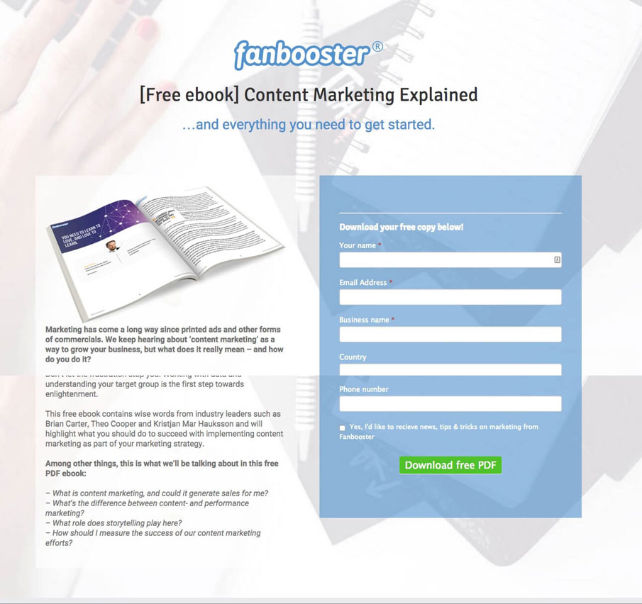
Why This Opt-In Page Example Is Good:
- Clear subject line, front and center and above-the-fold.
- Subheadline which expands on the simple title to communicate bonus value.
- Parallax background image and clean, well-balanced design communicates professionalism
- Encapsulated form divides the page well and focuses attention on conversion.
- Bullet-point “what you’ll get” section on the left communicates value quickly for those that need it.
- Stand-out, contrasting call to action button and appealing copy (always avoid “Submit”).
Opt-in Page Example #2. MainstreetHost’s “How to Conquer Social Media“

Why This Opt-In Page Example Is Good:
- Excellent, descriptive paragraph below clear headline. Communicates what you get in the ebook and why it’s valuable.
- Let’s people know the length of the ebook upfront. Length is also well-balanced: 32 pages is enough to be comprehensive but not too much to be overwhelming.
- Prominently features the four main components you’ll learn in the ebook, with large, skimmable titles and short paragraphs for those who need them.
- Aggressive subscriber prompts within the online form, asking people to select “No, I don’t want to learn how to grow my business” to opt-out of subscribing.
- Call to action button changes color (not shown above) from red to orange.
That little feature, of turning a CTA button a different color when the visitor’s cursor hovering over it, is highly recommended, and one of my favorite recent feature additions within the Wishpond Landing Page Builder.
Opt-in Page Example #3. Wrike’s “Guide to Online Marketing“
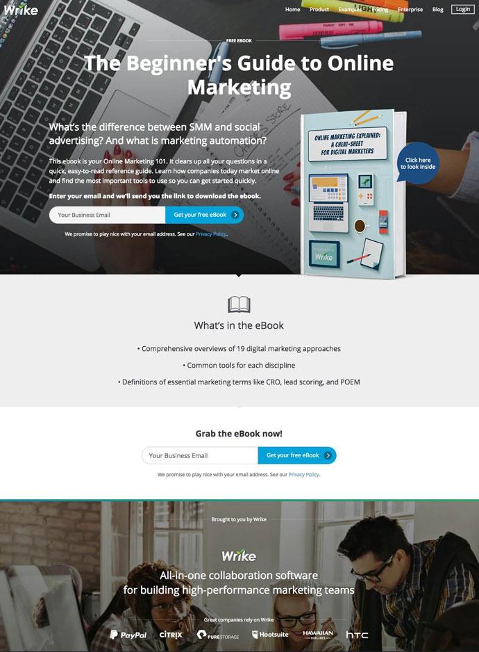
Why This Opt-In Page Example Is Good:
- One above-the-fold call to action and one below-the-fold call to action gives visitors multiple ways to convert.
- The visuals create a professional look.
- Simple, concise language gives value without overwhelming page visitors.
- The Wrike tagline, along with the trust symbols (“brands we’ve worked with”) creates credibility that the company knows what they’re talking about.
Opt-in Page Example #4. Infotap’s “Marketing Strategies for the Mobile Startup CEO“
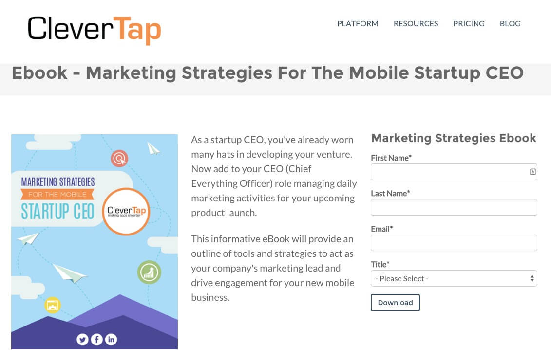
Why This Opt-In Page Example Is Good:
- By far the shortest op-in page, CleverTap cranks out email-gated content quickly and creates simple opt-in pages to generate as many prospective customers as possible.
- They’ve created content targeted at individual roles (in this case a CEO) to better segment leads.
- The images are templated, so designers can quickly and easily add titles and churn out appealing, professional designs quickly.
- The form asks for a job title alongside name and email address. If the lead isn’t a CEO it’s important they know. This effectively qualifies leads and segments them easily for an optimized lead nurturing drip campaign.
The reason I chose this opt-in page is because it showcases how your business can utilize email-gated content easily and often with templates and by re-purposing existing content. The truth of the matter is that I think this opt-in page could be optimized further, particularly encapsulating the form, contrasting the CTA, and adding a few design elements.
For a guide to creating ebooks quickly and with minimal design skills, check out my article “The Ebook Design Kit for Marketers who Can’t Design for S**t.”
Opt-in Page Example #5. Altitude’s “Integrated Marketing Essentials”
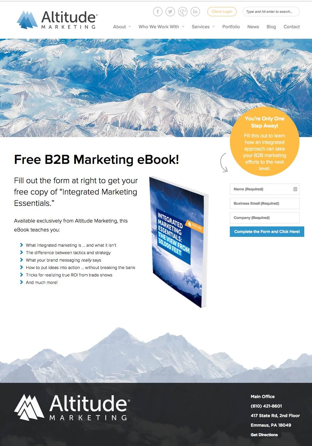
Why This Opt-In Page Example Is Good:
- Directional cues like the arrow tell the visitor’s eye where to go (this works entirely subconsciously).
- The page is original, separating itself from competitors. With opt-in pages often being so similar element-wise, it’s important to find a way to stand out and images are a great way to do so.
- The whole opt-in page makes it very clear what the visitor needs to do to get the ebook, from the subtitle to the call to action button copy.
Opt-in Page Example to Learn From: ClickConsult’s “Content Marketing Ebook”

The Optimization Issues I See:
- Long-form landing pages can be good, but only when you need to communicate a lot of information (like a product page). In this case the call to action button is far below the fold.
- Large amount of whitespace on the left side, which distracts from the rest of the page.
- The navigation and contact details at the bottom of the page include calls to action which are the same color as the page’s primary conversion button. Not optimized.
How I’d Design this Opt-in Page:

This opt-in page includes the exact same information as the page above, but communicates it in a far more focused way. When it doubt, simplify your opt-in page rather than adding elements.
Wrapping it Up
Hopefully these examples (good and bad) have inspired you to optimize your own opt-in pages. The smallest changes can yield huge results.
If you have any questions don’t hesitate to reach out in the comment section below. I’d love to know your optimization stories!
Related Reading:
- Landing Page FAQ: What’s the Difference Between a Landing Page and a Squeeze Page?
- The Beginner’s Guide to Creating a Squeeze Page
- 5 List Building Strategies We Used to Get 18,124 Subscribers
- 5 Drip Email Templates That Work
- 9 Lead Magnet Ideas People Actually Want
- 25 Creative Facebook Contest Ideas You Can Use Today
P.S. Wishpond’s Facebook Contest Apps make it easy to create sweepstakes, photo contests, Instagram hashtag contests & more.