
Designing a landing page without considering who’s going to be looking at it is like going to work in the same clothes you wear for a Sunday afternoon on the couch.
It’s not going to fly.

To avoid that embarrassing moment when you realize your boss can see the top of your underwear because you’re wearing a shirt you should have gotten rid of when you were 13, we need to dress for our audience.
In the case of landing pages, we’re (usually) talking about your advertising audience.
This article will give you three complete examples of ad audiences and the corresponding landing page I’ve built with specific traffic in mind:
- The first is a general squeeze page for a webinar on SEO, targeting marketing professionals
- The second is for a B2C outdoor activities business, running guy’s weekend getaways
- The third is for a nonprofit organization, targeting (with this specific campaign) women interested in environmentalism
Let’s put a tie on our landing pages, or at least take off the bunny slippers…
Facebook Ad Example #1
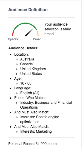
This Facebook Ad targets men and women in the top English speaking developed countries – Canada, the United States, Australia and the UK.
I’ve targeted people of all age groups interested in SEO, marketing and who work in the business industry.
This results in an ad audience of about 64,000 people, which (in my experience) is just about ideal: it’s large enough that I’ll reach my conversion goals but small enough that the traffic I receive is specific enough to be qualified.
With a $20 daily ad spend, the ad will be seen by about 3,500 people per day on Facebook and 2,000 on Instagram. With a click through rate of .75% it will drive 40 or so qualified prospective leads to the landing page each day.
Corresponding Landing Page Example #1

Landing Page Elements Specific to the Ad Audience:
- Length: This is a very simple landing page without a lot of exposition. Marketing experts (who will be viewing this page) know they’re on a landing page, and they’re busy people.
- Image: The image features the webinar host in a relaxed, confident position. You’ve likely heard how important body language is in interviews and professional settings, and your landing page image is the same. The webinar host is young but well dressed, and looks (stereotypically) like one of those startup millionaires.
- Language: Using language like “Master class” and “advanced” creates a feeling of exclusivity for the visitor. This is also achieved with the CTA copy “reserve my seat” which implies there are a limited number. The language also acknowledges that the person already knows a bit of SEO. Also making it actionable with “to get you to rank #1 appeals to the results-driven marketer.
Recommended A/B Test for this Landing Page Example
The first thing I’d test would be a countdown timer to really push the feeling of exclusivity and urgency. They’ve been shown to increase landing page conversions considerably, and are well worth testing with any webinar landing page. Check out our article which explores countdown timers more specifically at [Feature Release] A Countdown Clock for Extra Conversions.
Facebook Ad Example #2

This Facebook Ad targets men between the ages of 18 and 45 who are interested in the outdoors and also have a college degree – an effort to target higher-income individuals (since Facebook has gotten rid of the income/financial targeting capability they used to have, frustratingly).
This results in an ad audience of about 130,000 men. With a $20 daily ad spend, the ad will be seen by about 4,000 men per day on Facebook and 2,000 on Instagram. With a click through rate of .5% it will drive 30 or so qualified prospective leads to the landing page each day.
Corresponding Landing Page Example #2

Landing Page Elements Specific to the Ad Audience:
- Language: The target audience of this landing page is young professional men. The language (“we’re f*ckin good at it” and “Craft beer included”) appeals to that demographic. Language like this improves the chance of the message (and sales pitch) resonating with the target audience.
- Peer Endorsement (Testimonials): Not only are testimonials from similar people as the landing page visitor powerful, the bios (a CMO and a sales associate) hammer home those similarities. These testimonials convincingly tell the visitor “If guys like you had a great time, you can too.”
- Image: Just like with the testimonials, the background image shows a man of a similar age to the likely visitor, as well as being an inspirational picture of him looking into the wilderness with a large pack on his back. Inspirational images like this are great at creating an emotional reaction to the landing page.
Recommended A/B Test for this Landing Page Example
I’d definitely A/B test a different color scheme (perhaps red as an accent color). I’d also test messing around with the language – either going full casual or full professional (as it’s currently somewhere in the middle).
Facebook Ad Example #3
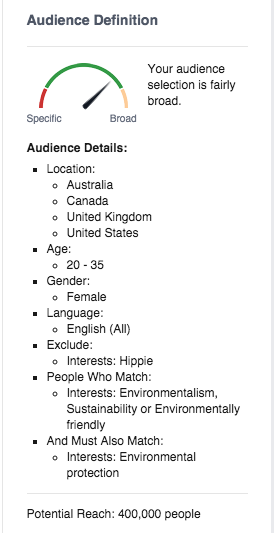
This Facebook Ad targets women between the ages of 20 and 35 who are interested environmental sustainability, but don’t identify as hippies (an attempt to target more financially capable donors for a non-profit organization).
This results in an ad audience of about 400,000 women, which is a bit larger than I’d like. I’d likely test this audience size and then hone in (if necessary) with a few more exclusion characteristics.
With a $20 daily ad spend, the ad will be seen by about 3,500 women per day on Facebook and 4,000 on Instagram. With a click through rate of .5% it will drive 38 or so qualified prospective leads to the landing page each day.
Corresponding Landing Page Example #3

Landing Page Elements Specific to the Ad Audience:
- The Background Image: Featuring a young girl in a third-world country is a deliberate appeal to pull at the heartstrings of a female target audience. Like the inspirational image in the men’s guy’s weekend landing page, this one also prompts the visitor to imagine themselves in the situation.
- The Language: “Don’t Change your Status” is a headline focused on traffic who has just come from a social media site. It elicits a bit of guilt and inspires real action.
Recommended A/B Test for this Landing Page Example
I’d definitely test a more focused ad/landing page campaign in which I create up to a dozen landing pages (easy to duplicate one a dozen times) with a dozen Facebook ads. This would allow me to target my campaigns at specific locations around the world and include statistics relevant to that location.
For a better look at location-centric marketing campaigns and how marketing automation can play a role in making it easier, check out my article How the Obama Administration Uses Marketing Automation.
Wrapping it Up
Hopefully seeing a few examples of audience-centric landing pages has given you some insight into building your own ad/landing page combinations.
Remember, the people who see your landing page define what it means for that landing page to be optimized.
That said, if you want me to critique your landing pages, don’t hesitate to reach out in the comment section below and I’ll run through as many of them as I can.
Cheers!
Related Reading:
- 5 Facebook Ad and Landing Page Combinations Critiqued
- 17 Landing Page Examples Reviewed with A/B Testing Ideas
- 4 Ways to Create Facebook Ad and Landing Page Combos to Maximize Conversions
- 13 Facebook Ads We Got That Were Right on the Money (and Why)
- 21 Ways: How to Create Landing Page/Google AdWord Combos That Convert