Wishpond is happy to publish this guest post from Lori Wagoner…
Every website is a work in progress.
With all the changes in coding standards, design frameworks, search engine algorithms, and evolving consumer behavior, you need to be constantly updating.
This post talks about the 5 most common ecommerce roadblocks I come across. From cluttered homepage to complicated checkouts, you’d be surprised at the cardinal ecommerce sins people are still committing.
Let’s outline a few of these roadblocks and see if you – as an ecommerce business – can do anything to make sure your customers breeze across the conversion funnel smoothly and swiftly.
Home In with Your Home Page
When it comes to home page or landing pages, everything from your banner image to your product pricing should be customized to the visitor’s location.
If a harried shopper happens to chance upon your website for “the last try of the day” and sees product pricing in foreign currency, she’d dump you before you can say “PayPal.” The standard practice is to keep a small language / country button or dropdown in the top navigation menu, which shows visitors the list of countries where you ship.
However, this is not ideal.
For instance, MinInTheBox ships to almost all the countries in the world and yet, this important feature is not highlighted. You learn this only when you click the small option at the top-right:

For retailers and ecommerce businesses that cater to a worldwide customer base, a generic page for all locations can be a conversion killer. If you are not providing a tailored home page or landing page to visitors from different countries, you stumble right there.
Here’s one way you can overcame this roadblock. The instant you land on the Funky Christmas Sweaters website, you get this entry pop-up, which asks you to set your country and currency:
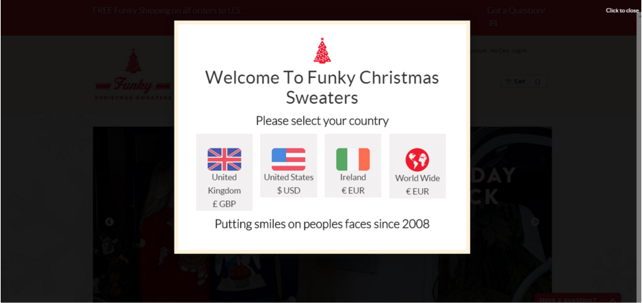
Another option is to take a cue from the biggies like Amazon, eBay, and Shopify, which automatically redirect you to your country page. If you land on an Amazon.com page from a different country, it asks you if you want to stay on Amazon.com or be redirected to a country-specific version.
You’ll find many services that provide geo-targeted URL redirection for websites. You can also show images, popups & HTML content based on location. Services like Geolify help you micro-target your audience by displaying geo-specific telephone numbers on your website. This generates more leads and higher conversion rates due to the familiarity of the number and low local rate call costs.
Nail Down Your Navigation
How ironic that the brand that has been helping us make beautiful things for years has a disorganized website and navigation structure.
Yes, I am talking about Lego. I am a huge Lego fan and was disappointed to see their website. It’s a big mess. It is so cluttered and there are so many confusing categories (e.g. games and products – aren’t games products?) that one can’t help feeling lost:

So what is the ideal navigation structure?
Consider TravelSmith:
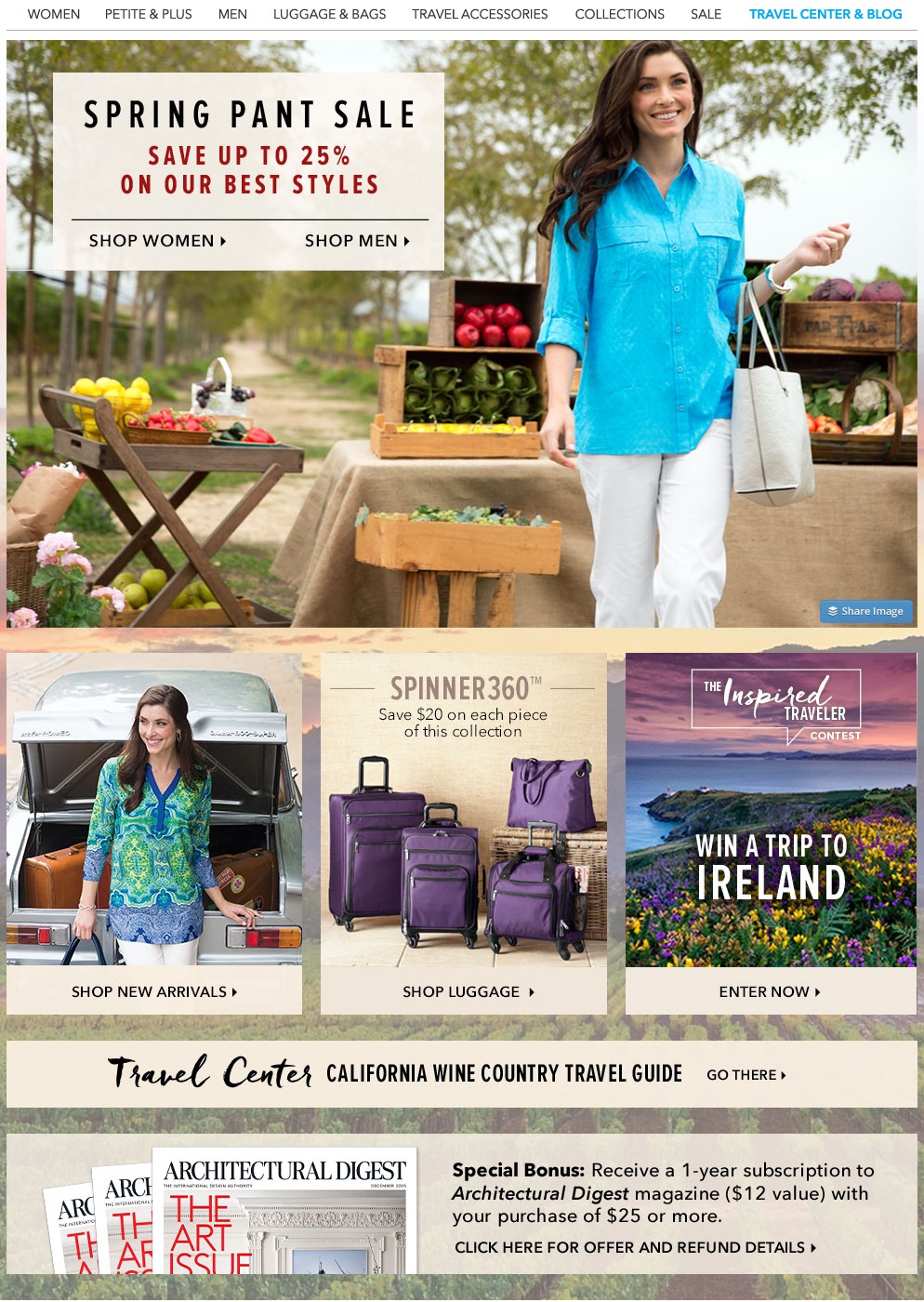
They have neat categories with only the most important categories on the home page. Subcategories and secondary categories can be accessed through a mega dropdown menu.
Keep your most important categories at the top and bottom or first and last, as the human brain is wired to pay most attention at the beginning and end while ignoring what lies in the middle.
But this covers only the homepage navigation. Your internal structure also has to be clear, with every internal page linked to at least 2 or 3 relevant pages. If you have a well-organized site with good navigation and strong hierarchal structure, your visitors will be able to reach any page in three or less clicks/taps. This is very important and can potentially act as a tipping point for conversion.
Sizzle Your Site Search
A good couple complete each other’s sentences. Automatic suggestions and intelligent predictive search act like that other half that completes your sentences halfway. They help your visitors search for and identify a product that solves their problem quickly and effectively. Inability to find the right product is one of the biggest conversion turn offs.
The best way to display your products is to show the popular ones at the top, whether it’s on a category page or search results. However, if you have a sale going on or want to promote certain brands or featured items, you can highlight them by displaying them first in search results. This way your visitors can reach the intended products faster.
Also allow visitors to search faster using product attributes. This is a painstaking but very rewarding act. And it doesn’t just apply to retailers.
See how Priceline categorizes, filters, sorts, and arranges hotel accommodation services by various attributes such as location, rating, price, and so on:
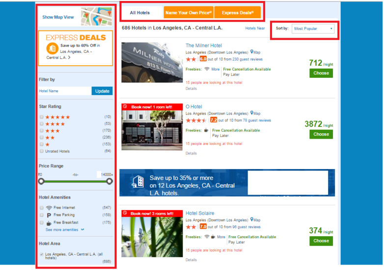
You can use tools like SearchSpring or Unbxd to boost conversion rates with intelligence gained on user preferences, product performance, search patterns, and other behavioral analytics data. These can also integrate with major ecommerce platforms like Magento, BigCommerce, Shopify as well as most custom-built websites.
Perfect Your Product Pages
One of my pet peeves is the lack of a coherent description or benefits-focused information on the product page. I am sure to favor sites with more product images, relevant use cases, detailed specs, etc. over their lazier counterparts.
For instance, Flipkart (the Indian equivalent of Amazon and Alibaba) sells this ref=”nofollow”>Chkokko Chkokko thing but the product name is vague and the title makes no effort to clarify it:
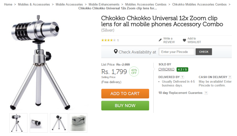
Further, there’s no product description at all. The title proclaims it is a clip lens for mobile phones but the picture shows a single product (lens attached to tripod) as opposed to an “accessory combo.” Confusing! Finally, the picture of the package on the fourth image shows how it’s all put together. Even so, it says “For iPhone Lens” while the title implies the product is good “for all mobile phones.”
On the other hand, Malta Watch Company, a single page website, has relevant product and company information, giving you a taste of Malta culture through its content:

In fact, it’s not even a full-grown ecommerce site, it is a simple informative website with those embeddable Shopify buy buttons that take you through the checkout process.
A good product page is characterized by two very important factors – product content and CTA. The Malta Watch Company not only has excellent content but also a prominent Order Now button on the sticky header and just below the product image. Exceedingly simple, but not simplistic.
Un-complicate Your Checkout
I know that’s not even a word. But I want you to think of it.
A lot of abandoning happens at the checkout stage, thanks to complex forms, scary and ambiguous words in content, surprise price additions and an insane number of times one has to click and confirm to proceed.
Here are two examples of checkout pages, one that I absolutely hate and one that I genuinely like… can you guess which is which?
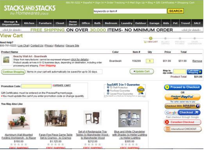
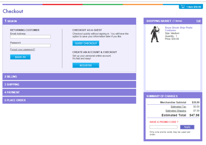
Needless to say, example #2 wins hands down – it’s clutter free, shows product images, allows you to enter a coupon code right there, and takes you through all the relevant (expected) steps.
Over to You
So basically we discussed five hurdles that could well and truly be blocking your visitors’ way through the conversion funnel. Let me be clear that these are not the only obstacles; however, they are as important as any others. Start by clearing away these roadblocks first and then proceed towards more nuanced things that make a difference to your conversions.
I also recommend getting constant visitor feedback using a service such as
Lori Wagoner is an independent content strategist who gives online marketing advice to small businesses. Lori has blogged at Tweak Your Biz, The Social Media Hat and a bunch of other business and tech blogs. She tweets amazing stuff at @LoriDWagoner.

