

When it comes to the calls-to-action (CTAs) on your website, not all are created equal. As with the basketball court, it helps to have 7 foot Dwight Howard snatching rebounds and blocking shooters, but an entire team of Dwight Howards would be an ungodly mess. There wouldn’t be anyone shooting threes or running down the court on fast breaks, and no free throws would be made. The entire team would be out of position.
CTAs work in a similar fashion. Each must be placed in the optimal locations on your website for the best chances of your desired actions taking place. Put simply, some areas of your website are better than others if you want your visitors to click on your CTAs.
As with everything, always A/B test your CTA placement. The best location for your CTAs will vary depending on your website’s layout and design but this article will give you the best locations to start with.
Let’s get into it.
Get Your Free Ebook!
In our new industry report, State of Lead Generation, you’ll discover the biggest lead generation trends, benchmarks, and obstacles faced by marketers today.
Best CTA Locations
If you’ve just begun placing CTAs on your website, start by placing them in the high impact areas below first. Then with time you’ll be able to see which ones are working and which ones need further testing.
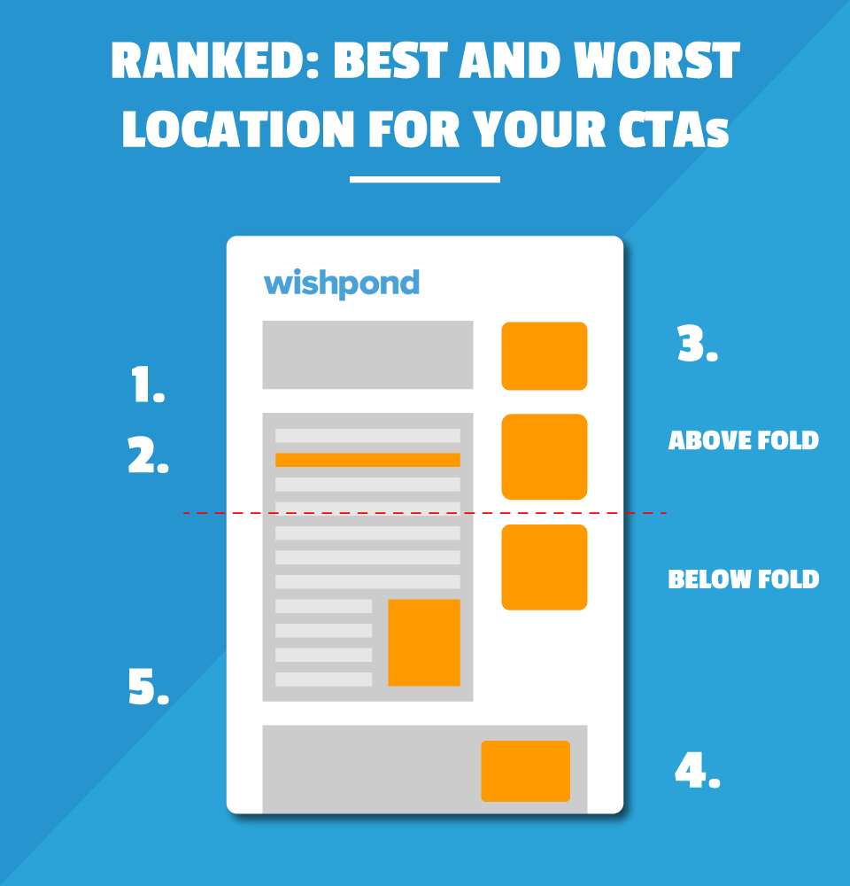
CTA Location #1: Above the Fold
Place one CTA above the fold of your website to gain the most attention for your offer.
What does above the fold mean?
Above the fold is the area your visitor arrives on before they begin to scroll to the contents below.
Placing at least one CTA above the fold ensures that it is seen immediately by your visitors upon landing. No need for any scrolling or action.
A perfect example of CTA location can be seen on the Netflix landing page:

What makes their CTA on their landing page perfect?
- It’s above the fold and seen immediately.
- It’s clear and concise, action and benefit oriented “Join Free for a Month”
- The CTA design is contrasted from the rest of the page. Bold red color and surrounded by whitespace.
- It’s large enough and highlighted on the landing page.
- It’s easy to locate and not muddled by any other CTAs, buttons or designs.
CTA Location #2: Inline
Inline CTAs are located in the body text of a blog post in the form of something like anchor text or form filed. When we think about CTAs we typically think of big, bold, in-your-face images or buttons at the end of your blog post or in the sidebar.
But inline CTAs don’t follow the same style. They’re sprinkled in throughout your articles. For example, you can download your own copy of our State of Lead Generation Industry Report (see how I used an inline CTA there?).
They can also be in the form of a “Tweet to Share” if you’re looking for more social shares or in a tiny inline form for more blog subscribers.

Inline CTAs work well because the reader can be primed with relevant content before you ask for any sort of action.
If I’m justifying the power of Instagram marketing, I’d first elaborate on the aspects that make Instagram a great platform, then present some powerful statistics, and then my reader, if they’d like, can download my ebook on the Ultimate Guide to Instagram Marketing.
Inline CTAs are less intrusive and don’t distract your reader from your content as much as large images or buttons.
If your content is lengthy, include inline CTAs in different areas of your articles to break up the text. One at the beginning, middle, and end.
CTA Location #3: Popup
Ah the classic website popup. Hate it or love it, popups are still one of the most powerful ways to get your visitor’s attention. Though controversial, popups force your visitors to act in some fashion.
Most if not all visitors are in a trance when they’re browsing the web. They’re not clicking on banners or paying attention to anything other than what they’re focused on.
A popup works well because it commands action and attention from your visitor. Whether that be to click through to whatever you’re offering or to click the “X” and close the window. It snaps your visitor out of their trance and makes them pay attention.
If you forego using a popup, thinking you don’t need it or you’re above it, I guarantee that you’re missing out on a valuable opportunity to convert a portion of your visitors.

Relying on your visitors to click on a passive CTA in the corner or at the bottom of your blog post is a massive opportunity lost. Most visitors are coming to your site, consuming your free content, and leaving without any action prompt.
You might think popups are annoying or they ruin the user experience but let’s be real, it doesn’t require much effort to close the popup window. Use a popup CTA or miss out on conversions, it’s your choice.
Worst CTA Locations
CTA Location #4: Footer
The footer of a website ranks as one of the lowest converting locations for a CTA for a few reasons:
- Visitors must read/scroll all the way to the bottom to see it.
- It is surrounded by several other navigation links and buttons — competing for attention.
- They’re often ignored due to banner blindness.
You may choose to place a CTA in your footer but don’t expect it to do much. Remember that the more CTAs you add to a page, the more distractions you’re adding as well.
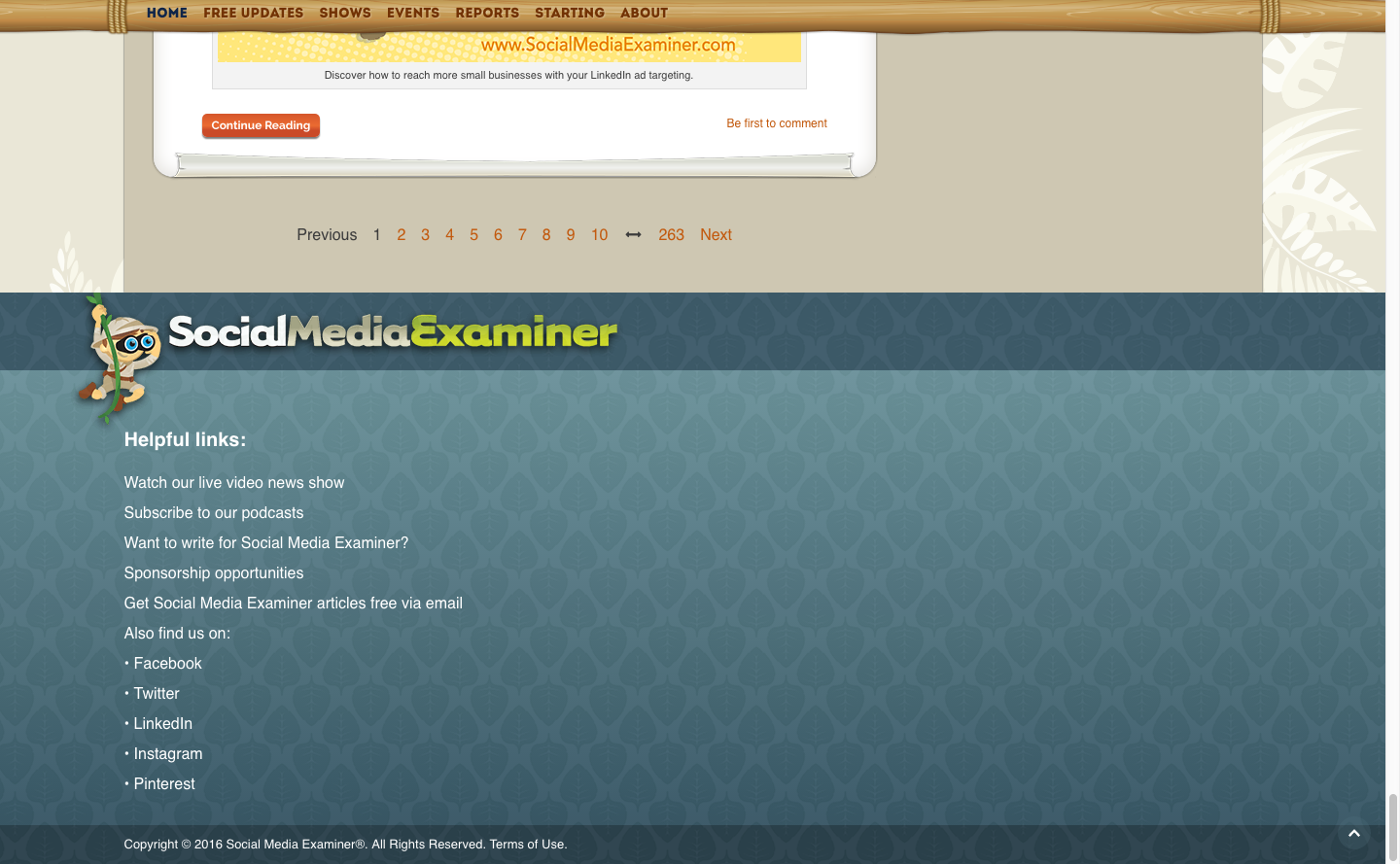
SocialMediaExaminer keeps their footer super simple, only including helpful links for their visitors. It allows them to direct their visitors, new and old, with navigation links that they deem the most important.
They’ve made sure not to overcrowd their footer with other CTAs and forms so as not to distract their visitors from the action they want them to take.
CTA Location #5: Sidebar
The classic sidebar CTA is used on many websites across the web but still ranks as a low conversion location for a CTA. The sidebar is a great location for things that should be a constant throughout your website like, a blog subscription form or popular resources, but the space should be used sparingly.
Why?
- The sidebar CTA distracts from other conversion goals on your website.
- It is often ignored due to banner blindness. The prevalence of digital advertising across the web has created a tendency for users to ignore anything that isn’t relevant to what they’re looking for.
In an experiment performed by Impactbnd.com they wanted to see if removing their sidebar would increase the number of form fills on their inline CTAs.
The justification being that there were too many CTAs on the page:
- Join their newsletter.
- Share their content on social media.
- Follow their account on social media.
- Download their free resource.
- Check out other popular content.
Too many distractions were diluting their visitor’s attention.

Instead of trying to get clicks on their sidebar CTAs which lead to a separate landing page, they created inline CTAs with built-in forms.
By eliminating the sidebar and focusing the attention on the incline CTA forms it resulted in a 71% increase in downloads for their free ebook. A stunning result from such a simple solution.
Tying It All Together
By all means, locate your CTAs wherever you like – CTA mistakes only really become visible once you start testing them. Cover your bases by placing them in the best places first, sprinkle in a few inline and above the fold. Don’t be afraid to employ a popup. Then feel free to add some padding with a CTA either in the footer or sidebar.
The best locations for a CTA are:
- Somewhere above the fold
- Inline throughout your content
- In a popup to grab your visitor’s attention
The worst locations for a CTA are:
- In a sidebar
- In the footer of your website
Keep in mind that there are a host of other factors that can determine whether or not your CTA is effective. Your conversion rate relies on much more than the location of your CTA so A/B test accordingly.
What locations do you use for your CTAs?
Do you agree or disagree with these locations?
Leave a comment and let me know what you think!
Related Content
- 46 Proven Call-to-Action Words to Maximize Conversions
- 7 Call to Action Examples and Proven Conversion Boosts
- 6 Design Tips to Make Your Calls-to-Action Stand Out
- 7 CTA’s to Generate Leads from Your Blog: Placement
- 7 Facebook Ad Call-To-Action (CTA) Copy Formulas
Get Your Free Ebook!
In our new industry report, State of Lead Generation, you’ll discover the biggest lead generation trends, benchmarks, and obstacles faced by marketers today.