

How does recouping some of your digital ad budget sound?
How about collecting more leads?
If you’re in the business of lead generation you are missing out on leads every second without an exit intent popup. If your visitors go to leave (aka “bounce”) from your website or landing page, an exit-intent popup is designed to stop them in their tracks. Think of it as a last ditch effort to collect their email or make them an offer they can’t refuse.
In this article I’ll share 51 exit intent popup examples, tips, and ideas to improve your website conversion rates.
Related reading: How We Get Customers Using Website Popups
1. Negative CTA
We’ll admit not everyone is a fan of the negative CTA. Sometimes the text can go a little overboard.
A negative CTA works because the user is forced to make a choice: yes I want your offer or no I’ll continue on my way. The point being that a choice has to be made.
The negative language is meant to persuade the reader to accept your offer. In the example below the reader has a choice “Yes, sign me up” or “No, I hate saving money”. The language address most people’s aversion to loss. Consumers want to save money whenever possible so the choice of yes become obvious.

2.Image of product
An image of your product (e.g. an ebook cover) will make your offer much more compelling. Access to a reader’s email won’t come easily so a visual aid will make your offer much more tangible. Include imagery wherever possible to cut down on the words your reader has to gloss over.
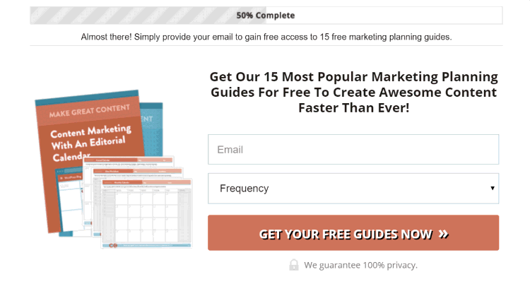
3. Progress bar
When a visitor accepts your offer on your popup they’ve become invested. A progress bar that shows a 50% completion harnesses what is called the Zeigarnik effect. It refers to the nagging effect one gets when they leave a task incomplete.
A progress bar is meant to persuade a visitor to complete the process they’ve started. In the example below, the visitor sees that they’re halfway there. One more step and they’ll receive the reward.
4. Benefit oriented CTA
A benefit oriented CTA is meant to address the question, “So what?” Why should the visitor care about what you have to offer? What is the benefit?
Using a benefit oriented CTA implies a reward or the end of a problem for the visitor. Use a benefit oriented CTA to increase the feeling of reward.
Example:
* Grow my business
* Save me 50%
* Get my free template
5. Action oriented CTA
When making an offer, action or fulfillment is paramount. Visitors want to know what they’re about to accomplish. Mystery or uncertainty is the enemy of conversion. Make it clear what the user is going to accomplish by using an action oriented CTA button.
The language or text should match the offer you are making. Be specific so that any hesitation or “friction” is eliminated for the visitor.
Example:
* Offering a free ebook. CTA: Get my free ebook
* Offering a free trial. CTA: Start my free trial
* Offering a discount: CTA: Claim my 10% discount

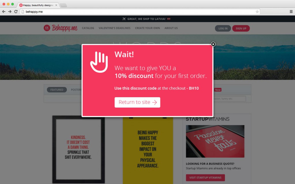
6. Discount code
Offering a discount to customers about to leave your website or abandon their carts can be a powerful persuasion tool. Think of the small discount as a last ditch effort to save a sale or else lose the sale completely.
As a visitor moves to leave your website they’ll see the discount and finish their transaction. In the example below Behappy.me offers visitors 10% off their first purchase before they leave their website.
7. Free template
A free resource or template is a suitable lead magnet for almost any website. Designers, writers, or marketers could all use helpful resources to get their projects off and running quickly. Templates like a Photoshop mockups, prewritten emails, precoded plugins etc are all examples of things that can hook your visitors into giving you their emails before they leave.
8. Ebook
A value-packed ebook is an excellent resource, and if done properly, can be the least costly lead magnet to create. First off, does your company actively promote and maintain a blog?
If so, you’ve already done most of the work. Collect all of your high-traffic and widely shared content. Organize that content under one topic. Create a book cover and you’ll have your very first ebook.
The social ad gurus at AdEspresso took all of their Twitter ad content and combined them into a single resource 500 Twitter Ads Examples to Inspire You. An ebook packed with valuable information will surely collect the email of any visitor before leaving your website.

9. Deadline for promotion
Including a deadline for your offer (e.g. offer expires tonight at midnight!) will create urgency. In the best case scenario your visitor will question, “should I buy this now before it’s gone?”
Abandoning one’s shopping cart or leaving before accepting a free resource will be much more difficult if the offer won’t exist tomorrow.
10. Full overlay
Instead of a popup, experiment using an entire page overlay to really grab the attention of your visitors before they leave. Use your most valued free resource to hook their attention and second guess their decision to leave.
Brian Dean of Backlinko uses this bright exit-intent overlay to stop visitors in their tracks. He offers his visitors the checklist he used to rank #1 in Google — an invaluable resource by my standards. What makes an exit-intent overlay so great is that it only provides the visitor with the option of opting in or clicking the no button, nothing else. Clicking elsewhere has no effect, visitors must make a decision.

11. Social proof
As much as we like to think we’re not susceptible to peer pressure there are moments where we can subconsciously cave-in. Knowing that like-minded individuals are doing something that we aren’t, is enough to make us want to join in. Social proof or seeing that others are doing something is a powerful persuasion tool.
“Join 72,558 subscribers”, says this HelpScout exit popup. By seeing that there are 72,558 other subscribers on their list it makes you question yourself. Am I missing out on something valuable?

12. Loss aversion
Focus on what your visitor has to lose by not accepting your offer. “Losses loom larger than gains” means that people are inherently more averse to losses than equal gains. It is a bias all people posses subconsciously. That’s why we know people prefer to save 25% rather than spend only 75%. The thought of losing $5 is much more painful than the joy of receiving $5.
This exit-intent overlay from BounceExchange leverages loss aversion. Stop wasting the potential revenue from the traffic you’re already receiving. Convert that traffic into revenue instead.

13. Unlock
Using the word “unlock” communicates exclusivity in your offer. Visitors are receiving the privilege of unlocking your ultra-valuable offer in other words.
Tim Ferriss uses this tactic on his exit-intent overlay to capture visitor attention. Before leaving they have the opportunity to unlock the tools and tactics to change their lives and business. Fairly compelling offer, no?

14. Join
The use of the word “join” suggests a feeling of access or oneness with a group. Being able to join something gives us all a certain sense of belonging. We’d all like to feel included right?
By joining the Later newsletter you’re one of 600,000 other subscribers receiving the best social media content on the web.

15. Instant savings
Using the word “instant” in your offer communicates immediacy. Your visitors will instantly receive their 10% off when they accept your offer, for example. Stating exactly what your visitor will accomplish or receives creates action because the next step is explicit. Whatever you can do to lend confidence to your visitor’s actions will reduce friction and lead to more conversions.

16. Directional cue
Your desired conversion goal is not always obvious. It hurts to assume that your visitors will know exactly what you want them to accomplish. So help them out a little. Add a directional cue arrow to the areas you’d like to bring attention to. Point towards the form field or the CTA button to naturally draw a visitor’s eye toward it.
Jeff Bullas uses a directional cue arrow on his exit popup to lead the eye down the copy towards the form fields.

17. Personalize with name
Being able to address visitors by name is a nifty trick to add personalization to your offer. Users that have already opted into your website can be targeted with personalized messages. A new promotion or feature can be given more attention if the offer is directed to a visitor by name.
Let’s say you’ve collected a visitor’s name in a previous interaction or sale. If they’re about to abandon a cart your exit popup will be able to say “Wait, Jim!” and offer them 10% to complete their transaction. Much more compelling.
18. Add authority
Coming from a place of authority provides much more credibility to your offer. It’s much like saying, “You’re trying to do this? Well I’ve done it already so listen up.”
Going back to Brain Dean’s resource offer, he comes from a place of authority. He has proven success in an area that many are attempting to accomplish. It makes him an authority on the subject.
19. Use numbers or data
Large numerals and concrete data are powerful persuasion tools. Big numbers within a headline or body copy automatically attract the eye. Anytime you can support your offer with data or large numbers it makes for much more compelling communication.
20,000 digital marketers are already receiving the Convince & Convert newsletter, are you in? The large number and bold headline command attention. Even if the visitor clicks no, they’ll at least have read and understood the sell.

20. Personalize with referral source
Personalization in all of its forms adds much more value to your offer. Addressing visitors by name or location, for example, makes the offer seem uniquely crafted for them.
Thrillist personalizes their popup with a user’s location to entice them to sign up before they leave. To be sent the best content on food, drink, and fun is good, but the best in my city? Even better.

21. Source specific offer
A source specific offer is an offer related to the source of the visitor. For example, an offer for all your fans coming from Facebook, a different offer for those coming from Twitter or a partner website. The more personalized you can make the offer seem the higher the conversions.
22. Content upgrade
Before leaving your website an exit popup could be used to offer a content upgrade. This could be a downloadable infographic, a handy checklist, or a pdf of the entire post for offline reading.
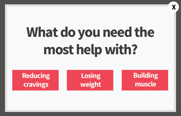
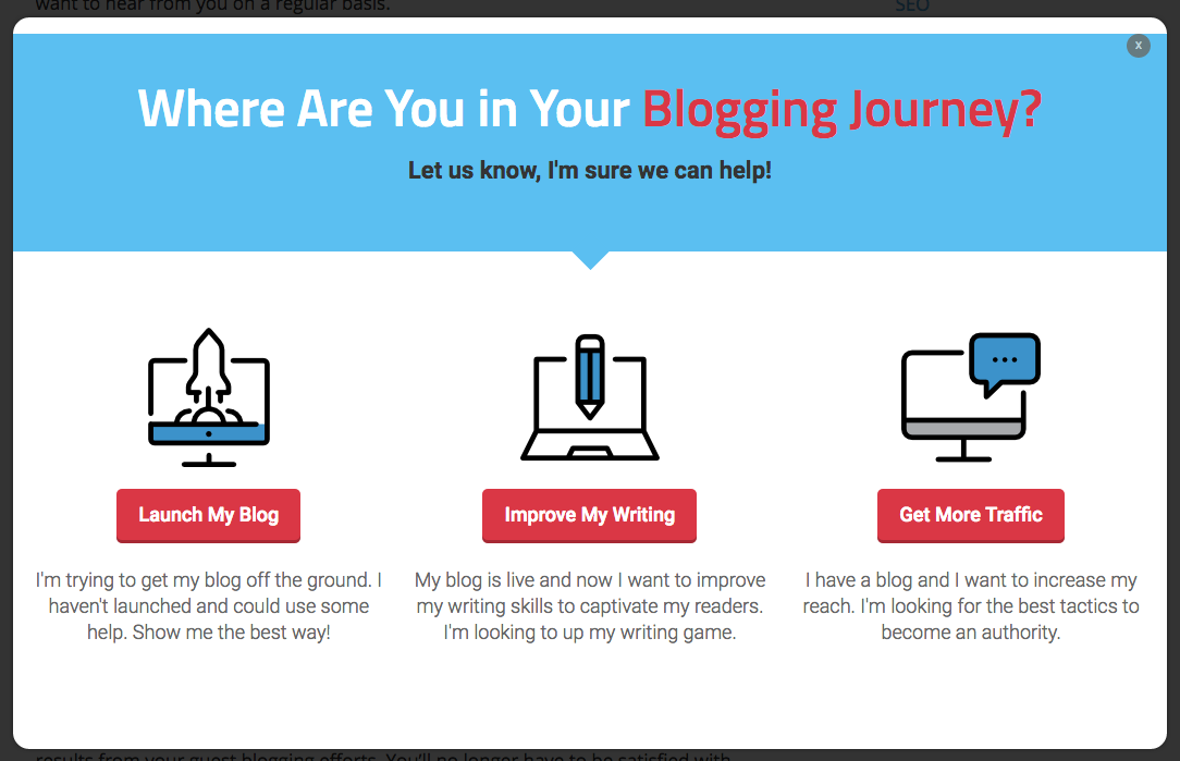
23. Provide several choices
An exit popup does not always have to present an offer. It could be used as a navigational tool. Landing on a website from a Google search result, for example, could be a navigational challenge for a visitor. They’re only presented with the blog post and will leave right after they’ve found what they were looking for.
An exit popup could stop them from leaving by leading them to another topic of interest. In the example below, visitors could be persuaded to explore more of the site by following one of these three topics.
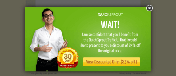
24. Address objection directly
Addressing visitor hesitations and objections comes from knowing your audience. Addressing concerns directly is a quick way to give your visitors confidence. Confidence to trust in and claim whatever you have to offer.
Neil Patel is so confident that you’ll love his product that he’d like to offer you 83% off plus a 30 day money back guarantee. Addressing the concerns that his product won’t deliver on value by offering a steep discount is a smart way for Neil to show that he’s more than confident that it will.
25. Provide a reminder
If a visitor has browsed your website, picked out some items, but then proceeded to abandon the transaction, an exit popup could show them the items and remind them to finish. Some visitors may simply forget they’ve picked out products from your store. An exit popup can be used as a friendly way to remind them they’ve forgot to finish.
In the example below the visitor is shown the dresses she’s picked out and is given the option to save her items for later. This exit popup does double duty by wisely collecting an email or persuading a visitor to complete their transaction.

26. Imply scarcity
A product that is in high demand and low supply creates scarcity. Create a sense of scarcity in your exit popup by including things like stock numbers or supply levels. Seeing that there is only one jacket left in their size would be powerful enough to convince them to make the purchase.
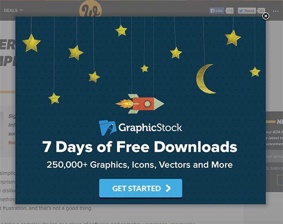
27. Free trial
Don’t leave the site without signing up for a free trial! GraphicStock makes a compelling offer in their exit popup for “7 days of free downloads.” A free trial can make a tempting offer for those who wish to explore your product without any commitment. Once visitors have explored your product and you’ve demonstrated your value it is more likely that they will commit.
28. Suggest related products
Having the choice to explore other related products can help keep visitors on your website longer. An ecommerce shop, for example, can use an exit popup to show visitors other items that they might be interested in — increasing on-site time.
Items on sale or new stock as in the example below, persuade visitors to explore more of your offerings before they make the decision to leave.

29. Exit survey to collect user data
Just because a visitor chooses to leave doesn’t mean you should be left with nothing. An exit popup could be used to collect visitor feedback in the form of an exit survey. The information collected could range from the user interface, shopping habits, or interests. The goal here is to learn more about your visitors to make measurable improvements. Use this tactic to optimize for future conversions.

30. Wait _______
Starting with “Wait!” will get most people to stop dead in their tracks much like yelling it on a street corner. It grabs attention, plain and simple.
Green Mountain Mustard stops their visitors by yelling wait! Then they pitch a 10% discount to make sure no one leaves without some tasty mustard.

31. Use humour
Humour can create a memorable interaction with your visitors and your brand. Humour creates happiness, an emotion that makes visitors relate positively with a brand.
Experiment with humour like Esquire does on their exit popup. Visitors can opt-in to receive 75 Movies Every Man Must See or stick to the latest Adam Sandler films.

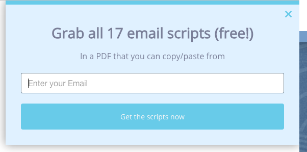
32. Two step opt-in
Research has shown that a two-step opt-in consistently performs better than a one step opt-in. Meaning, a visitor clicks on a button, choosing to opt-in and then provides their email in the second step. Two step opt-in.
Visitors must click “Yes Please” on this Marie Forleo exit popup and then enter in their email on the next step. By first agreeing to opt-in, visitors are implying “yes I want this” and thus are more likely to complete the opt-in process. This will ensure that visitors actually want the offer resulting in much better lead quality.

33. Animations
Adding animations to your popups are meant to draw attention to specific areas like the CTA. Experiment by having the CTA button wiggle or jump. But use animation sparingly. They may slow down the speed of your popup or cause loading errors.
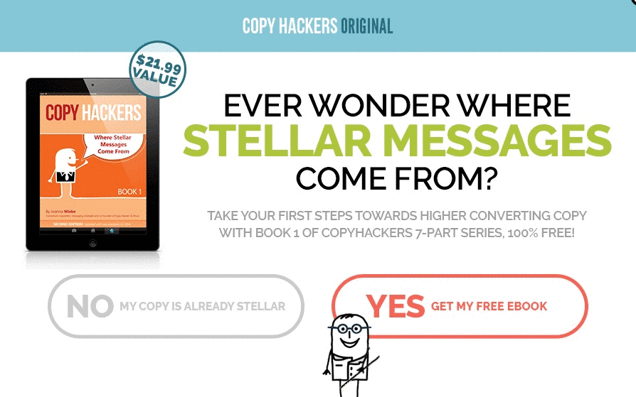
34. Yes or No choices
Much like the two step opt-in process the visitor should only be presented with a choice of yes or no. Why? When presented with only an opt-in box a person will always choose to make no choice at all.
To get past this popup on SmartPassiveIncome you’ll either have to opt-in or click no. Pat Flynn provides only two buttons for his visitors to click so that they’re forced to consider his offer — nothing else. (Same goes for the CopyHackers example above)

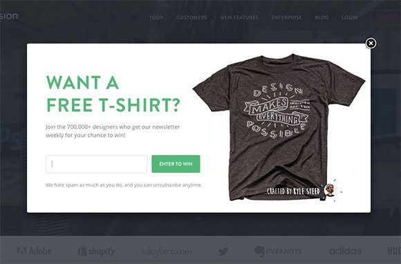
35. Win a _______ giveaway for email
Those who join Invision’s email list are entered to win a free t-shirt. A giveaway like this can be a fun incentive for people to opt-in. Think of an item you can offer your audience for free. Pick something that ties itself back to your business and brand. Those who win this shirt will receive something for free and Invision will receive free promotion in return.
36. Use contrast
As far as design tips go, contrast is most imperative for popups. Lightly colour forms and CTAs should be contrasted with dark backgrounds vice versa. Exit popups literally have seconds to persuade a visitor to stay so it’s important that each element is easy to see and read.
It’s hard to ignore the text in the Groove popup example below. Each element easy to read because of the well contrasted use of colour and font weight.

37. Create curiosity
Add a bit of curiosity to persuade the reader to continue to explore. One way to do this is by asking a question.
SocialTriggers asks, “Want to learn how to get 5,000 subscribers for free?” The mystery creates curiosity. By opting in, visitors can learn Derek’s secrets. Try creating curiosity with your offer to peak the interest of your visitors.

38. Free bonus add-on
A bonus add-on can be just thing to push your offer over the edge. By separating your offer into two parts you can double its perceived value.
Neil Patel offers his Advanced Customer Acquisition Webinar to all of QuickSprout’s visitors. As a free bonus they also receive the 24-step framework he uses to teach marketing. An added bonus like, a free framework or checklist, is a clever way to easily increase the value of your offer.

39. Redirect traffic
As we mentioned before, an exit popup can work as a tool to redirect visitors to other areas of interest. Imagine a visitor lands on your website looking for information about your new lawnmowers. After struggling to find anything he decides to leave but a popup promoting your new stock of lawnmowers shows up and saves the day.
Visitors can find exactly what they’re looking for on this SmartBlogger popup. If they go to leave the website this popup will redirect them to a blogging topic of their interest.
40. Optimize for speed
Optimizing your exit popup for speed is the single best thing you can do today. When visitors decide to leave your website they do it quickly. The quicker the popup appears the better chance you have of saving the interaction. This can be accomplished by using smaller image sizes and fewer amount of graphics. For the best results, switch to a popup provider with proven speed.
41. Segment by interests
Segmentation is important for personalization. As well as collecting email addresses — interests, industry, or position can be helpful information for sending personalized promotions in the future.
Visitors of the Wishpond blog can select what type of content they’re most interested in when opting in. This saves them from having to receive irrelevant emails and it allows us to provide more content that interests them. When updating features or running promotions we can email the people who are most likely to be interested.

42. Mobile friendly/responsive
By now you should know that half of all web traffic is from a mobile device. This means all of your lead gen tools, especially popups, should be mobile responsive. A better user experience always leads to more conversions.
43. A/B test with popup software
To get the most out of your popups they must be continuously optimized through A/B testing. Much like most of your website, conversions can be improved by testing different copy, images, and colours. A popup building platform (like Wishpond) allows users to run and test different variations to see which performs better.
44. AIDA
The AIDA copywriting formula is one of the most tried and true copywriting formulas around. Use it to organize the hierarchy of your exit popup copy.
AIDA stands for:
- Attention. Grab the attention of the reader using an emotional or benefit based headline. The headline should hook the reader and interest them enough to continue reading.
- Interest. Create interest with a compelling fact, figure, or piece of data. Demonstrate that your solution is proven to solve the problem.
- Desire. Create desire by explaining what’s in it for them.
- Action. Your call-to-action. Make it precise and specific so that the reader knows exactly what to do.
45. PAS
The PAS copywriting formula takes a problem-based approach. Identify the problem. Dig into why that problem sucks. Then present your solution to the problem.
- Problem.
- Agitate
- Solve
CTA Button Text Examples
46. Teach me _________
Mastery of a skill takes 10,000 hours of practice says Malcolm Gladwell. If your offer is educational in format you’ll need to use a CTA button that reflects your offer.
Examples:
- Teach me how to retain more users
- Teach me how to reduce churn
- Teach me how to increase conversions
47. Hook-line-sinker
This CTA formula is courtesy of Wordstream. It’s great for ad copy but also text links and buttons. Here’s how to use it:
Command verb + offer + urgency
Examples:
- Download our whitepaper today!
- Access the templates now!
- Download your free report now!
48. RAD
The RAD CTA button formula stands for:
- Require
- Acquire
- Desire
When using this formula the very first thing you want to do is make sure you’ve clearly explained the offer first. Don’t prematurely place a button anywhere on the popup before you’ve explained the information first.
According to RAD: First give your visitors the info they require, make the button easy to acquire (locate), then make sure your visitor desires what the button promises.
49. Claim my __________
There is no better way to piss off a potential customer than to not come through on your promise. If you’re offering an amazing lead magnet or promotional discount, the last thing you should do is make your visitors jump through more hoops than they’re comfortable with. It will more than likely lead to a bounce rather than a conversion.
Let your visitors know they’re about to claim your offer immediately with this CTA button text.
Examples:
- Claim My Free Ebook
- Claim My 15% Discount
- Claim My Spot
50. Become a __________
This landing page CTA button is for those who are offering some sort of education based product. The offer is purely aspirational so the button language reflects that. Visitors are opting in to become something. Add in a prospected timeline and you’ll have yourself a very tempting offer.
Example:
- Become a better blogger in 30 days.
- Become a conversion rate expert.
- Become a better writer in 30 days.
51. Send me the free _______
Your resource is on the way. Like the previous button, this one will tell visitors that the resource they want is on its way. It also includes the fact that it is cost-free so commitment costs nothing.
Example:
- Send me the free ebook.
- Send me the free resource.
- Send me the free templates.
Final Thoughts
An exit-intent popup can be applied to many areas of your website to capture lead information or save a sale. The benefits are hard to ignore.
Hopefully these strategies, tips, and examples can help give your website a conversion boost.
Do you use exit popups on your website?
What strategies, tips or tricks work best for you?