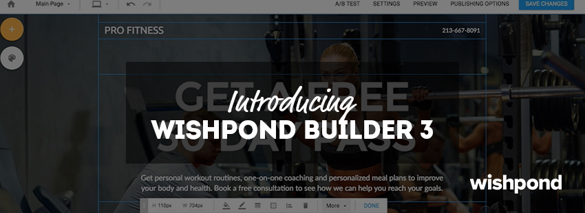
We spent the past year listening to your feedback and used it to create Wishpond Builder 3: Our brand new tool for creating mobile-responsive landing pages, popups and forms.
Your feedback led us to focus on 4 key areas for improvement:
- A Full-screen Canvas
- More Intuitive Controls
- Simplified Navigation and Interface
- Effortless Micro-interactions

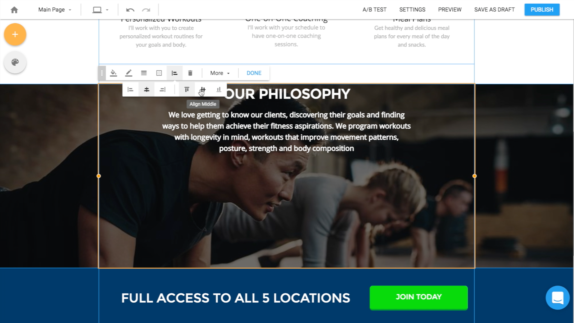
1. A Full-Screen Canvas
The full-screen canvas makes it easy to visualize how your campaigns will look as you’re building them. It makes the builder itself feel lighter and smoother, as you’re not boxed in by a big sidebar anymore. And it makes it easier to select what you want to edit.
2. More Intuitive Controls
We radically changed the way we display and label controls to make them more intuitive. We made it simpler to make edits and easier for each control to be found by improving the descriptions and placement to match how you think.

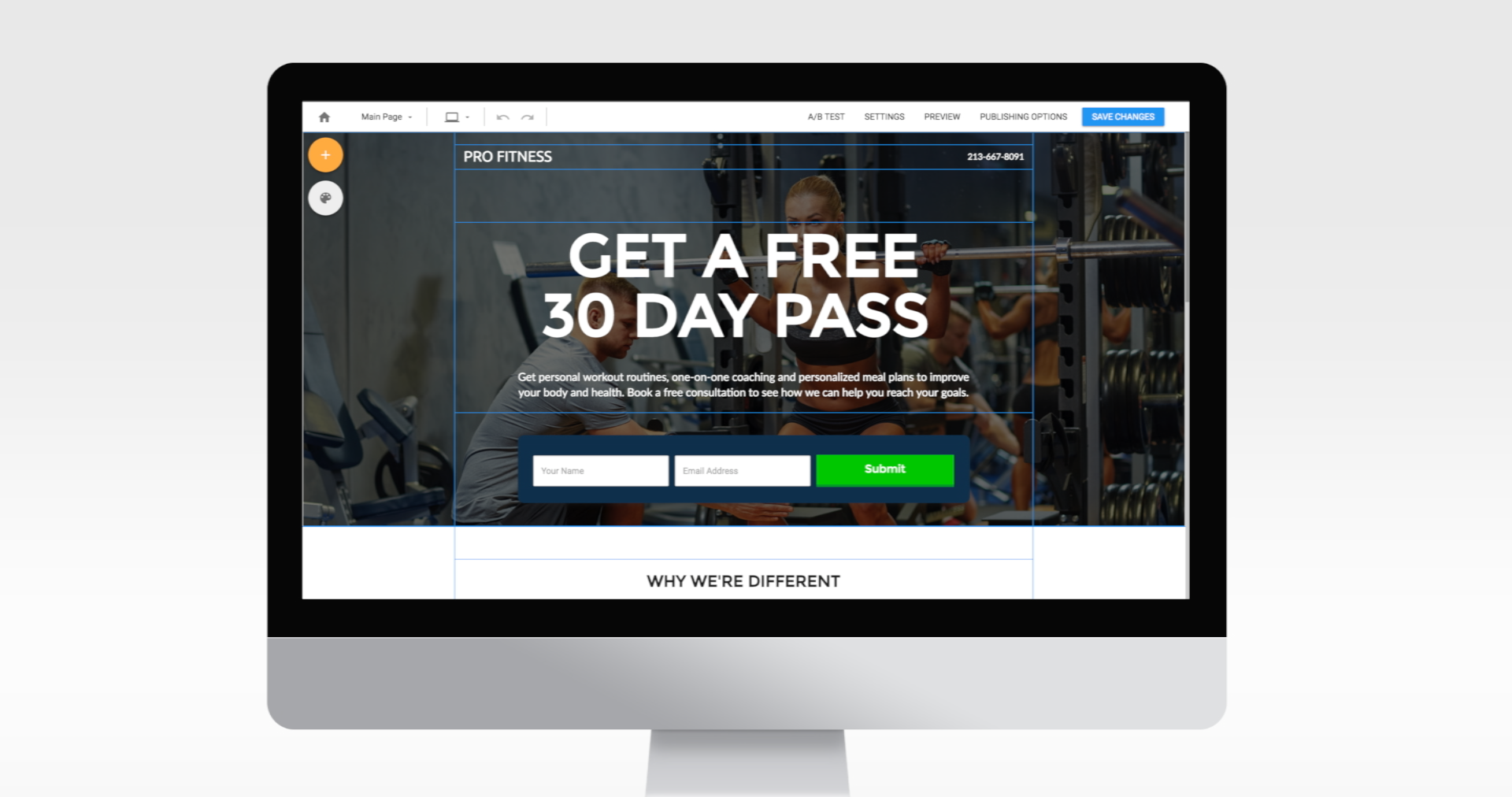
3. Simplified Navigation and Interface
We’ve made it easier to navigate the builder by simplifying the navigation, page styling and ‘Add Content’ interfaces. This makes it especially easy to quickly switch between device views and variations of your campaigns.

4. Effortless Micro-interactions
We focused in on the most common micro-interactions to make them effortless. No more digging to find the controls you use most. No more confusion about how to use them.
In beta testing, designers have told us they’ve been able to build campaigns up to 30% faster due to the improvements to the micro-interactions in their building process.