
Are you looking to market your tour or adventure business online?
If you’ve decided digital marketing is the right channel to help you reach new customers (and it is), you’re probably running ads through Facebook or AdWords.
That’s awesome! You’re probably driving a bunch of potential customers to your website. While that’s great and all, sending them to a landing page is even better. Why? It’s targeted and optimized for a single goal: getting more people to book spots on your tour or adventure.
I’ve compiled 7 awesome examples of tours and adventures landing pages and critiqued them, to give you great ideas for your own landing pages.
Without further ado…
Tours and Adventures Landing Page #1. Trafalgar

What I like:
The hero section: The hero section in this tour’s landing page is great because it clearly describes everything about it, including how long it lasts and how many cities it passes through.
The directional cue: The subtle arrow at the bottom of the hero section entices page visitors into learning more about the tour. Directional cues are great for convincing viewers to take certain actions on your landing page.
The itinerary section: This interactive itinerary section of this page makes it easy for visitors to see all of the tour’s stops and highlights. Making information easily digestible for your viewers is the best way to make sure they take it in.
The reviews section: Having reviews helps to create social proof, reducing potential customer hesitation and increasing the chance they’ll book a tour.
What could be improved:
More CTA buttons: Currently, the main CTA on the page (“Book Now”) appears only once. Trafalgar’s goal is to get as many bookings as possible – making it easy for potential customers to convert through the addition of more CTA buttons would help increase conversion rate.
The layout: The number of people who view elements on your page reduces drastically with the location of these elements – the lower the element, the lower the number of viewers.
Tours and Adventures Landing Page #2: Miami Helicopter

What I like:
- Learn more: Having a quick overview of Miami Helicopter’s tour options with times, prices, and reservation information right below the hero section makes it easy for visitors to see what packages the company offers, without needing to look through the entire page.
- The video: For an industry like tours and adventures, a video can be the perfect addition to a landing page. A video helps to show people the things you can’t explain in your copy – points of interests, exciting sights, or your great tour vehicles.
- The reviews: Choosing specific, great reviews that help Miami Helicopter shine as a business is a great way to show potential customers how past customers have enjoyed their services in the past.
What could be improved:
- The layout: As my designer would tell me, “there’s not enough white space!” The elements on the page don’t have enough room to breathe between sections. Increasing this space could make a big difference on this page.
- The headline: To put it short, there’s no ring to it. It’s not catchy or engaging – it simply says the price of the offer.
- The main CTA: “Check Availability” isn’t awful, but something more action-oriented like “Book Your Spot” would be more engaging for visitors.

Tours and Adventures Landing Page #3: Backpacking Thailand

What I like:
- The headline: “The ULTIMATE 3 week group tour!” is an incredibly engaging – and clear – headline. This is one of the first things people see on a landing page, and creating a headline with power words (like ultimate) can make a strong first impression.
- The page length: There’s no wasted space here. Having a short page means all of your information is in a small space, increasing the chances that your visitors will take in all of the details you want them to read.
- The visuals. The visual design of the page is great – the ticket graphics on the right side of the page convey a feeling of travel and adventure, while giving viewers valuable information in a manner that’s easy to take in.
What could be improved:
- A better overview: The page features 21 small blurbs with the itinerary of the group tour – that’s too much text. Creating a shorter (but still comprehensive) information section detailing the tour’s structure would improve viewer experience.
- A distinct CTA: The only button on the page is “What’s Included?” It’s not action oriented, and it’s not a great CTA when you consider it’s really the only one on the page. I’d change it to something like “Book My Adventure” – something a little more engaging.
Tours and Adventures Landing Page #4: TAO
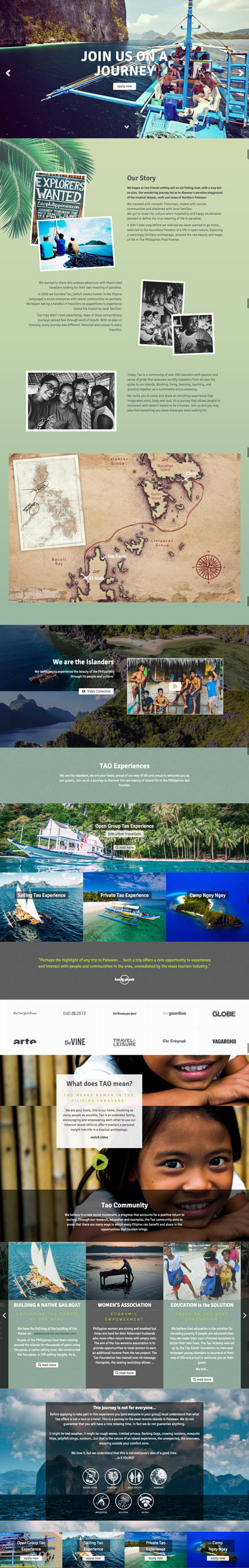
What I like:
- The headlines: The hero section is a carousel that rotates through a number of images and headlines. These headlines are all engaging (“Join us on a journey”), invoking a sense of adventure and drawing visitors to read the rest of the page.
- The social proof: Both the testimonials and company logos on the page act as trust symbols that help to build credibility with page viewers. This is especially important for the tours and adventures industry – convincing a potential customer they’ll be safe with your company is essential.
- The map: If you’re covering a lot of ground on your tour, adding a map isn’t a bad idea. Visual content is easily digestible, giving visitors a quick look at your tour’s itinerary.
What could be improved:
- CTAs: This is a common problem with these landing pages – there’s not enough CTAs. This page could use at least a CTA in every other section to make sure it’s easy for visitors to convert.
- The content: The majority of the page is great in this regard – but there’s some unnecessary sections. The one that stands out most to me is the “warning” section at the bottom – save that for a later page, once visitors have already decided this is something they’re interested in.
Tours and Adventures Landing Page #5: ATR

What I like:
- The visuals: The images and videos in the hero section are beautiful. Because they take up the entire above-the-fold section of the page, having engaging images that entice the visitor into learning more about the tour is imperative to increasing conversions.
- The testimonial: I love that the testimonial is front and center right below the hero section on this tours and adventures landing page. This immediately establishes strong credibility with page visitors and potential customers.
What could be improved:
- The hero section: Frankly, I’m a little torn here. This section looks incredible at first glance – it’s gorgeous. At the same time, it’s lacking a real, gripping headline and it gives viewers the choice between images and video – an unnecessary one. I’d optimize this a little more.
- Trip search: I don’t think separating trips by cost is the best way to introduce them to visitors. Instead of a search, I’d combine this section with the “Popular” section above. This could highlight several of the most popular experiences with more information about each.
Tours and Adventures Landing Page #6: Quicksilver Cruises

What I like:
- The headline: “Experience Nature’s Finest with Australia’s Best” is a clear, concise and engaging headline that explains what the company is and what it offers to visitors. If I’m nitpicking, I’d change “nature’s finest” to “great barrier reef” to make it even more targeted.
- The directional cue: Pairing a large above-the-fold hero section with a directional cue is a great way to ensure your visitors keep reading. It’s a simple arrow with click-to-scroll functionality. Love it.
- The trust symbols: Showing off the company’s many awards on the page drastically increases its credibility to potential visitors. It greatly reduces hesitation, increasing the chances that people will feel safe booking a tour with Quicksilver.
What could be improved:
- The information: The section of the page showing off the different types of experiences (like snorkelling and diving) could use some additional copy, making each of these tour packages sound more exciting.
- A main CTA: There are a few buttons on the page, but I can’t actually see how to book a tour right from this page. Considering Quicksilver is running to ads to this page to get customers, I’m surprised they haven’t made it as easy as possible for a visitor to convert and book a tour.
Tours and Adventures Landing Page #7: Helm

What I like:
- It’s designed with the customer in mind: This is an extravagant experience for travellers with significant income – the page is clean, and doesn’t mention price even once. This is a landing page case where the design of the page is dictated by the status of the offer. I like it.
- The uniform CTA: “Create Yours [Now]” is the main CTA on this page, and it’s repeated more than once. Having a uniform CTA in multiple locations on the page ensures you’re directing your visitors into a single place that’s optimized for conversion.
- The hero section: You can’t tell from the screenshot, but the majority of the page features beautiful full-width video, highlighted by an attention-grabbing headline that states the company’s value proposition.
What could be improved:
- Information: As beautiful as this page is, it’s a little lacking in information. Though visitors could learn more through the rest of the website, the main CTA is “Create Yours” – it might be hard to get people to click through without more information first.
- Credibility: A private yacht trip can is definitely a type of adventure that requires a long decision-making process. It’s a large commitment for both trust and finances. Adding a trust symbol or some sort of social proof – a testimonial, award or company logo – would help greatly reduce hesitation.
Wrapping it up
Hopefully, this article has given you some inspiration to create your own great-looking, high-converting landing page for your tours and adventures business. If you have any questions about building your own landing page, feel free to leave me a comment below!