

Are you not getting the click-through-rates you were hoping for with your Facebook Ads? Are you wondering what you might be doing wrong?
This article will dive into the nitty gritty details that could be affecting your Facebook Ad’s performance.
I’ll give you the nine mistakes you could be making. I’ll provide examples of exactly what these mistakes look like, explain why this could be hurting your ad campaign, and what you can do to fix these oh-so-painful Facebook Ad errors.
Tweetable Takeaways:
(Click to Tweet)
-
Include a CTA in your Facebook Ad or watch your Lead slip away
-
Are your Facebook Ad images bright and eye-catching or dull and easy to ignore?
-
Are your Facebook Ad Images simple and direct or complex and confusing?
-
Have you targeted your Facebook Ad as specifically as you can?

1. Wrong Shape
It should be well-known by now that Facebook Ads display in landscape, so your image should be landscape as well. This ensures you’re making the best use of the available space.
The Facebook Ad below has fallen into the trap of ‘well, this is the picture we have… I guess we better use it’.

How to Fix your Mistake:
If you really can’t find another image that could possibly work for your Facebook Ad, I recommend using a photo editor tool to enlarge your image. If you’re finding that the image becomes too distorted, simply add a rectangular box beneath it. I did the below ad in Microsoft Paint in about three seconds.

2. Wrong Color
It should be no surprise to you by now that Facebook’s News Feed color scheme is white and blue. If your image is the same colors it’ll get lost and your engagement will suffer.
I recommend using reds, oranges and greens in your ads, as these have proven to be the most eye-catching.
Remember the purpose of your Facebook image is to capture a user’s eye. The copy encourages them to click.
The image below disappears next to bright, engaging Facebook Ads. Let alone when competing with the images, albums and status updates of a Facebook user’s Friends.
How to Fix your Mistake:
If your product or the image you’ve chosen can’t be changed, I recommend an orange, red or green border be put around it. Again, this is incredibly simple to do in any photo editing tool (you don’t need to be a Paintshop Pro).
You’d be surprised at how the smallest details can have huge repercussions for your Facebook Ad’s performance.
Try A/B Testing your Facebook Ad images. If you want to learn more read my article How to A/B Split Test your Facebook Ads to Maximize ROI.
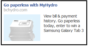
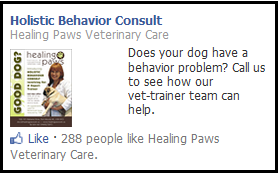
3. Too Much Text in the Image
I would recommend you don’t include text in your image, with two notable exceptions: the word ‘Free” and a dollar amount. Both these work fantastically as value propositions.
You want your image to catch the eye and draw attention to a great headline, which in turn directs attention to a value proposition and call-to-action. Smooth out your miniature sales funnel and you’ll see ad engagement increase.
The Facebook Ad below has a couple issues, but the tiny lettering is my main problem. How difficult would it have been for this vet to find a simple picture of a dog? Pets are one of the best and most-shared images on social-media.
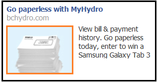
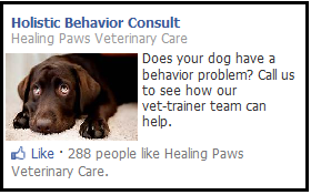
How to Fix your Mistake:
-
Keep your image simple
-
Keep it colorful and attractive
-
Don’t be a lazy Facebook advertiser (the change in image I did below took me less than a minute)
-
Be sure to check the preview of your ad before you go live!
4. Too Much Detail
Like too much text, too much detail can ruin the chance of a Facebook Ad’s success as your Facebook audience isn’t entirely sure what they’re seeing.
Remember, when choosing your picture, that it will likely be downsized significantly (especially if you’re running a side-bar ad, as most of us are). Be sure the details you do want to draw attention to stand out. And don’t include anything you don’t absolutely need.
The Facebook Ad I’ve included below, from the Guatemalan tourist board, has good copy but an image with far too much detail. I can imagine that its been taken from their website’s landing page and simply downsized 1000%. In this case, it would have been far better had they chosen a simpler, smaller image.

How to Fix your Mistake:
I mentioned in #3 that your image serves the purpose of grabbing a Facebook user’s attention. The Guatemalan tourist board would have been served far better with a basic image of a tropical island standing by itself amid blue waters:

Simple, enticing, and I’ve kept the “Guatemala” across the entire image.
Another rule of thumb to keep in mind is to have a single focus for your Facebook Ad. If your headline, image and body copy work together to encourage a single outcome (click-through) you’re doing fine. If there is more than one thing going on in your ad you need to reassess.
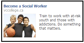
5. Bad Image Choice
Be sure your image makes clicking desirable, or at least doesn’t hurt your chances.
The image I’ve included below, for a career as a social worker, makes the job look terrible. Always put your product, no matter what it is, in the best possible light.
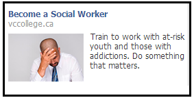
How to Fix your Mistake:
If your product is stereotypically boring, find the best result (just talk to your sales team, I’m sure they’ll have something) and use it as a value proposition. And remember your image doesn’t have to be 100% related to your product.
All I’ve done to transform this social worker Facebook Ad is taken the other side of social work, the success stories, and highlighted them.
Want to be sure you’re optimizing your Facebook Ad images for click-through-rates and conversions? Read my article 6 Facebook Ad Image Best Practices that will Send your Click-Through-Rates to the Moon.
6. Copy Errors
It’s been proven time and againthat typos do matter in marketing. They reduce the trust your audience has in you, and can be especially detrimental in advertising.
This is because a Facebook Ad is often your business’ first interaction with a possible lead. The last thing you want is an easily-fixed copy error to be the thing they notice and remember.
The Facebook Ad below is even more disappointing, as it’s an ad for a university’s MBA program.

How to Fix your Mistake:
Check your copy. Then check it again. This one isn’t complicated, but you’d be surprised how often I see it.
7. Bad Headline
Unless your brand name is very well known I don’t recommend you use it for your Facebook Ad headline. And definitely don’t use your website url (see ad below).
I like questions, Calls-to-Action and value propositions for my Facebook Ad titles.
Here are five examples:
-
Are you ready?
-
Enter to Win!
-
Get Yours Free!
-
Tips to Succeed
-
Get $200 Off
The Facebook Ad below, for a humorous texts website in Quebec, has as many issues as any ad I’ve seen yet. Not least of which is the headline. Nothing in this ad grips you:
-
The image doesn’t catch your eye.
-
The headline doesn’t offer value or a question
-
The body copy is simply the words “Unusual Texts”
-
There’s no call-to-action. I’m not inspired or told to do anything at all
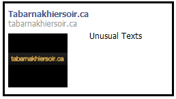
How to Fix your Mistake:
Here’s what I would have done:

8. No Call-to-Action (CTA)
An easy thing to forget, but vital to the success of your Facebook Ad campaign, the CTA is what encourages a person to act. The image hooks them, a value-proposition sells them, but a CTA gives them the final impetus they need to click.
I’ll ignore the other copy issues within the ad below for a training certificate (but really, “potentially always?”) and focus on its lack of a CTA.

To be honest the image is fine, and the value proposition – always being on the right side of the market – is a good one. Yet I don’t feel the need to act.
Not including a CTA in your Facebook Ad is like poking holes in your social media marketing funnel. You grab a potential lead but then don’t direct them in any particular direction and they slip out the side.
How to Fix your Mistake:

The simple addition of ‘Start your course today’ gives the Facebook user that little extra nudge they need to click through.
Always check your Facebook Ad for a CTA. Here’s some great examples:
-
Enter here to win
-
Click to find out more
-
Start succeeding today
-
Get a quote now
-
Do something about it
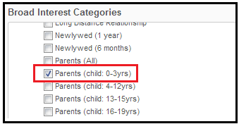
9. Poor Targeting
Poor targeting is one of the most unfortunate mistakes you can make, as it means you’re wasting your money entirely. Even with a poor image, bad headline and spelling errors, you will still get clicks on our Facebook Ad if it’s relevant to the audience.
My seeing the ad below (not having children) means PediaSure has completely wasted a portion of their ad budget. And it’s so easy to avoid!
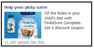
How to Fix your Mistake:
Your Facebook Ad tool should allow you to target your ad. And if you don’t use a tool that targets for you (like Wishpond’sdoes) be sure you put some time and energy into targeting your ad yourself.
For the ad above it’s straightforward with Facebook Ad targeting to simply focus your ad on parents. Other ads will have different targeting tactics, but it’s a good rule of thumb to target as specifically as you can. Just watch that your Reach metric stays large enough.
If you want to learn more about how to target your Facebook Ads, read my article How to Create a Targeted Facebook Ad Audience
Conclusion
Hopefully you now know what to avoid with Facebook Ads, and how, with a little bit of effort, you can make them work for you. Remember to make your images simple and eye-catching, your headlines appealing, and your body copy clear.
Further Reading:
-
7 Value-Proposition Formulas to Boost Conversion on Ads and Landing Pages
-
6 Facebook Ad Image Best Practices that will Send your Click-through-Rate to the Moon
Are there any Facebook Ad mistakes you see over and over? Anything you’ve been thinking about trying for yourself? Start the conversation below!