
You’ve spent hours optimizing your Facebook Ads.
You’re getting a higher click-through rate and lower CPM costs than you’ve ever had.
But no one is converting on your landing page.
So what’s the problem?
In this article I’ll dissect the top 3 reasons why people click on your Facebook Ads, but don’t convert. And how to fix each problem.
Let’s begin.
1. Your Landing Page doesn’t use the same image/copy as your Ad
When a person clicks on your Ad, they have a general expectation of what they’re going to see when they are directed to your landing page. This expectation stems ENTIRELY from what you show them in the Ad. So if the Ad you show them on Facebook looks completely different than your landing page, you’re going to confuse people – confusion leads to drop-offs and a low conversion rate.
There are two things that you need to match up between your Facebook Ad and your landing page to minimize confusion as much as possible: imagery and copy.
Imagery
More than anything, I recommend using the same image on your landing page as you do in your Facebook Ad – just a larger version, of course. This can cause some issues for certain images, as the max pixel size of a right-side Facebook Ad is 100 x 72 px, while you’ll probably use dimensions upwards of 400 px for the image on your landing page. So you need to find an image that works in both sizes.
One other important piece to note is the color of the Ad image. Do your best to use the same color template in both the Ad and your landing page. This will make your landing page seem like a direct extension of your Ad, which will decrease confusion and mistrust in your visitors, causing them to convert more.
Check out a great example of this done right by Clearly Contacts. They used the same pair of glasses and white background on their Facebook Ad as they did on their landing page. They even used a similar blue for text on the landing page as the default blue Facebook uses for the Ad headline:
Landing Page

Copy
Now, to perfect the transition from Ad to landing page, it’s vital to use the same copy on both. Your Facebook Ad, especially if in the right-side column, will require much shorter text than you can utilize on your landing page. So for the Facebook Ad headline, I would recommend using a shortened version of the main title on your landing page.
For the example above, Clearly Contacts made a major mistake in that they used the word “Designer” to describe its glasses on the Facebook Ad, but not on the landing page. This will lead to confusion and mistrust in the visitor. They may think that they fell victim to a bait-and-switch: that they were promised “Designer” glasses, but the Free Offer is actually only for generic knock-offs. Even if this is not the case, it could be perceived this way. And perception is key on your landing page.
I would also add the text from the Facebook Ad to the landing page that reads “includes frames + basic lenses”. A pair of glasses needs both, so a person buying them will want to know whether this offer includes both or not. Leaving it off the page leads to ambiguity, which will lead to drop-off.
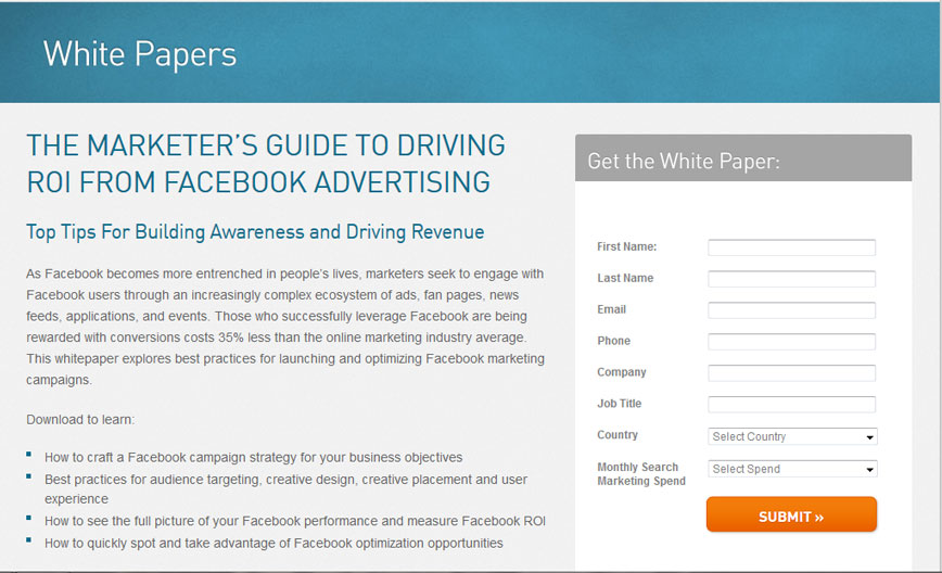
One more element of the copy that NEEDS to match between the Ad and the landing page is the call-to-action. If your Ad’s call-to-action is “Get the Free Ebook”, it should be the exact same on the landing page. Here is an example from Marin Software on the WRONG way to do it. On the Ad their call-to-action (in the image) is “GET THE GUIDE”, while on the landing page it’s “SUBMIT”.
It’s actually quite unfortunate that they flubbed this part, because they did a perfect job of using the same button style and color on both the Ad and the landing page, going so far as to include the same “>>” on both. This makes it perfectly obvious to the user coming from the Ad that the orange button on the landing page is the right one to click.
Check out the example for yourself below:
Landing Page
2. Your Landing Page Is Taking Too long to Load
Just as the copy and imagery of your landing page are important, the speed at which it loads is just as important. The longer it takes your landing page to load, the lower your conversion rate will be. That’s a fact. Studies by Amazon have shown that a page load slowdown of just one second could cost it $1.6 billion in sales each year. For Google, slowing its search results by just four tenths of a second they could lose 8 million searches per day.
These examples magnify the results of slow webpages quite a bit – but even if your business is much smaller than Amazon and Google, slow load speeds on your landing pages will hurt you a lot.
To alleviate this pain, let’s take a look at a few things that may be causing your page to load slowly and how to alleviate them.
Tips to Decrease the Load Time of your Landing Pages
1. Decrease the number of images: Images are incredibly “heavy” (meaning they take a long time to load). Whereas text and the page’s background color are extremely light. So if you see that you are using a lot of images to help explain the points of your landing page, try to replace them as much as possible with description text. And if you need them to stand out, use a different font or background color instead of an image.
2. Lower the file sizes of your images: When you’ve narrowed down the number of images to an absolute minimum, you can look at decreasing their file sizes. This can be done in two ways, either by decreasing the dimensions of the image or decreasing the quality.
3. Move all Javascript below the tag: If you have any pop-up windows, analytics tracking codes or fancy animations on your landing page, then you have Javascript. Similar to images, Javascript is heavy. So what can you do to alleviate the load? Move it to the very bottom of the landing page, below the tag. This will allow your server to load the visual elements of your landing page first, so visitors can quickly begin viewing the page, while the tracking codes and pop-ups, that users either don’t interact with or interact with after reading the page, load in the background.
3. Too Many Form Fields
A large form can be daunting to even the most interested person. Especially if the form fields in it ask them questions that they need to think about before answering. Asking a person for their first name is one thing, but asking for their favorite brand of running shoes will require them to stop and think. This is exactly what you DON’T want to make a person do. Any student of UX design will be familiar with Steve Krug’s book “Don’t Make Me Think!”. This is a concept you should always keep in mind when designing any marketing material that you want a person to read or interact with.
So what is the right amount of form fields to have?
Well, that depends on the requirements of your sales or marketing teams. If your sales team absolutely needs to know certain things, such as industry and marketing budget to accurately prepare for a product demonstration, then you need to ask for it. Or if your marketing team’s email marketing automation campaigns need to have personalized merge tags for the company name and address, then you need to ask for it.
Just don’t add in anything that doesn’t NEED to be there. When someone on your team asks for a field to be added to your form, make sure it is 100% necessary before you add it. Unless you’re going to use it in an automated email, you don’t need to ask for a person’s last name. Unless your sales team plans to call every lead that you get from your landing pages, you don’t need to ask for a phone number.
It’s important to realize that not every form on every landing page needs to ask the same things. Only some fields are relevant. This depends a lot on where this batch of leads is in the sales cycle. If it will be the first time they are interacting with your company, and they just want to download an ebook you’re offering, you don’t need to care about any sales information. Because at this point they are unlikely to respond well to any kind of sales call or message from your company. So you can save those fields for future landing pages.
More Free Resources on Facebook Ads:
- Facebook Advertising Costs: CPC, CPM, CPA & CPL Guide
- 6 Facebook Ad Image Best Practices to Boost your Click-Through-Rate
- How to A/B Split Test your Facebook Ads to Maximize ROI
- The Science of Optimizing your Facebook Advertising Campaigns
- 7 Facebook Ad Call-To-Action (CTA) Tips, Techniques & Best Practices
- How to Run a Facebook Ad that Gets Clicks
- The Complete Guide to Facebook Ads (Ebook)
P.S. Wishpond’s Facebook Contest Apps make it easy to create sweepstakes, photo contests, Instagram hashtag contests & more. Looking for inspiration? Check out 25 Creative Facebook Contest Ideas You Can Use Today.