
Looking for a little landing page inspiration for your ecommerce shop?
How about some examples for your next conversion rate optimization tests?
Whatever your reason, you’ve come to the right place. The best way to improve your website or landing page is to learn from those doing it right. The optimization process is a never-ending pursuit but it’s certainly worth the effort.
In this article I’ll show you 23 beautiful ecommerce landing page examples. I’ll show you each example and discuss the reasons why we chose it.
Let’s get to it.
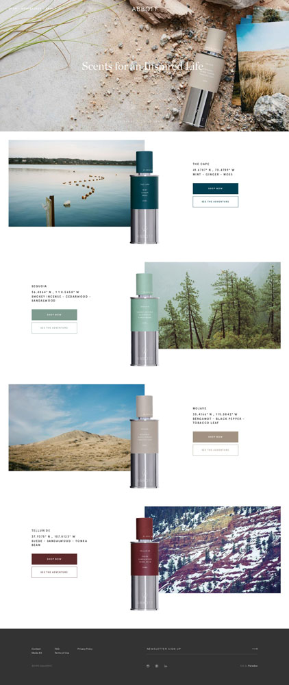
Ecommerce Landing Page Example #1: Abbott
Fragrance maker, Abbott, uses this ecommerce landing page to promote it’s new line of geo-inspired scents.
Why we like it:
- Product, colour, and image combo. The product presentation is visually stunning, set in front of a matching photograph. The colour scheme and backdrop make it almost possible to smell the fragrance through the screen.
- Heavy contrast. Product shots, photography, and colour are set in front of a white background. The heavy contrast makes reading easy. Meaning, nothing distracts from the product.
Ecommerce Landing Page Example #2: Beats
Beats built this landing page to show off their line of colourful headphones.
Why we like it:
- Bold and contrasted. Beats does a great job showing their product off in the best light. Each section is clear with contrasting colours and bright photography. Text is easy to read against the coloured backgrounds.
- Visuals. Photography is in the driver’s seat. Instead of more text crowding the design, video and photography are used to expedite the reading process. By using more imagery, visitors can easily read and conceptualize the product faster.


Ecommerce Landing Page Example #3: Bedowl
Air mattress ecommerce shop Bedowl uses this landing page to feature its range of products.
Why we like it:
- Clean and minimal design. We like the approach Bedowl takes on the design. Content on the page takes priority. Clean graphics and minimal designs make the product easier to understand.
- Stars and ratings. Social proof from happy customers add trust and credibility to the Bedowl brand. Star ratings, testimonials, and things of that nature help add trust to your offer. Trust that the product you sell is what is being delivered.

Ecommerce Landing Page Example #4: Construction Papers
Construction Papers used this landing page to take preorders for their new batch of design guides.
Why we like it:
- The theme. More than anything else we love the design of this landing page. The beautiful images, minimalistic graphics, and complementary colours make this a joy to look at. The section about the author, in particular, adds a human element to the page which builds trust.
- Typography. A fine balance of typography and contrast makes for easy reading. Different font weights are used to emphasize areas of importance.

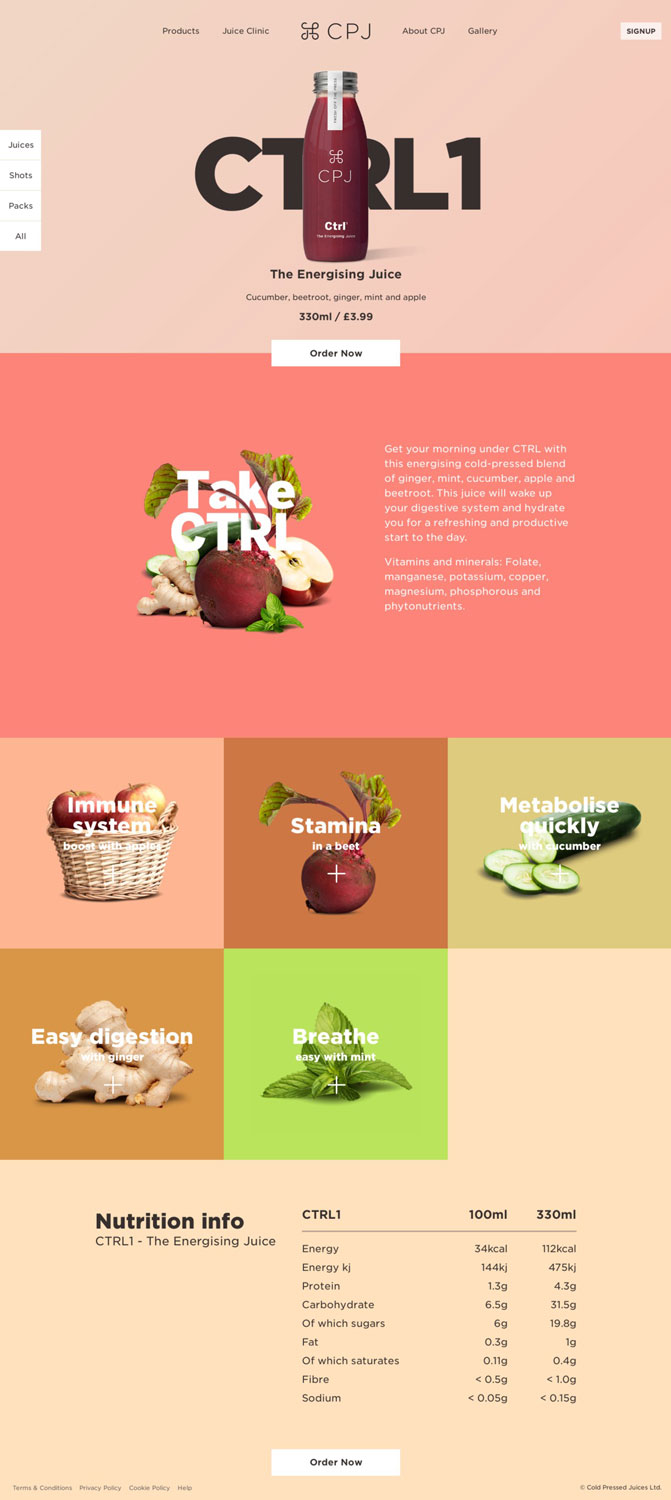
Ecommerce Landing Page Example #5: CPJ
Cold pressed juicery, CPJ, uses this landing page to promote and highlight the benefits of their CTRL1 juices.
Why we like it:
- The stunning graphic design. At first glance you can see that CPJ takes design seriously. The complementary colours, immaculate imagery, and tight copy all translate into a landing page that’s a pleasure to read.
- Nutrition info. There’s no debating that CPJ’s customers are health conscious. Including the nutrition info shows just how well CPJ knows their customer. When designing a landing page, each section should address questions that your customers will have as they scroll through.
Ecommerce Landing Page Example #6: ETQ
Footwear brand ETQ uses this ecommerce landing page to show off its latest season selections.
Why we like it:
- Photography. Like other landing page examples on this list, amazing photography is the focus. It tells a story and gets visitors invested in the product they’re exploring.
- Contrast. The white background helps all the photos and copy on the page stand out. Nothing is lost in the design. Everything about the look and feel of the photos to the minimalistic style of the copy works together.

Ecommerce Landing Page Example #7: Everlane
This is the landing page from luxury clothing retailer Everlane.
Why we like it:
- Photography. The products being the focus, are given plenty of opportunity to shine. The products photos are absolutely gorgeous. The styling and composure are very much in line with Everlane’s brand.
- You shop and we ship. The small sales calculator at the bottom adds a bit of fun into the mix. The playful way it shows its most popular locations is a smart way to add social proof.

Ecommerce Landing Page Example #8: Farmbody
Farmbody makes and sells natural tattoo skincare products and this is their landing page.
Why we like it:
- Typography. Big and in your face, the typography choice is excellent. It manages to represent the “natural” aspect of the product while maintaining the bold elements of tattooing.
- Product shots. The product photography is stellar. Different angles and positions leaves no question about the product unturned. The section with the wood paneling in particular really creates interest around the product and the creation process.

Ecommerce Landing Page Example #9: FIET
This an ecommerce landing page from luxury shoe maker Fiet.
Why we like it:
- Imagery. No details are left out of Fiet’s product shots. Wide angle and macro images focus on the details that make the Fiet brand great. The photography lets the page speak for itself.
- Simplicity. Did you notice the lack of copy on the page? This landing page is meant to separate visitors according to their shopping preferences. This way visitors can be ushered onto product pages more efficiently and be more likely to convert.

Ecommerce Landing Page Example #10: Harmless Harvest
Organic coconut water maker Harmless Harvest uses this landing page to tout the benefits and story behind their tasty organic drink.
Why we like it:
- The story. Hundreds of companies make coconut water, that’s a fact. What separates Harmless Harvest from the competition is their story. They put it up front a centre for a reason. We like how the story is presented and mixed in with the brand’s look and feel, plus some amazing photography.
- The design. The pixel perfect use of colour and photography are simply sublime. Nothing crowds the brand story or confuses the focus of the page. It all works cohesively to explain the Harmless Harvest product and the people behind it.

Ecommerce Landing Page Example #11: Helbak
Houseware retailer Helbak uses this stunning landing page to highlight their latest wares.
Why we like it:
- Green, very green. The shading and complementary colours highlight the products excellently. The choice of a masonry-like layout makes the product shots clear as day.
- Contrast. I said it once and I’ll say it again. Contrast is essential for clear communication. Contrasting font weights, colours, copy, and images all add up to an enjoyable browsing experience for your visitor.

Ecommerce Landing Page Example #12: LogoShop
Here’s a deceptively simple landing page from LogoShop.
Why we like it:
- It’s flat. The design is kept flat, like the logos they sell. Nothing distracts from the product or the copy on the page. Choosing to use only two colours works perfectly on this landing page.
- No links. Ecommerce landing pages aren’t like a traditional landing page due to the inclusion of more than one conversion goal. But for this example, the LogoShop does away with distractions and sticks to only one conversion goal: the sale.
Ecommerce Landing Page Example #13: MAAP
Here’s the landing page MAAP uses to show off its flashy riding gear.
Why we like it:
- The layout. Though slightly complicated (and not well contrasted), the layout of the design is hard to ignore. Dynamic photography is the star on this landing page. MAAP clearly wants the product up-front-and-centre and does so accordingly.
- Bright colours. In line with the brand’s look and feel, the landing page has an eye-catching brightness to it. In a sense it creates curiosity and pushes visitors to explore more of the page.

Ecommerce Landing Page Example #14: More by Bourn
Bourn used this landing page to promote it’s new line of Love More sweaters.
Why we like it:
- Social proof. To build trust Bourn includes photos of their happy customers, a live Instagram feed, and a note from the creator. Little elements like these give your customers confidence and enough trust to make a purchase.
- Great contrast. Readability plays a major role in the success (or failure) of a landing page. That’s why we continue to harp on the benefits of contrast. The eyes are drawn to the bright read areas and the dark black text makes body copy easy to read.
- Sharing. Below the “pre-order” buttons there are calls-to-action to share the product on social media for a bonus 10% off. Tiny incentives like this are smart ways to increase the exposure of your landing page.

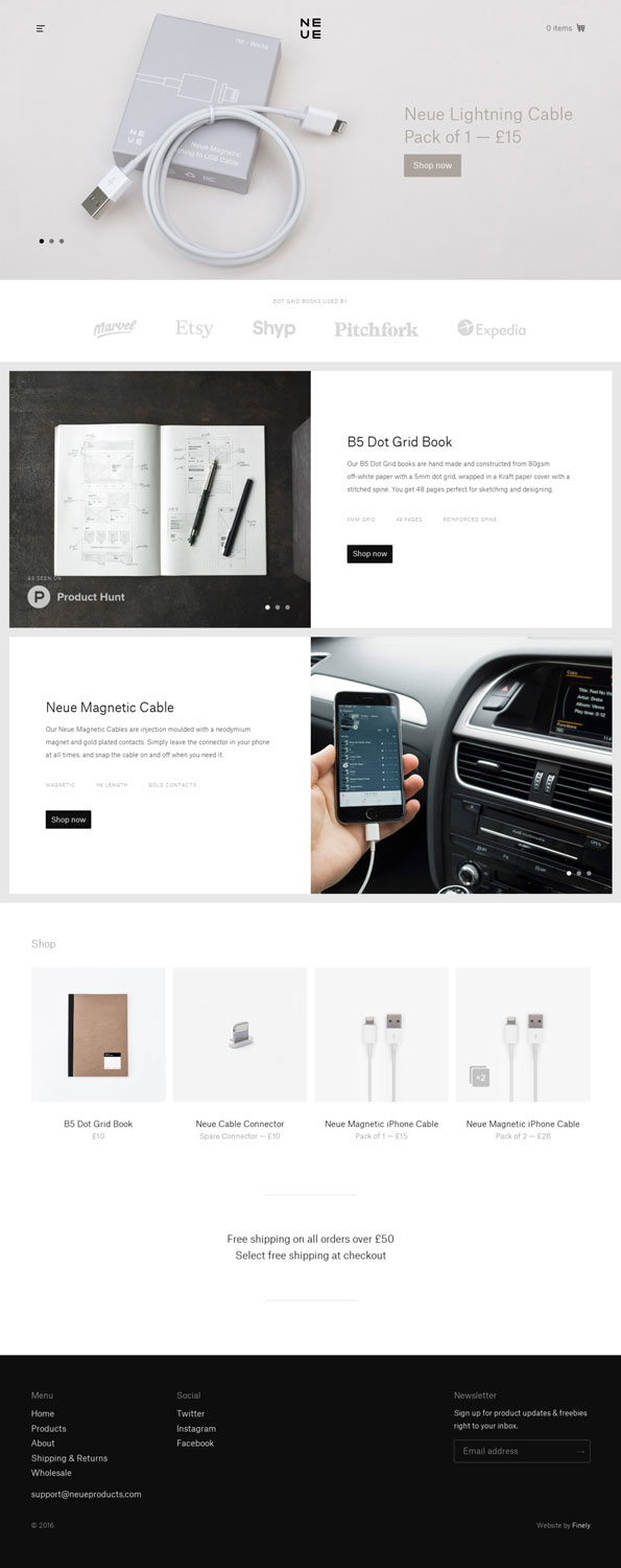
Ecommerce Landing Page Example #15: Neue
Gadget and accessory maker Neue use this landing page to highlight their range of contemporary products.
Why we like it:
- It’s contemporary. Keeping in line with its products, Neue designed their landing page with the same focus on contemporary design. Images and font choices are kept minimalistic and clean. Overall the design makes for a pleasant shopping experience.
- The logos. Prominent brand logos are placed near the top of the page to build trust. In terms of building social proof, brand logos provide plenty of added help.
Ecommerce Landing Page Example #16: Parka London
Parka London used this landing page to promote their seasonal sale.
Why we like it:
- The visuals. In terms of showing off their products the photography does so excellently. Each section uses photography in different ways to communicate the offer.
- Hierarchy. Each section is positioned on the landing page strategically. As you scroll downwards you can tell sections are arranged in order of importance.

Ecommerce Landing Page Example #17: Repick
On Repick’s landing page the products are priority.
Why we like it:
- Images come first. Because Repick relies on clicks, the products come first. Especially in the header section. Visitors are well tempted to click on each product to learn more about it.
- Bright CTAs. When a lot of visuals crowd the page you need to have CTAs that stand out. The bright blue CTAs do an awesome job at drawing attention and getting clicks.

Ecommerce Landing Page Example #18: Seedlip
Non-alcoholic spirit Seedlip uses this landing page to distill the brand down to its roots.
Why we like it:
- It’s beautiful. The typography, photos, and graphics all combine to create one beautiful landing page. Exploring it is part adventure, part education.
- The story. Lots of explanation is needed for something like a non-alcoholic spirit — new to the market. Seedlip makes sure to include their brand story, nutrition facts, recipes, and stockists. This way they can preemptively answer any questions or concerns a new visitor might have.
- Their tagline. The tagline, “What to drink when you’re not drinking” had to be mentioned. It’s genius!

Ecommerce Landing Page Example #19: Shinola
Detroit-based manufacturer uses this landing page to show off it’s beautiful range of leather products.
Why we like it:
- The separation. Shinola makes a vast array of leather products, each of which need to be featured on the landing page. They do an excellent job of defining each section and not overpowering others.
- The photography. The devil is in the details. Shinola gets up close and personal with their product shots. It’s a step away from holding one of their fine products in your hands. Key to what makes them one of the best luxury manufacturers in the world.

Ecommerce Landing Page Example #20: Starbucks
Starbucks uses this landing page to promote their in-store items like verismo pods, syrups, and high quality coffees.
Why we like it:
- The layout. The design and layout of the page is kept simple yet in the typical Starbucks aesthetic. Each section is divided simply and is contained in its own area to avoid any clutter.
- The CTAs. The smart use of black makes each call-to-action hard to miss. Contrasting CTAs in each section are clear and easy to find, essential for any high-converting landing page.

Ecommerce Landing Page Example #21: DogCollar.ca
DogCollar.ca, somewhat unsurprisingly, sells dog collars online.
Let’s check out their landing page:

What I like
The Tone:
- I like the rock and roll style of this site. They’ve found a tone that works with them and they’re running with it.
- Much of ecommerce marketing is about finding your own niche and individuality, and pushing it. DogCollar.ca has done this well.
The Easy Navigation:
- The top four links (with large images) work really well to draw the eye.
- They make it clear how to navigate to where you want to go – whether that’s collar selection, leads, or contact details.
The Product Display:
- Piling their products up and displaying them in a large image is an effective way to grab people’s attention (especially in such a relatively small and short landing page). If someone sees something they like they’re far more likely to click through.
What I’d Change or Test
The Font:
- Sometimes it’s the smallest things that have the largest affect on your landing page’s conversions.
- In this case, I’d definitely test a different font – as a few of the words (see “Collars” at the top) are somewhat difficult to read – which could increase the page’s bounce rate.
A Picture of a Dog:
- DogCollar.ca is missing a serious beat by not including pictures of their collars on actual dogs. I would guess that throwing a cute dog image (or a revolving album) could increase their page conversions by anywhere between 15 and 25%.
The Mid-2000s Design:
- Anything that dates your landing page (like the red banner at the bottom) will detract from your page’s conversions. I’d recommend a straight matte banner on the bottom with the links standing out a bit more.
A CTA:
- The revolving album I recommended above would also be perfect for a few specific call-to-actions (CTAs):
- Showing a picture of a dog with one of their most popular collars would work with the CTA “Check out our bespoke dog collars today”.
- Showing a picture of a dog and its stylish owner showcasing their most popular lead would work with the CTA “Get 10% off your pup’s accessories now!”
- Showing a picture of the DogCollar.ca staff with their own pooches would work with a “passion for dogs” quote and a “Contact Us Now” CTA.
Visitors to your landing page may not know exactly what they’re there for. You need to tell them. CTAs (the “Ask” on your page) do this. Landing pages are the face of your ecommerce brand online – make sure that face is saying something.
Ecommerce Landing Page Example #22: XEROSHOES
Xeroshoes are an ecommerce company who has developed a shoe (and accessories) based around the recent trend of barefoot running.
Let’s check out their landing page:

What I like
The Easy Navigation:
-
- Far and away the most visible part of this page is the selection “shop men’s” or “shop women’s”.
–
This makes it easy to quickly and easily navigate to what you’re on the site for, which will decrease bounce rates (there’s nothing worth than not being able to find what you’re looking for on an ecommerce site).
The CTAs:
-
- “Shop Men’s” and “Shop Women’s” are actually pretty solid CTA’s.
–
I love the color contrast as well. Yellow on green works very well to grab the eye of the page’s internet traffic.
The Customer Testimonials:
-
- Customer testimonials are incredibly valuable on your landing page, especially when you product needs some explanation (like Xeroshoes’ does).
–
People don’t, implicitly, trust your business. They trust your customers far more.
- I also like including headshots of the customers giving their testimonial. This improves the personable tone of the page.
What I’d Change or Test
A More Focused Page:
-
- Below-the-fold (what you can’t see without scrolling down on the page) is a very confusing place on this page.
–
There are a total of 13 different images – which detracts from the appeal of all of them
- I’d recommend keeping the customer testimonials and “Barefoot Walking”, “Barefoot Running” and “Why Barefoot?” and moving the rest to a product or resources page.
The Bottom Paragraph:
-
- The bottom paragraph is a large amount of text – which detracts from the efficiency of the page by trying to do too much.
–
I recommend against paragraphs across-the-board. Nobody is on your landing page to read an essay. Sell them on the value of engaging with your brand and make a conversion easy. Everything else is distraction.
The Color Scheme:
-
- The top half of this page is very clean and focused, with a great color scheme that I like.
–
The bottom half, however, is not only unfocused, but also loses the color scheme and becomes less exciting and less visually appealing.
- I’d recommend they test fewer images (as I mentioned above) and integrating the green and blue back into the below-the-fold.
Another Lead-generating Page:
-
- You can have as many landing page as you think are useful – I would recommend that Xeroshoes create another page entirely for their lead generation efforts (“Get Free Tips, Special Offers, and Free 7-Day E-Course” at the bottom)
–
Like I mentioned with DogCollar.ca above, you should focus your page on as few CTAs as possible. You’ll get more conversions on both your main landing page as well as your lead generation page if you separate them.
Ecommerce Landing Page Example #23: Reed & Barton
Reed and Barton is a high-end household goods business. They’ve been around since 1824, and have taken to the ecommerce world like a fish to water.
Let’s check out their landing page:

What I like
Having a USP:
-
- Your business’ unique selling point should be one of the main focuses of your page.
–
Whether that’s a unique product line or a unique approach to a well-known product, or (like Reed & Barton) a unique philosophy and perspective.
- It’s this uniqueness that will encourage people to engage with your brand as much as it is your products themselves.
The USP itself:
-
- “A modern approach to home in philosophy as much as style” is perfect for their high-end target audience
–
Your USP should speak to your target audience as individuals – echoing their own desires
The Revolving Photo Album:
-
- Reed & Barton’s landing page has four-image/USP combinations.
–
This is incredibly effective for ecommerce, as it shows off your products as well as drills home the uniqueness (with four awesome USPs) of your business.
The Color Scheme:
-
- I like the dark blue, dark grey and white color scheme. These colors excellently communicate sophistication and quality.
–
The colors you use are hugely influential on the tone of your page. Consider dark blues and dark greys for elegance and urbanity. Consider green and beige for environmentally friendly, and bright colors (purple, orange and blue) for children and fun.
The CTA:
-
- This is the only page of the three I’ve critiqued that has a loud and obvious CTA – something that hugely improves your page’s conversion rates.
–
The color contrast of this page (orange on grey) is awesome at attracting the eye of a landing page visitor. I recommend you test the color of your own CTA’s to see which your market responds to the most (you might be surprised how influential this kind of small change can be).
The Images:
- I think that three to four images is the optimal number for an ecommerce page.
What I’d Change or Test
The Reed & Barton landing page is close to my ideal landing page for their market and sector. The page’s tone matches their target audience very well. The images are clean and appealing, and there is a limited amount of distractions that might pull a visitor away. I also like the small amount of text, no paragraphs, and exclusives.
The only small thing that I think would improve conversions would be to increase the size of the CTA at the top and repeat it near the bottom.
Apart from that, this page is optimized for conversions. Congratulations to Reed & Barton (to be fair, they’ve had since 1824 to figure it out).
Final Thoughts
Hopefully seeing these examples have inspired you to test your own ecommerce landing pages.
Here’s a hypothetical…
If your page is seeing 1000 visitors a week, currently converting website traffic at 15%, and a conversion is worth (on average) around $35 to your business, your page is making $5,250 a week.
If you implement some of the tests I’ve recommended above, it’s not unlikely that your page will increase conversions by at least 25% – raising your overall conversion rate to 18.75%.
1000 visitors a week converting at 18.75% at a value of $35 equals $6,562 – a weekly revenue increase of more than 1300 dollars.
The only way to improve is to be constantly testing. Happy testing!
Related Articles:
- A Complete Walkthrough to the Most Essential eCommerce Marketing Tactic
- 6 High-Quality Product Landing Page Designs & Tools to Use
- 5 Expert Ways to Increase Your eCommerce Customer Service
- 6 Best Contest Emails & What You Can Learn From Them
- 5 Ways Digital Transformation Can Drive Your eCommerce Business