Have you written a business eBook? Are you trying to generate more leads from it?
Try to achieve some landing page optimization.
eBooks are a great method to give your potential customers something for free, show you’re an industry leader and build trust with your readers. Put your eBooks on an email-gated landing page, hosted directly on your website – and you can generate warm, qualified leads for your business.
But even with the greatest of all eBooks, you won’t get leads unless your landing page converts. You need a landing page that converts which means you have to evaluate the different possibilities in terms of landing page templates.
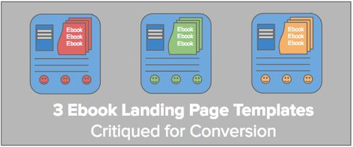
In this article, I show you 3 sector based examples of real ebook landing pages. I’ll run through them with a critique of what’s good, what needs changing and how you can optimize your own ebook landing pages.
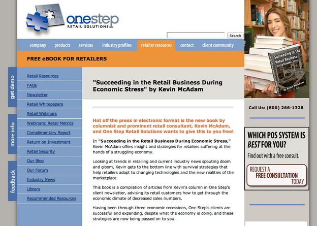
Retailers eBook Landing Page
One Stop Retail Solutions gives support to retail businesses. They have an entire library of retail related resources, including free eBooks.
Here’s what one of their email-gated eBook landing pages looks like:
What’s Good:
First off, this landing page is terrible. On initial glance, this page looks like it is from 2004 – or earlier. There are still a few good points about the page:
-
Visual of logo – Their logo is prominently placed on the upper left corner of the page. This is good marketing to reinforce who they are, and breeds trust.
-
Image of smiling woman – The image of a smiling woman has shown to increase conversions in online marketing. On this page, it’s prominently placed. It also visually explains what the page is about – books. (But the image is, well, boring, and looks stock. Additionally, the eBook that’s being ‘sold’ on the page is poorly photoshopped in – and hard to see.)
-
Contrasting color scheme – I give the landing page points for the contrasting blue/ orange color scheme. The orange banner makes their “free ebook” selling feature stand out.
-
Includes contact info – Putting a phone number on your landing page can increase consumer trust. It shows you’re available and easy to access as a business.
-
Good SEO – This ranked high in Google search, appearing on the first SERP. There’s clearly good use of relevant keywords, site links, alt tags and other SEO tactics. Honestly though, it’s tough to see why this ranks so high. They would definitely benefit with a higher converting page.
What’s Needs Optimizing:
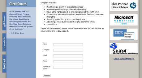
To increase conversions, the page needs to be more visually appealing and user friendly. Here’s a few reasons why their page is not getting the leads it could:
- CTA not above the fold – This is one of my pet peeves. Your Call to Action needs to be above the fold. Studies have shown that a viewer rarely scrolls down on your site. If your CTA is not visible immediately, you’ve pretty much lost the lead.
The CTA and bullet points about the book are “below the fold”. The visitor does not see the benefits and action ask – unless they scroll through the entire page.
-
Lacks clear visuals – If you look closely, you can actually see the image of the book cover (you have to look very closely). It is not prominent, and doesn’t ‘sell’ the book. A customer these days sees hundreds of sites. Your page needs to attract a customer’s attention with a clear selling point within 5 seconds.
-
Too cluttered – The page is too wordy. There are too many distractions with the left hand side links. Again, this page looks like it was styled in 2004. Today’s landing pages are much more visually based and simply designed. Give some breathing space to your leads.
-
CTA not clear – There’s no distinct CTA button to download the ebook. This tactic of simply having a list of form fields, with a non-distinct “submit” button may have been effective a few years ago. But in 2014, your customers have an exponential amount of visual distractions online. You need to make your CTA stand out with contrasting colours, and more enticing form fields.
-
Too many value propositions – Is the objective of this page to get customers to “Request a free consultation today”, or to download an eBook? The page has too many focal directions. Keep your landing page value proposition to one. Don’t confuse your prospects – they will just leave.
-
No social share buttons – Again, this page is outdated. It needs social share buttons to increase its reach.
Free Recipe eBook Landing Page
Purdy’s Chocolatier makes fine chocolates sold at their own retail outlets. The company has a number of innovative marketing strategies for their sector, including their own blog, contests, and eBooks.
Here’s a look at one of their recipe eBook landing pages:
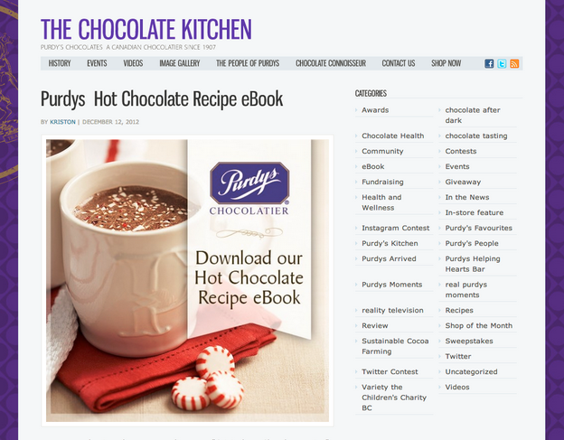
What’s good:
-
Clear headline – The title of their blog landing page “Purdy’s Hot Chocolate Recipe eBook” is clear and to the point. It uses their keywords (which is good for search), and it visually stands out on the page.
-
Clear CTA – The Call to Action is visually distinct with a ribbon-like overlay on the large image. It’s above the fold, branded, and reiterates what it is the prospect will get. The action to take is simple: “download”.
-
Strong visuals – The hot chocolate theme is obvious through the image. It shows the reader what the topic is, and gives a taste of what they’ll get in the download – without having to read it. The visual flow is optimized – I’d say they’ve used visual heat maps to determine where the to place the image. (Most people tend to scan to left side of site first).
-
Share buttons – The site has social share buttons for Facebook and Twitter.
-
Clever marketing – Ok this isn’t specific to a critique on the landing page itself, but I’ve got to give a shout-out to the clever lead generation strategy here. The company is a chocolate maker. By producing free eBooks, they expand the use of their products and give customers creative reasons to buy more chocolate to enjoy.
What needs optimizing:
-
Broken link – Unfortunately, the link to download the ebook is broken. This is a huge miss. You’ve worked to get your customers to click on your ebook page, you’ve sold them with your landing page. Then they can’t get what you’re selling them. FAIL.
-
eBook not on page – Aside from the broken link itself, the eBook had been hosted on Facebook, not on the business website itself. They should optimize the lead generation opportunity by uploading the ebook directly onto their website for people to download while on their own domain. (Hosting an eBook on Facebook is so 2011.)
-
Additionally, they would increase conversions by decreasing the number of clicks their customer needs to take. Include a clear CTA on your eBook page, where people can get your book without leaving the site.
-
Not email-gated – This campaign was clearly intended to get more Likes on Facebook. In 2014, however, they should be focused on gaining more email leads to nurture, convert and gain the coveted repeat consumer.
-
Host on unique landing page – They should host their eBooks on a unique landing page – not on their blog. A web page gives more SEO opportunities, and greater styling flexibility.
Wedding Resource Lead Generation Landing Page
The Perfect Wedding Guideis an online resource for both brides and for wedding planners. They offer resources and listings for how to plan the perfect wedding.
Here’s a look at one of their wedding guide eBook landing pages:
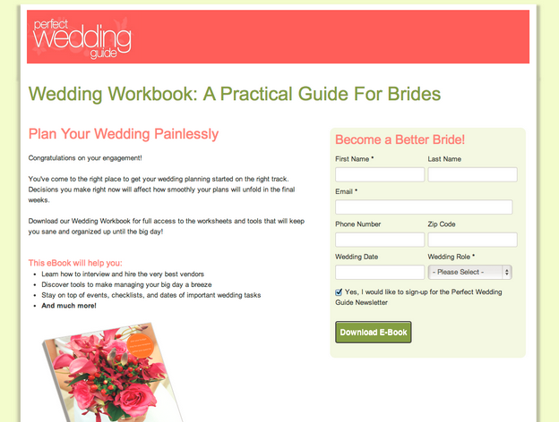
What’s good:
-
Clean design – The page employs a great use of whitespace and complementary colors. The pink banner accents the pink colored value propositions. The green headline makes the darker green “Download” CTA button pop. It’s not too cluttered, and is easy to understand the offer and ask at a glance.
-
Clear headline – It is clear what to expect from the book – a practical workbook for brides. The more obvious you make your offer, the more conversions you’ll likely get from your particular market.
-
Shows the benefits – The page gives a number of enticements for why a bride to be would want (or even need) this book. It offers their market the ability to “Plan your wedding painlessly” (a huge benefit for a stressed out bridal parties). It also give the promise to “Become a Better Bride!” (another huge benefit for – well the bridesmaids and family at least!)
-
Personable and understanding – Yes, a standard landing page can (and should) be personable. They write the landing page copy using words like “you”, “keep you sane” and “you’ve come to the right place”. It sounds like they understand their customer, which develops trust. The more your customer trusts you, the more likely they’ll buy from you – or at least give you their email for your free stuff.
-
Bullet points – People are scanners online today. Succinctly tell the benefits of your book in a few well coined bullet points. Be truthful about what your book is about, and show how amazingly good it is for your consumer to get. Their bullets points start with “learn”, “discover” and “stay on top” – these are all great words to entice a download for a free resource.
-
Optional fields in lead generation form – The color contrasted lead gen form stands out on the page, and the required fields are not a large ask. I love that they ask for more fields than they require. This marketing tactic makes the consumer feel like the information ask is less than it could be – so it seems like a deal. Additionally, the business could end up with even more information about their prospects.
What needs optimizing:
-
Testimonial – They could include a testimonial from a former bride-to-be. This would deepen the feeling of a personal connection and increase the level of trust.
-
Image of smiling bride – Instead of held flowers, they could show an image of a happy, stress-free bride on her wedding day. They could A/B test where on the page it gets the most conversions (i.e. the top left hand side vs. the bottom left hand side).
-
Include social share buttons – Most brides want to share their planning with friends and family. Make the email-gated landing page easy to share on Facebook, Pinterest and Twitter, and they could easily increase conversions.
Conclusion
Producing helpful, customer-related ebooks and giving them away for free can increase your customer trust level, build your business brand as an industry leader, and even get you qualified leads.
Make it easy to download your great content. Use well-optimized landing page templates directly on your website to increase your leads and start the sales conversion process.
Want to learn more about generating leads from landing pages? Check out:
- Landing Pages: How to Increase Webinar Attendance
- 21 Ways to Generate Leads from Your Landing Page
- Landing Pages: The Fundamentals and Conversion Principles
- Landing Pages: Optimizing your Landing Page for Lead Generation
- Landing Pages: The Science Behind Designing for Conversion
What do you think? Do you make eBooks? Do you generate leads with landing pages?
Written by Krista Bunskoek @ Wishpond