
Are you launching a new business? Starting a start-up? Introducing an amazing new product?
Before you jump right in and start selling your new product, business, service and more, you need to start generating a buzz within your niche market. If you can build excitement with your key customer influencers – you’re well on your way to success. One of the best and most cost-effective ways to do this is through online marketing. And the heart of your online marketing campaign is your pre-launch landing page.
A “coming soon” landing page can start to build anticipation, generate leads with your potential customers and create a successful future launch.
Here’s 3 “coming soon” landing page templates critiqued with tips to help you design your own landing page!
#1 Pre-launch Landing Page Template: Simple, sleek and intriguing
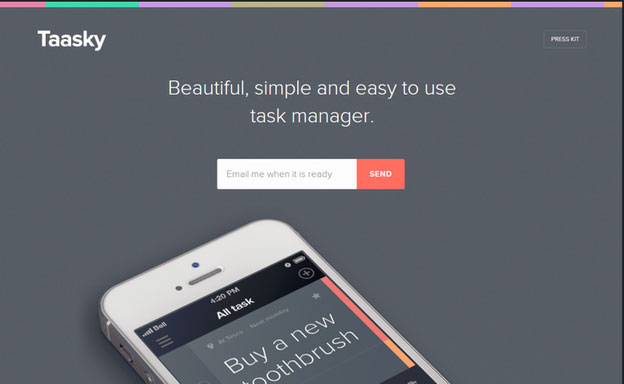
Taasky is a tech start-up that now makes a task managing app for iPhones. Prior to launching themselves a few months ago, they generated buzz through online marketing. They were hugely successful, and now have thousands of customers around the globe. Their clever marketing strategy included an email lead generating landing page.
What I like:
Overall, I like this landing page design. Maybe it’s the product that appeals to my geeky “to do list” type personality, but I emotionally appreciate this simple pre-launch page. (And I’m likely one of their target markets.) Here’s a few elements that make this page work:
The simple design – This design is clear of too many distractions. It visually tells what the product does and has minimal text to overwhelm the visitor. The simple branded header gives contrasting colours without taking away from the prominent “Send” button.
Whitespace – A key element in simple design is whitespace. This pre-launch landing page has enough whitespace to put the visitor at ease, and frees up the eye. The intent is clear, without clutter.
Clear, contrasting CTA – The CTA of inputting your email and clicking is clear. Great use of contrasting colours (red on grey) within a colour scheme.
Consumer centric CTA – They think of their customer in their CTA copy, by using the pronoun “me” (as in “Email me when it is ready”).
Link to Press Kit – I like the unobtrusive link to their press kit. It gives you, the consumer, both the feel like you’re important enough to get an exclusive pre-media look at the app, and it sleekly gives the opportunity to get more information (without cluttering the conversion landing page).
Image that tells a thousand words – Great use of imagery, with a iPhone showing how the product will work. For any iPhone user, this can create desire. The task they chose to use “Buy a new toothbrush” is common and super relatable to appeal to a wider market.
Creates intrigue – The landing page doesn’t give everything away. It shows enough of the product to create desire, but leaves the viewer with motivation to be the first to get it, or at least learn more.
What I’d change or test:
Every good landing page needs A/B testing. A few tweaks to a page, or even a complete redesign can increase conversion results, and generate tons more interest in your own product pre-launch. I like this particular landing page for it’s clean design, but there are a few tests I’d still run to optimize consumer motivation.
Colours – I’d test out the background colour. I get that grey is a colour of business and organizing. But I’d test out (sorry) another shade of grey, or even clean hue of yellow. I’d stick to colours that invoke a clean and simple emotional feel.
CTA wording – They could make the CTA button a little more inviting. Instead of “Send” I’d test out words like “Organize me” or “Keep me in the know”.
Exclusivity – As a pre-launch marketing campaign to their new product, I’d like to feel more special for being the first in line to try this new innovation. I’d test out additional tag lines like: “Be the first. Easy and simple to use task manager” or “Coming soon. A new way to organize your life. Sign up for updates now.”
List of benefits – They could try testing the inclusion of a list of three benefits. It may distract from the overall look and feel and simple appeal, but it could also tell a little bit more about the product, and how it’s going to make my life so much better.
#2 Pre-Opening Landing Page Template: Good marketing idea, but where’s the CTA?
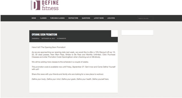
Definite Studio Fitness is a new small business. They’re a local fitness centre, offering a variety of classes. They opened a few months ago to some success. They did have an online marketing strategy, but as we’ll see a better landing page would have given them more success.
What I like:
From a marketing perspective, I like what Define Fitness is trying to accomplish with this page. They are building anticipation for their new location opening by pre-marketing it, and offering discounts for upcoming classes. However, the implementation of their online marketing campaign is, well, abysmal. There are a few things I do like about their pre-launch landing page:
Marketing promotion campaign – I love that this fitness studio is giving customers a discount to pre-register for class passes. They even identify specific target markets like “New Moms” and “Brides to Be”.
The clean design – The page is nice and simple. It clearly tells the purpose of the landing page. The title of the page is clearly “Opening Soon Promotion”.
Skimmable content – The landing page content is written with short sentences and short paragraphs. Their viewers might be more inclined to read the page, and feel connected because it’s not too wordy. Customers can skim the page, and even read it on their phone. However, there are many changes they should make to enhance this marketing page, such as the use of bullet points and visuals.
What I’d change or test:
There’s a LOT I would change about this landing page. There are so many opportunities missed on this page to: generate leads, get immediate sales, deepen the reach to targeted markets and more. I’d say this fitness studio understands marketing and how to launch a location opening. They just don’t know how to do it using online marketing and landing page templates.
There’s no Action to take on the page – This page is terrible because a viewer cannot immediately take the requested action. With no clear CTA button, this landing page is kind of – useless.
The message of the page is to tells people that they can use a promotion code when they are checking out. But there’s not even a link directly to the check out landing page. A customer has to be so motivated that they’ll copy the promotion code, search for the gym’s checkout page, select a class pass option, start the checkout process, and then paste the code to get a discount. Uh, you’ve just lost a ton of potential customers.
They should set up a distinct opening soon promotion landing page, with a clear (and clickable) call-to-action. Use contrasting colours to make that CTA stand out, and link it directly to a specific and unique promotional discount landing page. Use a coupon code as they have. Use a simple online coupon creator that’s visually appealing, and takes one click (and an email) to get the coupon. By making it super easy to get the discount. They’d generate a lot more interest -and immediate sales.
No visuals – Show me the benefits! Show me why I’d be interested! Today’s online marketing is about grabbing your viewers attention and holding it long enough for them to convert with you. Show visuals of a new mom having tons of fun and getting back into shape. Show visuals of a happy bride to be working out. Show visuals of the new studio. Show me something to get me hooked!
No Address – Show the location address of the new studio. People need to know this information before they sign up. The local address will attract more people in their neighborhood – who will be the customers at the gym.
Make unique pages for each targeted market – Ok, this might be a slightly advanced tactic for a company like this, who clearly want to be marketing online but just don’t know how. But, they could easily make a few unique landing pages to target each of their specified demographics. Why? They could then market to each group specifically to show the benefits of their membership. They could then use highly targeted Facebook Ads or Google Adwords to drive that niche market to their locally based landing page.
It’s marketing – the more personally you can connect with your customer, the more likely they’ll convert.
It’s easy to make a great landing page when you use a customizable landing page builder.
I could go on, such as:
- Making the CTA button clear and simple.
- Highlighting the dates of the studio opening.
- Invoking a sense of urgency by making the promotion end date more visual.
- Using more colours to make the promotion look exciting.
- Listing out the benefits of a membership.
- Having an easy way to collect emails – so the gym can keep in touch with prospects through email automation campaigns.
#3 Opening Soon Landing Page Template: Keep it visual and generate leads
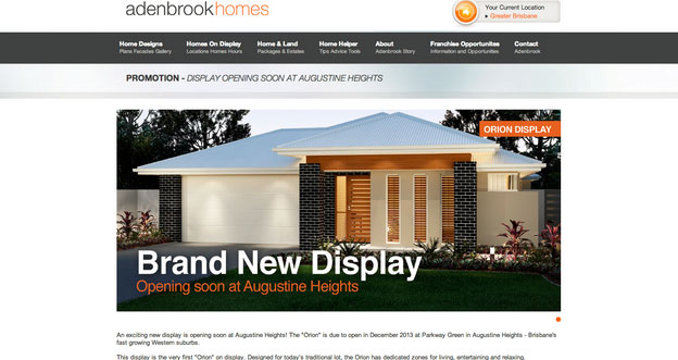
Adenbrook homes is real estate development company in Brisbane Australia. They created a website landing page to pre-market their homes and generate immediate sales.
What I like:
The concept of pre-marketing and pre-sales in real estate marketing is nothing new. It’s a common practice to start generating cash flow to a developer/ realtor’s budget – and start to create a buzz about the amazing new real estate properties for sale. This development company is using a landing page on their website as part of their marketing mix.
Visually appealing – On first glance, the visitor can see exactly what the page is about. The page shows a visual of the house exterior. The image has a text overlay clearly stating that it is a “Brand New Display” and that it is “opening soon”.
Contrasting branded colours – Both the “opening soon at Augustine Heights” and the “Orion display” button are contrasted to stand out. It also happens to be in their brand logo colours.
Clean navigation bar – The top menu bar is easy to navigate. Once a visitor has landed on this promotional page, it’s easy for them to check out the company website to get to know more about them and develop trust.
What I’d change or test:
This landing page could be improved to be much more exciting, generate leads and increase the pre-sale line up.
No Lead Generation – In real estate marketing, you’re selling one of the largest purchases of a customer’s lifetime. It takes nurturing, trust building and lots of informative communication. They could have generated tons of email leads by including a lead generating form. The form could be short, with just the requirement of the interested buyer’s name and email. Use trusting, no commitment type benefits for signing up, such as “Be the first in line”, “You’ll be the first to know about upcoming properties available” or “Sign up for our pre-sale membership list”.
Give a prospect the feeling of exclusivity. Show scarcity in your real estate offerings. Get leads and start an email automation campaign to keep generating buzz to create a buying frenzy.
More visuals to show the lifestyle – The visuals are alright on this page. But, they could generate a lot more excitement by showing the inside of this designer show home. Make the viewer fall in love with the house’s unique selling features by showing them on the pre-sale landing page.
List of benefits – The landing page tells that this house is an “Orion” design. That’s a great benefit, I’m sure. But, they need to translate what this means for potential homebuyers. Is it an award winning design? What are the features that make this design so great and livable? What’s so great about the suburbs? If these homes are marketed to a young family – list the outdoor space and open concept kitchen (for example). If these homes are marketed to investors – list the potential for rental income and property value increase.
Give the location – Ah, isn’t that “location, location, location” thing a real estate expression? They could extend the page below the fold (though I rarely recommend this), to show a map of the housing development location. Express the benefits of the area in that typical real estate way – you know “close to schools, great community, growing suburbs, etc.”. Show the location with pictures of parks, coffee shops, and so on.
Conclusion
Your pre-launch landing page is the hub of your online marketing campaign. Optimize your “coming soon” page to generate leads, take care of the landing page design and begin to send out those much needed lead nurturing email automations.
Read more about optimizing your landing pages:
- 25 Tips to Optimize Landing Page Conversions
- How to A/B Test your Landing Page to Maximize Conversions
- 7 Landing Page Mistakes that are Costing you Conversions
- 3 Plumber Landing Pages Critiqued with Optimization Tips
- How to Optimize your Landing Page for Lead Generation
Have you launched a new business? Promoted a new product? Or started your own start-up? What buzz generating tactics did you use? How many landing pages do you have on your business website? Do you use a landing page builder with marketing automation options?
P.S. Wishpond’s Facebook Contest Apps make it easy to create sweepstakes, photo contests, Instagram hashtag contests & more. Looking for inspiration? Check out 25 Creative Facebook Contest Ideas You Can Use Today.