Are you happy with your landing page’s rate of conversion? Or would you like more email subscribers, leads or sales?
Are you satisfied with your business’ online success and don’t think it could be improved at all?
If so, then you can turn right around and jump back into your jacuzzi of money. If not, then let’s get rolling on a few tricks of the conversion optimization trade.
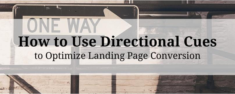
This article will break down four ways you can use directional cues to increase engagement and conversions on your landing pages.
I’ll introduce you to why these directional cues work and give you examples so you know exactly what I’m talking about and how you can find success for yourself.
Introduction to Directional Cues
You may have heard that your landing page traffic makes a decision when they first arrive on your page: “Am I going to check this out, or move on?”
The decision takes about three seconds, and it’s based on several questions your landing page visitor asks themselves (unconsciously, of course):
- Is this page related to the link I clicked?
- Is the page visually appealing?
- Do I know what this page is about?
- Is this page relevant to something I want?
These observations are answered by your landing page’s image, headline, and general formatting. Now, general formatting is pretty straightforward on most pages: make it appeal visually to you, and your traffic will probably agree (I say probably, as it all needs to be A/B tested first).
Your image and headline, however, are a bit more complicated. You need to communicate value and engage your visitor at the same time.
And that’s where directional cues come in. Directional cues are the things on your page that influence (unconsciously, again) where your traffic focuses its attention. And believe me, you want to be in charge of that focus.
Here are the four primary directional cues that drive focus in your landing pages:

Here’s how (and why) they can work for your business…
White-Space Cues
The human eye is naturally drawn to statistical outliers (think the tall man in a crowd of shorter people). This is similar to the concept of color contrast as well (something you can’t forget in your landing pages, but that’s a whole other article): when something is different from the things around it, we see it far more clearly.
This concept is also applicable in terms of white-space. When you put space around an object, that object starts to contrast with the area around it. The greater the space around an object, the more it stands out.
Like this:

Here’s an example of what I’m talking about in terms of your landing page:

Which CTA button (they’re exactly the same size and the same color) stands out most to you?
Ensuring your CTA stands out is one of the most essential (and elementary) requirements of an optimized landing page. We do it through color contrast, copy, and (now) we know to do it by implementing principles of white-space.
Eye-Direction Cues
Eye-direction cues use a bit of evolutionary psychology to increase your landing page’s conversions. Bear with me while I get a bit sciency on you:
Have you ever seen one of those prairie dog documentaries where the “lookout’ prairie dog makes a yipping noise to alert his prairie dog friends that danger is coming? They’re able, in an instant, to determine the exact place the lookout is looking.
Humans do the same thing. We’re incredibly good at determining where another person is looking (ilke to within a few inches from 20 feet away).
Eye-direction cues on your landing pages take into account the above evolutionary trait as well as our unconscious attraction to people’s faces. If your landing page includes an image of a person, that image will be the first thing that your traffic’s eyes land on.
And where that person is looking will be the second thing.
Here’s a real-world example from Kissmetrics:

Kissmetrics has used eye-directionality on their primary landing page for months now (which signifies to me that it’s working for them). They use it to draw attention to their USP, but it would be just as useful to draw attention to a call-to-action button, customer testimonial or benefit.
Arrows/Linear Cues
Linear cues are the most common directional cue you’re likely to see (especially on ecommerce sites and Facebook Landing Pages.
It’s not that your landing page traffic doesn’t necessarily engage or convert, it’s simply that they’re more likely to if you make it obvious.
Arrows/linear cues also include a pointed finger (though this comes across as pretty damn cheesy to me, but test it for yourself) as well as something subtle like this:
A subtle example from Salesforce:

I recommend you test out arrows and linear cues to direct attention to your CTA button (especially on Facebook Landing Pages when asking traffic to “Like” your Page to enter a social contest.
It’s likely that you’ll find more success with arrows that direct people’s behavior, rather than direct their focus. For instance, use them with “do this thing” rather than “look at this thing”.
An obvious example from Wordstream:

Arrow/Linear Cue Best Practices:
- Contrast the color of your arrows with the rest of the page, to make them more visual
- Test to see if your landing page traffic responds to an upward arrow or a downward arrow more (seriously, this stuff matters)
- Don’t use more than one arrow cue on any given landing page
- Have your arrow “jump off the page” as Wordstream has done to add dimensionality
- Put time into designing your arrows, as they have the tendency to make your pages more sales-y and louder. Test the understated approach (Salesforce) before jumping in with a large red arrow across your page.
Encapsulation Cues
Encapsulation, like white-space, is about drawing the eye where you want it in a way that people don’t recognize consciously. Encapsulation works by framing your focus-point. It cleans up your pages and helps to segment them into a hierarchy (based on color, formatting, contrast, and the directional cues above).
Here’s an (exaggerated) example to get the point across:

Encapsulation works at all stages of your website (not just landing pages). It makes your pages more professional and (in both mouse-tracking and eye-tracking case studies) proves to structure the behavior of visitors.
For instance, a visitor’s eye on a page without much encapsulation tends to travel around far more intensely, circling back and forth between focus points until they bounce. An eye on a page with encapsulation travels in straight lines between focus points, going from one to another and skipping the space in-between.
This is good, as you want your landing pages and website to have a natural structure. Ideally, something like this:
- First focus point: Image (catches the eye and speaks to our visual nature)
- Second focus point: USP or headline (communicates value and ensures the visitor knows they’re in the right place)
- Third focus point: Entry form (gaze travels here naturally because of the color contrast of a CTA, but the visitor doesn’t convert yet)
- Fourth focus point: Benefit list/subheader (communicates more value and explains a reason for conversion)
- Fifth focus point: Customer testimonials (encapsulate these as well, as they function as word-of-mouth marketing to convince your traffic)
- Sixth focus point: Entry form again (traffic is satisfied that engaging with your page/brand is worth it and completes their conversion)
Conclusion
Hopefully that’s given you a better idea of how directional cues can work to maximize your landing page’s conversions. They provide structure and focus to your page (and your landing page visitors like a structured page).
Remember to use only one of these strategies on any given page (except encapsulation, which I recommend for every part of your website). Don’t overwhelm your visitors with too much color and intensity or they’ll be intimidated and bounce.
Further reading:
- Which Visual Cues Work Best To Drive Attention? [Original Research] a great article from ConversionXL
- Landing Pages: The Science Behind Designing for Conversion
- Landing Pages: 5 Details that Make the Conversion Difference
- Optimizing your Landing Page Form Fields for Conversion
- Landing Pages: Using the Language that Converts
- The Complete Guide to Landing Pages