

You need more leads. You need more leads that are qualified and already engaged with your website or brand. Don’t you?
I’m going to offer you a (somewhat) controversial solution.
You guessed it – a website popup.
But not just any kind of pop-up (there’s 5 types of pop-ups you can use on your website).
In this article, I’m going to show you specific examples of exit pop-ups. Why? A well-executed exit pop-up can increase leads by 600% or more. That’s quite amazing if you think about it. If you’re currently generating say 100 new leads a week, a simple exit pop-up could net you 600 new leads. That’s 500 more potential prospects – just by adding a bit of code to your website.
For this article, I’ve compiled five of my favorite exit pop-ups. I’ll tell you what I like and what I don’t so you can implement and optimize your own exit pop-ups on your site.
What is an Exit Pop-Up?
First off, for those of you who’ve been living offline for months (is that possible?), exit pop-ups are one of the most common types of website lead generators. They appear on screen just when you visitor is about to (or has) bounced.
The point of an exit pop-up is to keep your visitor engaged and prevent lost leads just as that interested visitor is about to bounce on to some other site (maybe even your competitor).
A well-designed exit pop-up encourages a conversion or a further page view on your site. Let’s say someone finds you on your awesomely SEO’d blog article. While that person may be getting tons of value from your article, they likely don’t know much about your other pages – or even what your business offers. An exit pop-up directs that readers attention to your ask (whether it’s a newsletter sign up, ebook download or the chance to click on your product funnel page), before they leave your site into the internet abyss.
Let’s take a look at how top online marketers use them.
1. Exit Pop-Ups: Search Engine Journal
Search Engine Journal is one of the leading publications on all things search marketing – from paid to SEO to social media.
When you visit their site and are about to exit, you’ll see a pop-up directing your attention to something like this:
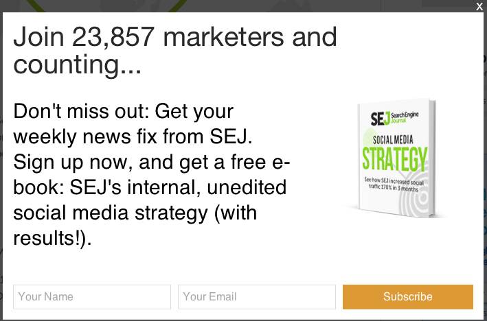
Their ask is to subscribe to the SEJ weekly newsletter.
What I like about the exit pop-up:
- Design wise, there’s lots of white space giving it a look and feel of trustworthiness (the image of a book supports trust/ authority too).
- The specific number (23,857) stands out, and shows social endorsement from peers.
- The CTA “subscribe” button stands out in the natural direction of eye flow – and it’s in a contrasting orange which drives both attention and action.
How the exit pop-up could improve:
- The text is too busy and the same. It’s not immediately clear what the offer is. They should use a smaller font and even a lighter shade of black for the specifics of signing up.
- The image doesn’t directly correspond to the offer – at first glance (and that’s all you get in pop-ups) it look like they’re offering a free book.
- They could have better directional cues, such as an arrow pointing to the CTA button, to drive attention to the action needed.
2. Exit Pop-Ups: KISSmetrics
KISSmetrics (and really anything Neil Patel touches) is chock-a-block full of pop-ups. He’s kinda the king of online marketing – and he knows what he’s talking about.
It was KISSmetrics that originated the negative ask option. Here’s the pop-up you see when you try to leave the homepage:
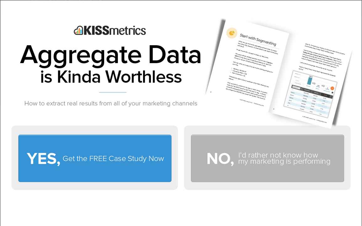
You can either say “Yes”, get something for free and be further along in the KISSmetrics funnel – or say “No” and be ignorant to your marketing results.
What I like about the exit pop-up:
- Hands down this pop-up is genius. Any marketing tactic to get your visitors saying ‘yes’ to small asks is brilliant. To compound it with a negative choice of staying the same or missing out is money.
- The design is clean and the copy is both easy to read and enticing to its demographic of marketers.
- The image corresponds to the offer making it understandable at a glance.
- The CTA color scheme is smart (and kinda funny), with the “Yes, Get the FREE Case Study Now” button in a contrasting blue, and the “No” CTA in a dull, fade away grey. It makes the viewer choice clear.
- The fact there is a choice, and to close the pop-up you have to click one of the two buttons. Choices make people feel empowered. An empowered consumer is a positive one.
- Additionally, a choice can leave a doubt in people’s minds if they did make the right decision or not. If someone said “No”, that choice can linger on in their minds and there’s more likelihood of them coming back to your site anyway.
How the exit pop-up could improve:
- Although the tactic clearly works (KISSmetrics would have A/B tested the daylights out of it by now), it is getting a bit dated, and possibly overused.
3. Exit Pop-Ups: Social Triggers
Social Triggers is an online marketing site run by Derek Halpren. The website itself has about four pages, with most of his thousands of leads generated through pop-ups.
Here’s what you’ll see if you click on his site and try to exit:
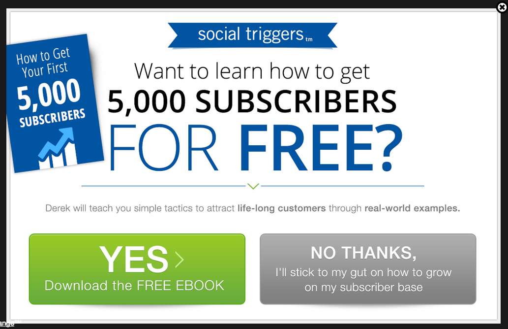
Looks familiar, right? Social Triggers uses the classic negative ask option.
What I like about the exit pop-up:
- Just like the KISSmetrics pop-up, this gives readers the empowerment of choice (and doubt). Brilliant marketing.
- The design is clean and simple, with large font and CTA buttons, making it easy to read and act upon.
- The copy provides obvious benefits of downloading the ebook – even including eye-catching numbers.
- The copy is personalized, by including Derek’s name – making you feel like you’re closer to knowing (and trusting) the online entrepreneur.
- The ‘Yes’ CTA button includes an arrow, which is psychologically more conducive to taking action than the comma after ‘No Thanks’.
How the exit pop-up could improve:
- This tactic seems like a copycat and has been used to ad nauseum. (But if it’s tested, tested and tested and still works….)
- I would A/B test the image placement to the right side of the box.
- I’d A/B test the book cover color image – it’s too much of the same blue to stand out at a glance. I’d test incorporating the green hex code of the “yes” button into the cover image.
4. Exit Pop-Ups: WP Beginner
WP Beginner is a WordPress resource site that aptly provides tips and hacks to the WordPress community.
Their exit pop-up a little unique as it shakes to grab the attention of exiting readers. It looks like this:
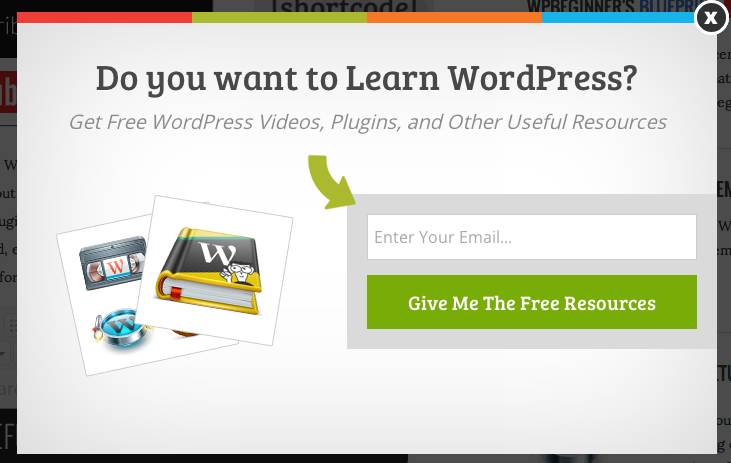
According to Conversion XL, these exit pop-ups (that are only on blog posts – not every web page) generated a 600% sign-up increase, gaining the company 445 – 470 new subscribers every day (their non-pop-up sign up rate was 70-80).
What I like about the exit pop-up:
- The clean and simple design makes it easy to convert.
- The headline is a yes/ no question, with the keywords “learn” “wordpress” capitalized for emphasis about the offer. Unconsciously or not, the reader will answer the question and it’s likely a ‘yes’ if they’ve just been reading about WordPress.
- The green arrow provides a simple, eye-directional cue to the pop-up ask of an email.
- There is only one form field, reducing the barriers to conversion.
- The CTA copy includes “me”, which has shown to increase conversion rates.
How the exit pop-up could improve:
- The design is pretty basic and looks as if it’s directly from a pop-up tool builder.
- The pop-up copy could be more compelling by telling how many other people (just like you) are already subscribed. This creates a greater sense of community.
- The CTA could be more specific. What particular “resources” will a sign-up get the reader? An ebook, a series of whitepapers, access to exclusive webinars?
5. Exit Pop-Ups: John Chow dot com
John Chow is a successful entrepreneur, blogger and author. His website is an award winning top Marketing Affiliate Blog.
When you exit certain pages on his site, readers will get this pop-up:
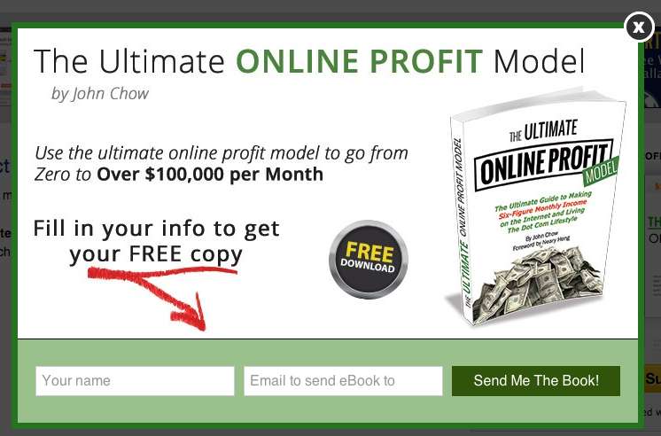
The clear ask here is to receive a free copy of John’s book, in exchange for a name and email.
What I like about the exit pop-up:
- The eye-catching design is composed with whitespace and conversion enticements in mind.
- The headline emphasizes the clear benefit of converting with “online profit” in a contrasting green.
- The benefit statement includes the powerful sell of making over $100,000 a month (emphasized through bold).
- The offer enticement is visually clear with a large image of the book cover and spine. It’s slightly open which gives the feeling of an actionable read – and also motivates taking action in the reader.
- The author’s name is clearly stated, making you feel like you could get to know the guy personally.
- Love the hand-drawn crayon arrow to provide directional cues to the form fields. This action oriented arrow motivates conversions – and would appeal to his market base of fellow affiliate, action-taking bloggers.
How the exit pop-up could improve:
- The design looks a little grainy, with the slight grey highlight of each piece of text. He could use a better pop-up builder (like Wishpond).
- He should A/B test the image of the “free download” button. This is likely not needed, and makes the design too busy.
- He could change the CTA copy to “Send Me My Book!” and test against the current “Send Me The Book” for conversion rate differences.
Conclusion
Whether you like seeing them or not, exit pop-ups are here to stay bening a very effective type of website popup. They work by generating tons more leads from your potentially bounced traffic. If you’re not working to catch your visitors before they leave you site – they really could be lost forever.
Try out a few of these tips from the top online marketing sites. See how you do.
And of course, with any online marketing, test, test and test again. A/B testing is a must to tweak and optimize your conversion rates – so you can most effectively connect with your target market.
Ready to get started with popups? Try Wishpond’s drag and drop Popup Builder today!
Further reading:
- Should you Use Pop-Ups?
- 5 Ways to Use Pop-Ups on Your Website
- 7 CTA Mistakes Killing Your Conversion Rate
- 25 Tips to Optimize Landing Page Conversions
- 25 Creative Facebook Contest Ideas You Can Use Today
Wishpond’s Facebook Contest Apps make it easy to create sweepstakes, photo contests, Instagram hashtag contests & more.
What do you think? Do you use exit pop-ups? What’s your conversion rate increase? How did you do it?