Is your landing page conversion rate lower than you expected? Could it be your page’s design that’s turning potential leads away?
You may be using overall best practices, but one simple design flaw can ruin your entire page’s conversion rate.
In this article I’m going to outline the 8 mistakes that I see most often in landing page design, many of which I made when I first started. I’ll also discuss why these mistakes are so harmful to your conversion rate and how they can easily be corrected. Lastly I’ll tell you the true secret to solving any conversion problem.
Lets get into it!
Landing Page Design Mistake #1: Too Much Text Makes the Page Complex and Uninviting
Don’t overwhelm visitors with information. If your page seems like an endless wall of text to a user, you will lose them before conversion. Yes, we want to educate page viewers on our offering. But too much text can make the page appear cluttered and hard to skim.
The landing page below is a perfect example of having too much text. The amount of information makes it nearly impossible to focus on the message the company is trying to deliver.
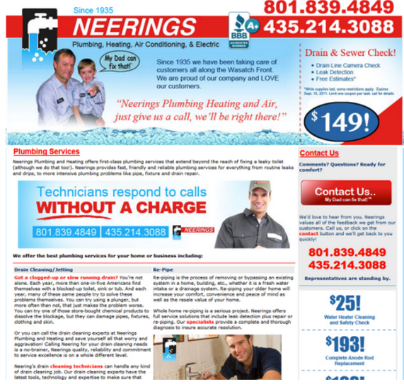
The volume of text on your page can immediately impact what visitors think of your offer. Don’t forget that you only have 5 seconds to convince viewers to stay on your page. If you don’t impress and engage them within those first 5 seconds, they will likely end up on the page of a competitor.
Display the benefits (not features) of your offer in a small blurb or bulleted list so that it’s easy for potential leads to quickly skim. These formats convey the same message as a longer paragraph in a more attractive way, increasing the readability of your page.
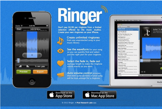
The Ringer landing page below uses minimal, organized text to clearly explain how potential customers can benefit from the App. The Information is presented in small easy-to-read sections, and the page appears clean and uncluttered.
The goal of a landing page is to provide potential leads with just enough knowledge to persuade them to take a single action. When combined with relevant, impactful images, less text will make your landing page more effective.
Landing Page Design Mistake #2: Lack of an Appealing Image Makes the Page Appear Undesirable
When a viewer arrives on a landing page they need something to stand out and persuade them to stay. The best way to make potential leads curious for more is to provide them with an enticing or appealing image. Lack of an image or graphic on a landing page makes your product or service seem boring and uninspiring.
The software landing page below is an example of how uninviting a page appears without a captivating image or background. Personally, when I look at this page I find it dull and unimaginative.

Images of people tend to perform the best as they make your page more welcoming and personal. As one study showed, a smiling person could increase your conversion rate by 102.5%. A smiling face puts potential leads in a positive mood, which positively impacts your conversion rate.
The landing page below is also for a software program, but the colourful picture of a smiling woman makes it instantly more appealing. An image makes a page more personalized, unique, and overall more interesting.

Landing Page Design Mistake #3: Lack of a Relevant Heading to Grab Visitors’ Attention
In addition to the image, the heading is what grabs visitors’ attention when they land on your page. Not having an informative heading leaves potential leads confused as to why they’re on your landing page.
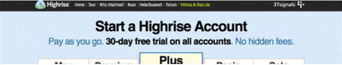
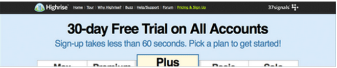
Below is a perfect example of how a heading affects conversions. There is nothing unique about “Start a Highrise Account” to make me excited or curious for more information. The 30-day free trial doesn’t stand out enough to entice customers to try out the service.
After A/B testing, the company tried out a new heading as seen below. Putting an emphasis on the free trial and the quick signup process increased Highrise’s conversions by 30%. Your heading and subheading should tell potential leads what you’re offering and the main benefit they’ll get from converting.
Some companies also make the mistake of failing to include their call-to-action in their landing page heading. Your heading is the first thing visitors read on your landing page therefore it should line up with the main goal of your call-to-action.
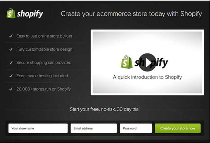
A great example of a corresponding heading and call-to-action can be seen in the Shopify landing page below. The heading stating “Create your ecommerce store today with Shopify” and the matching call-to-action button “Create your store now” produce a consistent message from top to bottom.
Landing Page Design Mistake #4: Your Call-to-Action Button is Hard to Find
I often come across landing pages where the CTA button is too small, blends into the background, or is competing with too much other information on the page. A call-to-action button should be hard for potential leads to ignore. In order to convert, they need to be able to easily find where to click to obtain your offer.
An example of a bad call-to-action button can be seen in the landing page from Perivolas below. Can you spot the call-to-action button in the bottom right? It’s small and barely noticeable as it blends in with the black background.
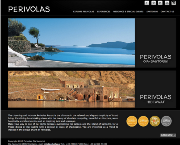
Many companies make the mistake of creating a button they think fits with the page aesthetically, rather than a button that will get them conversions.
Always ensure that potential leads can easily locate your CTA button on your landing page. You can give your button a 3D clickable appearance or even add a download arrow to the button as seen below, to give context to the action your lead is taking.

You can also use directional cues to guide viewers to your CTA. Arrows, lines, and line of sight are great ways to steer viewers to your CTA button so that it’s obvious where to convert. The arrows in the landing page below are a perfect example of using directional cues to attract attention to your button.

Using contrasting colors for your CTA button and landing page background is another great way to make your button stand out. The button should be larger than the other elements on the page so that it’s bold and stands out to viewers. The landing page above is also a great example of this design tip. The large, bright red “Create Resume” button stands out perfectly against the blue background.
Landing Page Design Mistake #5: Multiple Calls-To-Action Distract Potential Leads From Converting
The goal of a landing page is to provide potential leads with a single action to take. This makes it as obvious as possible what they should do. Having multiple calls-to-action can distract potential leads and reduce the ease of conversion.
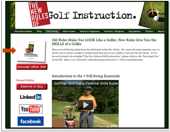
The landing page below is an example of having multiple calls-to-action. Asking customers to download an ebook, subscribe to a blog, and follow you on social media is not a single action for a potential lead to take. This company needs to decide the objective of this landing page and use one CTA to reach that conversion goal.
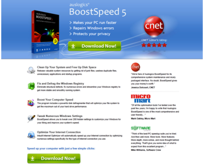
Having more than one button on your landing page can work to your advantage, as long as they’re working towards the same call-to-action and conversion goal. An example of this can be seen in Auslogic’s landing page below. There is one “Download Now” button above the fold, and one at the bottom of the page to make sure visitors don’t miss this conversion opportunity. There are no other distractions for visitors with these two buttons working towards the same goal of getting downloads.
Having multiple calls-to-action may confuse and distract visitors, causing your conversion rate to fall. One CTA means one goal, one action, and one result…a higher conversion rate.
Landing Page Design Mistake #6: Lack of Social Proof
Marketers often make the mistake of creating a landing page that doesn’t include customer testimonials or social proof. Endorsements by others can lead to a strong reputation as a trustworthy company, and make potential leads more comfortable converting.
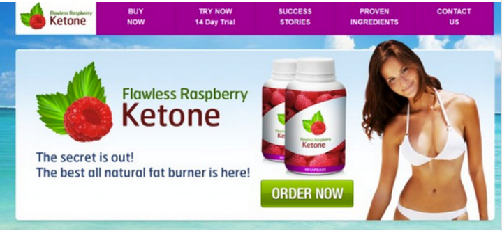
The landing page below states that Ketone is the “best all natural fat burner” but provides no proof of trust or credibility. Although there is an image of a fit model and a section labelled “success stories,” the landing page itself doesn’t give any evidence that its claim has been verified.
Reviews need to be actual quotes from real, relatable customers that have used your product or service. Having real people makes your page seem friendlier and can showcase the benefits of your product in a way you can’t explain with a bulleted list. When deciding what customer testimonials to use, ensure they’re specific, include a name and a face, and are believable. Endorsements from well-known companies or people are even better.
Check out these testimonials from Wishpond’s homepage:

Why do these testimonials work?
- They include names and faces of real customers, as well as the position and company they work for, proving credibility
- They are relatable to traffic arriving at the Wishpond landing page as they represent small to medium sized businesses in very different industries
- They both use specific numbers to show how they benefitted from the Wishpond service – 30,000 entrants for Diamond Candles in 6 weeks. These specific facts reinforce that these are honest, true testimonials.
Customer reviews show the value of your business to real, relatable people and can have a strong influence on your conversion rate. By showing credibility and social proof, potential leads will feel at ease trusting your business.
Landing Page Design
Mistake #7: A Lengthy Lead-Capture Form Turns Potential Leads Away
If you choose to have a lead-capture form on your landing page, you need to make sure it doesn’t scare off potential leads. A lead-capture form is often the source of a landing page’s problems, as companies try to gain too much information at once from potential leads.
A form like the one in the landing page below asks the potential lead for too much information, causing them to bounce before finishing. This form also asks for personal information that potential leads may not feel comfortable giving out online.

You should only ask potential leads for information that’s absolutely necessary. If you need multiple pieces of information you can also spread the form across several landing pages so you don’t overwhelm potential leads. For example, ask for their basics such as their name, and email on the first page, and then ask for the remaining fields once the visitor clicks “next.”
You want your web form to be as simple as possible to make sure people actually complete it. A recent study by HubSpot analyzed over 40,000 landing pages and actually found that conversion rates improved by nearly half when text entry fields were reduced from 4 to 3. This shows how even one additional field can lead to potential leads believing it’s not worth their effort. This study also found a strong negative correlation between conversion rates and the number of drop-down menu fields.
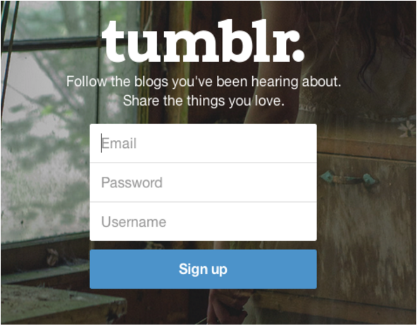
A great example of a web form from Tumblr can be seen below. In order to create an account they ask for just 3 simple fields; an email, password, and username. By limiting the number of fields, it takes a potential lead just a matter of seconds to sign up, allowing Tumblr to maximize their conversion rate.
If you need help designing your web form, check out 7 Best Practices for Web Form Design.
Mistake #8: Keeping Your Landing Pages Static
A common opportunity that so many landing pages miss out on is that they keep their landing pages static, where they could be adding interactive elements. If you have a video, a piece of audio content, or anything else that is not static, try to include this in an interactive format on your landing page.
We hosted a webinar with interactive landing page expert, Brenna O’Neill, from Genially. On this topic, she mentioned:
“Static pages and links make it very possible to lose your audience because they are going to leave your content. You might not get them back and they might miss out on the rest of the content that you have to share. We choose to focus on visual communication because the most important thing is what we see the most. This is thanks to interactivity, which is going to allow you to add a secondary layer of content. This means the user doesn’t have to seek out the content in order to view it.”
Interactivity makes your landing pages more visually appealing, it increases engagement, and it helps you boost conversions.
Check out your webinar for more information on using interactivity to create high-converting landing pages.
Conclusion
Your landing page must be appealing to potential leads and provide them with a painless path to conversion. A/B testing is the true secret to any landing page design. Continuously test the elements on your page to ensure they attract potential leads and steer them towards conversion. By avoiding the 8 design mistakes listed above, your landing page will boost your conversion rate to new heights. If you are looking for fresh ideas you can check out our post about nice landing page design.
If you want to learn more about landing pages or conversion rates be sure to check out the articles below:
- Landing Pages: Optimizing your Landing Page for Lead Generation
- 25 Tips to Optimize Landing Page Conversions
- 8 Landing Page Design Best Practices
- 7 Landing Page Mistakes that are Costing you Conversions