
Your call-to-action (CTA) button is one of the most important elements on your landing page or website. Think of it as the door to the next step of your marketing funnels, where every click is a potential customer through that door.
As marketers, we spend a lot of time thinking about the design of a page – the hero image, its layout, colors – and even some conversion optimization – the number of form fields, headlines, and such. Often, however, we skip over the CTA button, which can sometimes be the difference between a conversion and a bounce.
It’s easy to leave your CTA button saying “Submit”. But you shouldn’t. Your call-to-action should have a clear meaning, even if a visitor has only skimmed your page. The words in your call-to-action should be representative of the action your visitors are taking.
In this article, we’ll look at 46 CTA phrases and words that you can use for your own call-to-actions that will maximize your conversions and ROI, including explanations on when and why you should use each of them.
Let’s get right into it.
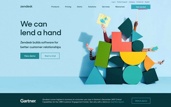
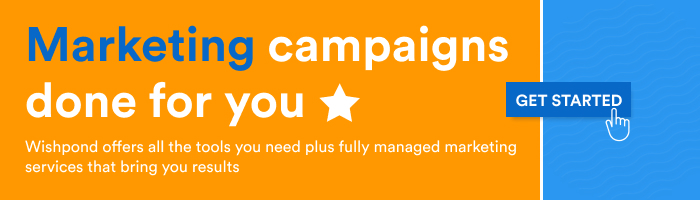
1. Get Started
“Get Started” is probably the most popular call-to-action in the SaaS business space, and with good reason.
It’s a highly actionable word that suggests your visitor will be able to move forward to using your product when they click.
If you’re not sure what call-to-action to use on your website or landing page, “Get Started” is a good go-to.
2. Sign Up Free
“Sign Up Free” is a pretty direct call-to-action that sets expectations for your visitors, letting them know they’ll be able to start using the service after creating an account.
Adding “Free” to the call-to-action makes it clear they won’t need to pay at this point in your signup process, increasing your conversion rate.
3. Create Account
A straightforward call-to-action, “Create Account” lets visitors know they’ll be headed straight to the account creation process, priming them to be ready to fill out a few forms.
Though it’s not the most appealing call-to-action, it can definitely help you increase the conversion rate of your signup page.
4. View Demo/Book a Demo
If your funnel is more sales-focused or sales-reliant, you’ll likely benefit more from sending visitors to your appointment or demo-booking page than to any other page.
If you have a prepared product demo, you can link to that, too.
Directing people to book (or view) a demo is a little more inviting than a call-to-action like “talk to a salesperson” or “contact sales”.
5. Contact Sales
Though it might be a little contrary to what I said in the previous point, sometimes you can afford to be more straightforward with visitors to your landing page or website.
A call-to-action like “Contact Sales” lets people know they’ll be connected directly to a salesperson through chat, call, or appointment.
6. Learn More
If your product needs a little more explaining, you might find yourself linking your primary calls-to-action to places like product tours or pages.
“Learn More” is an inviting way to tell visitors they’ll be taken to a low-commitment page where they can get more information about your product and how it works.
“Learn More” works well on popups, too. Since it’s hard to put an adequate amount of information on a popup, having a “Learn More” call-to-action for your visitors could push them to a page where they can get more details.
7. Join Free
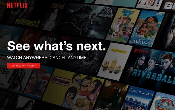
As I mentioned earlier, “Free” is a great “flavor” word to add to your calls-to-action.
Having a free product or trial is a huge benefit and can dramatically improve the click-through rate of your calls-to-action.
In this specific example, Netflix adds “for a month”, which makes it clear to a visitor that they can sign up for a 1-month free trial.
Setting accurate expectations on your call-to-action helps prepare your visitor for the next steps in your signup or purchasing process.
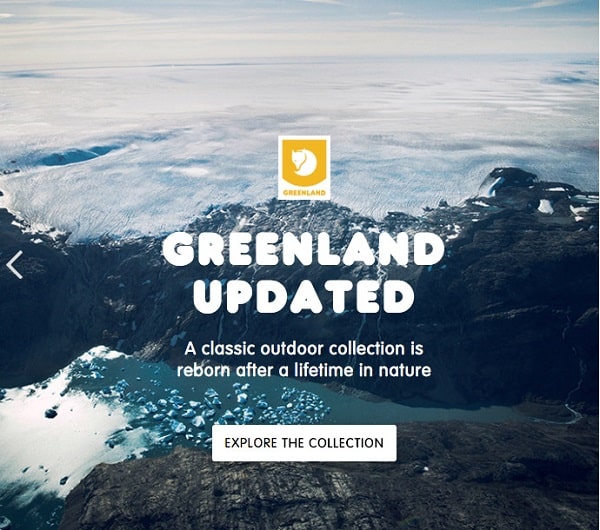
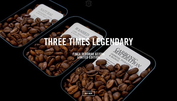
8. Shop Now
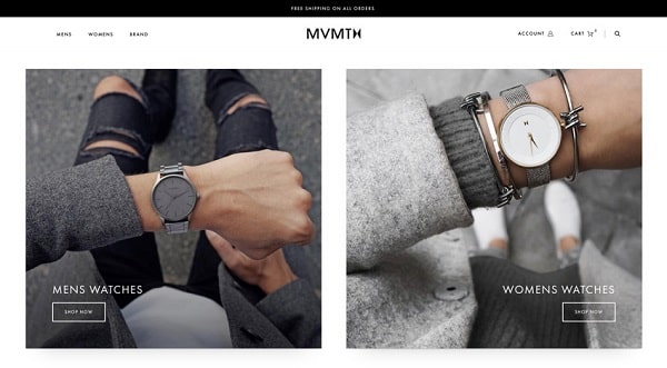
“Shop Now” is the “Get Started” of CTAs for eCommerce businesses. It’s as straightforward as can be and lets your visitors know that they’ll be headed to a product page or category within your store.
If you have multiple products or product categories, it’s not a bad idea to add the name of the product or category to the call-to-action – for example, “Shop Women’s” or “Shop Clearance”.
9. Explore
Though being straight-to-the-point isn’t a bad thing for your eCommerce CTAs, you can be a little more subtle by using “Explore”.
This is particularly great if your product pages act more like landing pages, giving visitors more information about your products.
10. Discover
Though it’s pretty similar to the previous one, I’ll include “Discover” because it’s a relatively common call-to-action for businesses of all kinds.
Again, it’s great if you’re sending people to detailed product pages or even things like restaurant menus.
11. Get X% Off
I’m a big proponent of discounts and promotions when it comes to marketing online. If you simply want to sell more, create a discount offer that gives people a % off their first purchase when they subscribe to your email list (or complete some other action, like following you on Instagram).
CTAs with numbers can be quite appealing, especially when those numbers represent discounts.
And having a promotional offer for first-time shoppers is an awesome way to incentivize them to become customers.
12. Add to Bag/Add to Cart
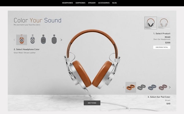
Why not cut right to the chase? Though this call-to-action text is pretty common on eCommerce product pages, some companies have started using “Add to Bag” CTAs on their product directories.
This essentially allows you to skip a whole step in your buying process, which could lead to higher conversion rates down the line.
13. New _______
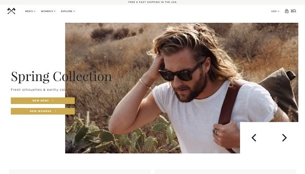
As you can see in this example, Shwood uses “New” instead of “Shop” to direct their visitors to product pages.
This call-to-action is less actionable than “Shop Men’s”, but it does help tell visitors that they’re shopping new arrivals to your store.
I’d be inclined to keep an action word in there – maybe “Shop New Menswear”. Your call-to-action represents an action, so making this clear to your visitors can make it more compelling to click.
14. Buy Now
Sometimes, it’s better to be direct. I like the “Buy Now” call-to-action in particular because, for a visitor, a lot of their intent is conveyed when they click.
A lot of the commitment in eCommerce purchasing can be overcome when a visitor clicks “Buy Now”.
15. Schedule/Book a _______
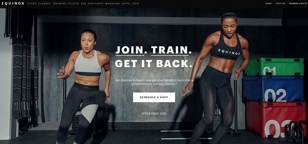
If you’re a service-based business, it can be tough to get any real commitment from your potential customers until they’ve learned more.
One good primary call-to-action, particularly for businesses like gyms, clinics, or auto repairs, is “Schedule a (Visit/Consultation/Assessment)”.
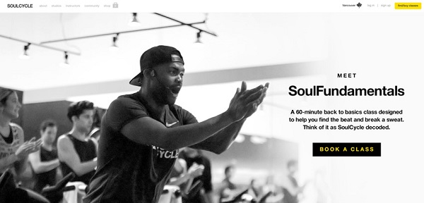
I’d recommend you connect this to a landing page or popup that allows your visitors to schedule a time to visit your business or where they can fill in information that you can use to contact them later.
16. Enter Now
If you’re running a contest, you never want to use the default “Submit” call-to-action for your form. Change it to something like “Enter Now!” to indicate the action your visitors are about to take.
17. Try for Free
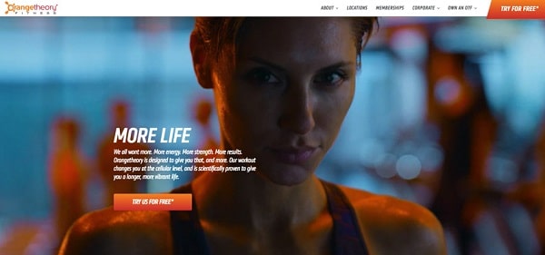
Even non-SaaS businesses can take advantage of a call-to-action like “Try for Free”. Often, it’s a good idea to get new customers in the door with a special promotion like a free class or trial.
This call-to-action makes it clear to visitors what they’ll be getting – a free introduction to your service or product without any commitment.
Use this call-to-action to generate leads, bring them in, and then sell them on your product later on.
18. Join _______
Social proof is a big motivator for a lot of people – they want to do what others like them are doing.
It follows, then, that CTAs like “Join 123,456 brilliant marketers” can be very appealing to visitors.
They feel like they’re becoming part of something exclusive and feel like they’re missing out on something if they don’t covert.
19. Subscribe
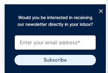
To get website visitors to subscribe to their newsletter, OfficeVibe keeps it to the point and uses that exact word on its CTA button.
This simple CTA lets people know exactly what they’ll get when they click the button to submit their email address – a subscription to an email newsletter.
If it matches your brand identity, a minimal call-to-action like “Subscribe” can still be an effective call-to-action.
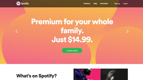
20. Get _______ Free
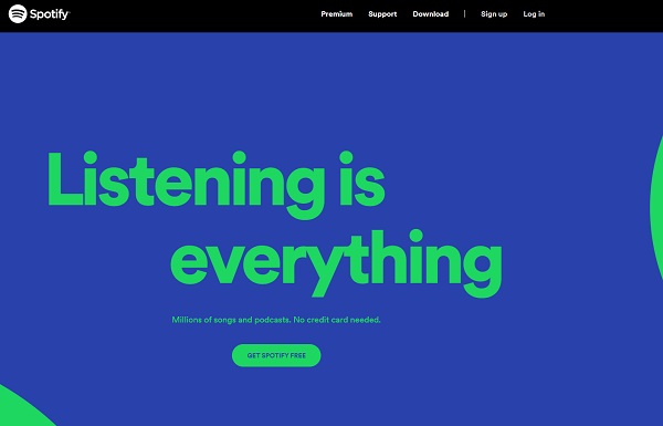
“Get Something Free” call-to-action phrases are a great way to appeal to a consumer’s desire to try products for free.
By offering a free account without requiring a credit card, Spotify has created an effective call-to-action phrase that increases the chances users take the desired action of signing up for its streaming service.
If you offer a free version of your product, highlight it in your CTA copy and use the supporting copy to tell your website visitors what they can expect.
21. Order Now
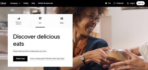
UberEats’ call-to-action phrase “Order now” is a good CTA because the “now” modifier creates urgency. It’s a simple phrase, which is what makes it such a great call-to-action, as it lets users know what the call-to-action button does and when you want them to take the action.
Another great thing about UberEats’ monochrome CTA design is that it helps its CTA buttons stand out.
22. Continue
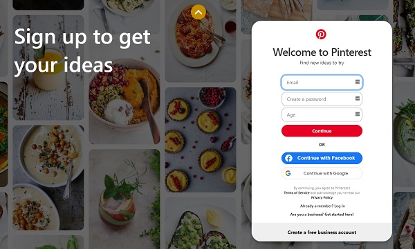
Pinterest’s use of the simple CTA “Continue” is another example of the supporting copy giving users context about what the call-to-action button does—in this example, continuing the sign-up process.
Pinterest also includes a secondary CTA, which lets users sign up with Facebook or Google.
If there are multiple steps users will have to take after clicking your call-to-action button, then “Continue” is the best call-to-action phrase for the job.
23. Start your free 30-day trial
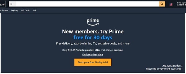
Potential customers love to try before they buy, but many are wary of getting locked into contracts if they forget to cancel the trial before it runs out.
To address this pain point, Amazon Prime’s call-to-action button encourages users to try it for 30 days without paying, while the secondary copy highlights the benefits, monthly costs after trial, and the ability to cancel at any time.
If your service has a trial period users can sign up for, highlight it in the call-to-action phrase to convince people to give it a try.
24. Get Your Free ____
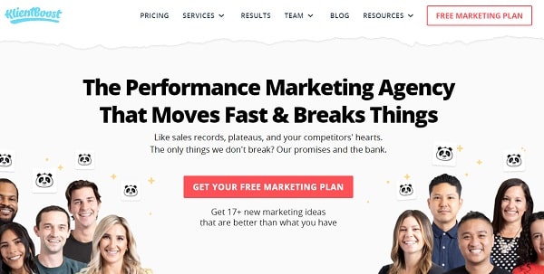
Do you want to generate leads with your CTA? Then a CTA phrase like KlientBoost’s is the perfect way to highlight your offer.
What’s great about this call-to-action is that it emphasizes that users are getting a free download, as well as what to expect from it, in this case, a marketing plan.
Try the “Get your free _” CTA phrase when you have a lead magnet that you’re promoting.
25. Try it
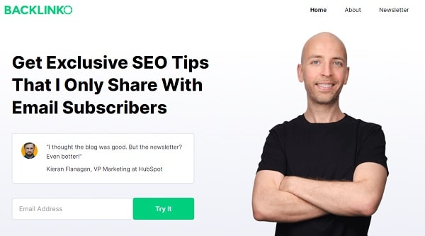
By using “Try it” as their call-to-action, Backlinko indicates to potential newsletter subscribers that if they don’t enjoy the newsletter, unsubscribing from it will be an easy process.
To remove any doubts that this newsletter provides valuable information, the supporting copy features a positive review from an experienced marketer.
If you have an offer that users can trial without being tied into a contract, consider the “Try it” CTA phrase to encourage sign-ups.
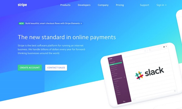
26. Start now
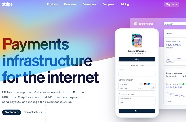
Stripe’s “Start now” call-to-action is a good example of a CTA phrase that uses the “now” modifier to create urgency.
The supporting copy lets users know what the product does, while the call-to-action indicates that the setup process is quick.
To add more value to those users that are still at the consideration stage of the sales funnel, the secondary call-to-action directs users to find out more about the product from the sales team.
27. See offers
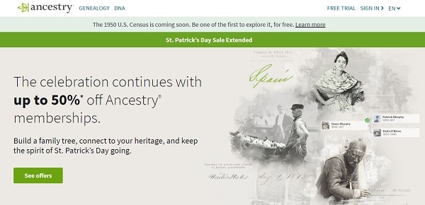
Ancestry.com uses the “See offers” call-to-action to encourage users to visit the sales page and find out more about the discounted membership deal.
By highlighting “up to 50%” in the supporting copy, users know what kind of deals they can expect while also letting them know there is more than one deal available.
If you have a selection of special deals on your products available, “See offers” is a great call-to-action to create interest among visitors.
28. Get Started For Free
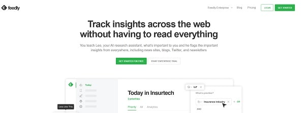
Feedly’s “Get Started For Free” is a classic CTA that lets users know that they don’t have to pay to try its product.
Using a bold green on the CTA button on an otherwise monochrome web page immediately draws attention to it.
As I’ve mentioned before, highlighting that users can try your product for free in your call-to-action is one of the best ways to encourage them to give it a try.
29. Start reading
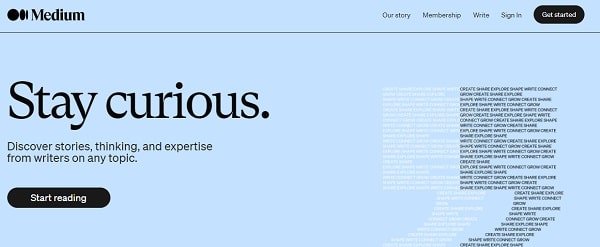
Medium’s “Start reading” call-to-action is a great example of how to let users know what to expect from the product when they click the button, with the supporting copy giving more details about it.
By using a minimal design with few other distractions, visitors’ eyes are immediately drawn to the supporting copy and call-to-action button, encouraging more click-throughs.
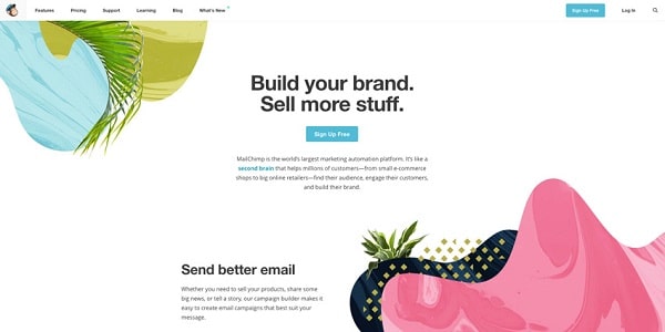
30. Sign Up
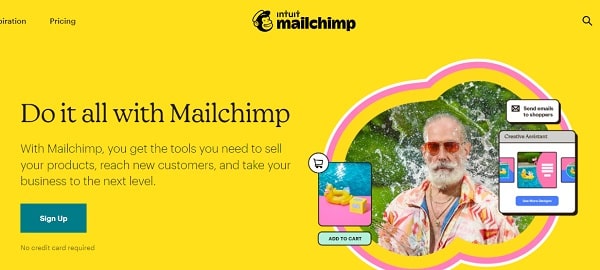
Mailchimp’s simple “Sign Up” call-to-action is simple and to the point, with the supporting copy explaining exactly what users get when they sign up.
By using a blue that pops against the yellow background, the CTA button stands out from the rest of the page.
31. Analyze Website
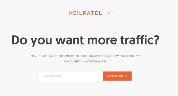
Neil Patel uses the power of short but bold supporting copy to create interest in his offerings and explain to visitors what will happen if they click the “Analyze Website” call-to-action button.
This web page is also a great example of how using a bold color on an otherwise monochrome page helps the button pop out at visitors.
If you have a tool that can provide a service for your users, let them know the benefits of using it in the supporting copy and describe what it does on the call-to-action.
32. Yes, show me
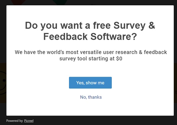
As I’ve mentioned before, using a color on the call-to-action button when the rest of the page is monochrome is a great way to draw attention to it, just like Qualaroo did here with its blue “Yes, show me” button.
They also follow the best practice of letting users know that they won’t have to pay to try their product.
Finally, there is a secondary call-to-action for those users that aren’t at the end of the customer journey yet but might want to find out more about the product.
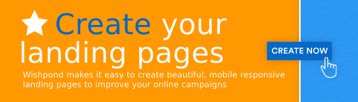
33. Book a demo

Wishpond’s “Book A Demo” is one of the best CTA phrases to use if you need to walk potential users through your product rather than letting them try it out for themselves.
While the call-to-action lets users know clicking it will let them schedule a product demonstration, the supporting copy lets them know what to expect from the product.
The fact that they’re using contrasting colors on the button makes this an even better example of a great call-to-action.
34. Start my free trial
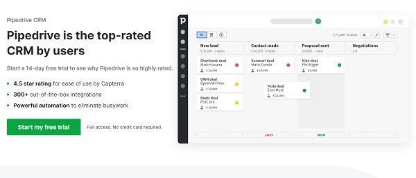
Pipedrive’s “Start my free trial” combines two important psychological principles into one great call-to-action.
First, it includes the tried and tested “free” modifier to highlight that users won’t have to pay to try the product, and second, they use the “my” modifier to personalize the call-to-action.
Finally, what makes this such a good call-to-action is that the supporting copy highlights features and that you get full access to the product without needing to give your credit card details.
35. Start growing today
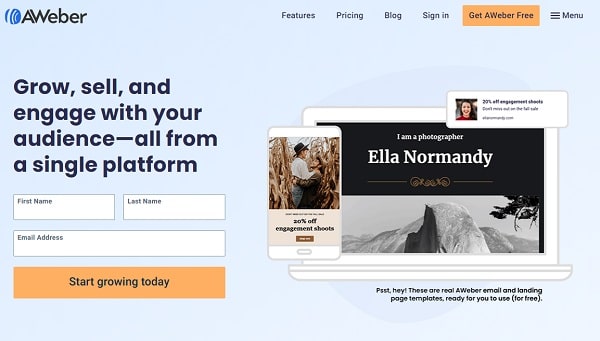
AWeber uses an interesting strategy on their call-to-action, with the “Start growing today” phrase letting users know what will happen to their business if they start using the platform.
To give a bit more context to the call-to-action, the supporting copy goes into a bit more detail about what one can expect from the platform.
36. View demo
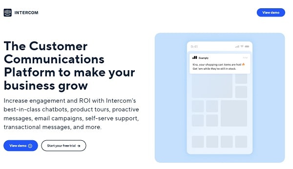
Intercom’s “View demo” is a great example of a call-to-action that lets users know they can expect a product tour if they click the button.
But by including the “play video” icon on the button, it visually informs the user that it is a video product tour and not a scheduled demonstration with a member of the sales team.
For users further down the sales funnel, they also include a secondary call-to-action that lets users try the product for free.
37. Make an Enquiry
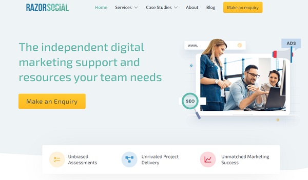
Razorsocial’s “Make an Enquiry” is the perfect call-to-action for businesses like theirs that offer a service rather than a product.
In this case, the supporting copy explains to users what kind of services they can expect if they get in touch via the call-to-action button.
38. Download
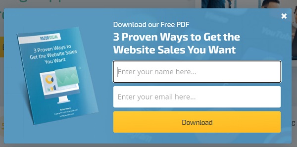
Razorsocial’s “Download” call-to-action on their lead magnet pop-up is a great example of a simple design that quickly conveys to users what they’ll get and how, in this case, a PDF they can download.
By using a bright yellow on a dark blue background, the call-to-action button jumps out at users, encouraging them to click it.
39. Grade My Account
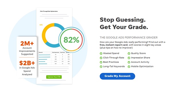
Wordstream’s “Grade My Account” is another example of a call-to-action that uses supporting copy to help inform users about what they’re getting, in this case, a report on their Google Ads performance.
For those interested in this report card, the CTA phrase “Grade My Account” gives them clear directions on how to get it.
CTA “Add-Ons”
Let’s end up this article with a few words you can use to spice up your CTAs. These are words you can combine with the above to maximize your conversion rates.
40. % or $
When you’re promoting a discount, adding the offer itself into your call-to-action is an awesome way to draw people in. “Save Now” isn’t nearly as compelling as “Save 20% Now!”. Adding numbers to your call-to-action makes your discount feel a little more tangible to your visitors.
41. Try
Like I mentioned in tip #17, the word “Try” is inviting because it feels low commitment. Adding this to your free trial or free class offer call-to-action buttons is a good way to get people in the door.
42. Now
Calls-to-action is aptly named – it signifies action, and adding “now” to your CTA buttons is an awesome way to reiterate that. Psychologically, they push visitors out of indifference (it’s easy to ignore a call-to-action) and into a state of mind that they need to convert on your page – now.
43. Free
In today’s world of eCommerce, every CTA button can feel like a purchase commitment. If your offer is at all free – think free trial, assessment, consultation, or what have you – this is a word you need to have in your CTA buttons, as it assures visitors there’s no downside to clicking.
On top of that, people love free stuff – they have nothing to lose by clicking, so why not convert?
44. Save
This word should be a staple in your discount or offer CTAs. Whether it’s a sale or a % off coupon, you can use the word “save” to signal to visitors that they’ll be saving money if they click and missing out on potential savings if they don’t. I prefer a call-to-action like “Save 10% Now” compared to something like “Get Coupon”.
45. Me/My/You/Your
One thing that’s common between most CTAs is that they can feel impersonal. Using pronouns or determiners like “me” or “my” can turn a call-to-action into a personal call-to-action, increasing a visitor’s emotional or cognitive connection with your button. For example, “Download Ebook” pales in comparison to “Download My Free Ebook!”.
46. Start/Stop
Words like “start” and “stop” are also great for successful CTAs. They work in a ton of contexts – for example, a gym might use “Start Changing Your Life” as an emotionally-driven CTA phrase. The word “stop” can also be very powerful in the right contexts – for example, Wishpond might have a call-to-action for its popup tools that says “Stop Wasting My Website Traffic!”.
Related Content
- 7 Call-to-Action Examples and Proven Conversion Boosts
- 6 Design Tips to Make Your Calls-to-Action Stand Out
- 7 CTA Mistakes Killing Your Conversion Rate
- 7 CTA’s to Generate Leads from Your Blog: Placement
- Ranked: Best and Worst Locations for Your Call-to-Actions
- 7 Facebook Ad Call-To-Action (CTA) Copy Formulas
Wrapping It Up
There you have it – 46 proven call-to-action phrases and words that you can use for your call-to-action buttons. Avoid common CTA mistakes and use the right words – it will have an enormous difference.
Know of a CTA phrase that I missed? Let me know in the comments below, and don’t hesitate to ask any questions.
Share
![]()
![]()
![]()