
Ah, the art of the capture.
Whether it’s user data or a simple clickthrough, nothing can solidify a lead into a conversion like an awesome landing page design. Of course, there’s always the question of what works best. Possibilities are endless. Yet in the face of such overwhelming choice, one should feel unencumbered—liberated, in fact, in deciding the best approach.
This article will dissect 10 landing pages, giving you the pros, cons, and actionable insights of each.
Let’s get started.
1. Awesomeweb
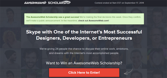
Awesomeweb’s landing page focuses on visibility, and has a very cool fade to white effect upon an initial scroll. All of the typography contrasts nicely and is easily legible as well. On the other hand, the initial typography and encapsulation is so distinct it makes the page look a little too busy.
Pros: Great legibility. Great use of scrolling effects.
Cons: Too much contrasting typography and coloring confuses the eye.
Actionable insight: Be careful with how many different sized colors and fonts you use as, rather than focusing attention it may end up looking overwhelming.
2. Gxap by wpSuper
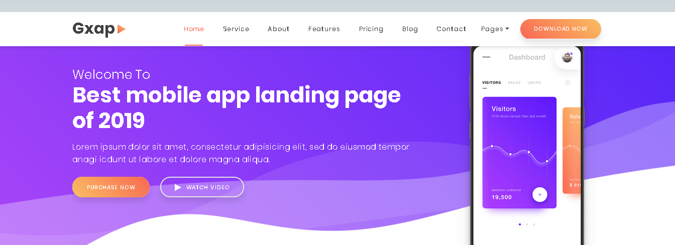
This high-quality template is developed to attain multiple business goals. Its modern design has every single element to bring awareness to your content. Stylish typography mixed with a well-structured layout makes it possible for your brand to stand out from the competition. To cut a long story short, it is intended to increase the number of your visitors and improve sales.
Pros: Four types of the homepage with different types of hero section.
Cons: Some may find a color palette of the website to be too screaming.
Actionable Insight: Take advantage of all possible customization options to make sure your website improves your brand image and presents it in an individual manner.
3. Lintense by ZEMEZ
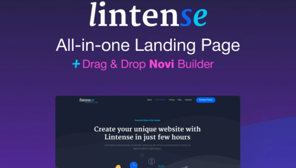
Lintense is a striking landing page template which aims at adding credibility to your brand. Its oversized typography contributes to the overall visual feel. In addition to this, the design is clean and uncluttered, stripped to only the necessary elements.
Pros: 7 ready-to-use templates for different business niches; Novi Builder included.
Cons: Its color scheme may be too vibrant for some users.
Actionable Insight: Make certain to take advantage of various extra plugins included in the package. They will not only add some advanced functionality but engage more visitors.
4. Boulevard
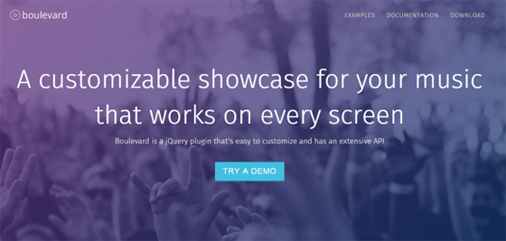
This landing page does a wonderful job of putting a user at ease with the soft color scheme. It piques interest with simple, legible typography and a compelling message, as well as an easily visible CTA. The page could, however, use a sense of dynamism. The full page background is okay, but a slider with rotating images could be used to further engage user attention.
Pros: Great color choice, imagery relevant to the offer, and well defined typography/CTA.
Cons: The page comes off as static,it needs some movement to engage user attention.
Actionable insight: Strike a balance between subdued imagery and eye-catching elements to highlight your CTA.
5. Envato
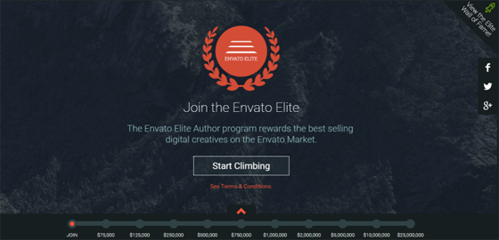
I have mixed feelings on this one. My initial impulse is always to scroll down but this landing page requires visitors to scroll upward to learn more and then backd own to opt in. It’s feels a bit like trying to driving on the wrong side of the road or writing with your off-hand. Weird.
On the other hand, scrolling upward is definitely different, and the aesthetics are gorgeous. The way each box seems to pulse into place is really quite elegant, and the bottom bar tracking progress keeps you from wondering how high you’ll have to climb. The social buttons at the side are perfectly placed as well. Easily visible, but not overbearing.
Pros: Very unique presentation which will increase brand recognition.
Cons: The CTA placement is something I’d test, rather than implement straight away. Having it at the bottom feels odd.
Actionable insight: Always direct user flows towards a CTA. If you’re going to be different, test it first.
6. Zapier
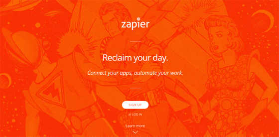
The appealing comic book style full-page illustration for a background beneath simple and appealing copy puts Zapier’s offer front and center. Details are listed in clean minimalist fashion right below the fold. The offer is explained in sufficient detail, without being too much to take in.
Pros: Unique color scheme and imagery displays distinctive brand personality. A slider with pictures for testimonial is a really smart touch; it makes the praise of your company seem humanized rather than the usual disembodied text.
Cons: No matter where you scroll on the page you’re cutting either the top or bottom of an image or message.
Actionable insight: Make sure your page matches your brand persona and keep your page segmented into easily visible sections.
7. Impact
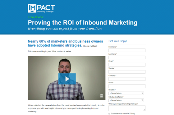
Impact uses video to deliver the content curation company’s USP, and immediately presents a supporting detail for the importance of its offer with an easily trackable statistic, complete with cited source. This is a refreshing break from traditional landing pages that’s completely unique to Impact’s brand persona.
My one criticism would be that the “Free eBook” CTA could be a little larger. Beneath the logo and above the heading it can be easy to miss.
Pros: Nontraditional presentation plus awesome video USP, effective use of whitespace, and proper branding techniques.
Cons: Actual offer is difficult to find or engage with.
Actionable insight: Make sure your main offer is visible, and don’t be afraid to experiment with the unfamiliar
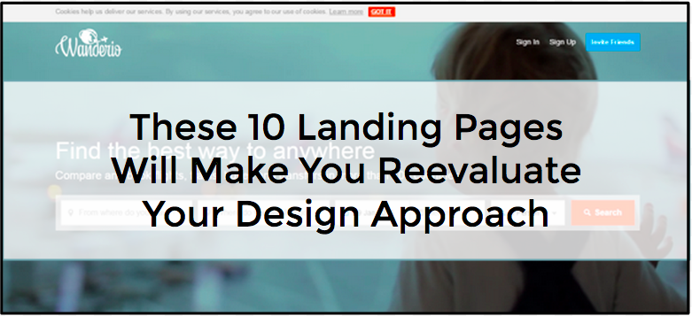
8. Wanderio
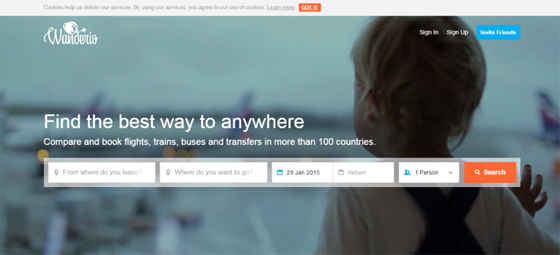
Obviously, ambient video is in full effect, but perhaps more interesting is that this page goes straight for the jugular, asking you to use its service before anything else. Account signups also sit inconspicuously in the upper right corner, help options are likewise immediately visible, and then below the fold you have your copy displayed in short, legible blurbs.
I think it would benefit them to change the placement of the feedback above the “Available on Wanderio” section, which doesn’t add anything useful to the design.
Pros: Ambient video, immediate offer, and minimalist navigation cues.
Cons: Poor order of elements below the fold.
Actionable insight: The “use first, signup later” tactic is a great way to get people involved with a B2B or SaaS offer.
9. MilsDev
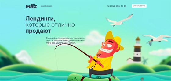
One big problem I can see with this page is I can’t read Russian. Other than that, it’s pretty solid. Among other things, the layout and user flows both hang together attractively, and the object of the landing page is never in doubt, nor difficult to provide. Milsdev’s landing page provides an accurate picture of its services in a highly consumable package.
Pros: Imagery, animations, intuitive user flows, etc.
Cons: It’s not internationalized
Actionable insight: This site should serve as a clear sign of how effective one-pagers can be for user engagement
10. Basecamp
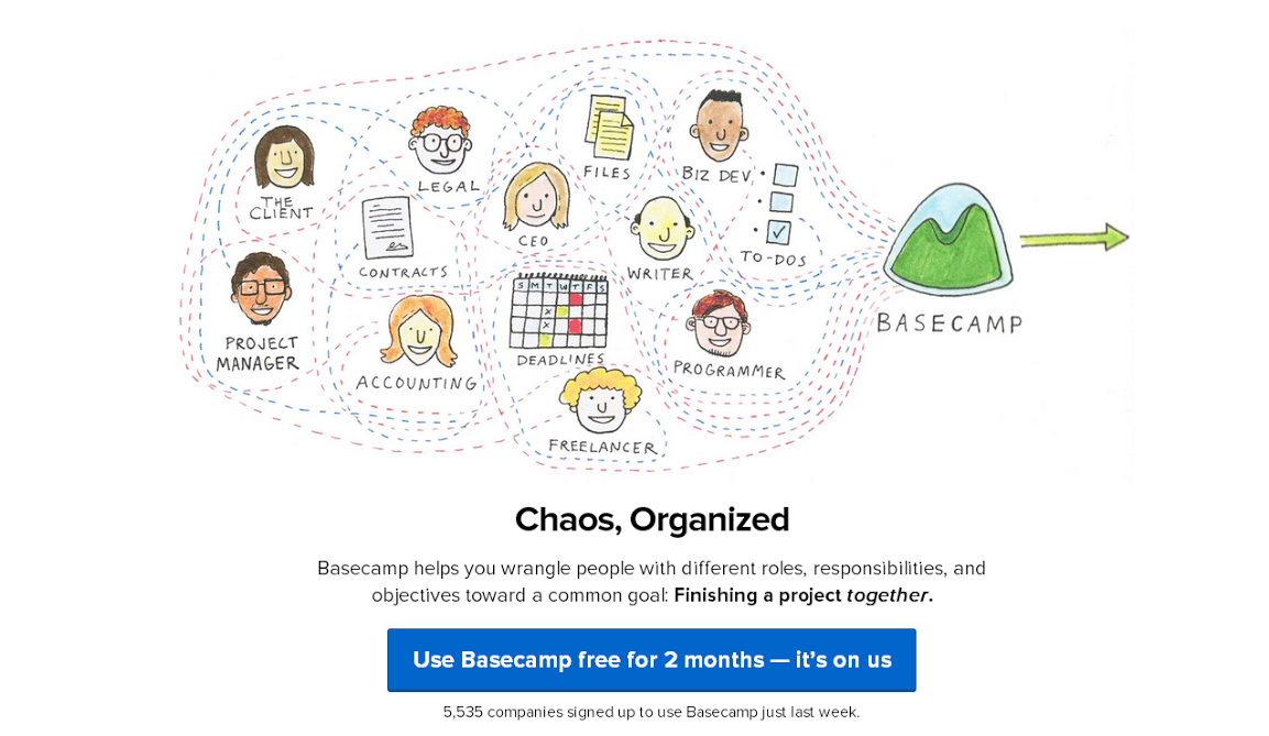
Great use of comic strip-style art, offset by liberal use of whitespace. This gives the page a lighthearted feel. Unfortunately, the white space around the illustration is inconspicuously clickable, which can surprise a user when they suddenly find themselves on a new page inadvertently.
Pros: Cool art and excellent use of whitespace.
Cons: Unexpectedly clickable.
Actionable insight: Be careful with what you decide to make clickable, unexpected navigation can alienate your users.
Conclusion
That’s 10 premium landing page design examples. Which did you think were most effective and why? Let me know in the comments.
About the author:

Zack Rutherford is a freelance copywriter. Combat sports enthusiast and poetic soul, Zack endeavors to create beauty through syntax, sentence structure, and the liberal use of hyperbole. Follow him on Twitter (@zack_rutherford) or visit his website (Zackrex.com) to read all of his innermost thoughts and unfounded opinions.