
It hasn’t been long since Google announced that they would be adding mobile-friendly websites to their list of must-haves in SEO. With this change came a gigantic shift in the direction of mobile marketing, one that was a long-time coming. This has made it necessary to make everything in digital marketing more mobile-friendly, including your email marketing strategy.
According to a study by Venture Beat, 65% of emails are opened on mobile phones, and that number will only continue to grow as mobile technology advances. This information, in combination with Google’s algorithm update, makes it even more important to focus your email marketing strategy on mobile optimization.
Here are 7 tips to get you started.
1. Use Short Subject Lines
Everything is going to be smaller on mobile, and that should include your subject lines. As a general rule, subject lines for mobile emails should be 40 characters or less, but still entice your audience to open the email. This might present a challenge for writers, but it can and must be done!
2. Stick to a Single Column Template
To learn the value of this tip, take a look at major news sites, such as the New York Times. Their website features several columns, which is extremely popular for websites, and it works successfully on a desktop computer:
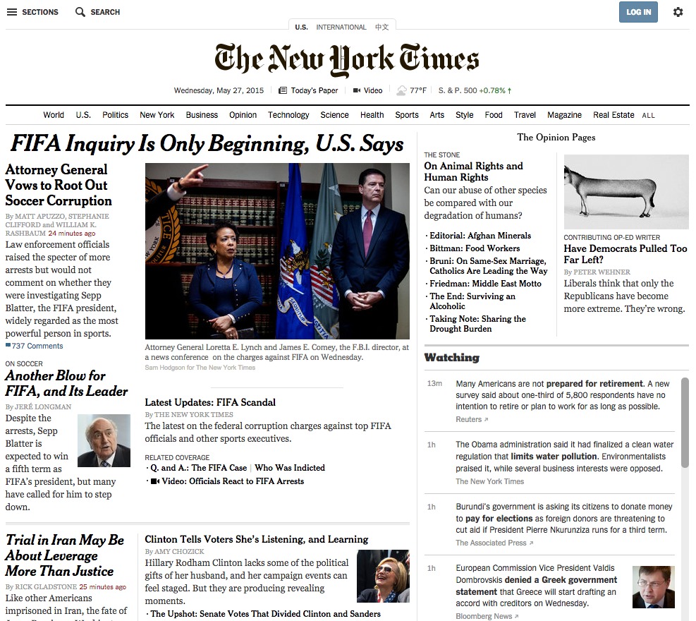
Now, look at the mobile version of their website:
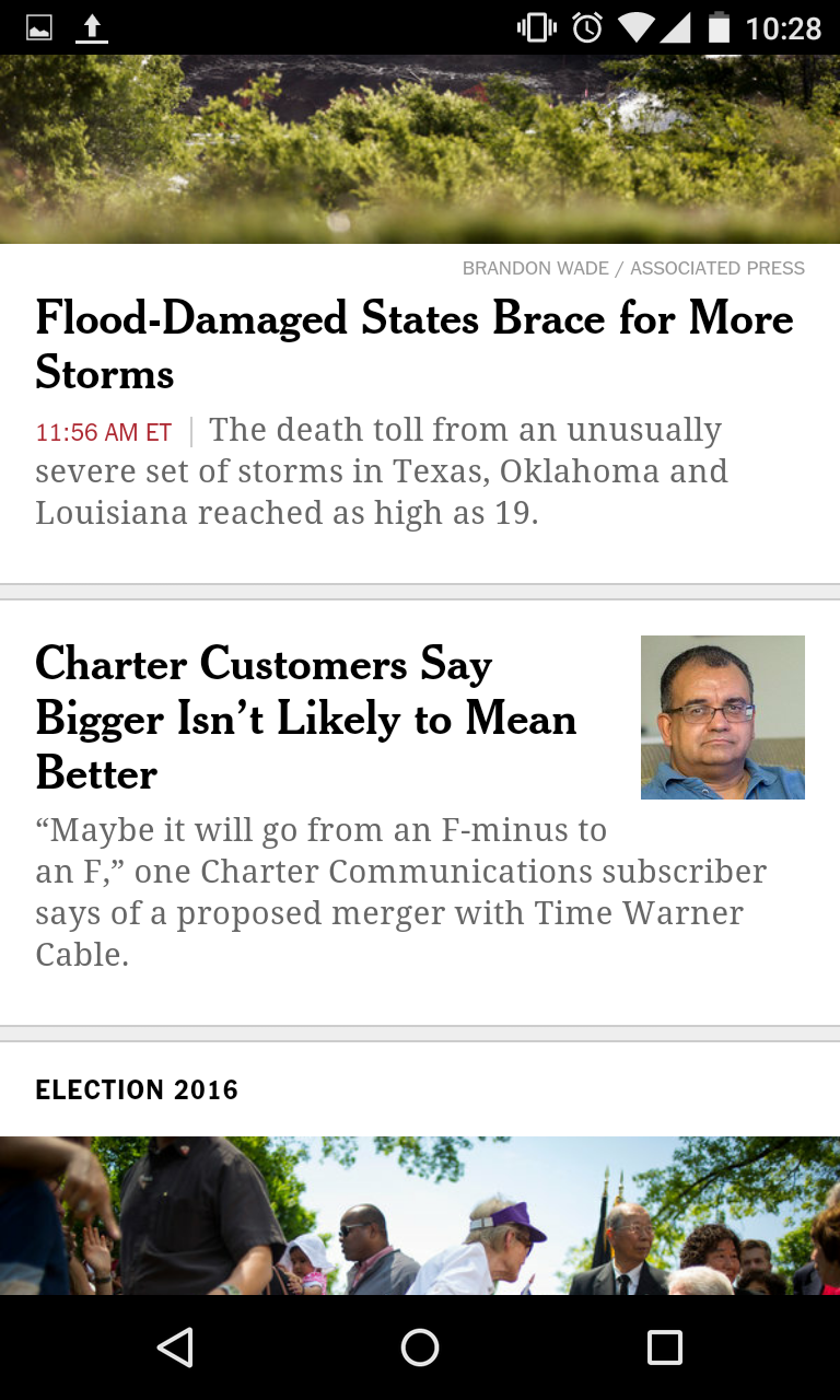
There is only one column and it features handy sidebar navigation. The web designers knew that they couldn’t shrink all those columns into a small mobile screen, so they simply did away with them and used a single column instead, which is the best option for mobile.
3. Make It Small
On a mobile device, your emails can be no larger than 600 pixels wide. That’s not a lot of space, so you need to pool your resources and shrink your content so that it loads quickly on the tiny screen.
Mailchimp, an email design reference, offers a few suggestions for doing this:
“We try to follow the mantra ‘one eyeball, one thumb, and arm’s length. This means that, on a small screen, an email should be easily readable with one eye, […] any links and calls-to-action usable with one thumb, and any text or visual cues large enough so that all of the above can be done comfortably at arm’s length.”
4. Integrate Imaging
Just like in traditional email marketing, consumers respond better to emails with images. However, in your email, you should avoid adding more than one image, and the image should be compressed for optimum loading. Your largest image should be no more than 640 px wide so that it will fit on all mobile screens. Anything bigger than that will significantly slow down loading time and frustrate the consumer.
If you have an image that you want to use, but is too big for the screen, that doesn’t mean you can’t use it. You’ll just need to use an image-compressing site to make it an appropriate size. For a list of useful imaging resources, see our “199 Social Media and Content Marketing Tools.”
5. Have Calls to Action Stand Out
Since you don’t have a lot of space, make it count with a noticeable and enticing call to action. A call to action is meant to tell customers to take the next step and visit your website, contact you, or perform any other business-minded action you wish. The font of this feature should be quite a bit larger than the text of your email and speak to your audience in a voice they understand.
Furthermore, a call to action generally leads your consumer to your website. Since they will likely be opening the email on a mobile phone, they’ll open your website on a mobile phone and it needs to be optimized for mobile use. If your website hasn’t had any mobile upgrades, it will be slow and disjointed on the mobile screen, and your consumers will abandon the task.
6. Make Links Clickable
Your email should include links that direct consumers where you want them to go. However, if you stack links or make them too close together, it will be difficult for the reader to click on the one they want to visit. If they’re too close together, a clumsy finger could click on the wrong link, which is frustrating, to say the least. Try to space out your links so that the consumer doesn’t have this problem.
7. Cut Down Content
Finally, be extremely concise with your content. Nobody likes endless scrolling when they’re reading an email. Challenge your writers to fit as much information into as few words as possible. Once again, this is a difficult prospect, but it’s been achieved with success!
The reader’s experience is your number one priority, and making your email marketing strategy more mobile-friendly is the best way to do that right now.
However, that’s often easier said than done. Sometimes you need a little help to get your email marketing strategy off the ground, and that’s where we come in. We are a close-knit, marketing aid that can help you gain the knowledge and skills you need for marketing success. For more information about the products and services that can help you, visit our website today.
Author Bio:

Larry Alton is an independent business consultant specializing in social media trends, business, and entrepreneurship. Follow him on Twitter and LinkedIn.
 amir
amir