

So you’ve set up your landing page, started paying for ads, and now you’re ready to sit back and watch the money roll in. Wrong! Setting up a landing page and driving traffic is only half the battle.
Now’s the time to start considering how you can start squeezing more value out of each visitor. Now’s the time to start thinking about conversion rate optimization.
One strategy that can be extremely useful in the process is called A/B testing. A/B testing is the process of showing two slightly different variations of a landing page to the same audience in order to determine which variation converts the best. Differences in variations could include changes in headlines, images vs text, background colours, etc.
In case you’re stumped for ideas, here are 10 A/B testing ideas to help you get started.
Test #1: Add a picture of people
As humans we like to see other people. It helps establish trust and builds rapport with your traffic. If your landing page consists of colors, text and objects, consider adding a picture of a person in the forefront of the page. Pages with pictures of people have been known to increase conversion rates by over 300%.

Real-world case study of this A/B test in action:
Kissmetrics profiled Medalia Art, a online art distributor trying to increase conversions on their ecommerce website. By changing the thumbnails of the artists from a picture of their art to pictures of themselves, they were able to achieve a 95% increase in conversions.

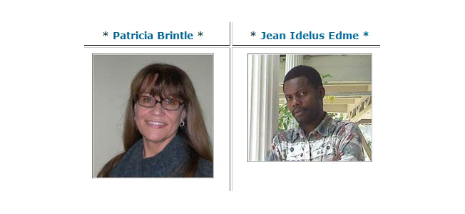
Source: https://blog.kissmetrics.com/boost-conversions-using-images/
A/B testing is only one the five strategies we’ll be covering in our upcoming webinar “5 Strategies to Double Your Growth” by our resident conversion expert Bree Nakatani. For more information on that webinar and how you can attend, find out here.

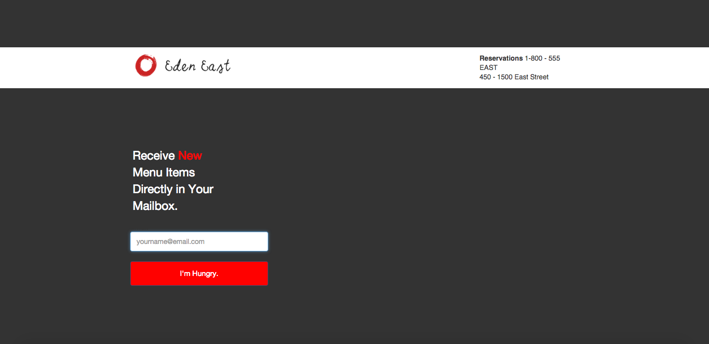
Test #2: Use an Image instead of a blank background
Sometimes simpler is better, other times it’s not. Depending on what your product or service is, a subtle background image can be a great way to set the tone of the page while still keeping the focus on the form. If you’re currently using a landing page with a blank background, try adding a background to one of your variations and see how that affects conversions.

Test #3: Add an explainer video
No matter how good your copy is, sometimes people just don’t feel like reading. Adding an explainer video can be a great way to showcase your business in a much more engaging way. Also, by adding an explainer video you can often cover a lot more material in a much shorter period of time than it’d take to write (and your traffic to read) it all.
Real-world case study of this A/B test in action:
Crazy Egg was able to increase their conversion rate by 64% simply by explaining how their business works in a different way.
Source: Quickspout
Test #4: Change the placement of testimonials
On a landing page, often where an element is located can be just as important as the element itself. In the case of a testimonial, showcasing social proof on different parts of the page can help users make the decision to trust you especially when they’re considering entering information into your form. Change the placement of testimonials above and below your form to see how that will affect your overall conversion rate.
Real-world case study of this A/B test in action:
By A/B testing the placement of testimonials above and below the form on contentverve.com, the marketing company was able to increase their conversion rate by 64%.
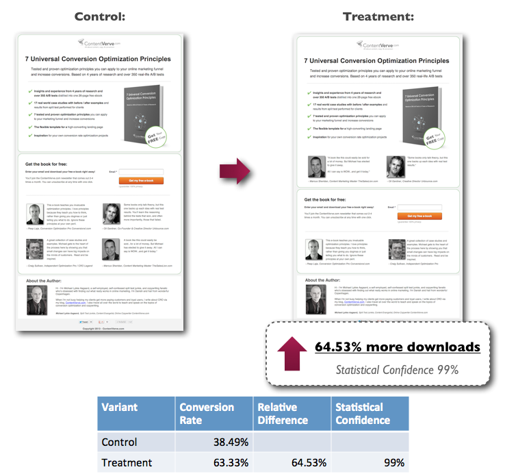
Source: https://contentverve.com/case-study-testimonials-landing-page/
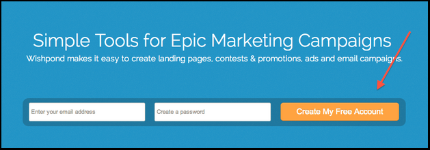
Test #5: Change the colour of your CTA
There’s a big connection between colour and human psychology. Red is associated with action and intensity and blue is associated with trust. Play around with the colour of your CTA and see if that will have an impact on conversions.
Top Tip: Try and make your CTA stand out by making it a contrasting colour compared with the rest of your page.
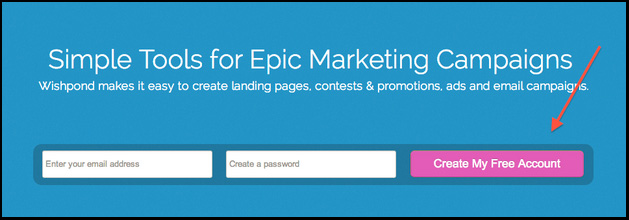
Test #6: Change your CTA (Call-to-Action) Button Text
Starting with something like “Submit” and changing it to “Get Started Today” can make a huge difference when optimizing a page for conversions. Play around with different word combinations and see what works best for your page. If you’re stumped, check out our article on the 25 best words to use in your CTA’s.


Test #7: Change your headshot
If your landing page includes a photo of yourself, consider testing multiple images in order to see which one converts the best. Depending on your audience, sometimes a more professional image isn’t always better. Try variations of professional looking photos against more casual images to determine whether it’s YOU that’s reducing conversions.
Real-world case study of this A/B test in action:
Speaker and Marketer Carl Taylor tested two images of himself on an event page to see which one would draw more signups. To his surprise, the more laid back image converted at 76.72% higher than the more professional image.


Source: https://blog.leadpages.net/9-embarassingly-easy-split-tests-boost-conversions/
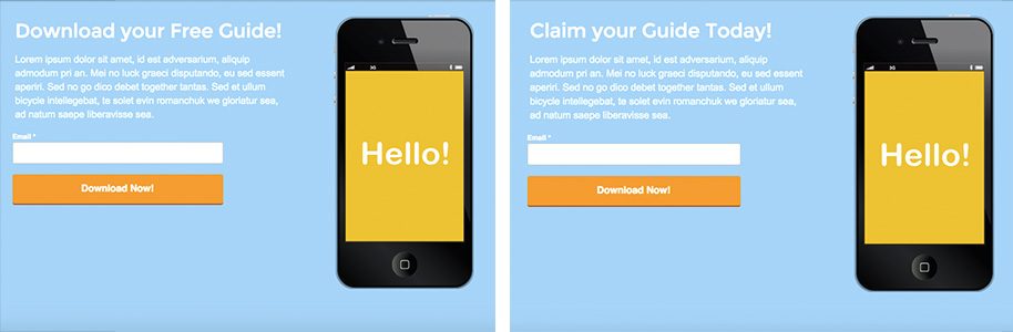
Test #8: Change your headline
When people arrive on your landing page, often the first thing they see is your headline. Try testing different variations of headlines to see how phrasing an offer can affect conversion rates.
Test #9: Arrange or Eliminate Formfields
As a marketer, you want to collect as much information as you can from your leads in order to determine the best way to nurture them into sales. But there’s a fine balance between getting the information you want and intimidating leads with too many form fields. Test rearranging form fields and eliminating non-essential ones to see how that impacts conversions.
Real-world case study of this A/B test in action:
Marketer Neil Patel regularly uses lead capture forms in order to collect information from users interested in online marketing. His forms consisted of four fields:
- Name
- URL
- Revenue
Neil tested removing the revenue field to see how that would affect his conversions. Upon testing he discovered his conversion rate went up by 26% on the variation that had that field removed.
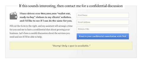
Source: https://www.quicksprout.com/2013/01/14/11-obvious-ab-tests-you-should-try/
Test #10: Change the Typography
Typography can be one of those areas that’s easy to overlook. But changes in font can have a major impact on the overall tone and readability of your page. Adjust typefaces between serif and san-serif and try different combinations of font sizes, line spacing and colours. For information on typography and conversions, check out Wishpond’s chief graphic designer and UX expert’s article: “Designing for Marketers Series: Crash Course on Typography”

There you have it: 10 A/B testing ideas to help you start optimizing your campaigns today.