
Satyendra Singh, of the University of Winnipeg, conducted a 2006 study on color in marketing. Her study’s abstract says it all:
”Color is ubiquitous and is a source of information. People make up their minds within 90 seconds of their initial interactions with either people or products [and] about 62-90 percent of the assessment is based on colors alone.
“So, prudent use of colors can contribute not only to differentiating products from competitors, but also to influencing moods and feelings – positively or negatively – and therefore, to attitude towards certain products. Given that our moods and feelings are unstable and that colors play roles in forming attitude, it is important that managers understand the importance of colors in marketing.”
#25. Red
Red is connotatively associated with excitement, urgency and passion. While it can be associated with negativity and mistakes (think of your homework being graded), it also attracts the eye better than any other color. Because seeing it causes the heart to beat faster, it (genuinely) tricks the brain into thinking time is moving faster than it is. This can cause us to act rashly, or when we otherwise wouldn’t.
Here’s an example of red in marketing from Canada Sports Betting:

How you can use this psychological factor for conversion rate optimization:
- Be cautious with red, as people find too much of the color intimidating, forceful, and pushy.
- Use red to draw attention to parts of your site, like around a Call-to-Action or selling point.
- Red is a useful color to contrast with professional colors (like dark grey, blue and dark green).
#26. Yellow
Yellow is associated with happiness, friendliness and light, but can also be related to illness and quarantine (and when joined with black is the universal symbol for poison).
But there’s no getting around the fact that yellow is one of the most eye-catching colors. Be careful with it, however, as it can be visually aggressive – particularly when used with white or another bright color.
Here’s an example of yellow in marketing from (who would have thought) Yellow Pages:
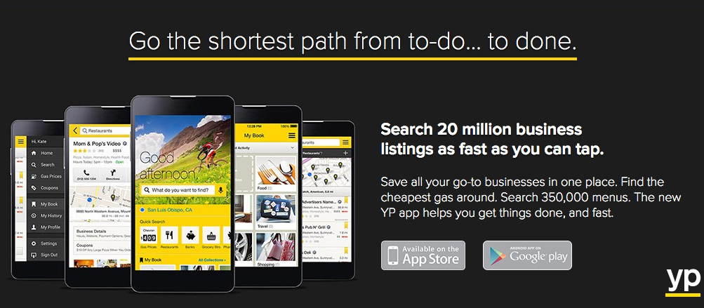
How you can use this psychological factor for conversion rate optimization:
- Yellow should exclusively be used as an accent color (as you see above) and should always be dominated by a calmer, darker color.
- It works effectively to draw attention, so use it with the continuation factor to direct focus. Yellow Pages use above – underlining their brand logo, USP, and to draw attention to their app – is a great use of the color.
#27. Green
Associated with environmentalism as well as wealth, green is the easiest color for the eye to process. Green also signifies positive action (think “green means go”) and affirmation. It’s also a calming color, as green (on the plains of Africa) meant water and safety.
Green is the second and third most-popular color among men and women respectively.
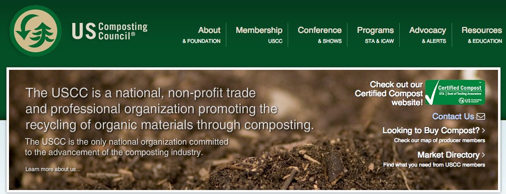
Here’s an example of green in marketing from the US Composting Council:
How you can use this psychological factor for conversion rate optimization:
- When you’ve approved something (like a payment or lead information) use green to indicate the affirmation. This will make people feel better about themselves than any other color.
- Use teal with a social offer or discount code to communicate value.
- Use green as a CTA color against a dark blue or black background.
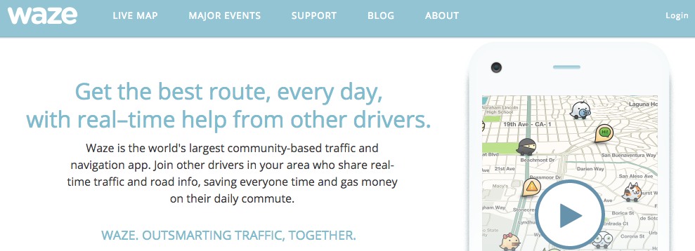
#28. Blue
The favorite color of both men and women, blue is associated peaceful, clean qualities. Lighter blue is associated with calm, while darker blue connotes professionalism and sincerity.
It’s an incredibly popular color (which doesn’t make it bad). It’s perceived by both businesses and prospective customers as having serious, conservative qualities.
That said, light blue (in particular) is associated with youth (think babies, robin eggs, or easter in general) and is often used by startups or app developers.
Here’s an example of blue in marketing from traffic app Waze:
How you can use this psychological factor for conversion rate optimization:
- Blue is used by many of the largest computing companies (think IBM, HP, Dell, Facebook) because it symbolizes intelligence, efficiency and logic. If your business wants to communicate these emotions, consider blue as well.
- Avoid using blue on the Facebook platform (in your posts or ads) as it (along with the white of your post/ad itself) will blend into the current color scheme of Facebook itself and users won’t see it.
- If you’re selling food, don’t use the color blue as many people associate it with illness and mold. Blueberries being a notable exception, there is very little blue in nature, and, in tests, people often refuse to eat perfectly healthy food that’s been dyed blue, or feel genuinely ill after doing so.
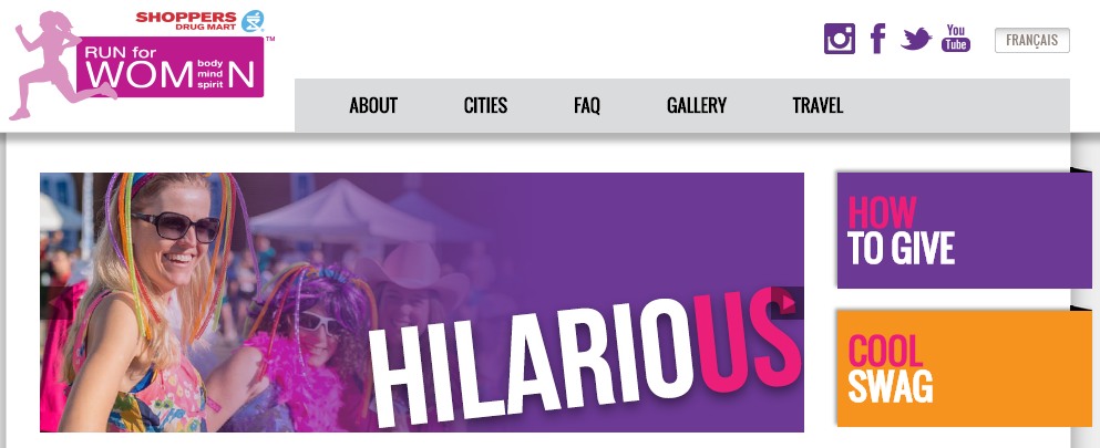
#29. Purple
Associated with calm, femininity, and wealth, purple is the second most popular color among women, at 23%. Interestingly, as women get older, their liking for the color purple increases. On the other hand, purple is the favorite color of 0% of the male population.
Dark purple often symbolize luxury and wealth, while lighter shades often come across as childish or naive.
Here’s an example of purple in marketing from the Run for Women:
How you can use this psychological factor for conversion rate optimization:
- If your target demographic is aged 60+ use only purple, white or blue.
- Bank on purple only if your target demographic is women, as it’s men’s second-least-favorite color (behind only brown).
- Avoid light purple (or pink) unless you’re target market is young girls.
Color psychology is largely based on culture, and, in the Western Culture, purple is still associated with girls (particularly by boys and men). Until that changes, nor do recommendations of how to use it in marketing.
30. Black
Powerful, sleek and intellectual, black signifies permanence, sincerity and sophistication. While black can, like red and orange, be a dangerous color if used too much, it also communicates professionalism, sophistication and formality.
Use black in conjunction with white or a solid, clear, color. Avoid greys or tans as they’ll wash out your message.
Note that every other color used will look brighter when put on a dark background – particularly black.
Here’s an example of black in marketing from Mercedes-Benz:
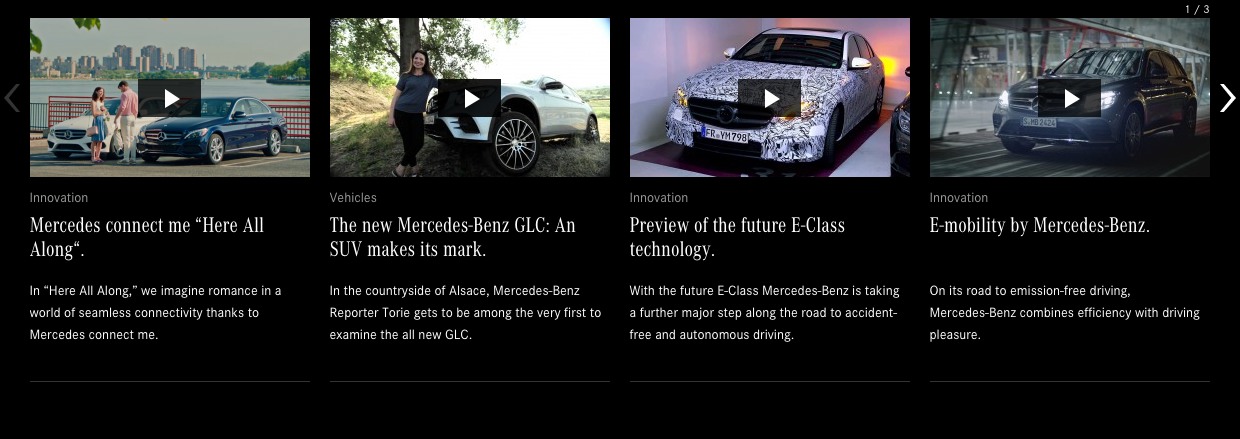
How you can use this psychological factor for conversion rate optimization:
- Black should be used if your company is looking to create a sincere brand profile. Steer clear of it if you want to promote your business as youthful, fun or engaging (except, of course, as an accent or font color).
- Black should be the dominant font color, particularly against the bright colors of a CTA.
#31. White
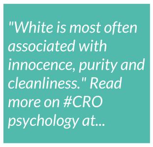
White is most often associated with innocence, purity and cleanliness, but can also communicate sterility and cold (think hospitals)
It also communicates peace (white flag) universally and, in China, is the color of mourning (whereas black is the color for weddings/births).
White often communicates simplicity or a clean, modern quality. Designers seeking a minimalist aesthetic will frequently use a lot of white.
Here’s an example of white in marketing from Apple:
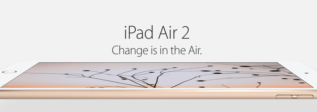
How you can use this psychological factor for for conversion rate optimization:
- White is clean and modern. Designers looking for minimalism (particularly companies who do design themselves) should consider white.
- White is the alternative font color (it’s hard to use color in font online, as different computers display color differently, often resulting in a clash).
Further Reading on The Psychology of Color:
- The Psychology of Color in Marketing and Branding
- Understanding Color Psychology for Impactful Web Design
- Infographic Design
Next Chapter