Is this the first time you’re hearing about Wishpond’s landing page series? Check out the intro article here.
Previously reviewed: Plumber Landing Pages
In 2014, 43% of people searching for homes looked online first.
Google is the place people go to search for properties and information about them.
If you’re creating ads on Google, you want them done right so you can generate qualified leads for your real estate business. This includes not only following the best practices for ads but also optimizing landing pages.
In this article I’ll detail exactly what you need to put together a killer real estate ad and landing page combination.
Before we jump into the critiques, we’ll go through some best practices for creating an all-around effective campaign for real estate.
We’ll start with the ad since it’s the first action the web user takes on your campaign.

Here are 9 best practices for creating ads for real estate on Google:
- Use Google Keyword Planner to see which keywords you should use for your ad campaign. Learn more about how to use Google’s Keyword Planner.
- Use “Search Network Only” when setting up your AdWords campaign. This is ideal for real estate businesses.
- Use the headline of the ad to describe what makes your property different than your competitors. Is it an amazing view? An unbeatable price?
- Make sure the headline of the ad matches the keywords the user searched (this is very important)! You can achieve this with Dynamic Keyword Insertion (DKI).
- Include some copy about what makes your offer unique.
- Use ad extensions to increase the space your ad takes up on Google. It can also give users different options. For real estate professionals, I would suggest using call extension and sitelinks.
- Pay close attention to location and language targeting so your ads show to the right people in the right places.
- Always have a specific landing page for your ad. No homepages!
- Be patient and remember that the quality of your leads is much more important than the quantity.

Here are 8 tips for designing real estate landing pages:
- Your landing page copy should reflect your ad copy, as your ad copy should reflect the user’s search terms. For landing pages with multiple properties available, you can use a programming language called liquid in Wishpond’s landing page editor to make sure the headline always matches the search query.
- Your landing page should be designed for action. Create a form for your landing page so people can sign up for your newsletter, so you can contact them about their interest in a property, etc. I suggest using a neutral color for your form background.
- Keep your form fields to the absolute minimum. Generally speaking, the less form fields, the higher the conversions. Don’t use more than 5 if you can help it.
- Contrast the color of your CTA (most likely the CTA button on your form) with the general landing page color(s).
- 89% of homebuyers who shop online notice photos first when looking for a home. It’s important to include professional, high-resolution photos of the property on your landing page to entice visitors to convert.
- Include a clickable phone number in your landing page header so people can call you easily if they’re on a mobile device. Make sure that the phone number is in an encapsulated button that contrasts with the page so it stands out (just like the CTA button on your form).
- Use directional cues to direct your traffic to important aspects of the page, such as the call-to-action. Directional cues include arrows, whitespace, people pointing or looking in a certain direction, etc.
- Make sure your landing page is optimized for mobile. 29% of time spent on the internet in the US is on mobile. If your landing page isn’t optimized for mobile, you’re practically throwing leads at your competitors.
Now for the fun part – the critiques!
For this article, I used the search terms “new vancouver condo” and came across five ads and associated landing pages.
1. Plaza Pacifico
This is one of the side ads that was shown to me for the search terms, “new vancouver condo.”

First thing I notice is that the headline of this ad doesn’t match the terms I searched. We’re not off to a good start! They should be similar if you want people to click on your ad.
Second, I see that in the description the ad is telling me to “call now.” It would be helpful if this had a call extension. Call extensions add phone numbers to your ads that are clickable via mobile. These are beneficial for varying businesses, especially real estate.
Third, does Plaza Pacifico sound like Canadian real estate? Let’s find out.

Surprise, this property is in Ecuador!
Always make sure to specify the search terms and location of your ad so this doesn’t happen to you. If I’m searching for apartments in Vancouver, it’s not likely that I’m also looking to buy in Ecuador.
You can learn about geographic location targeting here.
Also, this building has been around since 2008. Someone searching for a new condo wouldn’t consider 8 years old to be new.
What I like:
Nothing, sorry!
What I don’t like:
- The ad’s headline doesn’t match the landing page’s. This is an important aspect of the whole process – the ad’s headline should reflect the ad which reflects the Google user’s search terms.
- The calls-to-action (CTAs). There are multiple calls-to-action on this page. There is no clear conversion focus. If you have multiple CTA buttons on your landing page, they should all direct to the same place (and there generally doesn’t need to be more than two buttons).
- The formatting. This page definitely gives me the 2008 feels. It needs to be updated and organized less like a flyer and more like a landing page. I suggest they put a headline and a subheadline above a few real images of the property with a form on the right.
- The navigation bar. Did you know that removing a navigation bar (menu) can increase conversions by 100%? Yeah. Don’t distract your visitor from the conversion goal with a navigation bar.
- The renderings. These renderings look like they’re from The Sims. This property has been around since 2008, I would expect them to have actual photos of the property by now. The lack of up-to-date photos gives the impression that they’re careless and/or lazy.
What I would test:
I would scratch this page entirely and test two similar landing pages that have just one different element changed, such as testing a click-through page vs. one with a form.
Consensus: This is an all-around terrible campaign. Most importantly, make sure you’re not advertising to everyone in the world looking for a home. Change your location targeting to make sure you’re only targeting people in your area of Ecuador.
2. Binning Tower
The Binning Tower is a 206-residence property with starting prices just under half a million. It’s located in a Vancouver close to the University of British Columbia (UBC).
Let’s take a look at the ad.

Nice, the keywords in the headline match my search terms!
I see they’re using the location and call extension. Those are both great choices for a real estate related ad. You can immediately tell that this property is actually in Vancouver (unlike the last result). You can call to inquire right away if you want. AdWords extensions such as these can increase conversions.
They’ve also done well with the display URL, utilizing two of the three keywords searched.
They’ve nailed the ad portion of the campaign. Let’s see what the landing page looks like:
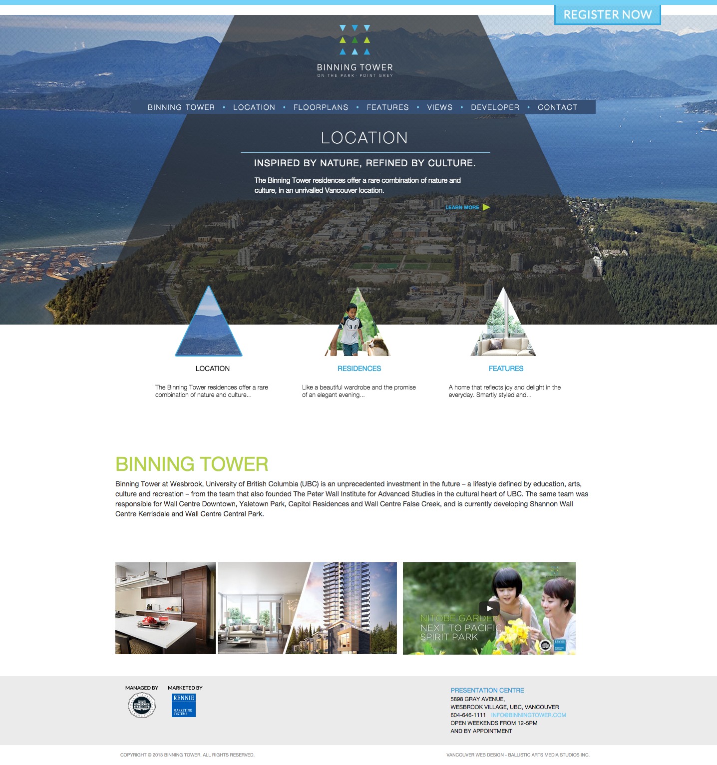
Oh no! I was hoping for an optimized landing page. Instead it looks as though we’ve got another homepage.
What I like:
- The whitespace. This page has utilized the idea of whitespace. I just wish there was a form or a big CTA button in the middle of it – something that encourages the user to take an action.
- The rotating features. If you click on the triangles below the header image, they rotate instead of navigating to another page. This seems to be a useful feature for a real estate landing page. I’m not sure how well this would convert, so I would test this feature to be sure.
What I don’t like:
- The headline and subheadline. As I always point out, the landing page headline should mimic that of the ad. The headline “Location” is doing absolutely nothing for this page. The copy should be changed to “New Vancouver Condos” to reflect their ad. The subheadline should describe the Binning Tower.
- The conversion goal is unclear. Do they want them to view the location of the building or do they want them to fill out the registration form? They have two different CTAs – one is the “Register Now” button and the other is layered on top the image with an arrow next to it that says, “Learn More.” There should only be one conversion goal.
- The navigation bar. I know that I’ve mentioned this already, but seriously, get rid of your navigation bars! These will increase your bounce rates.
- The lack of contrast. Nothing important pops out on this page. I would suggest making the
What I would test:
- Images of the Binning Tower renderings. I see that they have renderings on other pages of their website. They should put them on this page, hopefully increasing conversions.
- CTA button copy. Did you know that changing your CTA text could increase your CTR by 161%? It’s an important aspect of a landing page.
- CTA button positioning. The “register now” button is in a weird spot. I would suggest placing it on top of or below the focal images.
- CTA button color. Change the button to a more noticeable color such as orange (it contrasts well with blue).
- A form. Right now this landing page is a click-through, I would test making it into a lead-generation page. Fill the form with less than 5 fields
Consensus: I was really impressed with the ad on Google, but was unpleasantly surprised by the homepage that appeared after I clicked through. They’re probably spending a fair amount of money on the ad, getting lots of clicks but minimal conversions. Such a shame!
3. Polygon
Rhythm by Polygon is a soon-to-be collection of apartment homes in a new neighbourhood being developed in South Vancouver called “River District.”

The headline doesn’t mention anything about new condos in Vancouver… at first glance users may not even be aware that this ad is for an apartment building. That is not good for click-throughs.
The Display URL doesn’t have the keywords, either. Oh look, there’s one of the keywords in the description (condos). I like that the description has the starting price, though.
Having the number of Google+ followers doesn’t really mean much to a presale property. It would be much more beneficial to have a call extension in its place.
The links at the bottom of the ad are known as, “sitelinks.” They’re great for real estate ads as they link to other pages on your website (ex. information about the developer, other properties, etc). If used correctly, they can increase click-through rates by up to 20%.
Now let’s get to the landing page for this ad.
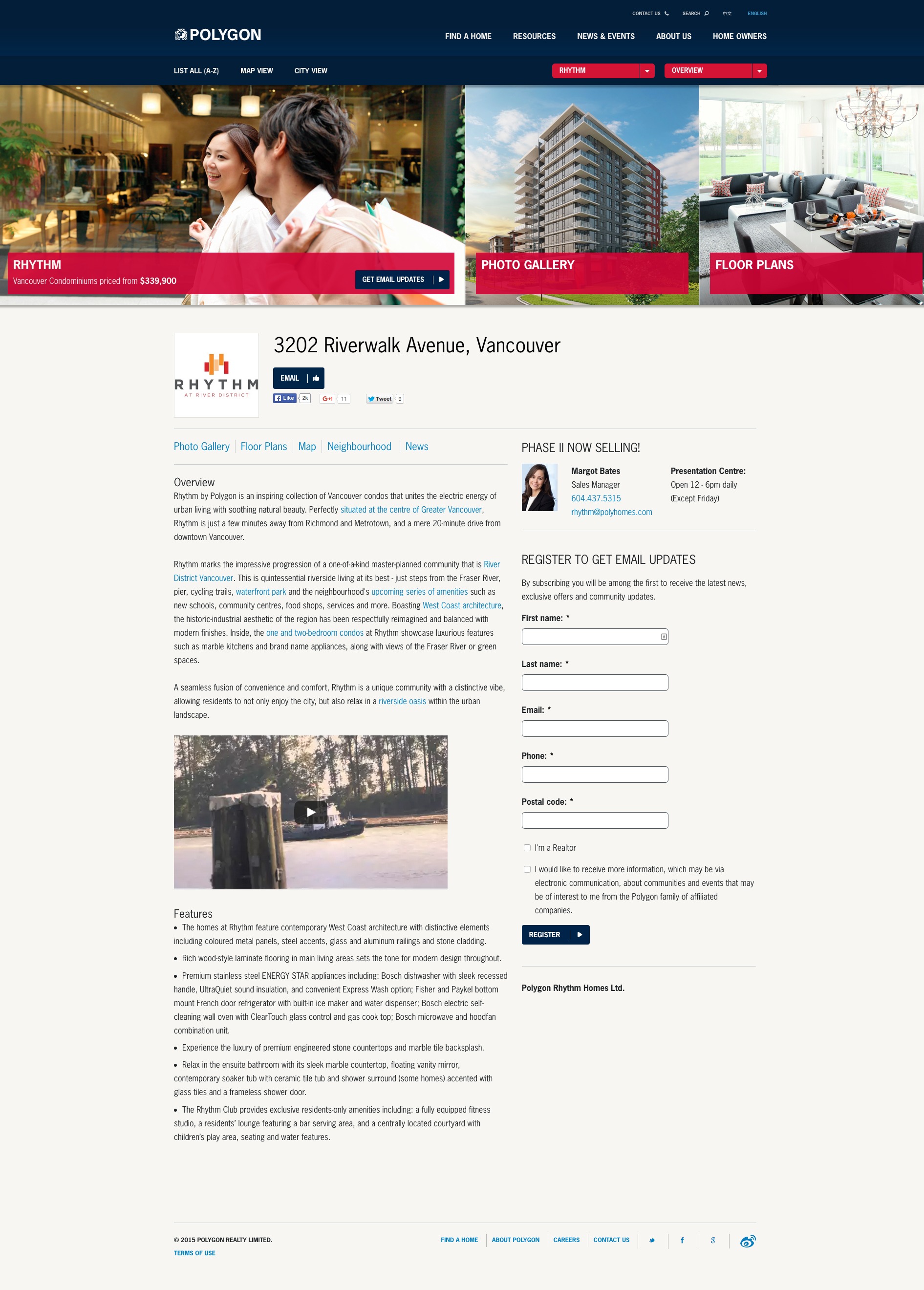
It looks like a regular old page on their website. sigh Am I ever going to come across a dedicated landing page?
What I like:
- There’s a form. Finally we see a landing page with a form on it. Now I’m not saying that having a form for a presale property isn’t necessarily better than having a click-through page – you should test both to see which converts better.
- They show a starting price. Starting prices are great for homes with affordable and/or reasonable pricing. It helps the visitor make more practical decisions when deciding whether or not to fill out the form, therefore making leads more qualified.
- They indicate which form fields are mandatory. The asterisks next to the form field’s names identify which form fields are required in order to fill out the form. Including asterisks on your form fields helps make your form less intimidating for users, knowing that certain fields are optional. At Wishpond we use this tactic on our landing pages as well.
What I don’t like:
- All of the text. There is too much information on this landing page. Not many people would read this much information on a landing page.
- Navigation bar. It’s sad to see so many navigation bars on landing pages. Please get rid of them, thanks.
- The links. There are countless links on this landing page (just kidding. I could count them, but I won’t). This is not a good practice, they should be removed. It’s important to have a conversion goal, and on this page it should be filling out the form, not clicking on any of these links.
- The number of form fields in the form. I would test combining “First Name” and “Last Name” into “Full Name” to eliminate a form field. The less form fields, the better!
- The CTA button on the form. The “Register” button should be more visible and contrast with the page. Try a brighter color that contrasts better with the page.
What I would test:
- A headline with a USP. What makes this property different than any of the others going up in the area? Most likely the fact that it’s going to be a new neighbourhood. Remind visitors that this is their chance to be one of the first people in on a new and exciting area of the city.
- Encapsulating the form and placing it above the fold. This form needs to stand out on the page. I would suggest encapsulating it and moving it further up the page, perhaps above the fold (still on the right-hand side) next to those renderings of the exterior and interior.
- A privacy blurb. It is important now than ever to assure your potential leads that you won’t be sharing their information with anyone. All you have to do is write a brief sentence below the form (ex. we won’t share your information with anyone!)
- A click-through page. I know that I said I like the form… and I do! It’s just a good idea to test these two because it depends on the process your web visitors need to go through in order to convert.
- The CTA button copy. I would try something like, “Get updates on Rhythm” or “Register for updates now. Something more specific and actionable.
- Moving the video up. I would want to know what that video would do for conversions. The video’s a bit weird with the man repeating the name of some website over and over in the background, though. I would suggest changing the script to include more information about the property instead.
Consensus: Meh. It’s not the worst I’ve seen… but there are a lot of elements that need to be eliminated: the multiple links, the nav bar, etc. At least they can work with what they have.
4. Dawson Sawyer
Dawson Sawyer features a collection of townhomes that are opening in Fall 2015. Hmm, last time I checked townhome wasn’t synonymous with condominium.

Here we have another location issue… Surrey is outside what we consider to be Vancouver. In fact it’s about a 45 minute drive from downtown Vancouver – so it’s quite the ways.
It’s hard to critique this ad because it’s not relevant to the search. So let’s just get to the landing page.

Dawson Sawyer has a click-through landing page. It opens and navigates to another page with a form to register for details about the property.
What I like:
- It’s basic. A lot of the “landing pages” I found through ads took me to cluttered and busy homepages. This one is more succinct and would be easier to work with.
- CTA copy. This is better than most of the CTA button copy I see. “Register Now” would convert better than something less descriptive such as, “Go.”
What I don’t like:
- This isn’t a condo. If I was seriously looking for a condo in Vancouver, I would immediately click away. Actually, I would never click on the ad to begin with. Townhomes in Surrey are not condos in Vancouver. It’s time to change the keywords they’re using in their AdWords campaign.
- The multiple calls-to-action (CTAs). There are too many places to navigate to that distract from the desired action (being “Register Now). I would guess that this has a high bounce-rate.
- The navigation bar. Again, this is just another distraction taking the spotlight away from the main CTA.
- The menu in the footer. It’s a normal practice to include Terms & Conditions and Privacy Statements at the bottom of your landing page, but an entire main menu is unnecessary and will also increase your bounce rate.
- The lack of headline and subheadline. Landing pages convert a lot better when they have attractive headlines and supporting subheadlines. Your landing page’s headline should mimic that of your ad.
- No clear USP. What makes this property so great? They should back up statements such as this with a clear benefit list.
What I’d test:
- A form or two-step opt-in. Instead of a click-through page, try testing a form on this page.
- More images. Right now Dawson Sawyer visitors have to click through to go to the gallery, which is an unnecessary step for them to take, leading them off the conversion path. Include a few images of renderings to spark interest in the condos. Showing the exterior of the building isn’t doing much for them.
Consensus: Total fail because that the ad came up for search terms that are irrelevant. Do not include keywords in your AdWords campaign that aren’t specific to what you’re offering.
In terms of the landing page, there are far too many distractions on this page for it to be generating leads. Take those CTAs away and add a headline and a subheadline.
5. The Sapperton
The Sapperton is a presale property located in New Westminster. It’s a part of a whole new neighbourhood they’re creating called “The Brewery District.”
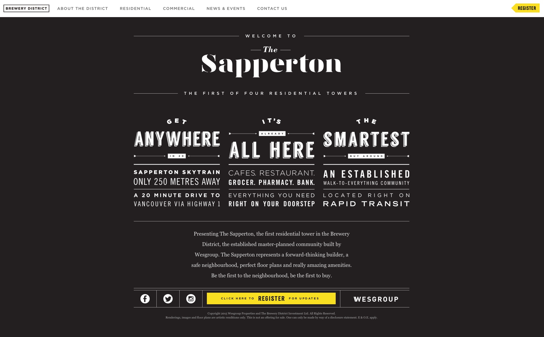
New Westminster technically part of the district of Greater Vancouver, but is not located in the City of Vancouver. Long story short, saying New West is in Vancouver isn’t really correct.
It’s good that they’ve included two out of the three keywords the headline. Presale means new to most people but some people may not know what it means. It’s usually safer to stick to the search terms used.
They could’ve put more emphasis on the fact that it’s a whole new neighbourhood that’s going up. This is very exclusive and could be used to easily pique people’s interests. People love being among the first to have something.
They also should have the keywords in the display URL.
Anyway, let’s get to the landing page:

This doesn’t look like a dedicated landing page, either. 🙁
What I like:
- The typography. It matches what I would think of when I hear brewery district. Trendy just like what you would imagine “brewery district” people to be.
- The benefits. Their copy is spot on, “Everything you need right on your doorstep” is comforting and convenient. It would be nice if they had a picture so potential leads could envision their doorstep.
- The contrasting CTA button. Yay for contrast, the below button does a great job at standing out on the page.
- The single conversion focus. It’s a nice change from the other property’s landing pages. They only have two CTA buttons that both direct to the same place. This is ideal for a landing page.
What I don’t like:
- Headlines don’t match. This is a classic mistake that really hurts conversions. I swear 90% of the ads I see don’t match their ad headline with their landing page.
- Lack of images. It’s extremely important for landing pages advertising real estate to include property images. This should be a no brainer!
- Lack of headline. This appears to be a reoccurring problem with property landing pages. This is an absolute conversion killer! Your landing page needs to reflect the ad it came from.
- The navigation bar. This is another classic mistake. We don’t want our visitors navigating to another page on your site. We want them converting on the page they’re on.
- The simplicity. I do like how it looks, but it’s not practical. This page is missing some seriously key landing page elements. A presale needs to have images of some sort so that potential leads can visualize themselves there. At least a rendering or a video of the vision and process of the building being conceptualized. Landing pages need visual elements to captivate visitors.
- The placement of the CTA buttons. It’s not good that they’ve put their most prominent CTA button in the footer. CTAs should be very accessible.
What I would test:
- A few images I wonder how much better this page would convert with a few renderings of the property on the top left hand side of the page? Images are very important on real estate landing pages. I see that they have renderings on other pages, so I’m unsure why they chose to direct their ad traffic to this page.
- A larger CTA above the fold. I would place that CTA that is in the footer above the fold and to the right-hand side of the renderings.
- Different CTA copy. There’s always work to be done with CTAs. They’re an important aspect of the page to test. I would try “Register for updates now” as it conveys a bit of urgency with the word, “now.”
- A form. Right now they have a click-through page that directs to a new page with a form. I would test a page with a form on it against the current one. Make sure the form only has 5 fields!
- A bullet point list of the benefits. Although I like the look of the typography, I feel that since it’s hard to read it could potentially hurt conversions. Try out a simple, easy-to-read font on the variable.
Consensus: This is definitely the most creative page of them all, but without some visuals it won’t live up to its potential. Add some images and a headline about what makes the Brewery District unique real estate.
Conclusion
I hope that gives you some ideas for your next ad campaign! Always remember to create landing pages dedicated to your real estate ads, and a/b test your ideas so you can optimize conversions.
Do you want me to review your landing page? Let me know in the comments section below.
Need more info? Check out these related resources:
- 10 (Great and Terrible) Real Estate Landing Page Examples Critiqued
- How Successful Realtors Create Killer Pre-Sale Campaigns
- The Data-Driven Guide to Landing Page Design
- 21 Social Media Tips for Real Estate Agents
- Real Estate Marketing Ideas: The Essential Guide