

It’s clear that since my photographer’s ebook on adwords, not much has changed. Photographers are still using their homepages as landing pages. sigh
People are paying money for ads but aren’t reaping the benefits they should be… if your ad doesn’t have a dedicated landing page with a conversion goal, then what are you using ads for?
Online advertisements can be one of the most cost-effective ways for photographers to get leads, you just have to understand how to leverage them.
In this article, I’ll go through some best practices for creating both an ad and an accompanying landing page for your photography business. Then we’ll look at a couple photographer landing page examples to show you exactly what you should and shouldn’t be doing with your landing pages.
Here are 6 tips for photographers creating Google AdWords campaigns:
- Use Google Keyword Planner to see which keywords you should use for your ad campaign. Learn more about how to use Google’s Keyword Planner.
- Make sure the headline of the ad uses keywords similar to what the user searched. You can achieve this with Dynamic Keyword Insertion (DKI).
- In your description, include some copy about what makes your offer unique. Is it your affordable rates? Your unique photography style?
- Use ad extensions to increase the space your ad takes up on Google. These can also increase your click-through rate.
- Use location targeting so your ads show to the local people in your area.
- Never direct your ad traffic to your homepage. Use a landing page you’ve created specifically for your ad campaign, or else you’re just wasting money on lost leads.
Now here’s an example of how a photographer’s landing page could be structured:
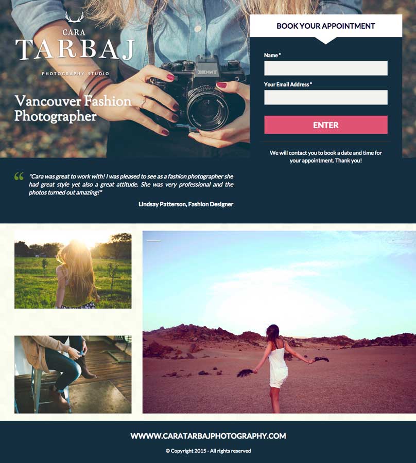
Note the headline, form, customer review, a variety of images and a contrasting CTA button on the form. Let’s get into some best practices.

Here are 9 tips on how to design a photographer’s landing page:
- Your photography landing page should be centered around a conversion goal. Create a contact form so people can give you their information so you can contact them about a consultation.
- Your landing page copy should reflect your ad copy, as your ad copy should reflect the user’s search terms.
- Don’t include any unnecessary information on your landing page – but do include what sets your photography business apart from others.
- Have a form? Keep your fields to an absolute minimum. Generally speaking, the less form fields, the higher the conversions. Keep them to five or less.
- Make sure your call-to-action (CTA) stands out. This can be achieved by creating contrast with the landing page.
- Include a clickable phone number in your landing page header so people can call easily from a mobile device. Make sure that the phone number is in an encapsulated button that contrasts with the page so it stands out (just like the CTA button on your form).
- Feature a customer review on your landing page to establish credibility for your photography business.
- Use directional cues to guide your visitors to your conversion goal. Directional cues include arrows, whitespace, people pointing or looking in a certain direction, etc.
- Make sure your photography landing page is optimized for mobile.
I’ve used the search terms, “vancouver photographers” and come across these two ads on Google.
1. Biografica
Biografica is a photography business located in Vancouver. It all started when Kevin Shoesmith quit his desk job of 15 years to pursue a more fulfilling job.
Here’s biografica’s side ad on Google:

“Vancouver’s newest photographer” sounds more amateur than alluring to me. I would mix up the wording a bit, use Vancouver Photographer with a Fresh Take” or something along those lines.
If they want to keep going with the amateur route, I would suggest creating a deal around it (25% off Portrait Photography in Vancouver!). Remember: It’s important that the keywords are used in the headline.
I would also change the display URL to include the keywords used in the search terms so it appears something like this: “www.biografi.ca/VancouverPhotographer. This can be achieved with ad AdWords technique called Dynamic Keyword Insertion (DKI).
Bottom line: They need to step up their game. Consistency throughout your campaign is key to success. Make sure that the Google user’s search terms are included in the ad.
When we click on the ad, we’re directed to this landing page:

First thoughts: It’s a click-through landing page with not much above the fold.
Note: This page was the closest I could find to an ideal landing page layout with my search terms (at least it’s not their homepage!).
What I like:
- The image. It adds a personal touch, and it looks like they do a lot of portrait photography so this image is relevant to the offer on their page.
- The contrast. The red really pops on this mostly white page.
- The whitespace. It’s nice to see that they’ve incorporated some design elements like whitespace to highlight certain areas of their page.
- The arrow. As a photography business, biografica understands the importance of visuals. So overtop a huge portrait is a directional cue that points down to explore the rest of their page.
- The customer testimonials. Customer testimonials are an important aspect of a photographer’s landing page because reputation is an important aspect of their business.
- The guarantee.* “You don’t like it, you don’t pay.” With a creative field like photography, this is a great disclaimer to have on their page and it adds to the trust factor.
What I don’t like:
- The headline copy. The copy, “your portrait” could really step up its game. What makes people favour getting portraits with you as opposed to a competitor?
- The paragraphs. On landing pages, I don’t like to see blocks of text that aren’t easily scannable. I would summarize the important information and put it in a headline, subheadline and benefit list.
- The navigation bar. A classic and (sadly) common mistake a lot of people put on their landing pages. Nav bars distract from the conversion goal.
- The footer. Links in footers, like navigation bars can take visitors off of the conversion path and lead to higher bounce rates. Do not include either of these features in your landing pages. All you need to include in your footer is a privacy policy + terms & conditions.
What I would test:
- A form. For a contact page such as this, it’s usually in good practice to test a form. Put a form below the prominent portrait photo.
- A benefit list. Biografica should put a list of the benefits (not features) of their business below the large portrait photo and next to a form. Learn how to create a benefit list here.
- A larger CTA button. Although the CTA contrasts well with the page, it should be more prominent and maybe higher up on the page. It could do well overlapping the large portrait photo.
- A second CTA button. Of course this would be for the second offer, but I would test placing another CTA button
- Removing the pricing. The pricing takes up a lot of the room on the page. I would suggest discussing prices once in contact with the lead.
2. Matt Morgan Photography
Matt Morgan specializes in wedding photography in Vancouver.
The ad appeared on Google like this:

First thoughts: I like the aggression behind placing your full-day price right upfront.
I also like including “in Vancouver” in the subheadline. The search terms were “wedding photographer Vancouver” so not seeing that would put me off clicking.
The duplicated CTAs “call today for more info “and then “call for more information” right after it could be left out. Remember you don’t have to fill in every single prompted spot in the ad creator. That said, what about “Check out the site for testimonials” or “Click for references”?
I would suggest running a promotion alongside the ad, this is an easy way to make your ad stand out on Google. Extensions are also a great way to take up more space on Google and get more clickthroughs. Think about adding the call and sitelink extensions.
Bottom line: This ad should be optimized to increase conversions. Use my tips above as a start and then check out our guide to building successful AdWords campaigns.
Here’s the page we land on:
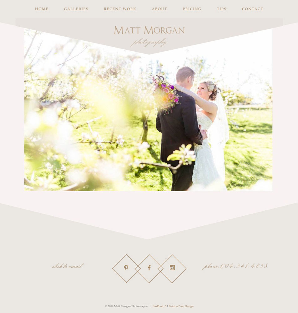
What we’ve got here is a homepage with only the navigation bar as CTAs.
What I like:
- The rotating images. Every few seconds, the image will switch to another shot of Matt Morgan’s work. This gives landing page visitors a good glance at his style of photography.
What I don’t like:
- It’s missing essential landing page elements. All landing pages need to have something that shows what makes the offer unique, and something that makes the offer stand out. This is usually accomplished with an alluring headline and a CTA button and/or lead generation form. This page doesn’t have either.
- There is no copy. There’s literally nothing on this page that describes anything about Matt Morgan’s photography business. What are his strengths? His values? Is there a special deal on right now? A landing page needs to have something to captivate a visitor to turn them into a lead.
- There’s no CTA button. There is nothing that calls out to you on this page. The closest thing they have to a call-to-action on this page is “click to email” in the bottom left, and that’s difficult to read and doesn’t contrast well.
What I would test:
- A Unique Selling Proposition. Craft a headline around what sets you apart (even if it’s price).
- Include a testimonial right on the page. There’s no reason not to feature a well-designed testimonial above the CTA
- An emphasized CTA. This is probably the largest missing element. I understand that photographer landing pages are often subtle and visually appealing, and I’m not telling you to have a flashing orange “buy now” button in the middle, but you want to draw the eye of your visitor towards the goal of the page a bit more effectively than this page currently is.
Conclusion
Hopefully these critiques have given you some ideas of how you can tweak your own photography landing pages to increase conversions.
Want me to critique your business’ landing page? Let me know by leaving a comment below.
Need more info? We have plenty of articles about online marketing for photographers:
- Landing Pages: An Introduction for Photographers
- Online Contests: An Introduction for Photographers
- Email Marketing: An Introduction for Photographers
- An Ideal Landing Page for Photographers
- Infographic: Data Driven Guide to Landing Page Design