This is the fifth instalment in Wishpond’s landing page series. First you’re hearing of it? Start at the beginning.
LP Review #4: Personal Trainer Landing Page Reviews
In the fifth entry of our landing page reviews we’re taking a look at AdWords Agency landing page examples. We’ll discuss the ads and landing pages top AdWords agencies use to find new clients.
When AdWords agencies advertise on Google, it shows that these agencies have confidence in online advertising, which is reassuring for people interested in using AdWords for the first time.
A solid search advertising campaign not only helps an agency find new clients, it puts their full range of skills on display. This includes a full search advertising campaign along with a series of landing pages.
Let’s get into some examples and tips to help your agency thrive with search advertising.
Table of contents
- 4 AdWords Agency Landing Page Examples
- 8 Tips for AdWords Agencies Creating AdWords Campaigns
- 7 Best Practices for AdWords Agencies Landing Pages

1. Bloom Search Marketing
In our first example of AdWords agency landing pages comes from Bloom Search Marketing.
Bloom Search Marketing is a Canadian search marketing agency that creates and manages PPC campaigns for clients all around the world.
Here’s their ad on Google:

They’ve included the keywords in their headline copy which is a good start. However, the display URL doesn’t include them. It should have, “/AdWordsAgency” on the end of their URL for relevancy.
“We’ll skyrocket your business with targeted and data-driven PPC” is good copy, but it isn’t ideal for an AdWords description. Descriptions should include succinct benefits of the offer, instead of using two whole description lines for a nice-sounding sentence.
They aren’t using any extensions which is fine, but they would probably do well with a review (as all AdWords Agencies would).
Here’s the landing page the ad directs to:

First thoughts: Love seeing a dedicated landing page! You can tell that this isn’t just some page off of their website, they’ve put some serious thought into the structure and design.
What I like:
-
The whitespace. Whitespace refers to the areas of your landing page that are left blank. This help draws attention to key components of the page, such as the CTA button or form.
-
They made it personal. Bloom knows that it’s best practice to use copy that makes the landing page more personal. Using words like, “you” help create a connection with the page.
-
The large font. The copy on their page is large and easy to read.
-
The benefit list. Pointing out what your product/service can do for the visitor is usually better than putting the features of your offer. Benefits speak directly to your potential leads.
-
The form fields. The form is simple and has only three form fields. It’s usually best practice to use less than five on your lead-gen landing page, as the more fields you include the more likely it is that people will not fill them out.
-
The contrasting CTA. Orange and blue are opposite each other on the color wheel, so the CTA button on the form stands out well.
-
The second CTA button. Bloom doesn’t have any distractions on their page, nowhere visitors can navigate to other than closing the tab. This page is leakproof! at the bottom that directs you back to the form.
-
The customer testimonial. They nailed the customer testimonial. They included both the name, job title and face of a client. Maximum trust achieved!
-
The customer logos. To further enforce trust, they have provided the logos of some of their biggest clients below the customer testimonial. This is a great way for AdWords agencies to show legitimacy.
-
The faux navigation bar. At first, I thought they had made the mistake of using an actual navigation bar on their landing page. Instead, it directs it certain parts of the page such as the row of client logos or the details of their service.
What I don’t like:
-
Who’s the client? I can’t fully trust this graph because I have no idea whose growth they are referring to. It would do a lot more for the graph if it shared the name of the business.
-
The copy by the graph. I’m not convinced that people will take the time to read the copy to the left of the graph. I would try cutting the copy down to just the essential information.
-
The copy below the form. I’m being picky, but I struggled to read the copy below the form. I would make it a darker grey to stand out better against the background.
What I would test:
-
Different headline copy. I like the headline copy, it’s great in conjunction with the subheadline. However, I would test it against a more relevant headline including the words, “AdWords” and “Agency” for relevancy purposes (ex. “we use adwords to skyrocket your business”).
-
A directional cue. Directional cues help guide visitors to fundamental elements of your page, such as the call-to-action. I would suggest an arrow pointing from the benefit list to the form.
-
A discount. Such as a limited time offer. Then they could also use a countdown timer alongside it, which creates urgency and has been known to increase click-throughs substantially.
-
Highlighting the client’s success in a more obvious way. I would suggest testing a variation of the page. What I would do is make the page more like a case study. For example the headline would read, “[insert client here] Gained a 138% Increase in Conversions YoY.”
Consensus: Great landing page. I’m glad to see that the first ad I clicked actually generated a real landing page.
2. Zero In
In our second Adwords agency landing page example we’ll take a look at Zero In.
Zero In specializes in PPC, mobile & social advertising. They provide services to business, franchises, agencies and nonprofit organizations.
Let’s take a look at their ad on Google:
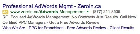
This ad has a lot going on – in a good way. They’ve included both the call extension and sitelinks. These extensions are known to increase click-throughs.
Their headline is decent considering they don’t advertise themselves as an agency. I’m sure a lot of people looking for AdWords agencies are looking for someone to manage their ads.
The description of their ad is pretty well done. They have a call-to-action saying “Call Now” with the phone number conveniently above.
All in all I’d say this is a pretty good ad.
Now onto the landing page:

Looks like we have a lead-gen landing page. Their offer is a free consultation with their PPC experts.
What I like:
- Google Certified Partner. This badge means that Google recognizes them as a business they trust to help you with AdWords – which is very beneficial for AdWords agencies. Making this statement helps increase the trust visitors will have in your business.
What I don’t like:
-
The headline. This is interesting. Great headlines cover a benefit, this one is promoting a features list. Their business is only PPC, so focus on that and the free consultation in the headline.
-
They’re not highlighting the offer. Zero In is offering a free consultation, and nothing about their landing page communicates that other than the form copy. I would draw more attention to this, as it seems to be their unique selling proposition (USP).
-
Unclear offer.The free consultation should also be elaborated on, as this page doesn’t make it clear what is included in the free consultation. What will the leads get from it?
-
There’s too much copy. This landing page is offering a free consultation, but there’s so much extra and unnecessary information on the page. I would get rid of the
-
Inconsistent spelling and capitalization. From looking at this page, it’s unclear whether or not there is a space in between “Zero” and “In.” There is also random capitalization of words throughout the page. Always proofread your landing pages (or get someone to do it for you).
-
“We work in all PPC platforms.” This is not relevant for a landing page that should be specific to AdWords. Remember that your potential leads are searching for AdWords agencies. Landing pages are specific to the offer you have made in your advertisement.
-
The form fields. They have five form fields, but only two are marked as necessary. I would remove at least two of them. Every extra form field you include increases the probability of conversion loss.
-
The CTA button copy on the form.* “Submit” is known as a conversion killer. It’s undescriptive and doesn’t encourage visitors to click-through. I would suggest changing the copy to, “Get My Free Consultation.”
What I would test:
-
Repositioning the form. This is definitely an interesting landing page – I have never come across this exact layout of a form. I’m not sure how I feel about it – I would definitely test it against a variation with the form on the right-hand side of the page in place of the image.
-
Changing the background colors. Right now, maximum contrast isn’t being achieved because of all of the different shades and colors. I would suggest cutting down on a couple of them to make sure that important elements of the page pop out.
-
The CTA button color on the form. Speaking of colors, I suggest contrasting the color of the button on the form with the background color of the form (red or orange would contrast well with the current color).
-
Encapsulating the phone number. Zero In has included the phone number on their page, so they must want calls from this landing page. I suggest encapsulating it in a button to make it stand out more on the page.
-
A customer testimonial. As we know, customer testimonials go a long way in creating trust on a web page, especially for online businesses such as AdWords agencies. I would include a quote, a name, the business and a photo of the customer.
Consensus: At first thought I thought it was alright, but there’s a lot of room for improvement on this landing page. They’re lacking trust factors and the details of the free consultation need to be added.
3. Search 2 Sales
Coming in at our third Adwords agency landing page example we have Search 2 Sales which is lead by John McLellan.
John McLellan started working with AdWords in 2002 and created Search 2 Sales in 2004, a one-man team. Search 2 Sales specializes in AdWords Consultation.
Here’s John’s ad on Google:

I love that he’s included his rates and his 10 years experience in the description. Having descriptive numbers add important information that promote legitimacy.
Usually I would suggest using both search terms in the headline… but he’s not an agency so this is acceptable.
I assume that he’s advertising for these keywords so that he can show people that there’s an alternative to AdWords agencies: him.
He’s also included the keyword, “AdWords” in the display URL, which is always a good practice.
John has established through just the ad that he knows how to set up an ad campaign for Google.
Now let’s see what his landing page looks like:

My first thoughts: when I extracted the landing page link from the ad URL I noticed that Search 2 Sales is using their homepage as a landing page. They’re not even using conversion tracking to see what happens once people click on your ad. You can tell because there are no parameters on the end of his landing page URL.
So Search 2 Sales can’t actually tell which of their searches lead to sales. All they are able to see really is the click-through rate.
Search 2 Sales is using a click-through landing page to warm up his leads before they convert on the follow-up page.
What I like:
-
The picture of the consultant. John McLellan is all about establishing trust with his landing page visitors. This picture helps enforce it as soon as you land on the page.
-
The customer testimonial. Customer testimonials add credibility to your landing page and makes the offer more relatable. This testimonial is great because it talks numbers and you can clearly see that the person giving the testimonial is real. Nice work!
-
The Google Partner symbol. In the top right hand corner of the page, you can see a trust symbol. Knowing that Search 2 Sales is a Google Partner increases the trust visitors have with your business.
-
The CTA. This CTA has enough whitespace and contrast to easily stand out on the page.
-
The bullet-point list. This is a great way to present copy on a landing page because it’s really easy to read. You don’t have to commit to reading several paragraphs about John’s skills.
What I don’t like:
-
The navigation bar. Nav bars make for leaky pages. Leaky pages take users off your landing page. It’s especially important that click-through landing pages don’t have nav bars because with click-through pages you need the visitors to go to two pages instead of one – and what happens if you lose all your visitors before they even make it to the second page?
-
The footer links. These links at the bottom will draw users away from the action they should take: clicking on the “Learn More” button at the top of the page. These links are going to create more leaks.
-
The list on the left. John has already proven that he’s an industry expert (trust symbols, customer testimonials, years of experience, etc.), he doesn’t need the list on the left, “Beyond AdWords.” People looking for AdWords consultants are more concerned with how effectively you can help them with AdWords as opposed to your other skills.
What I would test:
-
Changing the button copy. “Learn more” is boring and doesn’t encourage a click-through. I would try something along the lines of “Let’s talk AdWords” to make it more casual and inviting.
-
Emphasizing the benefits. Under “AdWords Results” he has a list of benefits. Those should be considered as one of the most important aspects of the page. Move it to the left and increase the font size.
Consensus: This is the best example of a homepage being used as a landing page, but that doesn’t make it right. Duplicate your homepage and work with it to make it better for conversions. Remove the page distractions (nav bar, footer links), focus on the benefits and leave out the extra services John offers.
4. Finch
Finch PPC management is our fourth and final Adwords agency landing page example.
Finch provides fully-automated PPC optimization for over 300+ online businesses in 11 different countries.
Here’s their Google ad:
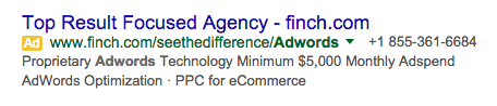
If we’re going to get technical, there should be a hyphen in between “result” and “focused” in their headline. There should also be a period after “technology” in the description to make it easier to read.
The headline should ideally have the keyword “AdWords” in there as well as “Agency” to make the ad even more specific to the search terms.
Display URL is good. They’ve included the main term, “AdWords” but it wouldn’t hurt to throw “Agency” in there for maximum relevancy.
I’m glad that they’ve laid out the minimum ad spend per month because that’s important for businesses to know (especially if they’re not able or willing to spend that much).
Now let’s take a look at their landing page:

What I like:
-
The video. I love when people try incorporating videos on their landing pages. Videos are an easy way for people to consume information.
-
The checkpoints. To the left of the video there are three checkpoints outlining the benefits and features. This is laid out in a succinct and easy-to-read format.
-
Customer testimonials. Finch has three rotating videos at the bottom of their page. They help to increase the trust visitors have in their business.
-
The trust symbols. Like the Search 2 Sales page, this page really evokes trust. I really feel that these guys are legitimate and good at what they do by looking at this landing page. Great work!
What I don’t like:
-
The missing phone number. Below the video it reads, “Call us at” and then nothing. This is easily fixable, though.
-
The subheadline. “ MORE THAN A TOOL, BETTER THAN AN AGENCY, WE’RE SAAS+.” What does that really mean? Can’t a business be all three of those things? I would consider pointing out the benefits of their free AdWords audit instead.
-
The audit list I really like incorporating bullet-point lists on landing pages. It makes information easy for the visitor to consume – but this bullet point list beside the form is essentially a paragraph. There’s not enough spacing in between the rows so it still looks intimidating. Space them out more like the checkpoints above the fold.
-
The navigation bar & footer links. Both of these features help create a leaky page – and you want yours to be leak-free.
What I would test:
-
The headline. I would change it to something about their tool, “We create AdWords campaigns to grow your revenue and maximize your profit.”
-
The CTA button copy. “Sign up now” conveys urgency, but I always like to try something more specific to the offer to see if it converts better. I would try something like, “Get my free audit now.”
-
The CTA button color. The button color should contrast better with the page. I would suggest making it the orange color of the subheadline and checkpoints.
-
The form positioning. It’s always a good idea to test a CTA above the fold. They could even put a button above the fold that skips down to the form.
-
Shortening the video. I like landing page videos to be as brief as possible. This one is just over two minutes, which isn’t bad but I would consider wrapping it up between 30 seconds and a minute.
-
Making these two different landing pages. There are two things going on with this page, they’re advertising a free audit but also talking about their paid services. I would separate the offers.
Consensus: It’s alright, although there are a lot of things I would tweak. Most important would splitting the pages up and testing the form above the fold.
8 Tips for AdWords Agencies Creating AdWords Campaigns:
-
Look at the other adwords agencies with ads on Google. Search terms like, “pay per click” and “adwords agency” so you can see the top ads you’ll be up against.
-
Always use Google’s Keyword Planner, it will help you figure out which keywords to use in your ad campaign.
-
Use specific call-to-action copy. It shouldn’t be something vague, like “read more.” The phrase should describe what the user will get when they land on your page, something like, “sign up for your free consultation” lets them know what to expect.
-
Make sure your ad copy is as relevant to the search terms as possible. Ideally your ad should include the most important keywords the user searched for. Learn more about this strategy here.
-
Use numbers in your copy when relevant. Being more specific helps Google users make the decision to click on your ad. Use exact numbers when referring to a client’s results, your hourly rate, or how many ads you’ve run.
-
Use ad extensions to increase click-throughs. For AdWords agencies, I recommend using review extensions and sitelinks.
-
What makes your agency different from the rest? Do you have incredible rates? Amazing case studies? Focus on something positive that makes your business stand out.
-
Most importantly, remember that leads aren’t going to flood to you overnight. The goal is to hyper-target your campaign so that your conversion rate is higher. Leads don’t matter if they’re not interested in your services.
7 Best Practices for AdWords Agencies Designing
-
AdWords agencies: never substitute a landing page with a homepage! Homepages don’t have a conversion goal and therefore will not convert well.
-
Consistency: make sure your landing page’s headline matches your ad’s headline. It doesn’t have to be word for word, but the most crucial keywords should be used in your ad’s headline.
-
Have a singular call-to-action (CTA) with one specific ask. Are you looking for clients? Include a form on your page or have a CTA that links to a secondary landing page with a form (known as a click-through landing page).
-
Make sure your CTA stands out from your page. This can be accomplished with whitespace and contrast.
-
Incorporate directional cues on your landing page – which are visuals that direct your traffic to important aspects of the page, such as the call-to-action (ex.arrows, people pointing or looking in at something, etc).
-
Use less than five form fields. The more form fields your form has, the less likely it will be that visitors convert.
-
Make sure your landing page is optimized for mobile (most landing page tools have this feature).
For these ad and landing page reviews, I used the keywords “adwords agency” to find ads on Google.
While I’m sure that these agencies will have their ads figured out, I’m not 100% convinced their landing pages will be optimized.
Hopefully we find some amazing campaigns!
Conclusion
I hope these critiques have sparked some ideas on how you can optimize your own ads and landing pages, whether or not you’re optimizing for AdWords agencies.
How are your ad campaigns doing? If your business was featured above, I’d love to know how well it’s converting.
If not, reach out to me in the comments below or on Twitter so I can review your landing page. 🙂
Need more landing page info? Check out these related articles:
- 17 Landing Page Examples Reviewed with A/B Testing Ideas
- 25 Tips to Optimize Landing Page Conversions
- The Data-Driven Guide to Landing Page Design
- How to Create a Landing Page That Converts
- 8 Landing Page Design Best Practices