
You’re up in the club. You see a perfect 10 standing alone from across the bar. #targetacquired
What’s your gameplan?
You could walk over there and ask the 10 to get out of there. That could work… If you’re Chris Hemsworth.
OR you could try to buy the 10 a drink. Then build trust and rapport with some witty conversation. Sounds like the smarter move right?
The same goes with landing page optimization. Before you shoot for the conversion there must be some form of trust built between you and the person arriving on your landing page.
Trust and credibility is the lifeblood of conversion success on a landing page. And you can bet that if you want that tasty tasty conversion — your consumer must trust you.
Shady advertisements, get-rich-quick promotions, spam and pyramid schemes are more widespread on the internet than ever. So it makes sense that today’s consumers are more wary of diving into a business relationship with just anyone.
If you want to improve your conversions, try these seven ways to build a trustworthy landing page.
Conversion Coupling
Conversion coupling sounds all technical and scary but don’t fret. It’s just a fancy term for making sure that your advertisement matches the landing page it leads to.
If your goal is to build a trustworthy landing page for an advertisement, then wouldn’t it make sense for that landing page to match your consumer’s expectation?
Here’s an example of conversion coupling…
On Google I searched “buy Adidas NMD” and here is an ad from Adidas:

The ad lead me to the Adidas store where I could buy a pair. Exactly what I was looking for. Perfect before-click and after-click congruency. The landing page header has “Adidas NMD” in big bold letters and has every style lined up for me to browse.

Let’s look at one more…
I searched for “learn flash photography” and this ad popped up:

This sent me to a Lynda.com flash photography course with a short preview video that outlines the course. Again, this landing page perfectly matches my expectations for learning flash photography.

Promising one thing and delivering something different would not only confuse your customer, it would come off as untrustworthy.
One way to easily match customer expectations is to use the same or similar headlines on the ad and on the landing page. That way the customer won’t be thrown off by different copy or a separate offer.
Avoid Cheesy Imagery
Using real photos and avoiding cheesy stock imagery can make a huge difference in the way customers interpret your landing page. The fake photos of people posing with fake smiles and generic clothing are tempting to use but can be a negative to your brand image.
The goal is to authentically present the product or service you are providing. If you and every other one of your competitors is using the same photo of a call reception woman smiling into the abyss, how can your business stand out?

What you’re communicating is that your business and your offer are real. By using real imagery it shows that you have put in the time and effort to show your business off in the right light.
Provide Contact Information
One way to provide a boatload of trust for your customers is to have a simple way to get in touch with your business. An email, phone number, or even better, a live chat, can really raise the trust meter.
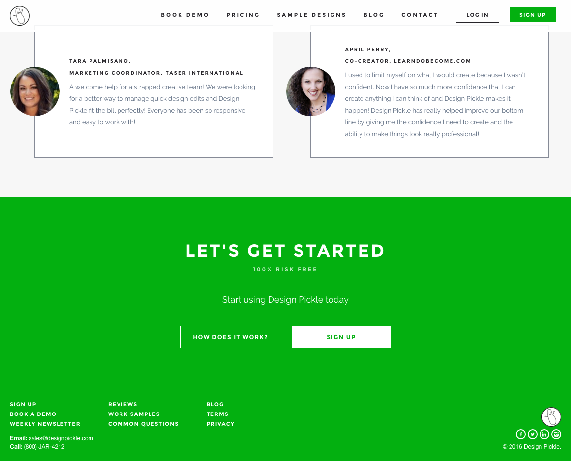
DesignPickle.com provides email and contact information at the bottom of their landing page. They were smart to include links to their social media pages as well so that their customers can pop over to their Facebook and poke around.
What does this landing page tell us?
DesignPickle is providing real value to real people. And if you have any questions or concerns, give them a shout and they’ll answer.
Concise Forms
Only capture the information you need. Easy right? You’d be surprised at how many companies overreach when asking for customer information.
This is likely the first interaction you’re having with this person so it may take some time before they allow you full access to their goodies. You’ll have to decide on what is a nice-to-have and what is a need-to-have.
Asking for a name, phone number, email, address, occupation, blood type, high school crush, and bank account information is far too much. The longer and more complex the form is, the less likely it is to be completed.
If you’re asking for a lot of unnecessary personal information during your first interaction for something like a free e-book or a free trial, this might set off some red flags. Why do they need my address? Why do they need my occupation?
Here’s an example from Mailchimp:

Mailchimp directs you to a simple landing page for their email service. Customers are directed to sign up for a free trial account and only need to complete three fields. Easy peasy.
Further down the road, once you’ve developed a trusting relationship with that customer, you can collect more information.
Clear Communication
Here is where the skill of your writing can really make a difference. Making the copy on the landing page convincing yet clear enough for your customer to understand can be difficult. There are a few points with this…
Don’t make promises or guarantees that your business cannot keep. It might be obvious but it can be difficult to avoid traditional “market-ese” type language on the page promising outlandish results.
Best Offer! Great Deal! Amazing product!
You know the deal.
This will confuse readers and ultimately distract them from the point or offer you’re trying to make.
Make note of the amount of information you have on your landing page. The amount of information present on the page plays a huge factor in influencing a conversion. An overbearing amount of information to read through or complex jargon can make for an unpleasant and intimidating experience.
Make the page objective obvious. After arriving on your landing page the action you want the customer to accomplish must be clear. Too many choices or too much friction can muddy the process and cause the user to bounce.
Let’s look at an example. I searched Google for “fast car window repair…”
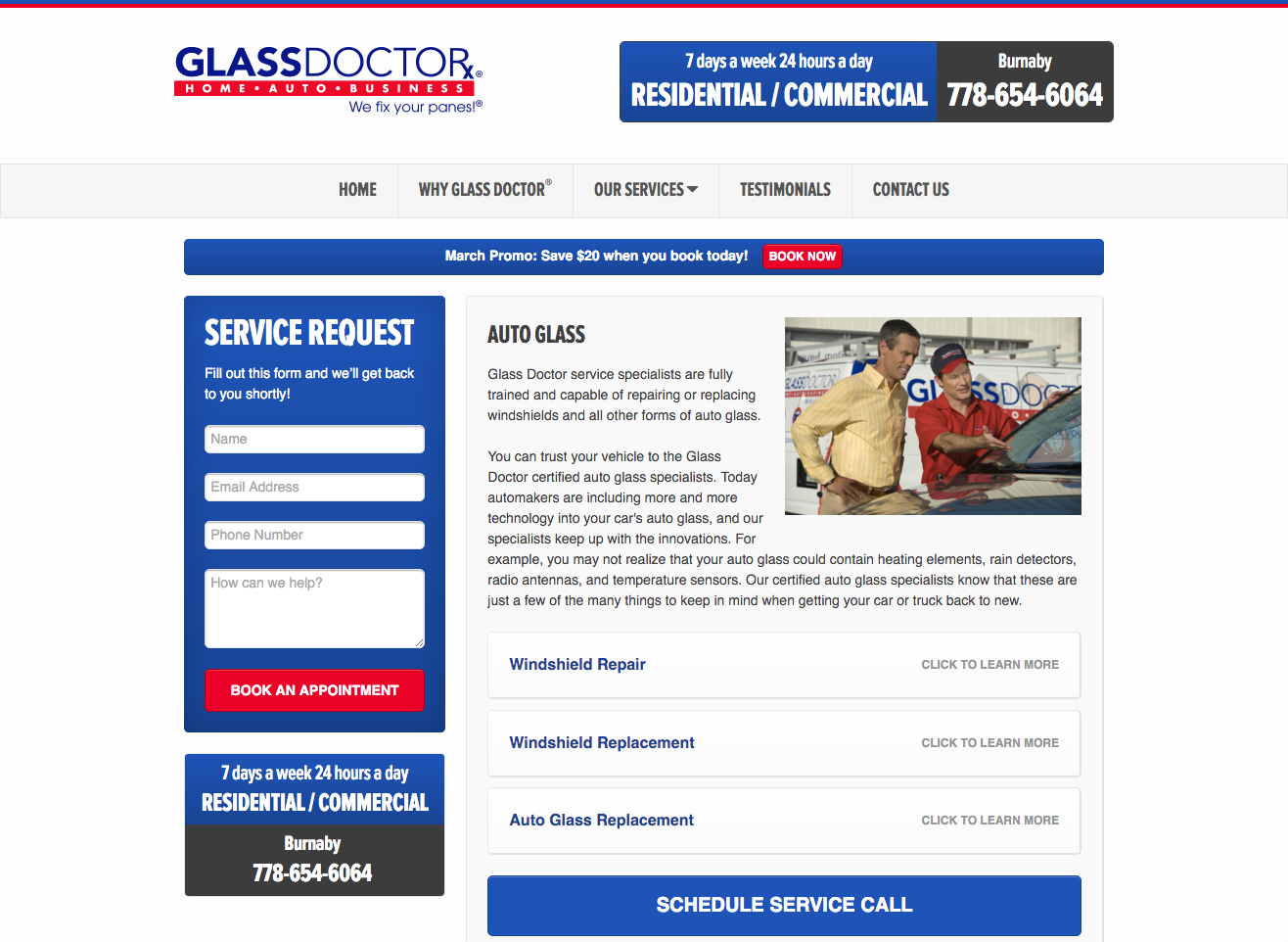
The GlassDoctor landing page clearly communicates their value and offer: quickly put in a service request or schedule a service call. There is no room for confusion. Simple and to the point, this page delivers exactly what I was looking for.
Want to make landing pages work for you? Click here to give Wishpond a try.
REAL Customer Testimonials
Whenever I’m looking to buy something online (right now it’s a pair of bluetooth headphones) I head directly to Amazon to read the buyer reviews.
Reading real reviews and opinions from real users/buyers can make a huge difference in swaying customer choices and building trust. On the other hand, having fake reviews with fake stock photos of people praising your company are more likely to hurt your reputation than help it.

Before signing up at Contently.com, you can head over to their client review and testimonial section to see user successes. They also provide real client work samples and case studies to back up their value propositions.
Here’s one more from a Shopify landing page:

Below the screen you can see where the company has been featured by renowned publications. Each element on the page does its part to add to the whole trustworthiness sandwich.
Secure Transaction Certifications
If you’ve ever shopped online you’ve seen these certifications. They tell the customer that their personal and financial information will be kept private.
The more your landing page does to show that you care about your customer, the more likely they are to trust you.

Wix.com uses the logos here to show that they use trusted and secure transaction providers to protect you and your customers’ information.
Are you feeling the trust?
If you have some landing pages running right now, most of these changes are simple to make. Quickly audit your page and ask yourself whether or not a customer would trust you with their information.
Is your landing page giving trust signals or scam signals?
Change a few images, clear up your copy, rethink your forms, and watch your conversions go up.
Related Land Page Reading:
- The Complete Guide to the Psychology of Conversion: Chapter 11 – Creating Trust
- 7 Landing Page Mistakes that are Costing you Conversions
- Landing Pages: How to Sell your Product without Selling your Product