
The reason that popups get such a bad rap is that they’re so often misused.
For myself, part of the marketing team for a company which provides your business with popup templates, it can be painful to see.

But when someone uses a popup correctly, a switch goes off. Like when you see, for the first time, someone use the hole in a pot handle for its intended use…
This article will break down the real way popups should be used on your website.
Correct and well-designed implementation of these popups can skyrocket your list-building, reduce bounce rates, and drive sales. Incorrect use? Well that’s why they get a bad rap.
Let’s get started.
Click Popup Use Case
Let’s start with click popups, as they’re my favorite and also the most under-utilized.
For me, click popups should replace landing pages in many situations.
Unless you have a lot of information you need to communicate, many of the landing page use cases can be replaced with a click popup.
And why are they so powerful?
Click popups keep your visitors on a page they’re comfortable being on. This in our experience, improves conversion rates by up to 40%.
Website optimizers have a term, “friction,” which means the addition of any obstacle to your visitor’s conversion. Introducing another page to your sales funnel always adds friction to that funnel. Keeping someone on-page reduces it.
Another reason click popups are so powerful is that, by opening only when someone requests them to open, make your site visitors feel in control of their experience. They took the action which resulted in the popup opening. It wasn’t forced on them.
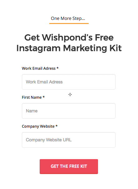
Here’s an example of a call-to-action (one of Wishpond’s) which, when clicked, would open the click popup below:
Click Popup Use Cases:
- Add a link or call-to-action within your blog article which reads “subscribe to the blog!” Clicking this button will trigger a click popup which enables readers to subscribe without leaving the article.
- Add a link or call-to-action within your blog article which reads “click here to download this article as a PDF!” Clicking this button will trigger a click popup with a form which, once filled out and submitted, enables readers to access your “email-gated” copy of the article. For all you familiar with content upgrades, this is the best way to do them.
- Use a click popup to segment people before sending them to a product directory. Add a call-to-action, link or (if you’re advanced) a footer-bar within your website for a promotion. When someone clicks on it, have a click popup which prompts them to choose “Mens” or “Womens,” with two buttons which send them to the relevant product directory.
Exit Popup Use Case
Perhaps the most often-hated popup type, exit popups are undoubtedly the most aggressive (though entry popups are up there).
However, they’re also the most powerful.
Exit popups stop people from leaving your website. And that’s huge.
Exit popups say to your visitor “hold on a second, let me give you a reason to stay, or an option for how you can engage.”
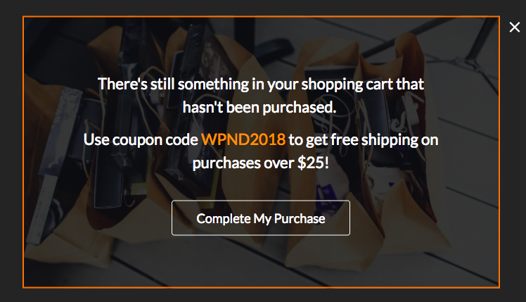
Here’s an example of an exit popup used in the ecommerce industry:
And here’s another:
Standard exit intent popup use is to write “Hold on. You haven’t completed the purchase/subscription/etc. Click here to go back and complete it.”
That’s the basic use, and will often frustrate your visitors more frequently than it will cause them to complete the action you want.
Superior Exit Popup Use Cases:
- Provide an incentive to turn around and complete the purchase. Give a discount, free shipping, etc.
- Prompt an easier conversion. If your page asks for signup, prompt subscription. If your page asks for a purchase, prompt a “sign up to receive exclusive discounts.”
- Stop people from leaving without purchasing by using urgency (the second exit popup example above). Express the need to buy now before supplies run out or a promotion expires.
To effectively capture people who have put something in a shopping cart but not completed the purchase, check out Wishpond’s Free Shopify Popup Builder App
Sidebar Scroll Popup Use Case
Whenever you want to draw the attention of a website visitor who has already shown interest in your business, a sidebar scroll popup is the answer.
Ever since our millennia on the plains, mankind has evolved to respond to two things above any other: color and movement. If I’m scrolling down a page, and something colorful moves out of the corner of my eye, I have no choice but to look at it. It used to be a matter of survival, now it’s a matter of boosting sales.
Here’s an example of a sidebar scroll popup on an ecommerce homepage:
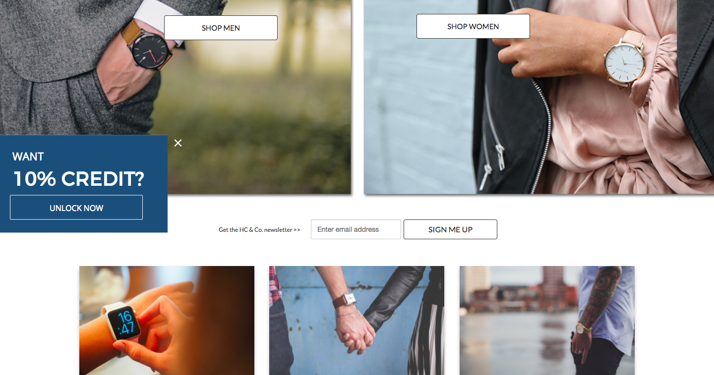
This is a good example of a popup which is used to direct traffic. There’s no form, simply an offer to get 10% credit which, when clicked, would say “sign up to have your 10%-off credited to your account” simply a thank you page which would say “your 10% credit will be assigned at checkout” or something similar.
Get creative with your popups. They don’t have to exclusively turn visitors into leads, but can be used to help you focus visitor attention on your value propositions.
Sidebar Scroll Popup Use Cases:
- Blog subscription: Get people to opt-in to receive your newsletter.
- Gated content: Add a call-to-action for people to click. Have the link send them to a click popup or separate landing page.
- Related content: Add a popup which links to articles relevant to the one they’re on, in order to get people to stay on your website.
Timed Popup Use Case
Timed popups show only to people who have committed to your website – ensuring you don’t annoy every visitor who arrives, and also ensuring that the people who see it are likely to care about what it offers.
Set your timed popups to appear after 30 or so seconds on your product directory or homepage (check out your average “time-on-page” within Google Analytics to determine when you can show your popup to maximize interest).
Timed popups can also be a great way to turn readers into leads, like with this example from Invision:

Want to massively decrease the chance of annoying your website visitors? Only show a popup when they’ve shown genuine interest in who you are and what you do. Easy as that.
Timed Popup Use Cases:
All the same as the sidebar scroll popup. Which of the two you use is up to you.
Entrance Overlay/Welcome Mat Use Case
At the other end of the spectrum from scroll or timed popups is the entry popup and welcome mat – overlays triggered as soon as a visitor arrives on your website and before they’ve seen or done anything.
Why would you use an entry overlay? Surely it’s the #1 way to annoy people…
Not if that overlay delivers value and enables you to frame the buying conversation.
Think about it: if you walk past a brick and mortar store and the front window has a big red “50% off” sign, you’re more likely to walk in.
The same is true of an entry overlay or welcome mat. If your business can deliver obvious value (through a discount or promotion) and make everyone aware of it before they start the buying experience, they’ll be more likely to complete the purchase.
Take this example, giving 20% off your first purchase:
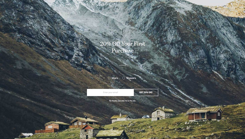
This means that you’re (in your head) taking 20% off every price you see in the product directory. You say to yourself “Oh that’s a big more expensive than I’d like. Oh wait, I get to take 20% off that price!”
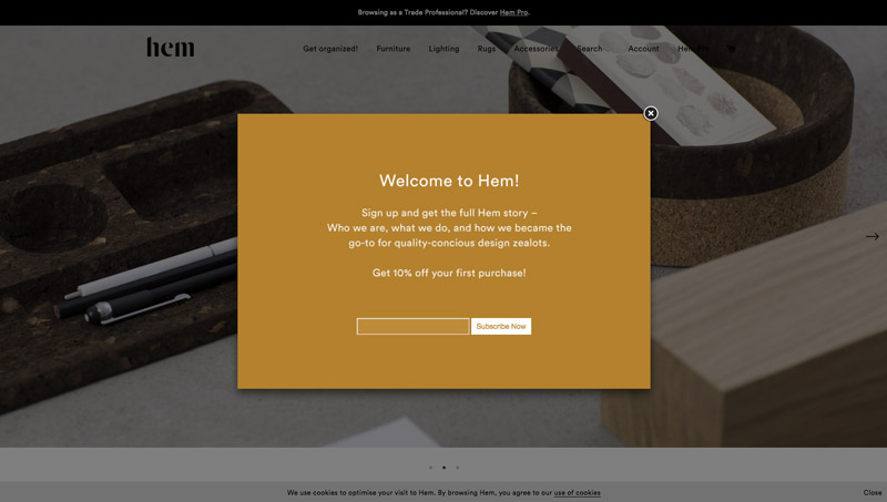
Entry overlays and welcome mats are also a powerful way to build your list – by giving discounts to everyone who subscribes:
An advanced use of an entry overlay is to show one exclusively to people who have put a product in their shopping cart but not completed the purchase:
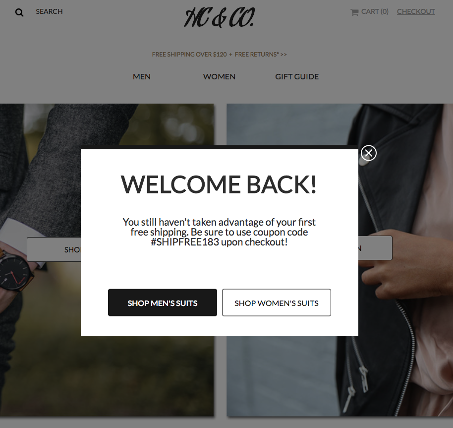
This example will require a bit more coding than the other examples, so feel free to reach out to a marketing expert from Wishpond with any questions.
Entry Overlay & Welcome Mat Use Cases:
- Immediate discount to new visitors if they opt-in
- Promotion of a limited-time or seasonal sale you’re running
- Ecommerce segmentation: Immediately prompt visitors to choose your men’s or women’s product directories. Segment them right off the bat so you can contact them appropriately down the line.
Opt-in Bar Use Case
Like the sidebar scroll popup, an Opt-in Bar remains visible while your visitors navigate the rest of your website.
This enables your promotion or offer to be visible at all times.
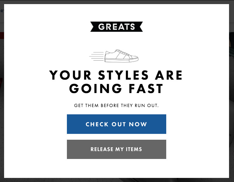
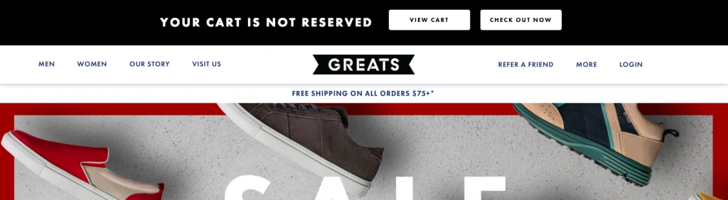
Here’s an example from Greats shoes which appears when you come back to their website after having added something to your checkout cart but then left:
And here’s one of Wishpond’s opt-in bar templates showing a simple opt-in form:
Opt-in Bar Popup Use Cases:
- Newsletter subscription at the top of your blog
- Seasonal or limited-time promotion
- Discount to all new visitors
- Call-to-action for a sale or contest
Final Thoughts
Popups are a powerful tool in website optimization and, when used correctly and designed well, can deliver value at the right time and in the right place. They can increase your site’s conversion rate, recover bounced traffic, build your email list and more.
Yes, they can also frustrate and annoy. But that’s why you can’t use them haphazardly.
Learn exactly how popups can best be used by your business and on your website by reaching out in the comment section below or by speaking to a Wishpond marketing expert.
Related Reading:
- How to Use Popups to Get More Customers for Your Ecommerce Store
- 101 Big-Brand Popups: 9 Ways to Improve Your Lead Generation
- 30 Reliable Ecommerce Marketing Strategies (With Real-World Examples
- The Ecommerce Guide to Online Marketing: How to Drive Traffic, Get More Sales, and Keep your Customers Coming Back
- Ecommerce Optimization: Smart Website Additions Guaranteed to Boost Sales