

So I’m reading The Hustle a few days ago, and I see a story about how The New York Times has made $340 million from online subscribers this year – a 46% increase in online subscription.
In the words of The Hustle, “Not bad for a 167-year-old newspaper company…”
Indeed.
These numbers (ignore the red, that’s print media…) are something any business would be excited to see:
/cdn.vox-cdn.com/uploads/chorus_asset/file/10186557/new_york_times_print_digital_revenue_2017_01.png)
My immediate response was “How?” and then “How can our business do that?”
So I headed to The New York Times website, and I think I’ve figured it out.
This article will break down the 7 website elements which The New York Times is using to generate huge subscription rates and a valuation of $4 billion – elements your business can use just as easily to find your own success.
1. A Powerful Value Proposition
Before I dive into the individual website elements (the tools that The Times is using to turn visitors into subscribers), I need to touch on a crucial part of their success, and something which every digital marketer and website optimizer needs to keep in mind.
The New York Times has two powerful motivators for subscription:
1. 60% off for one year: This is a very standard “% off” offer which every business will be familiar with. But don’t discount its value. People love a good deal, even (as in this case) you have no idea, to begin with, what 60% off is actually going to be equal to.
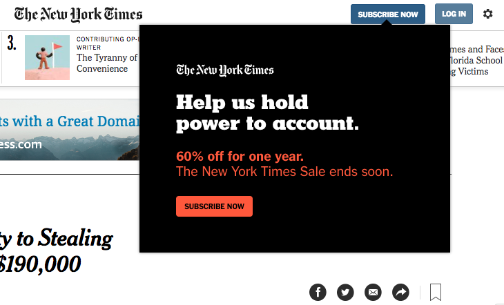
2. “Help us hold power to account: The New York Times is, in so many words, communicating the idea that subscription to their newspaper is an act of courage – a way to stand up to (let’s not beat around the bush) President Trump. Their target market (the political left) is looking for a way to do this, and the president has, if anything, helped The Times by being explicit about his disdain for the newspaper. Subscription is a way to stand up to that.
Takeaway
When you’re building your own list, remember that you should test giving your website visitors a good reason to subscribe. Test a reason to subscribe against “Sign up to receive our newsletter.” Test communicating value and a reason bigger than your own business’ content.
2. An entry popup
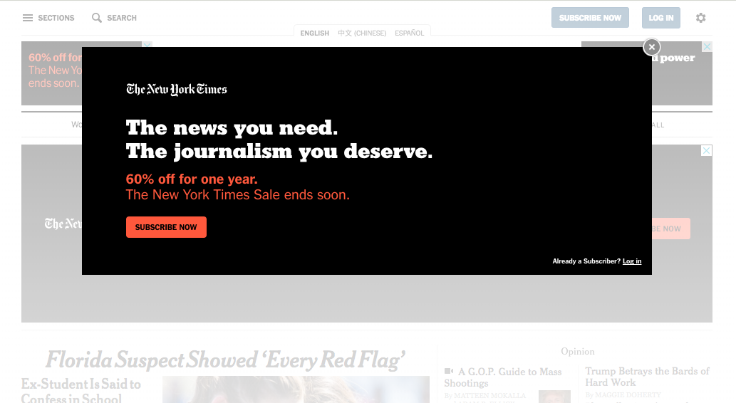
As soon as you arrive on their website, you see an entry popup which showcases their 60% off discount. I’m confident they’ll be a/b testing the headline here against “Help us hold power to account” (the headline for most of the rest of their website’s subscription prompts).
Why an entry popup?
The amazing thing about entry popups is that they’re shown to everybody. They frame the way people experience a website. By letting you know about a discount immediately, that discount is in the back of your mind as you navigate.
This is just as true for ecommerce websites as it is for a 167-year-old newspaper.
Discounts, showcased through an entry popup, frame the buyer conversation.
3. A Subscription-Oriented Header
The three black rectangles at the top of their homepage are actually Google Ads, which The New York Times has paid to ensure show on first-visit to their website.
The central ad shows both value propositions, and is framed by smaller ads which each feature a single message. Which do you respond to? The 60% off, or the ability to hold power to account?
By changing their newspaper’s header to orient around subscription, they focus attention on subscription.
Takeaway
If you’re marketing an ecommerce business, you can use this exact strategy by changing your website header whenever you run a sale or promotion. If you’re SaaS, consider changing your homepage header to feature your newest new feature or tool.
4. A Javascript popup
When you scroll over the “Subscribe Now” CTA in the nav bar at the top of The New York Times’ website a javascript popup appears upon hover.
Popups like this one (similar to a click popup but slightly more subtle) enable The New York Times to hit their visitors with their value proposition without requiring them to visit a new page.
This limits what website optimizers call “friction” – anything which gets in the way of conversion, or makes the conversion process easier.
5. A Opt-in Footer (and Paywall)

At the bottom of this image you’ll note a grey bar and orange call to action – this is The New York Times’ scrolling opt-in bar.
Opt-in bars are a more subtle way to prompt visitors to subscribe without completely interrupting their ability to interact with your website (as popups do). They can show at the top or bottom of the screen, and scroll as the reader scrolls.
By keeping the option open, they’re a powerful way to enable your visitors to subscribe at any time. When they decide they do want to subscribe/convert, they don’t have to go looking for a way to do so. The button is right there at the top or bottom of their screen.
You’ll also notice the number “3” on the left side of that bar. This is The Times’ paywall.
This is something a little more difficult for your business and mine to replicate. I mean, we could. I could limit your ability to read as many Wishpond blog articles as you wanted, but I don’t think we’d last very long if I did.
There are only a few publications (major US newspapers being the most noteworthy) which are able to limit their readers’ ability to read.
Takeaway
My recommendation for how to institute your own paywall is to limit your visitor’s ability to see the lessons within an academic course (“To get 7 more lessons for building your email list, subscribe to Acme Academy!”) or with a freemium software dashboard.
6. A Google Ad/Landing Page Combination
When you type “The New York Times” into Google, this is what appears at the top of the page:
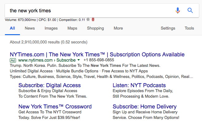
That’s a pretty subscription-oriented ad right there. It’s in the headline, description and “digital access” is the first of their list items.
When I click this Google Ad, I’m sent straight to The Times’ subscription-focused landing page (NOT their homepage):
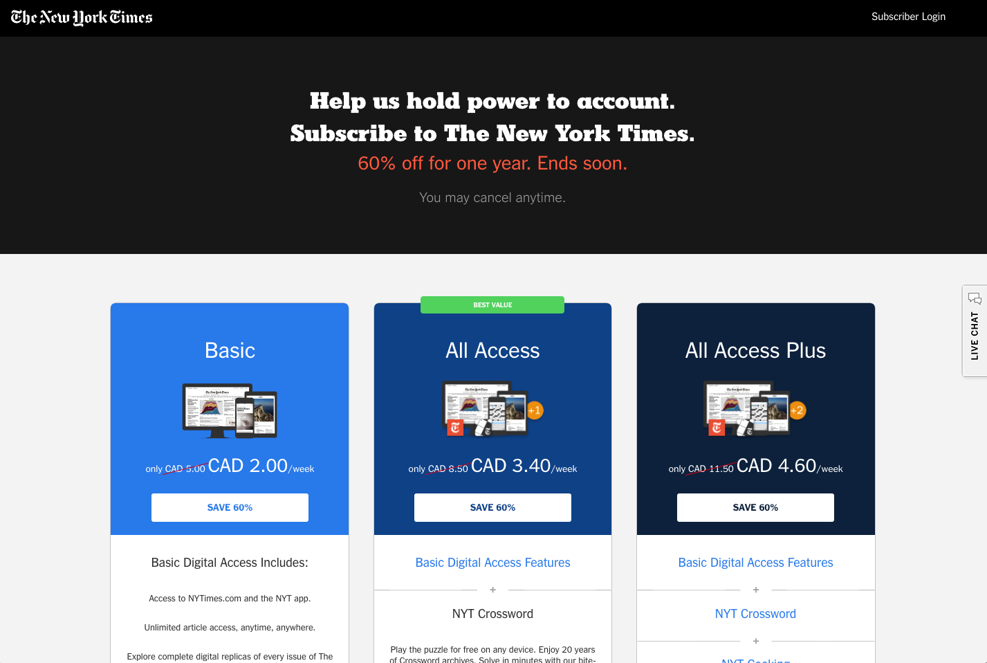
This landing page might remind you of something: a SaaS pricing page.
That’s because it is, basically.
The optimization best practices used by Wishpond on our pricing page are exactly the same best practices used by The New York Times on their subscription landing page.
The full landing page (not shown as it’s pretty long) has all the LP design best practices:
- An emphasized/preferred plan
- High-contrast buttons. The white CTA buttons within each plan turn orange as you hover over them. (Hover changes are something Wishpond’s landing page builder actually offers, by the way. Very cool).
- The previous, non-discounted pricing shown and crossed out (to show you the value of your discount)
- A full “plan features” list, with the “All Access” and “All Access Plus” plans showing more features.
- Weekly pricing (even though it’s a yearly payment plan) to make the commitment seem smaller
- Plan add-ons, including one-month free of The Times crossword
- An FAQ section with expanding answers (so as not to overwhelm landing page visitors)
7. A Campaign-Specific Landing Page
But what if you don’t care about holding power to account? What if your idea of perfection is a cup of coffee, a comfy chair and the New York Times crossword?
Monday to Thursday only of course. Weekend crosswords stress me out.
If that’s the case, then The New York Times offers a campaign-specific subscription option.
And, of course, every marketing campaign (whether “Get 50%-off at our back-to-school sale!” or “For a limited time, get one-month of our software, absolutely free”) needs a campaign-specific landing page:
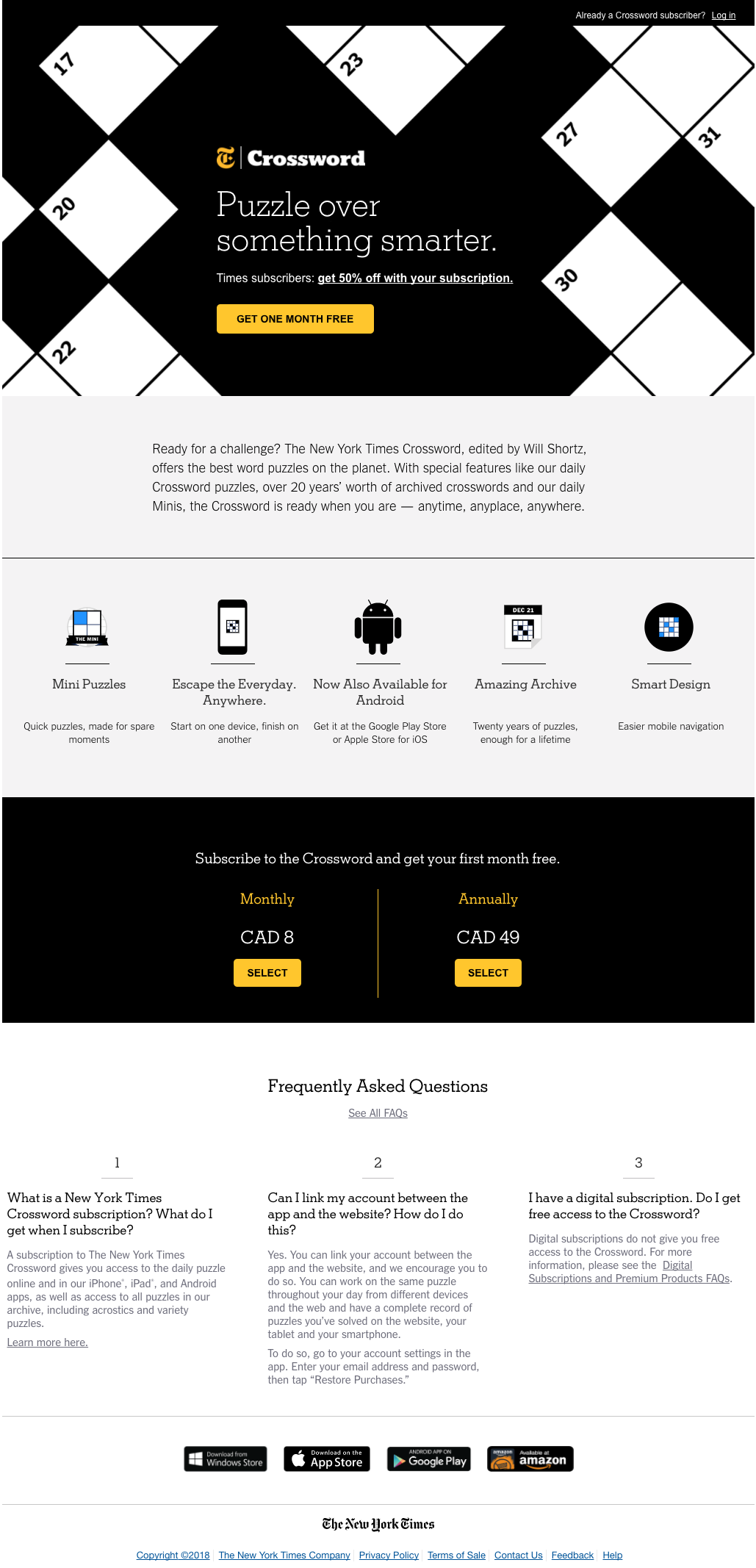
Notice that this landing page is completely independent from the rest of the website design.
We’ve dropped the color scheme – no more red. We’ve also messaging – crossword people probably don’t respond to the “Hold power to account” message.
While you need to keep general consistency across your campaigns, sometimes it pays to differentiate. What works on one landing page may not work on all of them. And yes, I recognize how frustrating it can be to optimize or A/B test a landing page only to have those same optimizations fail the next time you design a page.
Final Thoughts
The biggest lesson from this exercise, for me, was recognition that website optimization best practices are universal.
It doesn’t matter if you’re an ecommerce company, a SaaS business, a B2B conglomerate or a national newspaper which started in 1851…
The same stuff works to turn your website visitors into leads and customers:
- A powerful motivating message
- Entry popups
- Subscription-specific homepage headers
- Javascripted popups
- Opt-in bars
- Ad-specific landing pages
- Feature or tool-specific landing pages
Related Reading:
- 5 Ways You Can Do More With Your Website Traffic
- Ecommerce Optimization: Smart Website Additions Guaranteed to Boost Sales
- The Ecommerce Guide to Online Marketing
- 6 Types of Popups: Use Cases that Won’t Frustrate Your Visitors
- 3 Critical Ways to Build Your Blog and Newsletter Audience
- Digital Marketing Investment: Where to Put your Money to Grow Your Business