
If you’re building a website or landing page, you need to know how to create an effective sales funnel.
Converting visitors into customers takes an analytic approach, and you might need to change your strategy over time to see the most results. When designing your sales funnel, you have to keep a lot of different design elements in mind.
The most important thing to consider isn’t design at all, but how your design will benefit the actual form of the funnel.
Your funnel should be well thought out, and your design elements should complement this strategy rather than take away from it. Here are three design tips for better funneling.
Eliminate any distractions
One of the biggest design flaws for sales funnels is having too many distractions. If you have your sales page or pages on a larger website, consider removing distracting features like sidebars, excessive links, top navigations, or even too many images.
Really analyze the intention of this page and its role within the funnel.
- Do you want your visitors to be directed to another element of the funnel, or is this their final stop?
- Is there anything else on this page that could distract your visitors or lead them to click away?
People make decisions quickly. Whether or not they choose to stay on a website for longer than a few seconds depends on the quality of both the content and the design.
There should be only one clear message within this page or section of the funnel.
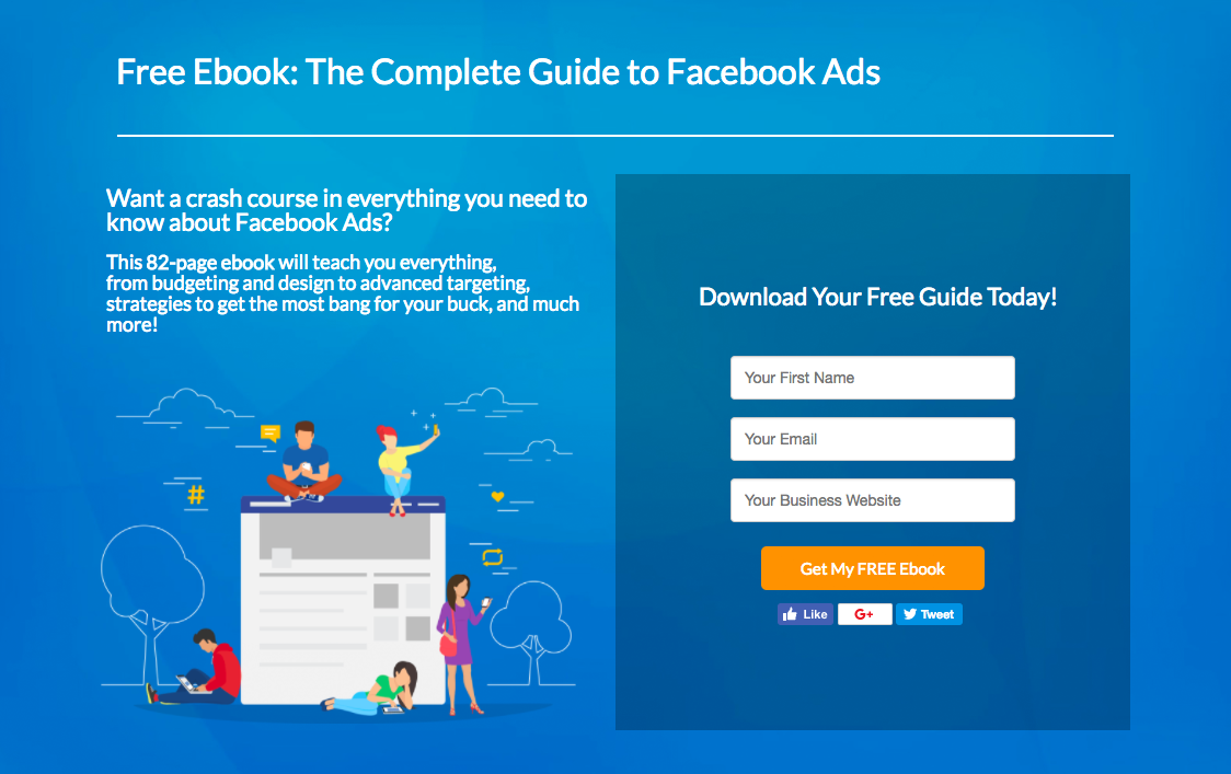
Here’s a simple example from Wishpond – where they’re prompting visitors to submit their contact information in return for a digital resource:
- What do you want your visitors to do next?
- Are these next steps clear?
- Are there any unnecessary elements that could confuse visitors or lead them away from the next steps?
Removing distractions is key to effective funneling!
Repeat your call to action
Every aspect of your sales funnel needs a clear call to action. If this section or page is early on in your sales funnel, that call to action might be to simply join a mailing list in exchange for a free download.
If it’s later in the funnel, it might even be to buy a product or sign up for a service. A big mistake many marketers and business owners make is listing the call to action at the end of the sales page or blog post where it won’t be seen.
Your visitors might not make it to the end of the page. If they can’t immediately figure out what it is they need to do next, they’ll likely move on to something else.
When designing your funnel, you need to make it as easy as possible for visitors to perform the action you want them to. Create an easy-to-use form or button and integrate it throughout the page.
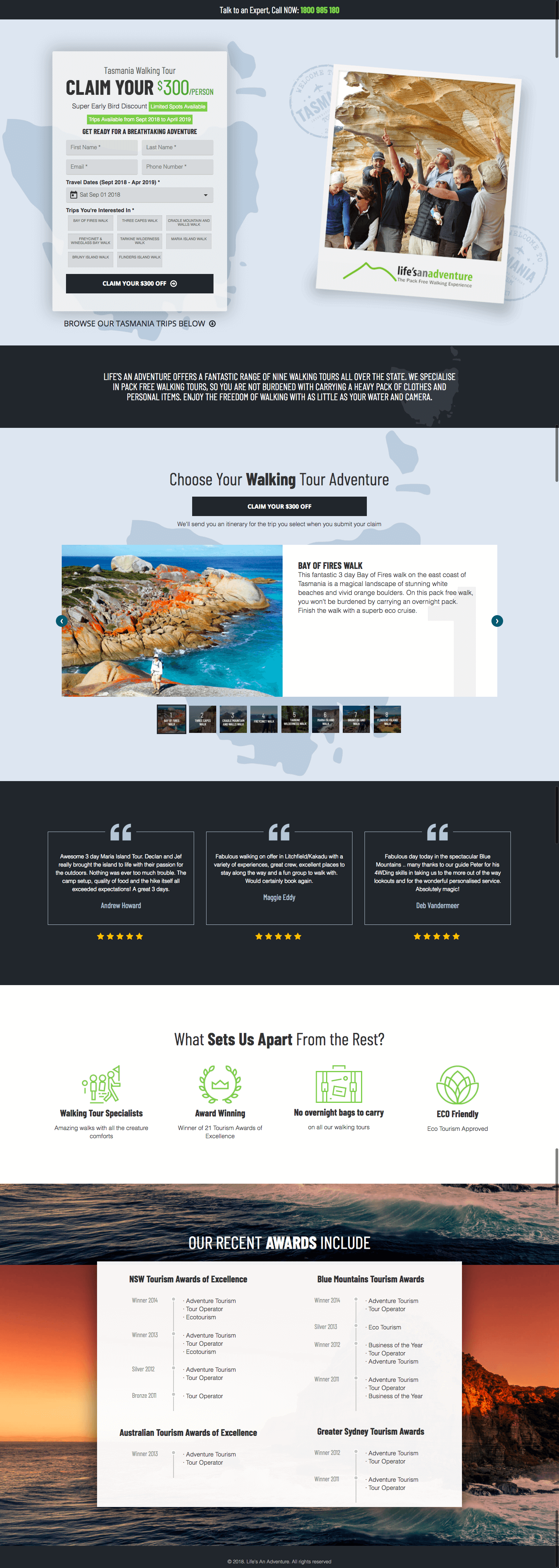
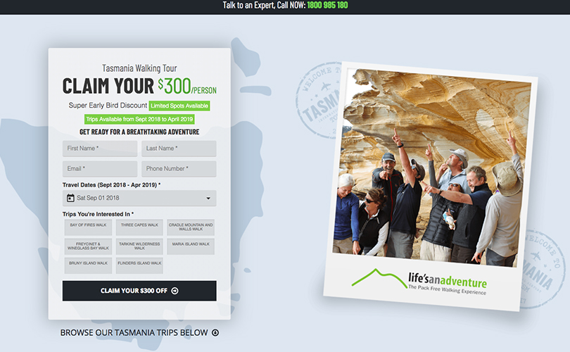
Here’s an example from a tours and adventures company, with multiple clear CTAs and an easy-to-use form:
Test the location of your call-to-action button for the most conversions!
Even if you use multiple buttons, they should all be the same action/conversion goal! Don’t add any extra steps or unnecessary links to confuse people and send them away from your sales funnel. When converting visitors into buyers, it’s all about making things as easy as possible.
Like that page above?
Wishpond’s contest and landing page tool makes it easy to create something like that in a few minutes. Learn more at Wishpond.com.
Encourage interactions with visitors
People don’t like to have their questions or concerns go unanswered. When designing your sales funnel, you need to create an interaction with your visitors.
Nobody likes feeling like they’re speaking to a robot. Put effort into coming across as a real person, and include helpful features to promote the breaking down of walls between buyer and seller.
To answer customer questions along the funnel, include live chat software that makes it easy for questions to be answered quickly.
Check out this example from Linkio:
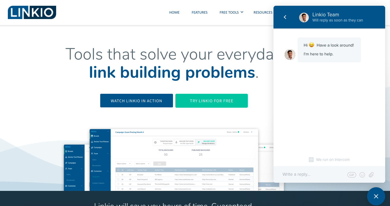
Answering questions to your customer at every step of the way, example: www.linkio.com
Advertise your email or your social media profiles so visitors have a way to follow up directly or keep in touch.
Your sales funnel should be designed in a way that resembles human interactions. Avoid being cold or unappealing in your messaging and design!
Design a sales funnel that converts
Sales funnels are essential to many digital marketing strategies. In this day and age of internet buying and selling, there are so many things to consider when formatting and designing landing pages or websites.
To convert the most visitors, you need to break down customer walls and stay true to your clear messaging. You only have a few seconds to make a big impact online, so make the most impact with these funneling design tips!
About the Author:
Ashley Lipman is a super-connector with Linkio, helping businesses build their audience online through outreach, partnerships, and networking. She frequently writes about the latest advancements in the SaaS world and digital marketing.