
According to data from Eisenberg, for every $98 spent on attracting traffic, the average business spends just $1 to convert this traffic.
This explains why, on most websites, research shows that 99 percent of people won’t buy on their first visit.
As an online business owner who wants increased profitability, the solution isn’t necessarily to buy more traffic. Sometimes, making a few simple tweaks can make a whole lot of difference.
This article will give you 10 simple but highly-effective tweaks you can make to your website that are guaranteed to boost your conversions:
Tip #1. Revise Your CTAs Based on the Neural Adaptation Principle
If you haven’t come across the concept of “neural adaptation” before, it might be a good idea to read up on it. Neural adaptation is “the decrease in a sensory response over time in the presence of a constant stimulus.”
In other words, the more exposure we have to something the higher the probability of us not easily noticing it or something like it – we get used to it and tune it out. This explains why it hurts at first when you dip your hands into slightly hot water, but feels normal after a while if you keep your hands in. It also explains why armies sometimes easily camouflage themselves and go unnoticeable by painting themselves and hiding behind grasses/bushes.
From a conversion perspective, Derek Halpern of Social Triggers put it more succinctly when he says, “What stands out gets remembered, what blends in gets ignored.”
So, how do you use neural adaptation to ensure more people click on your CTAs? By making your CTAs stand out compared to the page they are on or anything else on the page:
- Avoid using the same color for your CTAs as your website color scheme.
- If possible, try to ensure that your CTA button is unique – that it doesn’t share properties with other elements on your page – to ensure it more easily stands out.
Tip #2. Reduce The Available Options on Your Pages
In the classic, The Paradox of Choice, psychologist Barry Schwartz argues that while we tend to believe that we will do better with more choices, we respond negatively to more choices psychologically. He cited the famous jam study by Sheena Iyengar and Mark Lepper, involving 754 shoppers in an upscale grocery store. These shoppers were divided into two groups: the first group were shown 24 varieties of jam while the second were shown six varieties. Here’s a quick overview of the result of the study:
- In the first group shown 24 varieties, interest was higher – 60 percent of people stopped to look at the jams.
- In the second group shown six varieties – 40 percent of people stopped to look at the jams.
The results that really matter, however:
- Despite having fewer people stop to look at the jams, the second group had 10 times (yes, you read that right: TEN times!) more conversions than the first group.
In other words, presenting people with fewer options will result in higher conversion rates.
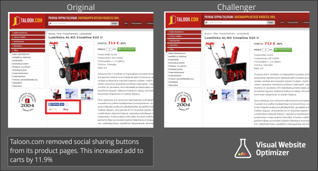
Another testament to limiting choices on key pages is the case study Visual Website Optimizer conducted of a Finland-based hardware ecommerce store. For this store, simply removing the share buttons on product pages increased conversions by a whopping 11.9 percent:
Tip #3. Cut your website load time in half
One of the quickest, simplest, and most effective changes you can make to boost your conversions is to make your website faster. I’d know since I make my living reviewing web hosting services – and speed is one of the metrics I pay attention to. There’s a method to my madness.
Research shows that:
- A one second delay in site load time can reduce conversions by 7 percent.
- Data based on an analysis of 33 major retailers found that by reducing site speed from 8 to 2 seconds you can increase your conversion rate by 74 percent.
You read that right: simply shaving off six seconds from your site load times will almost double your conversion rates. Simple and effective. So how do you cut your website load time in half?
Here are some quick tips:
- Enable caching and GZIP compression to reduce file sizes and server requests.
- Use a CDN to ensure people get served a version of your site closer to their location – resulting in your site being faster for them.
- Compress your images for better load times – images are one of the major culprits in slowing down websites.
Tip #4. Reduce Your Form Fields
It will probably take you a minute or two to reduce unnecessary form fields on your website, yet research shows that this simple action can boost your conversions massively.
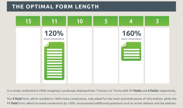
According to a study by Formstack, deleting just four form fields can increase your conversion rates by 120 percent – and having a 4-field form instead of a 15-field form can boost conversions by 160 percent. Yes, you read that right: simply deleting five form fields can more than double your conversion rates.
It’s good to have data on users to allow you better target them, but it’s worth asking yourself how much of that data you need right now? Is it worth sacrificing more than half of your conversions for? If not, it might be a good idea to reconsider.
Tip #5. Use Trust Seals on Your Website
According to a report by Econsultancy, 61 percent of people had decided not to make a purchase on a website due to absence of trust seals while 76 percent of people had decided not to make a purchase due to unrecognizable trust seals.
In essence, not having a trust seal on your website could cost you up to half of your sales. Not having a recognizable trust seal could cost you even more.
It will probably take 10 minutes to set up a trust seal on your website, and this could double your sales and conversion rate.
According to the Econsultancy report, some of the most recognized trust seals are:
- McAfee
- Verisign
- BBB
- TRUSTe
You can take things to the next level and use a combination of trust seals. Since no trust seal is recognized by 100 percent of people, why not use two or more to increase your website trust factor?
Tip #6. Reduce Cart Abandonment
When it comes to closing sales, perhaps the major challenge every business owner has to deal with is cart abandonment. Cart abandonment is so serious that Baymard’s research found that a whopping 69.23 percent of people will abandon the average shopping cart.
That’s a lot.
After optimizing your website to ensure many people get to the shopping cart using some of the other tips in this article, having them quit right at the cart can be discouraging. Thankfully, dealing with this is simple.
Here are some tips:
- Avoid surprising them with hidden costs and fees – unspecified extra costs (even if it is VAT, shipping costs, or other essential fees) is the number one reason people quit shopping carts. You can prevent this by factoring additional costs into the product cost or revealing the extra cost upfront.
- If you don’t have a follow up system in place for people who abandon your shopping, it might be a good idea to develop one.
Tip #7. Introduce a Decoy Option to Let People See That They Are Getting a Bargain
We are busy and overwhelmed. In fact, research shows that our attention span is the shortest it has ever been – and that it keeps declining. When you give people options it is important to push them to decide fast – otherwise they will get distracted by the next opportunity they come across and your conversions will suffer.
How do you make this happen?
By introducing a decoy option. An experiment conducted by Dan Ariely quickly comes to mind. In a survey of 100 people, Ariely presented two choices:
- A web-only subscription – $59
- A print and web subscription – $125
68 percent chose the web-only option and 32 percent chose the print and web option. Ariely would prefer that more people choose the print and web subscription, so he introduced a decoy. The new option looked like this:
- A web-only subscription – $59
- A print-only subscription – $125
- A print and web subscription – $125
This time around, however, guess how many people chose the print and web subscription? 84 percent! 16 percent chose the web-only subscription, and nobody chose the print-only subscription – this was because Ariely introduced a decoy to let people see what kind of bargain they were getting with the print and web subscription. By introducing a similar decoy that is pale in comparison to your real offer, you draw attention to how much of a bargain people are getting with the offer you want them to choose, and you boost your conversions as a result.
Tip #8. Incorporate Elements of Authority into Your Pages
On February 15, 2013, Oprah posted an endorsement of the T-FAL ActiFry on her social media accounts. Holding a picture of the Actifry, she added the message: “This machine ..T-Fal actifry has changed my life. And they’re not paying me to say it.”
For T-FAL, the manufacturer of ActiFry, this endorsement didn’t only boost sales – it increased their share value by over $150 million. This goes to show how much premium we place on authorities.
The Milgram experiments conducted in the 1970s show that people will do almost anything, including including fatal harm on another person, if instructed to do so by an authority figure. When an authority symbol encourages people to sign up on your website, conversions will naturally be higher than without.
Some of the best ways to incorporate authority elements include:
- By showcasing the fact that you have been endorsed by a renowned authority on your website.
- By showcasing the fact that you have been endorsed by an industry expert on your website.
- By getting featured on authority publications in your industry and showcasing this fact on your website.
Tip #9. Incorporate the Pleasure Principle into Your Sales Pages
Psychologists have found that we tend to want instant gratification – we are naturally inclined to go great lengths to avoid pain and get pleasure, and most people would always choose to have a smaller reward instantly instead of waiting slightly longer and getting a much bigger reward. This is explained by the pleasure principle.
By designing your website in a way that addresses people’s desire for instant gratification, you can significantly boost your conversion rates.
Some ways to do this are:
- In your messaging, emphasize the fact that users will be getting what they want fast – while being as specific as possible e.g. “Your dream job in 3 days” is more compelling than “Your dream job.”
- Ensure that users have all information needed to take the desired action – making them jump through hoops or having to contact you manually will cost you sales.
- Reduce the number of steps towards the desired action – every extra link clicks, extra pages, etc, will negatively impact your conversions.
- Introduce progress bars/indicators to let people know how long they have to wait: this can be used when filling forms or checking out. By letting people know exactly how long they have to wait, you’re gradually satisfying their desire for instant gratification until they get what they want.
Tip #10. Let Visuals Do The Talking
Research shows that 90 percent of information transmitted to our brains is visuals, and that our brains process visuals 60,000 times faster than it processes text.

Review key pages on your website to see whether visuals are being used, and how they are being used.
- Experiment with using 360 rotating images – these have been found to boost conversions by up to 27 percent.
- Consider including product images in the search window when people try to search for a product on your website – for a particular retailer, doing this increased conversions among shoppers using its site search feature by 100 percent.
- Using human photos instead of stock photos has also been found to boost conversions – for a particular business, this increased conversions by 95 percent.
About the Author:

John Stevens is the founder and CEO of Hosting Facts.