

The internet’s not the wild west it once was. Back in the day, businesses could throw up a simple website and be light-years ahead of their competitors. But times, they are a-changing.
Build it and they will come rarely works anymore. With over a billion websites on the internet, nearly every market is crowded with options customers can choose from, and increasingly savvy internet users have higher and higher expectations from the online stores they visit. They expect the stores to be mobile-friendly, tablet-friendly, error-free, fast-loading, well-designed…and probably with free next-day shipping! The bar has been raised.
If you’re an eCommerce website owner, this leaves you with a simple, yet critical challenge: where do you focus your (limited) resources to maximize your website’s effectiveness and customer satisfaction? How can you take your site to the next level?
Here are 10 research-backed tactics you can implement to improve your eCommerce website and attract more customers.
Kill the carousel
Image carousels or rotators are popular features to put at the top of eCommerce homepages or category pages. They’re flashy, dynamic, and site owners and designers seem to love them. But do users love them?
Generally speaking, no: carousels are not the most effective option for your homepage or category pages. A Nielsen usability study found that users were often unable to find content that was in a rotator:
“The user’s target was at the top of the page in 98-point font. But she failed to find it because the panel auto-rotated instead of staying still.”
Replace carousels with static content that presents your core value proposition and makes it easy for users to find the most critical information on each page.
Optimize shipping for 1-2 day delivery
Amazon has had an enormous influence on modern life. One way they’ve shaped the fabric of our society is by changing consumer expectations on delivery speed. Back in the day, 3-7 days was considered pretty typical. But Amazon has conditioned users to expect faster delivery (1-2 days) and online stores are under pressure to deliver quickly in order to compete for customers.
Fortunately, small businesses have some options – and you don’t need to pay for 2-day air shipping or stock products in 140 fulfillment centers across the US. Most businesses can use two strategically placed fulfillment centers to offer 2-day ground shipping to nearly every resident in the US.
For example, if you place your East Coast fulfillment center in Louisville, KY you can ship to the blue and pink portions of this map in 1-2 days with FedEx Ground:
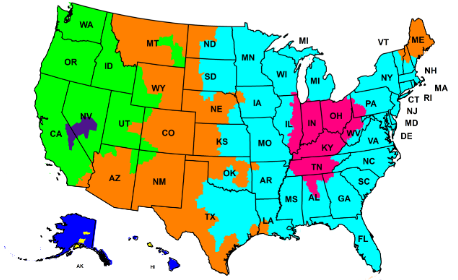
That includes basically all of the Eastern US plus the major population centers in Texas and the Midwest. Then, by adding a fulfillment center further west, you can cover all the population centers on the West Coast in 1-2 days also:
That delivers to the whole country in 2 days or less, except for the Rocky Mountain states, Maine, Hawaii, and Alaska.
Voila! You’ve got near-Amazon delivery speeds with two fulfillment centers and group shipping!
Visually prioritize one action on each page
Most internet users skim. According to a study Jakob Neilsen did 22 years ago, about 79% of users prefer to skim – and skimming has only become more prevalent in the years since.
Users want to be able to quickly identify what they want to do next. This means that presenting a bunch of equal options isn’t great for users or site owners. Users can skim and move faster (and complete purchases faster) when websites make it obvious which single action the user should take next.
This principle is especially important in your store checkout. MecLabs performed a study where they took this checkout:
And changed it to make it instantly obvious which button the user should click:
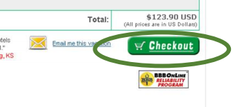
The result: eCommerce conversions increased by 37%!
Don’t force account creation
Want to frustrate customers so they abandon your site without purchasing?
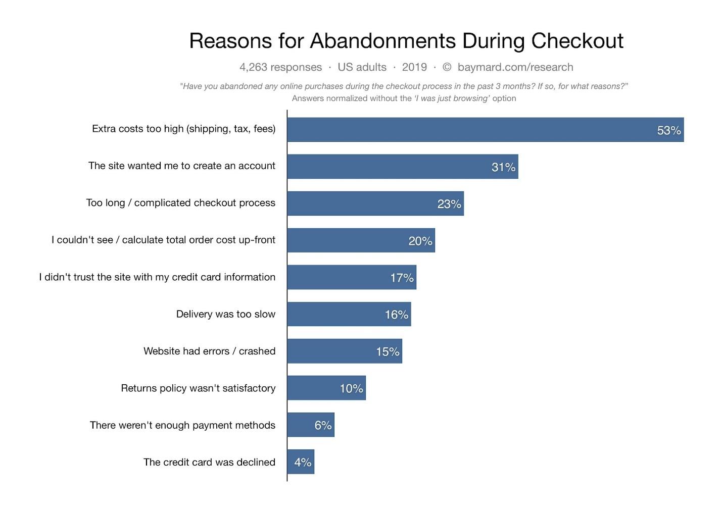
According to a Baymard Institute study, one of the best ways to cause shopping cart abandonment is to force users to create an account during checkout. 31% of US adults surveyed said they recently abandoned an online purchase for this reason:
If you want customers to complete their purchase, make it easy for them to checkout without registering for an account on your website.
Fortunately, many eCommerce platforms offer guest checkout as an out-of-the-box feature or as a plugin. For example, here’s the guest checkout option Magento offers by default:
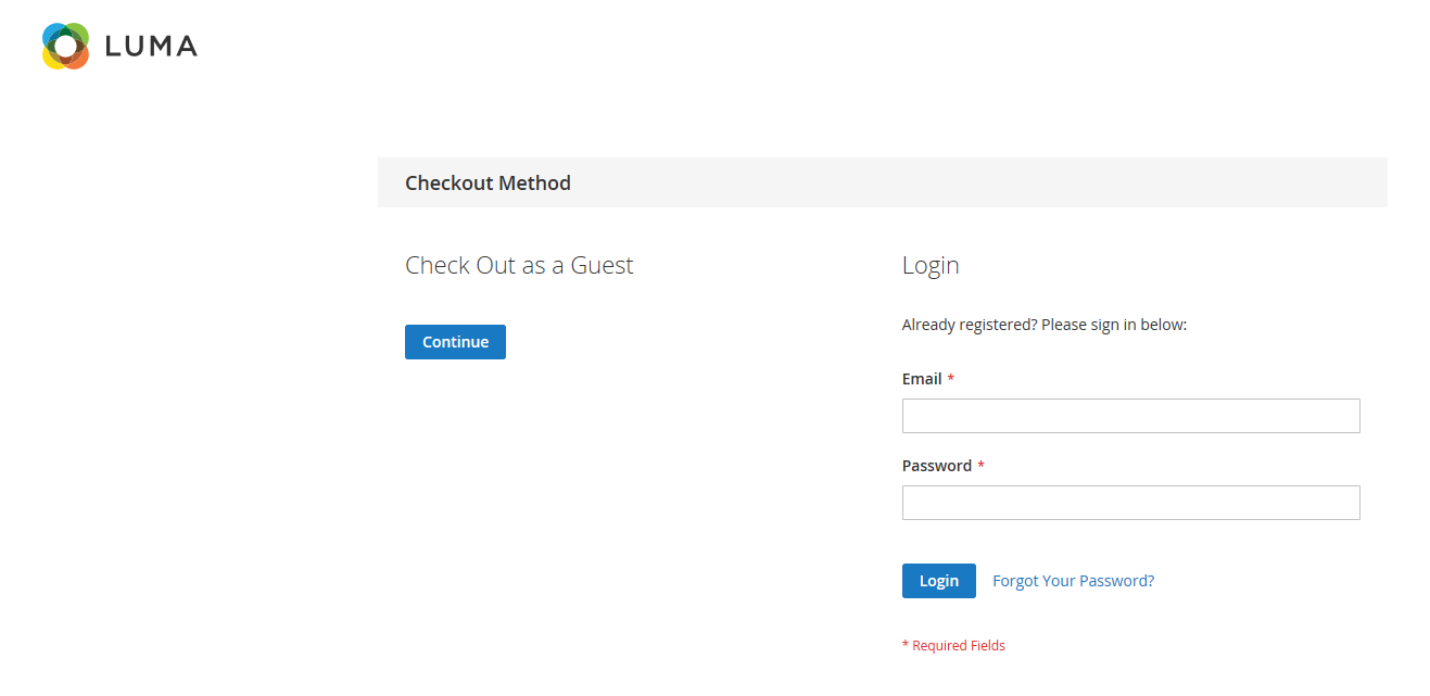
I typically recommend removing even this step, though – take users straight to the guest checkout with a link at the top for users to log in if they already have an account.
Find a way to offer free shipping
In the Baymard Institute study referenced previously, researchers found that the #1 reason for shopping cart abandonment is:
Extra costs are too high (shipping, taxes, fees).
Taxes are beyond your control, but you can work to make shipping costs more affordable for users. In fact, you probably need to offer a free shipping option: the Top 100 Ecommerce Retailers Benchmark Study found that 68% of top eCommerce websites offer free shipping, typically requiring a $50 minimum order to qualify for free shipping.
Here are a few tips for making free shipping a cost-effective option for your eCommerce store:
- Use strategic fulfillment center locations to ensure you can use cheap shipping options while still getting orders delivered quickly.
- Require a minimum purchase to qualify for free shipping.
Offer users an incentive (for example, a free gift or credit) to choose a cheaper shipping option. - Use your free shipping threshold to upsell customers to buy more: “Add $23 more to your shopping cart to get free shipping!”
Minimize packaging and processing costs to keep overall costs down. - If needed, mark heavier items (that are costlier to ship) as ineligible for free shipping. Or, require a higher minimum order to qualify for free shipping.
Shorten your checkout process
Not to harp on the same thing, but let’s reference that Baymard study again. It found that the #3 reason for shopping cart abandonment is an overly long or complicated checkout process.
Shortening forms isn’t just for eCommerce, either. Marketing Experiments ran a test that showed a shorter form boosted conversions by 34% – that’s a pretty significant boost!
Back to eCommerce, though. The key is to make checking out as fast and as easy as possible. And this doesn’t just apply to online – customers hate Walmart for making real-world checkout a pain:
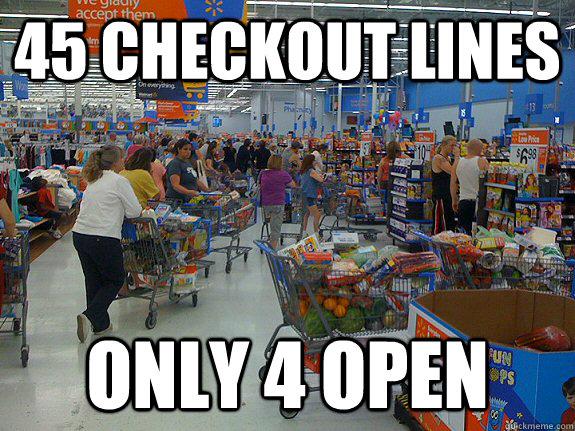
Don’t make your online store checkout like Walmart: slow and painful. Make it quick and intuitive by:
- Removing any fields that aren’t needed
- Making every error message clear and intuitive
- Ensuring skimming customers can easily see what to do next
- Making your forms fully compatible with auto-fill
- Making the visual flow of the process simple and intuitive
Tighten up your security
Customers are (slowly, but surely) learning to care about privacy and security online.
With headlines being published seemingly every day about hackers stealing customer data, government agencies are fining companies – and consumers appreciate it. For example, the UK government recently fined British Airways a record-breaking £183 million because of a data breach that happened in 2018. The government felt that BA hadn’t done enough to protect the data against hackers. While opinion was divided, a survey found that a significant percentage of brits supported the data security fine. In fact, 1 in 10 UK residents wanted the fine to be higher! Ouch.
The fact that customers care about their data security means that eCommerce website owners need to take steps to protect their customers, and just as importantly – demonstrate to customers what they’re doing for privacy and security. Here are a few tips to get you started:
- Take the steps needed to become fully PCI compliant (even if your bank doesn’t enforce it). Feel free to use a site seal or website message to tell your customers about this!
- Follow any privacy laws that apply to you (for example, GDPR) and list on your website what you’re doing.
- Implement best-practice security practices across your website and organization (which PCI requires, anyway).
- Implement SSL/HTTPS on all URLs, all the time.
- Be 100% certain that you’re not storing any payment card or other sensitive data un-encrypted. In fact, just don’t store it at all – companies like Stripe and Authorize.net make it easy for you to bill credit cards while they handle the secure storage portion.
Offer a satisfaction guarantee
Many companies are afraid to implement a 100% satisfaction, money-back guarantee due to fear that people will abuse the policy. Sure, that does happen.
But in most cases, you’ll get benefits from a satisfaction guarantee policy that far outweigh the costs. A Wiley study found that “selling with MBGs increases retail sales and profit. Furthermore, the second-sale opportunity created by restocking returned products enables the retailer to generate additional revenues.”
Money-back guarantees offer several benefits, including:
- Increased conversion rates. Advertising a money-back guarantee is very effective at removing any lingering doubts and getting the customer to make the purchase.
- Lower cart abandonment. Showing your guarantee seal/details in the checkout can help reduce shopping cart abandonment.
- Better online reputation. No matter how good your products are, some customers won’t be happy. And some unhappy customers will post negative reviews and complain about social media. Offering a money-back guarantee can reduce or sidestep a lot of that complaining, improving your online reputation and making new customer acquisition easier.
Give instant support options
Customers increasingly expect instant gratification. In the world of WhatsApp, Snapchat, & Tinder…email is just too slow.
The top 100 eCommerce study (linked above) found that eCommerce stores are catching up with the instant gratification trend: 99% of top stores offer phone support and 53% offer live chat support. Another study found that customers prefer live chat to phone or email.
And (in case you’re still not convinced) research by Kayako shows that a majority of companies find that live chat has a positive impact on their sales:
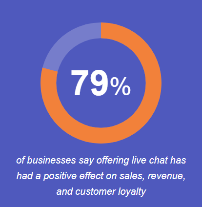
For customers who have a question or want to talk to someone before making their purchase decision, live chat is a great way to make customers happy and close more sales.
Track and optimize onsite search
Onsite search is a far-too-often-neglected feature in the eCommerce world. Research from eConsultancy shows that visitors who do a site search are nearly twice as likely to purchase as users who don’t do a site search.
Here are a few tips to help you maximize the effectiveness of your onsite search feature:
- Make the search box easy to find, sitewide.
- Enable autocomplete to show common searches and suggested products.
- Support text searches or product IDs.
- Sort by relevancy/best-selling by default.
- Auto-correct common misspellings.
- Allow users to change sort options on the search results page.
- Allow users to filter results by category, rating, and other criteria.
- Carefully track the terms users search on your site, checking to ensure good results are being returned.
What are your go-to tactics?
This article is hardly a comprehensive list of research-backed ways to improve your eCommerce store – it only covers a few of the tactics I’ve seen be effective. What are your favorite ways to improve an eCommerce shop?
About the Author

Adam Thompson is a digital marketing and technology manager with 15 years of experience in eCommerce and SEO. After 10 years agency-side, Adam moved into the cybersecurity industry, serving as SEO & SEM Manager for ComodoSSLStore. When he’s not digging in Google Analytics, creating content, or writing code, you’re likely to find Adam enjoying the outdoors near his home in sunny Florida.