
As you probably know, pop-ups and automatic live chat messages are crucial to lifting conversion rates on your website.
Having clean and intriguing pop-ups and automatic live chat messages that will catch your website visitor’s attention will improve your conversion rates and help you to engage in meaningful conversation.
That’s not only good for building strong relationships with your customers: it can also end in a purchase of your product or service.
Implementing webiste pop-ups and automatic live chat messages properly is of crucial importance to your CRO marketing.
On the other hand, improper or clumsy implementation of your pop-ups and automatic live chat messages can be very costly for your business – not to mention that you may lose new leads and potential customers.
In this article, we’re going to see the best pop-up and automatic live chat message examples and analyze what makes them good. You can use these to inspire your own!
Let’s get started!
7 Best Pop-up Examples (And What Makes Them Great)
We examined each pop-up against the following criteria:l:
- Context and timing – This is one of the most important things you need to consider while creating a pop-up. For example, does it make sense to show a, “Subscribe to our newsletter” pop-up on a pricing page? Not at all.
- Design – Eye-catching design will lure your website visitors in and encourage them to keep browsing your site. On the other hand, a design that looks like it was built by rudimentary HTML will just turn them away.
- Offering – Is your offer good enough so the people will be ready to give you their email in exchange for it? What are you giving them in return?
These are the main pillars of every successful pop-up. So, let’s see some great examples you can take inspiration from.
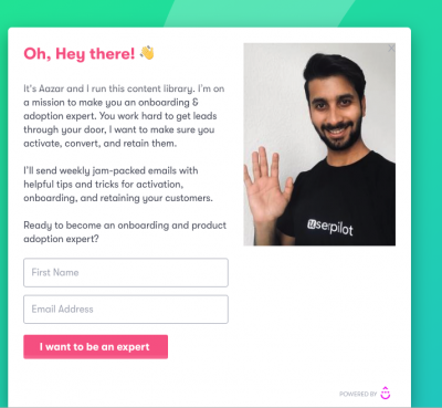
1. Userpilot – Emphasize the human element
After you spend some time on Userpilot’s blog, this pop-up will appear:
So, what’s great about this pop-up?
- Context – this “hey there” pop-up is shown after you scroll down 80% of the blog post. Since you’re already reading a blog post (and most likely invested, since you’ve made it most of the way down), and you see this pop-up that offers you amazing articles each month, you’re more likely to end up signing up.
- Design – The design is clean, without too many colours. The text is a little bit longer than you might usually see on a pop-up, but it doesn’t matter in this example since this pop-up has something unusual: a human element. It’s smart to sometimes show that we’re also humans, not robots. Not to mention that the human element brings empathy and improves conversion rates.
- Offer – The fact that context and offer complement each other perfectly is enough to say that this pop-up is great. But even more, this pop-up gives you an opportunity to become the “onboarding and adoption expert”. Appealing pitch, right?
2. Volusion – Showcase your community
Here’s another pop-up example that comes from Volusion.
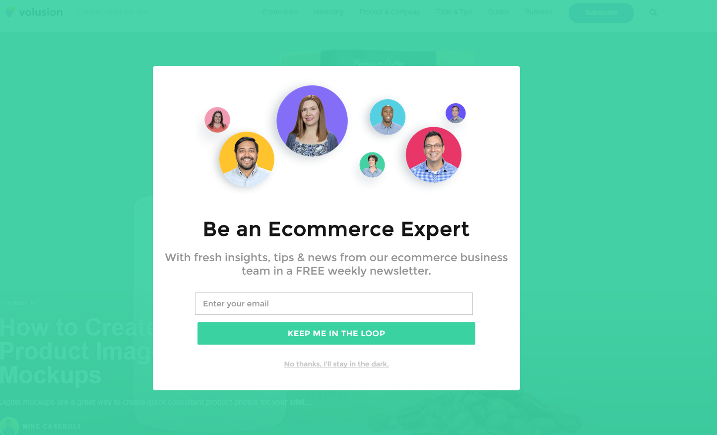
So, what’s great about this pop-up?
- Context – This pop-up appears after someone spends a couple of minutes on Volusion’s blog.
- Design – This pop-up definitely has a clean and eye-catching design as well as the human element inside it. But, what really makes this pop-up special are the photos of Volusion’s community members. When showing your product isn’t appropriate, turn to your own team.
- Offer – From the first sight, it’s clear what will you get: expertise in eCommerce.
3. Pinterest – Use your pop-up as the landing page
I was amazed when I saw how Pinterest leveraged the power of pop-ups to increase its conversions and sign-ups.
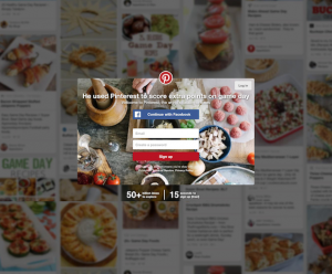
What’s great here?
- Context – This pop-up is shown a couple of seconds after someone tries to search for the pins. The best part? It’s shown only to people who don’t have an account on Pinterest.
- Design – Design looks stunning. The high-quality background image just adds value to Pinterest. A signup button that’s integrated with Facebook makes it easy for website visitors to quickly create an account and continue with their work, reducing friction.
- Offer – The heading presents a real-life use case. As a website visitor, you might think: “If someone else can find inspiration with Pinterest, then I can find it as well!”.
4. Pampers – Use emotions and empathy to your advantage
Literally, one picture can say a thousand words:
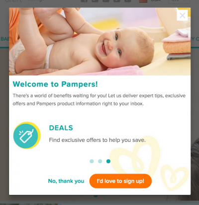
- Context – This pop-up is shown after you visit the second page on the website. It officially “welcomes” you to the Pampers family. A lot of moms that are exploring the Pampers website will definitely want to see something like this.
- Design – This pop-up is shown over the entire screen, which makes it easily catchable. Design is clean, on brand and geared towards the target audience. The picture of a grinning baby provokes positive emotions.
- Offer – The offer is tailor-made for the sleep-deprived new mother. Any new parent welcomes “expert tips”, and most will jump on exclusive deals that can help them to save some money.
Whether you’re using a form builder or pop up builder always be sure to use these three key elements to attract your readers.
5. Quicksprout – leverage the power of your benefits
Quicksprout is a great example of how to leverage the power of your benefits and write killer copy for your pop-up.
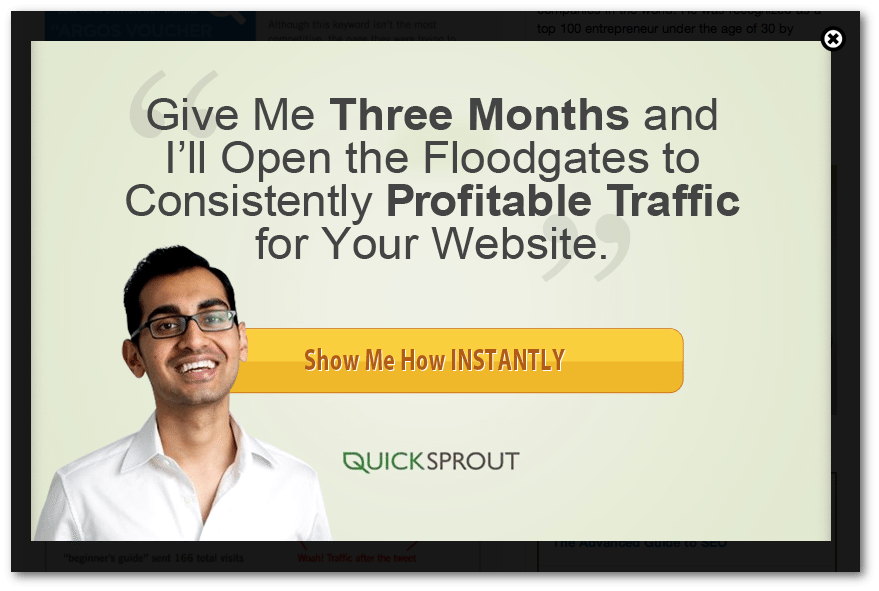
What’s great about this pop-up?
- Context – like in the Userpilot’s example, this pop-up is shown after someone spends some time reading articles and resources.
- Design – Text is easily readable and the CTA is eye-catching. This pop-up uses the human-element as well,this time showcasing Neil Patel, the founder of Quicksprout and an industry-recognized marketing influencer (solid social proof). Also, there’s no opt-in, only a CTA button. This is a great way to reduce the friction of your pop-ups and improve conversions.
- Offer – Just read this amazing copy. In three months you’re going to have profitable traffic on your website. Short, actionable, oriented towards the users’ goals and measurable.
6. Apple – Bring the FOMO in your pop-ups
FOMO (fear of missing out) is one of the most powerful emotions marketers can leverage in their campaigns Although it’s the best for eCommerce websites, it can also work well in software and other industries.
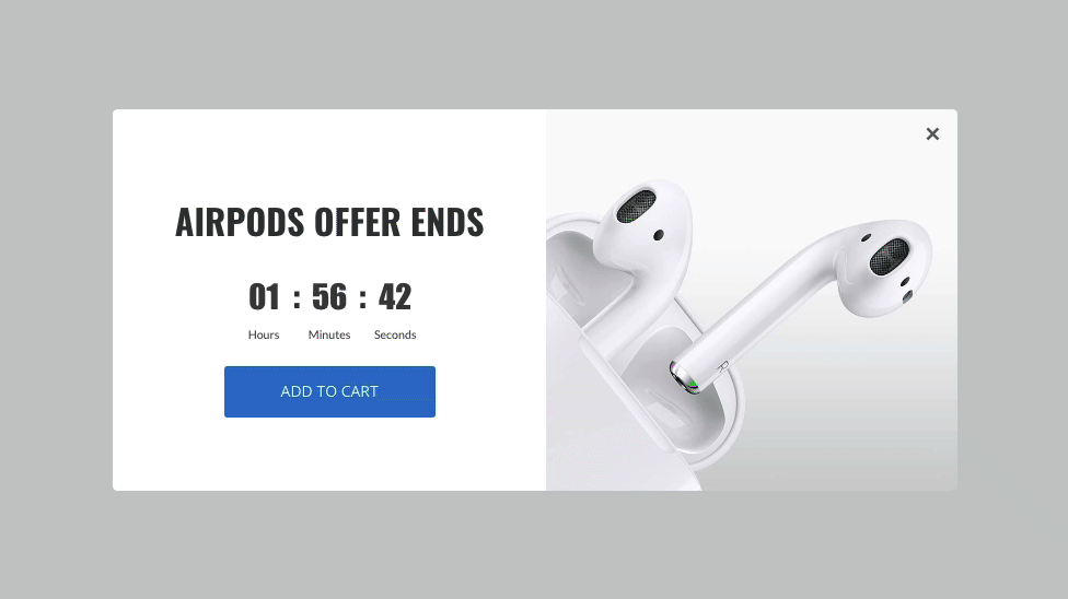
- Context – this pop-up is shown whenever someone tries to buy airpods online but abandons the purchase before completing. It’s an exit-intent pop-up which is great for this situation.
- Design – Ample use of whitespace to emphasize the CTA and match the product, with a countdown timer to increase the sense of urgency.
- Offer – Buy now with a discount or buy later for much more money. If you’re really interested in buying airpods, which option would you choose?
7. CookingLight – Offer notable discounts
When you say “15% off” it’s not a big deal, right? But when you say the exact price or when you mention the things that someone else can buy with the amount of your subscription, it becomes more meaningful.
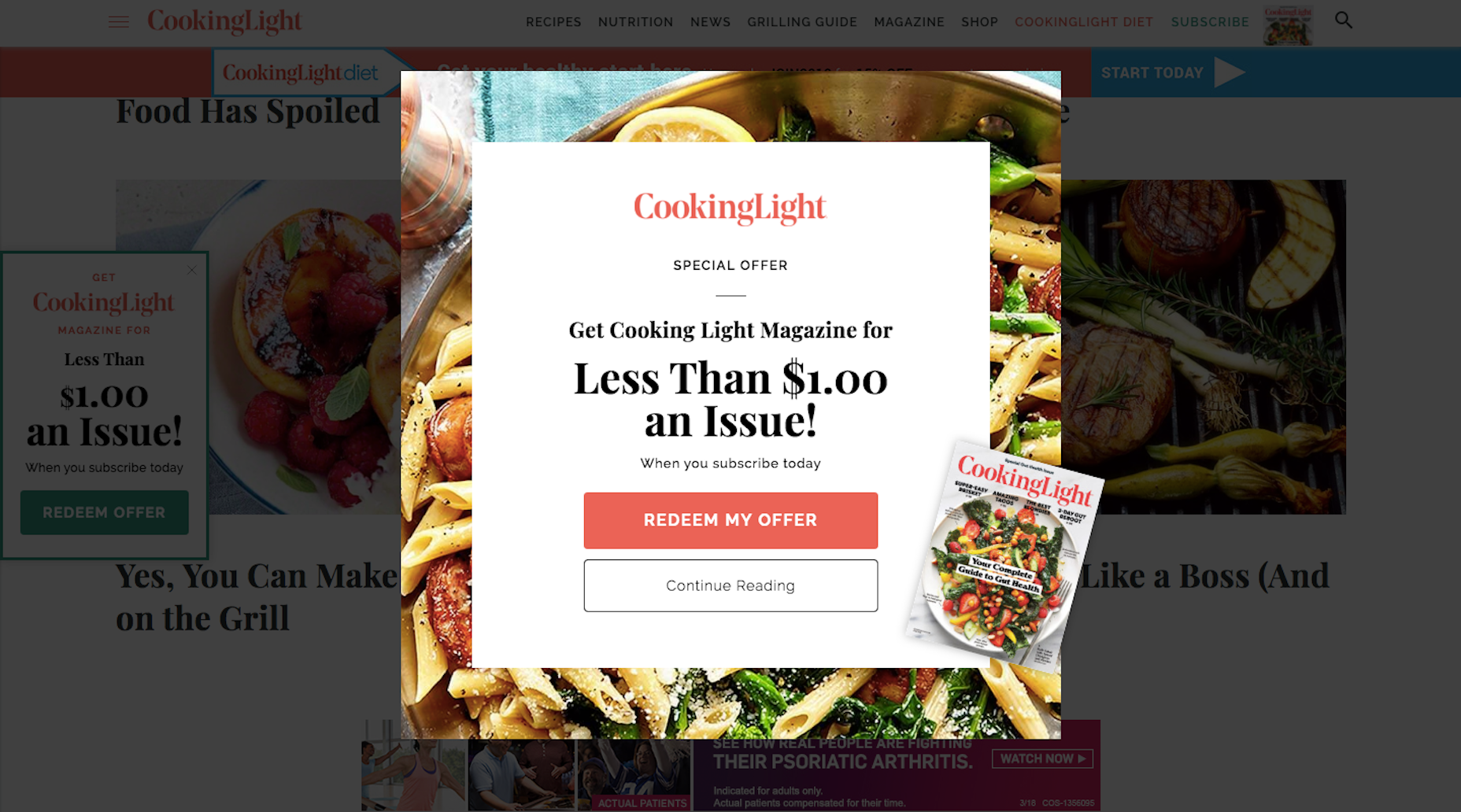
CookingLight perfectly leveraged the power of its pricing.
- Context – This pop-up is shown whenever someone spends some time reading the recipes on the site, signalling that they’re extremely interested in the content CookingLight has to offer.
- Design – A catchy image of the meal in the background and short copy is everything that was needed for CookingLight to improve their conversions.
- Offer – In this case, positioning the offer in hard dollar terms, like, “less than $1 an issue” means much more than saying “30% off per issue”.
What can we learn from the best pop-up examples?
Here are the key takeaways we can bring home from the best pop-up examples:
Pay attention to your context
Context is of utmost importance. Ask yourself: does it makes sense to show a subscription pop-up on the pricing page or a discount offer pop-up on a blog post?
Make your design be eye-catching
Pop-ups that look outdated will be more likely to turn away your website visitors. On the other hand, eye-catching, clean and well-designed pop-ups will improve your conversion rates.
Create a great offer
Put yourself into your visitor’s shoes: would you trade your email address for your offer.
Emphasize the human element
Highlighting the human element will show your website visitors that you’re not robots, but real people, like them. This simple psychological bridge helps you to build better relationships with your potential customers.
Play on emotions
Emotions are one of marketing’s biggest assets. No one buys logically, but with emotions.
Use FOMO in your pop-ups
Fear of missing out is one of the most powerful techniques you can use to grab someone’s attention and to convert them into customers – keep this in mind.
How big a discount are you offering?
Sometimes saying “30% off” doesn’t make an impact. On the other hand, saying the exact price will have a bigger impact, to give people an exact idea of the value. For example, if your subscription costs $6 – you can say that’s it’s the same price as a coffee.
3 Best Live Chat automatic message examples to inspire you
Automatic live chat messages have a similar purpose as pop-ups: engage with your website visitors.
Similar to pop-ups, we’re going to rate the live chat messages based on their context and message.
1. Infinity – Explain your Product
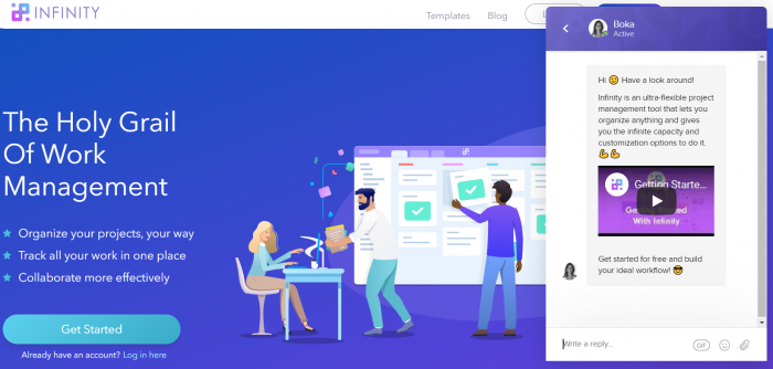
The first automatic message live chat example comes from Infinity. As you can see, as soon as you open the website, a new live chat message pops up.
What we like about it is the way they managed to explain their product in short, catchy and funny text while also providing a short demo video.
2. Reportz – Offer an Extended Trial
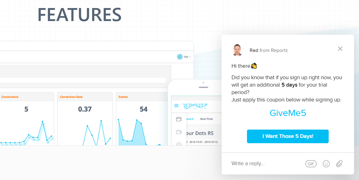
Reportz is a PPC reports software that lets you easily integrate your PPC campaigns and create stunning reports for your clients. This message is shown to website visitors who don’t have an account on the site.
It combines context and a great offer, considering where the user is in the customer journey.
3. Lemtalk – Prompt Visitors to Experience Your Product
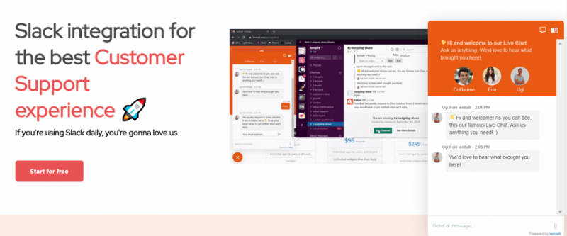
Lemtalk is a Slack Live chat tool. It’s an Intercom alternative that allows you to receive and answer your live chat messages directly from Slack.
The goal of this message is to engage in conversation with website visitors. Since we’re receiving and answering live chat messages directly from our Slack account, it allows our website visitors to see the value inside the product before even signing up for it.
This particular live chat message helped Lemtalk to engage 45% more conversations on the website and convert 23% more website visitors.
The Bottom Line
Appropriate pop-up offers and live chat messages can boost your website conversion rates by 10 – 30%.
But if you want results like that, you’ll need to stick to the best practices we mentioned above.
To experiment with pop-ups, create different designs, and offers, contact Wishpond today to improve your conversion rates!
About the Author
Ugi is the head of growth at lemtalk and content marketing manager at lempod. He’s passionate about writing, SaaS, organic user acquisition, horses and dalmatian dogs.