If you’ve been searching for methods to increase your conversions at once, exit popups are the number-one weapon that will most certainly get you there.
Pop-ups are an effective way to not only drive conversions but also reduce website abandonment and grow your marketing list when used intelligently.
According to one recent case study, the inclusion of an exit popup increased leads by an impressive 13% for an online marketing platform.
While these numbers seem to be small, when you add a high volume website traffic to the mix, it translates to a significant amount of conversions and email subscribers. It also goes into showing the incredible difference in the design and execution of pop-ups can have on the website conversions.
Contrarily, poorly executed pop-ups can belittle your overall customer experience. They may disrupt the customer in their journey to make the purchase forcefully and therefore, generate bad brand sentiment.
Even worse, obtrusive pop-ups may isolate customers from your service and either slow down or entirely stagnate the growth of your business.
How do you use pop-ups without annoying customers? Read on to find out!
1. Make the User Experience a Priority
The experience that visitors have when they land on your website until the time they are about to exit, plays an important role in forging a lasting relationship with potential prospects. Perfecting the UX and CX and engaging visitors is a challenge for all websites.
However, if you time your pop-ups right without interrupting the browsing flow of visitors, your exit pop-up can add to the user experience instead of interruption or distraction.
When a visitor’s behavior shows they are about to abandon your site, exit-intent popups show up at just the right moment.
For instance, Hubspot’s free exit intent popup software allows a site to trigger pop-ups based on the user’s behavior wherein one can set scroll triggers, time triggers, or page targeting to display at the right time and the right place.
It’s the timing that’s key to prevent the popup from annoying your visitors. It’s also worth limiting the number of popup appearances. A particular popup should appear only once to unique visitors. This way, your visitors won’t feel like they are being harassed with an offer.
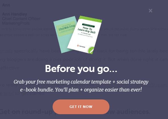
In addition, a beautiful, tasteful, and most importantly, a simple popup is much less annoying than a flashy or incomprehensible one. So make every effort to design elegant overlays.
One example of a simple yet elegant popup is the one that the team at Coschedule uses:
2. Make Sure Your Popup is Clickable
There is nothing more annoying than a pop-up that the visitor can’t get rid of. Often the users will end up abandoning the website altogether if they can’t close the pop-up notification.
With an increasingly large number of users using mobile devices for browsing, this has become a major issue. Since the touch target is smaller, they face issues in closing the pop-ups adding to the annoyance of pop-ups.
Your pop-up needs to work well on desktop as well as mobile devices so special consideration needs to be given to the responsive design.
Designing the popups for mobile is something you need to keep in mind for ensuring engaging visitor experiences.
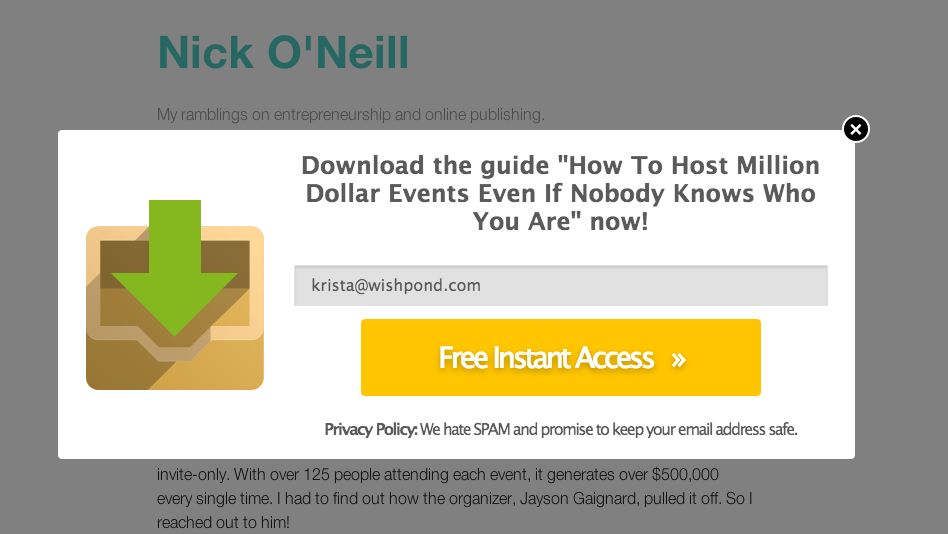
For example, this exit popup by Nick O’Neil has clickable text with a clear Call to Action (CTA) using the actionable verb “download”, and states the name of the guide, so interested viewers know what they will get when they take the action to click.
Ready to start using powerful popups for your website?
Book a free call to learn how our team of marketing experts can help you create high converting website popups today.
3. Embed a Progress Bar within the Exit Popup
A psychological phenomenon that causes people to feel uncomfortable upon witnessing incomplete situations or things is termed as the ‘Zeigarnik Effect’. The majority of online marketers today utilize this phenomenon to generate leads.
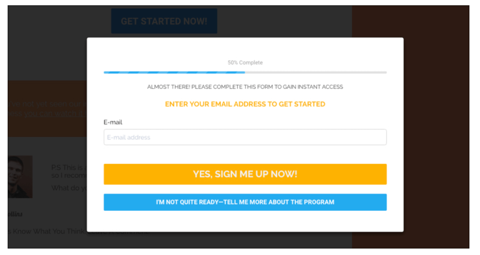
You too can harness the Zeigarnik Effect to your advantage by ingraining an idea of incompleteness in your visitors’ minds. This can easily be done by adding a progress bar reading anything less than 100%. Your readers will then want to perform the required actions to get a full bar.
Here is one excellent example of how a progress bar can be embedded within the exit popup without coming across as too annoying.
4. Overcome Objections Commonly Faced by Customers
What if your prospect is faltering to make a purchase from you simply due to one small objection, and if you could overcome that, would it be the last nudge they need for getting converted to a customer?
Here are some of the most common objections that online visitors have, and the ways in which you can prevail over them:
I need to think about it first:
People make any purchase based on emotion, therefore, if your website tries to nudge them on an emotional level all along, you’ll likely overcome this objection.
I will find a cheaper deal elsewhere:
Demonstrate how you’re the best value or the best price around. You can also place a comparison chart on your website’s homepage.
I’m happy with what I have at the moment:
Show them how their life will be far better once they avail of your product/service.
I don’t have the budget right now:
Offer a payment plan. Or, justify your plan with calculations on how your service will actually save/make them money in the long run.
I’m not certain if it is the best-suited work for me:
Offer a free trial.
I don’t have time right now: Throw in a limited-time bonus.
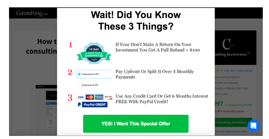
Sam Ovens does an incredible job of facing common objections that can cause visitors to bounce from his site, Consulting.com.
To better convert visitors, he provides a 14-day money-back guarantee, the choice to split payments out over time, and a special 6-month interest-free offer from PayPal.
5. Generate scarcity to grab a customer’s interest
“When our freedom to have something is limited,” Robert Cialdini says of scarcity, “the item becomes less available, and we experience an increased desire for it. However, we rarely recognize that the psychological reactance has caused us to want the item more; all we know is that we want it.”
It’s a well-known fact that scarcity (having less of something) greatly fuels a buyer’s impulse. Nobody wants to cast aside the increased probability of getting something they want, and it sure as hell doesn’t feel good when someone else gets it and you don’t.
Booking.com utilizes a popup during the reservation process to inform users how many other people are looking at the same hotel as them.
What it subtly implies is- “Better act before someone else gets your room!”
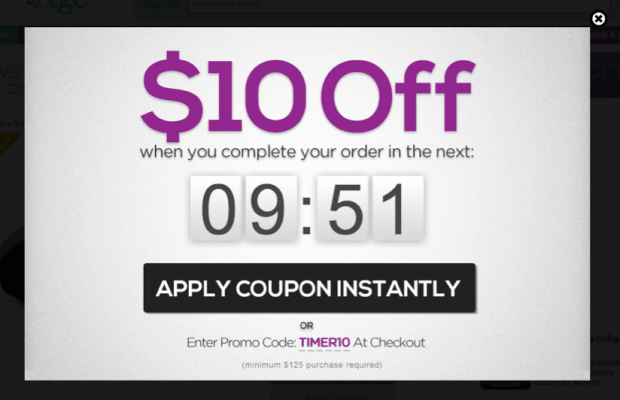
Use exit-intent related scarcity to get people to think twice before they abandon your website. You could offer a discounted price, but only for a limited time period or the first few who opt-in.
You could display a countdown ticker within the exit popup itself that shows how many more items are left at that price, and how quickly they’re getting sold.
Here is an example of how you can do that:
6. Present a Survey
Surveys are an excellent way to learn more about your website visitors and how you can implement changes within your website to better meet their needs.
However, many websites set them floating at the wrong times, which makes for awful user experience.
Envision landing on a website for the very first time and being hit with a survey immediately about how your experience has been on the said site or, being right in the middle of a purchase, and getting cut in by a popup survey.
Both of these scenarios would leave you annoyed, right?
The best thing about exit popups is that they don’t interrupt you while you’re doing something on the page. This makes exit popups all-the-more suited for surveys.
You just need to make sure that you don’t encompass a survey on your homepage, or on any other page that wouldn’t be on the same wavelength as someone filling out your survey.
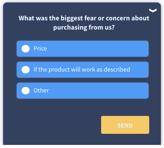
Here are some regularly named causes you can include to your website exit survey:
- The information displayed regarding the product/service isn’t enough
- The value of the product/service offered doesn’t match the price
- Lack of trust for a new brand
- The user flow or process (registration/download/checkout) is too complicated
- Getting in touch with the technical support team is quite tedious
Here’s one intelligent example of a website abandonment survey by Qualaroo:
Always be deferential of your visitor’s time and don’t expect them to fill out a survey for nothing. Give them something in exchange for it, such as a free deal.
7. Leverage the Power of Reverse Psychology
Another reason visitors often bail on your website is that they’re simply fatigued. But as a matter of fact, if you can make them laugh or even smile, it will be difficult for them to turn a deaf ear to your parting offer.
For instance, the opt-out or ‘No’ link can read, “No, I’d rather not receive free deals in my inbox.”
In this case, seeing this link, the visitor will reconsider their option to opt-out and think, “Ok, why not?
I like free deals, I can read the emails when they arrive and decide later, ok I’ll signup.”
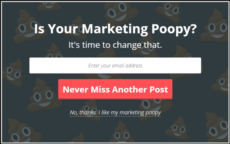
KlientBoost uses the “pile of poo” emoji, those cute, smiling piles of poop, to lighten the mood:
“A choice can leave doubt in people’s minds if they did make the right decision or not,” said Krista Bunskoek on Wishpond.
“If someone said ‘No,’ that choice can linger on in their minds and there’s more likelihood of them coming back to your site anyway.”
Final Words
Finally, to summarize it all up, you just need to look into a few simple things to engage visitors with exit popups in an intelligent manner.
-
First and foremost, make the user’s experience a priority. Your website can include endless exceptional features but it’s nothing if you can’t really keep your visitors hooked onto it, right up till they plan on exiting.
-
Then comes the fact that your website has to be responsive, no matter which device the visitor is accessing it through. The exit popup needs to be equally clickable across all devices and have a clear call-to-action. Because that’s the whole point of having an exit popup placed toward the end, isn’t it?
-
Grab your website visitor’s interest by embedding a progress bar within the exit popup so that they have a fair idea of how much more time they will have to invest within your website before they can acquire whatever they’re looking for.
-
Don’t leave a single stone unturned from your end. Overcome objections commonly faced by your website visitors within the exit popup in order to get their attention back to the ease of buying from/ investing in your brand.
-
Scarcity greatly fuels a buyer’s impulse. Use exit-intent related scarcity to get people to think twice before they abandon your website.
-
The best thing about exit popups is that they don’t interrupt you while you’re doing something on the page. This makes exit popups all-the-more suited for surveys.
-
Lastly, add a tinge of humor to your exit popup mix and you’ll see all the more conversions happening. We all like the one who can make us laugh, don’t we?
The above-mentioned tips are just some of the ways you can design exit popups that work well in your favor.
You can choose any of these to harness maximum returns from this feature, the only thing to keep in mind is that you are looking to provide value to your customers and design a strategy that appeals to your target audience.
About the Author

Rahul Varshneya is the co-founder and President of Arkenea. Rahul has been featured as a technology thought leader in numerous media channels such as Bloomberg TV, Forbes, HuffPost, Inc, among others.

