

Does your business need more qualified leads? Do you want your website visitors to say “yes”?
Then you’re reading the right blog.
In this article, I’m going to show you a cool – and relatively new – method of increasing your leads and getting your website visitors to engage with you (even if they’ve never clicked on your site before).
I’ve scoured the internet and found five awesome entry pop-ups from some of the smartest online marketers. I’ll tell you what I like and what I don’t like so you can try out and optimize your own website popup.
Try out the tips to increase your own business leads.
What is an entry pop-up?
An entry pop-up is a pop-up that’s shown to a visitor as soon as your website page loads. It generally blocks the viewer from seeing the page they’ve clicked through to until they engage with you.
In other words, if you have a visitor to your site (first time or not), they have to take an action – whether that’s:
- Converting with you
- Closing your pop-up box to view your website page
- Or (in the worse case scenario, if your entry pop-up is really annoying) clicking away from your site to find what they were looking for elsewhere
Entry pop-ups can be extremely effective because you’re getting your visitor to act (and priming them to take further action) even before they’ve seen your benefits, product images or really know what you’re offering. For the same reasons, they’re clearly very dangerous too.
As a result, you really need to pay attention to your bounce rate, A/B test and use best practices (and judgement) when you implement them.
Of the 5 types of pop-ups (click, scroll, timed, exitand entry), entry pop-ups are often viewed as the most controversial. Some online marketers love them, some loathe them.
That said, there are many ways that you can make entry pop-ups work for you. Let’s take a look at five top online marketing sites using the controversial lead generators.
1. Entry Pop-Up: Marketing Land
Marketing Land is a highly respected and popular online marketing publication. They write about everything from search marketing and social to analytics and more.
When you click on their homepage, you’re greeted with this pop-up:
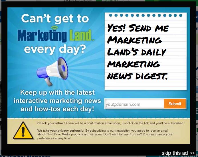
The pop-up ask is to receive daily marketing news digest. Action is required before you can get to the site – either a sign up or a click on “skip this ad” (or the side).
What I like about the entry pop-up:
- The overall design is friendly, but is full of contrasting colors and busy images. The action-oriented design provokes viewers to be active too – and convert.
- It’s well branded, with their Marketing Land logo clearly visible and contrasting to the lighter blue background – this instills trust with people who know the website, increasing the chance of a conversion.
- I love the note paper and hand written font in the primary image. It gives the pop-up a more personal feel and increases the relatability factor.
- The headline is a question, which (unconsciously or not) gets the viewer interested. We love to solve questions, don’t we?
What I don’t like about the entry pop-up:
- The pop-up is made with an advertising tool. But it’s not an Ad. I suggest they use a non-advertising pop-up tool builder, remove the “skip this ad” and test conversion rates.
- Aside from clicking “skip this ad”, there’s no clear method of getting rid of the form. This could be a major deterrent for visitors with short attention spans. Make it easy to see the site with a clear “x” on the top right corner.
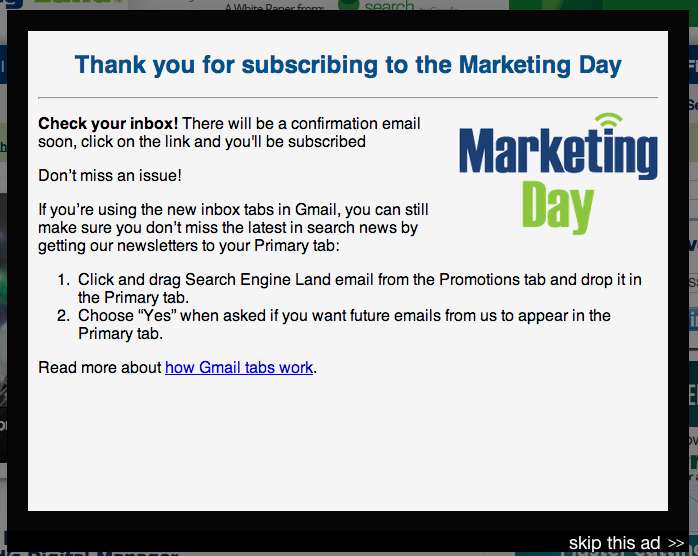
- While they have a thank-you pop-up for conversions – the thank you page is a bit wordy and gives pretty basic information about gmail spam filters.
 Marketing Land can get away with this kind of entry pop-up as they’re a well known publication. Their goal is to increase site visit numbers and publication subscribers to increase advertising rates – not to sell their products directly to consumers. By signing up, you’re pretty assured that you’ll be getting updates only from the site, and not overtly spammy emails.
 Marketing Land can get away with this kind of entry pop-up as they’re a well known publication. Their goal is to increase site visit numbers and publication subscribers to increase advertising rates – not to sell their products directly to consumers. By signing up, you’re pretty assured that you’ll be getting updates only from the site, and not overtly spammy emails.
2. Entry Pop-Up: ClickZ live
ClickZ Live (formerly SES conference & Expo) is a series of global conferences for (and by) digital marketers.
When you land on their San Francisco page (their next event) you get an embedded video pop-up:
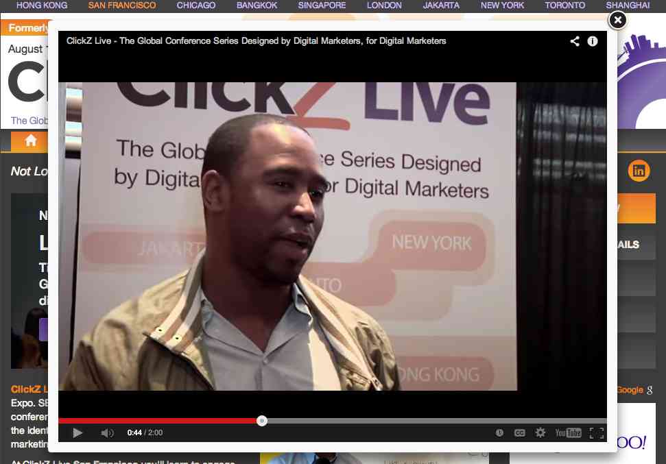
The two minute video is a compilation of short clips from previous conferences, marketing their events with compelling sound bites from speakers and attendees.
What I like about the entry pop-up:
- The video is a soft sell with digital marketers (just like you and I) giving customer testimonials and personal benefits of attending upcoming ClickZ Live conference. That’s great marketing.
- There’s no ask or action required. The pop-up isn’t email-gated or directing you to another site.
- The video is highly relevant to viewers – if you’ve clicked through to the San Fransisco page, you’re likely already interested in learning more about it.
- It auto-plays. I know, I know this is a controversial like. In this case, however, because the video is so directly related to the page it works to get more views.
- The pop-up only shows once a day to unique visitors.
- It’s easy to stop or close with the prominent ‘X’ in the corner.
What I don’t like about the entry pop-up:
- Overall I like the video pop-up for the above reasons and more.
- They could include a clickable link overlay to direct viewers to their conference sign-up page.
3. Entry Pop-Up: Quick Sprout
Quick Sprout is a Neil Patel company that helps businesses (big and small) grow their website traffic. As you might know, Neil Patel is kinda the king of pop-ups (and other online marketing stuff that works).
This is what you see when you go the homepage:
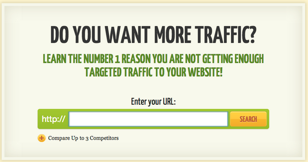
Okay, okay, if you know the site you know this isn’t really a pop-up.
You can’t click to close it. There’s nothing behind it. It is the actual homepage. But I thought I’d include it to show you how you can get creative with entry form fields – and drive immediate action on your site.
What I like about the entry pop-up (that’s not really a pop-up):
- He’s not asking for your email or other contact information, just the opportunity to try out the product – for free, no strings attached.
- The headline is a simple question with an obvious “yes” as the answer.
- The tagline gives a clear and simple benefit, offering the visitor the number one thing that will fix their problem.
- The form field is a large size, making it obvious and accessible to enter your URL
- The CTA “search” button is in a complementary contrasting hue of yellow.
- The yellow plus button under the green URL form field subtly draws your eye back up to the “https://”, invoking further action from you.
What I don’t like about the entry pop-up (that’s not really a pop-up):
- For a first time visitor, the ask can be a bit intimidating and direct.
- The page can be confusing as it’s not a standard homepage giving you information before you plunge into action.
4. Entry Pop-Up: Mashable
Mashable is a leading media source for digital innovation and online trends.
This is the entry pop-up you get when you click directly from Facebook:
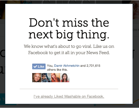
The pop-up does not show up from any other traffic source – just Facebook.
What I like about the entry pop-up:
- The pop-up is unique and specific based on traffic source, and the copy reinforces the site source (Facebook). This kind of tailored messaging increases conversions.
- The ask is simple – to Like the Mashable Page on Facebook. They make it easy with a Facebook Like button.
- It has a clean design with lots of whitespace.
- The headline reinforces their brand tagline.
- It shows social proof of the site. Once you Like it, you see your Friends who like it, and it shows that over 2.7 million other Facebook users do too.
What I don’t like about the entry pop-up:
- For a first time visitor, this pop-up is effective as it drives Likes of the Mashable Page. But, once you’ve Liked the Page, the pop-up really isn’t necessary – it’s kind of annoying.
5. Entry Pop-Up: Affiliate Marketing News
Affposts is a leading information source for all things related to affiliate marketing.
This is the entry pop-up you get when you click on the “Newspaper” page on the site:
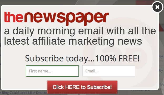
The ask it to subscribe to the daily affiliate marketing newspaper.
What I like about the entry pop-up:
- The header is clear and to the point. You know what you’ll get when you sign up.
- The list of benefits includes the numbers 100 and free.
- The large font is easy to read at a glance. Visitors on a site will give you about 5 seconds or less to pique their interest.
- The entry pop-up is only on the newspaper page – where visitors are likely already interested in getting the latest affiliate marketing news. It’s targeting the right audience at the right time.
- You can’t see it in this image, but the mouse indicator in the subtly outlined form field flashes on the live site – drawing attention and invoking action. It’s a brilliant hack (both the outline and the flash) that increases conversions by multiples (Wishpond has seen an over 200% conversion increase with it).
What I don’t like about the entry pop-up:
- Design wise, it’s a bit plain. They could use a more attractive and easy-to-read font.
- They could include an image of a newspaper to make it more visually obvious what the ask is.
Conclusion
As you can see, the entry pop-up can work to increase conversions without lowering your bounce rate. You do need to implement them with skilled knowledge and marketing smarts, but if you get it right, you could just drive conversions and start to develop consumer relationships through your online marketing funnel.
Try out these tips from some of the smartest online marketers in the world. You may just hit it right and grow your business to new heights.
As always, test your online marketing tactics. Use a website popup builder that has a robust, built-in A/B testing ability. Test what works best for optimal conversions on your entry pop-up for your target market, business and offer.
Further reading:
- 5 Exit Pop-Ups You Need to Know About
- 5 Ways to Use Pop-Ups on Your Website
- Should you Use Pop-Ups?
- 7 CTA Mistakes Killing Your Conversion Rate
- 25 Tips to Optimize Landing Page Conversions
- 25 Creative Facebook Contest Ideas You Can Use Today
What do you think? Do you use entry pop-ups or do you stay away from them? Share your tips and comments.
Ready to start using popups? Check out Wishpond’s drag and drop popup builder today!
P.S. Wishpond’s Facebook Contest Apps make it easy to create sweepstakes, photo contests, Instagram hashtag contests & more.