
Now is the best time for eCommerce sites to gear up for the holiday season, especially as COVID-19 pushes more shopping online. With a bit of smart planning, you can position your brand as the go-to for the latest seasonal fashion and trending gifts before your competitors.
The only problem is figuring out how to do that.
Should your website display holiday-themed font colors and backgrounds? What about seasonal banners to promote your gifting campaign? Is a mix of both better, or would it cause shoppers to feel bombarded by over the top holiday cheer?
It’s okay if you don’t know the answers to these questions. This huge beast of a guide contains tons of ideas to help your online brand stand out. We’re highlighting the best holiday promotion strategies used by 30+ fashion brands, and pointing out why your eCommerce brand should mimic them this season.
We’ll also go over why this is the perfect time to get this done, what to do if you have holiday-specific items, how to handle seasonal selections that aren’t holiday-themed, and what to do if you want to promote more online sales during this time but don’t want your brand to change with the seasons.
- 10 Holiday-Specific Branding Ideas for Your eCommerce Site
- 7 Seasonal Call-Outs to Consider on Your eCommerce Site
- 14 Expert Marketing Tips from Top Online Fashion Brands
Use the above links to skip around to the brands most similar to your eCommerce site, but we recommend reading this guide in its entirety so you can check out ideas you may have never considered.
To start, let’s discuss why sooner is better than later when it comes to your website’s holiday glow-up.
Why Now is the Time to Focus on Your eCommerce Plan
There are two good reasons to put some extra time and effort into your eCommerce store right now, including:
- The COVID-19 pandemic will undoubtedly affect in-store shopping this holiday season. With less foot traffic, more buyers are turning to eCommerce, which is exactly why your website, checkout system, and customer service systems like emailand live chat need to be in top shape.
- Due to COVID-19 stay-at-home measures, your customers may not be meeting up to exchange gifts this holiday season. They’ll be looking for brands that provide a seamless online gift-giving experience. If your website is designed and optimized correctly, you could be their one-stop-shop for fulfilling many of the gifts on their list.
So besides the time of year, these reasons give you all the more motivation to buckle down and work on your website. Let’s start by looking at holiday-specific ideas before moving onto general marketing best practices you can adopt even if your brand doesn’t change seasonally.
Need help marketing your eCommerce store?
Book a free call to learn how our team of eCommerce experts can help you generate leads, boost traffic and drive MORE sales.
10 Holiday-Specific Branding Ideas for Your eCommerce Site
Check out how these companies deftly handle holiday-specific promotions and think about whether their ideas may work for your business:
1. Manly Bands
Manly Bands has cornered the market for unique wedding bands for men. So they’re a company you wouldn’t typically think of when it comes to Halloween promotions. After all, how many men think of buying their wedding bands during Halloween season?
But that didn’t stop the team at Manly Bands from creating an epic Halloween-themed video on their homepage. It both celebrates the holiday and showcases their wedding bands:
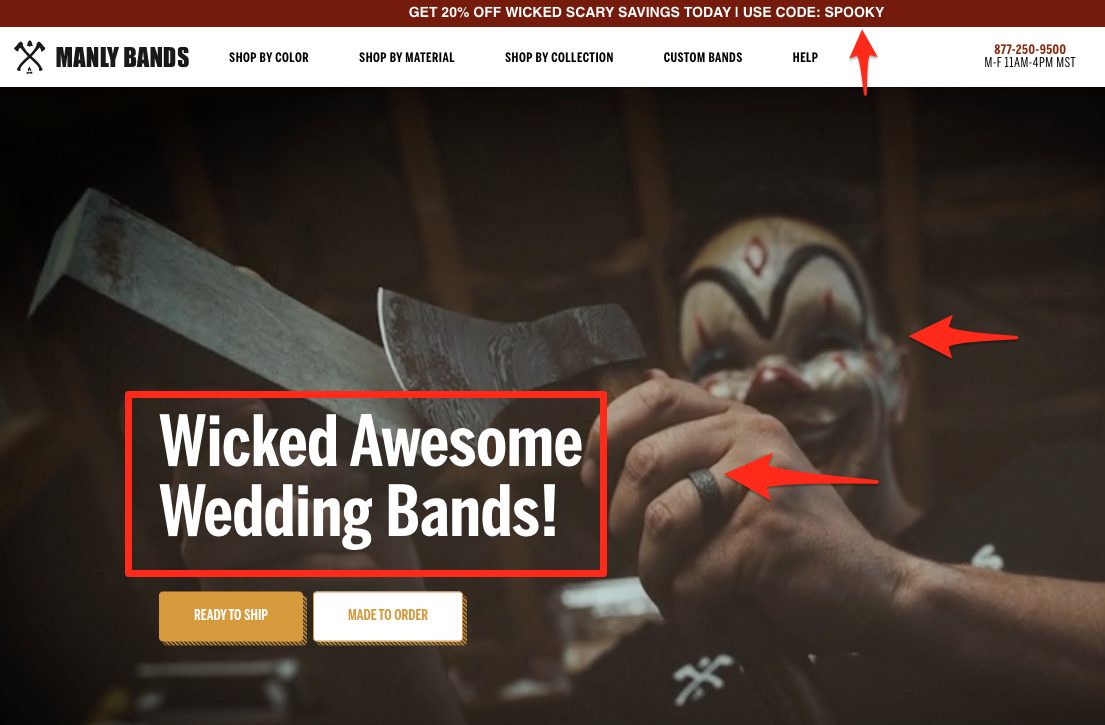
In that image, a creepy clown lurks in the background while the perfect shot of his wedding band takes center stage. This does a great job of capturing the holiday spirit, grabbing attention, and encouraging people to shop.
The Halloween-themed call-to-action — Wicked Awesome Wedding Bands — and “Spooky” discount code nudge them even closer to making a purchase.
Takeaway: Use holiday-themed images to grab browsers and showcase your products in new ways. Think about seasonal discount codes to convey a limited-time-only sale.
2. Charming Charlie
Popular accessory brand Charming Charlie takes a subtle, more cheerful approach to its homepage Halloween marketing:
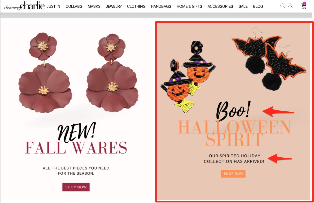
The brand combines images of fall-themed jewelry with Halloween-specific picks like pumpkin witch and bat earrings. Charming Charlie updated their standard font to reflect holiday-themed colors yet formatted their CTAs the same: with an attention-seeking call-out and a brief description.
Copy like, “Our spirited holiday collection has arrived” and “All the best pieces you need for the season” give off on-trend vibes browsers won’t want to miss out on.
Takeaway: A simple design switch of font colors, on-theme product images, and holiday copy may be all you need to make a significant impact.
3. Fashion Nova
Online retailer Fashion Nova is best known for selling trendy clothing and beauty items for men and women. So to promote their Halloween costumes and accessories, they used a bold campaign with a creepy font to let their customers know where to go:
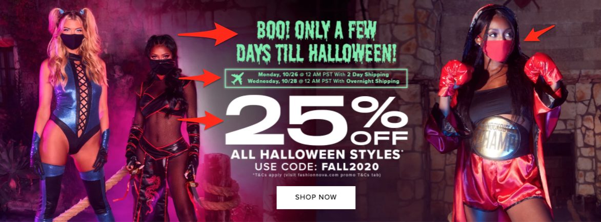
The banner image above from their homepage starts with a CTA created to build a sense of urgency: “Boo! Only a Few Days Till Halloween.” Underneath, browsers have a list of shipping deadlines to ensure their last-minute costume purchase arrives before Halloween. There’s an on-theme 25% discount code (FALL2020) to entice browsers further.
Fashion Nova even offers matching masks for costumes to encourage safety during holiday celebrations mid-pandemic.
Takeaway:* Instil a sense of urgency in your browsers by displaying a countdown to the holiday (example: X days till Halloween!) and holiday shipping deadlines.
4. Urban Outfitters
Popular retail chain Urban Outfitters (UO) doesn’t go all-out with Halloween promotions on their homepage. Instead, they chose to tuck a Halloween tab into their main menu navigation, which takes browsers to all their Halloween offerings:
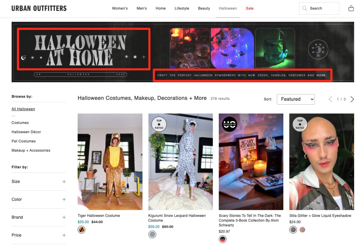
As you can see from the banner, their “Halloween at Home” promotion shows browsers how to use their products to “craft the perfect Halloween atmosphere with new decor, candles, costumes, and more.” Their marketing messages also address how to celebrate during COVID-19 with a few easy, effortless tweaks.
Takeaway: If you want to keep your regular products front-and-center on your homepage, add a new tab to give those interested in celebrating the holiday plenty of goodies to check out. You can mimic this idea for every holiday during the year.
You may also want to include a few simple tips for how your products have adapted/evolved for buyers’ needs during the pandemic.
5. SHEIN
Online fashion brand SHEIN already has a headstart on Black Friday deals. The company’s promoting its pre-sale a full month before the real “holiday” event hits:
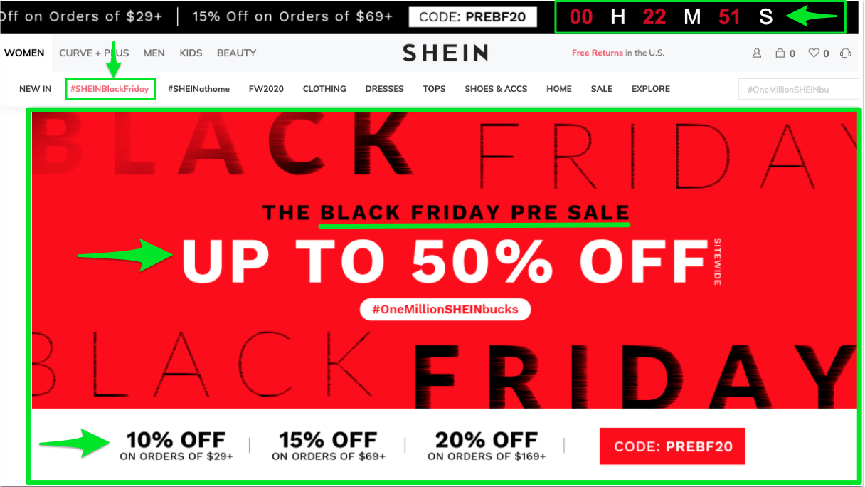
They explicitly show visitors that they’ll score higher deals the more they spend on their orders. The brand also added a countdown at the top of the page to build excitement and a sense of urgency.
Click the #SHEINBlackFriday tab, and you’re directed to the Black Friday Extravaganza page, which includes all their giveaways and events leading up to Black Friday:
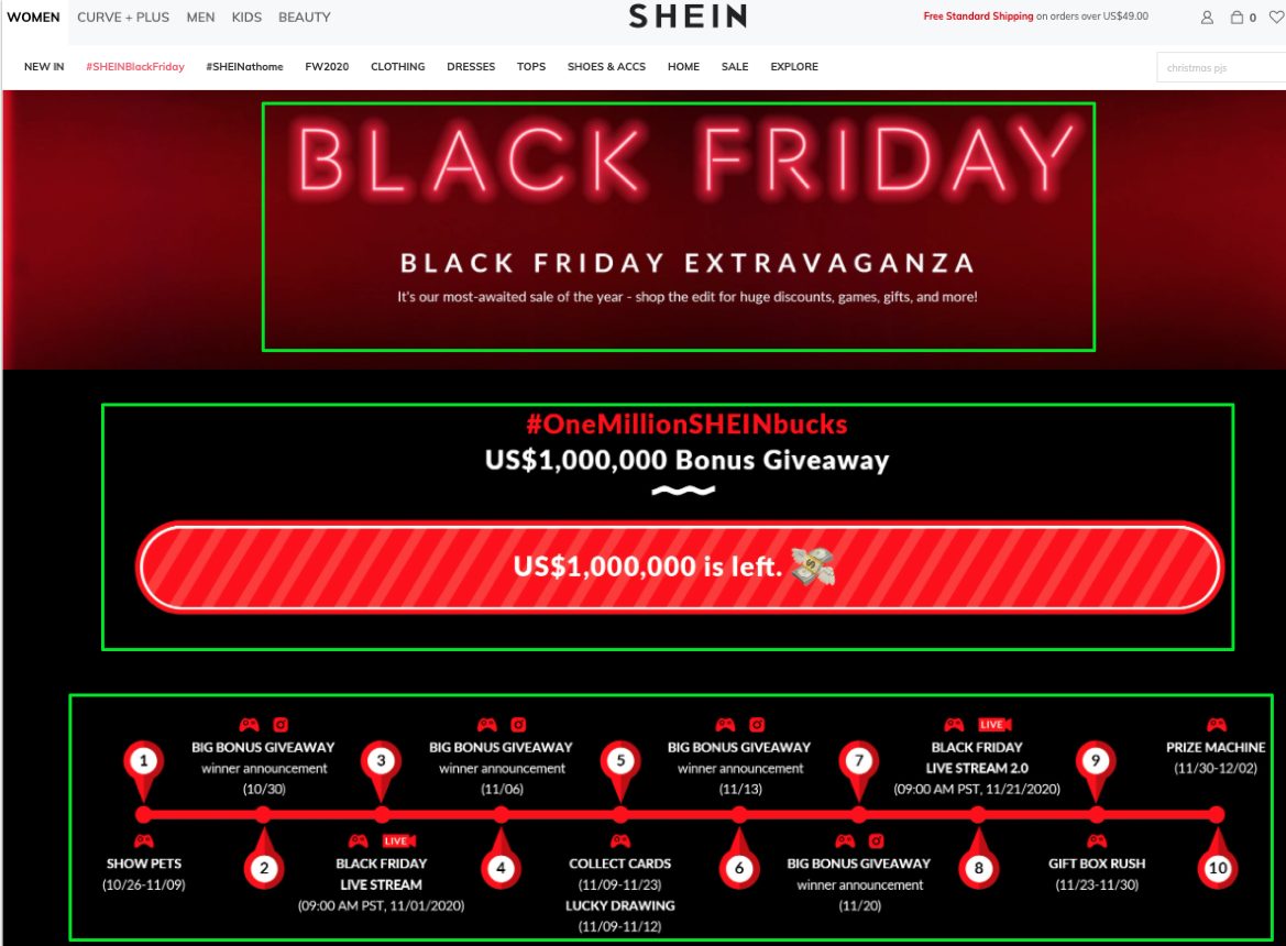
What’s smart about this strategy — and why you’ll want to use it on your website — is that they’re getting ahead of the Black Friday crowd. This works well for a few reasons:
- SHEIN won’t have to compete with other brands for shoppers on the day of. They also don’t have to worry that customers have spent all their holiday shopping money in other stores (again, because they’re one step ahead).
- SHEIN keeps customers engaged. By having giveaways throughout the month, customers will check back often to see what deals and freebies they can snag. Buyers will also appreciate the ability to get ahead of the Black Friday craziness.
Takeaway: Consider creating online holiday giveaway events — and start them earlier than your competitors.
6. Next (US)
Like UO, the marketing team at family clothing brand Next added a Christmas tab to the top of their navigation. But they went a step further than UO by changing the tab’s font color to yellow so it stands out. Next then added a holiday banner down the page to welcome shoppers to the season:
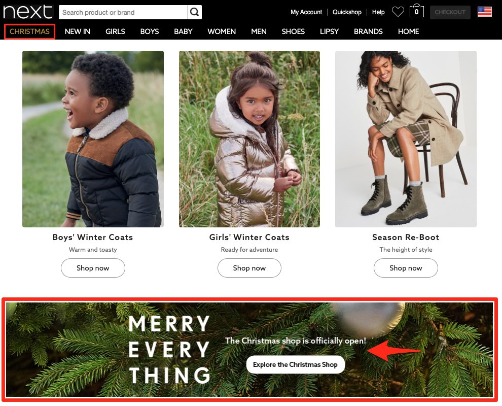
Copy like, “The Christmas shop is officially open!” compels browsers to clink the link and step through this portal as if they’re entering a store in person. Once they do, visitors are transported to a holiday page that evokes the spirit of the season via Christmas colors and Next’s on-theme product offerings:
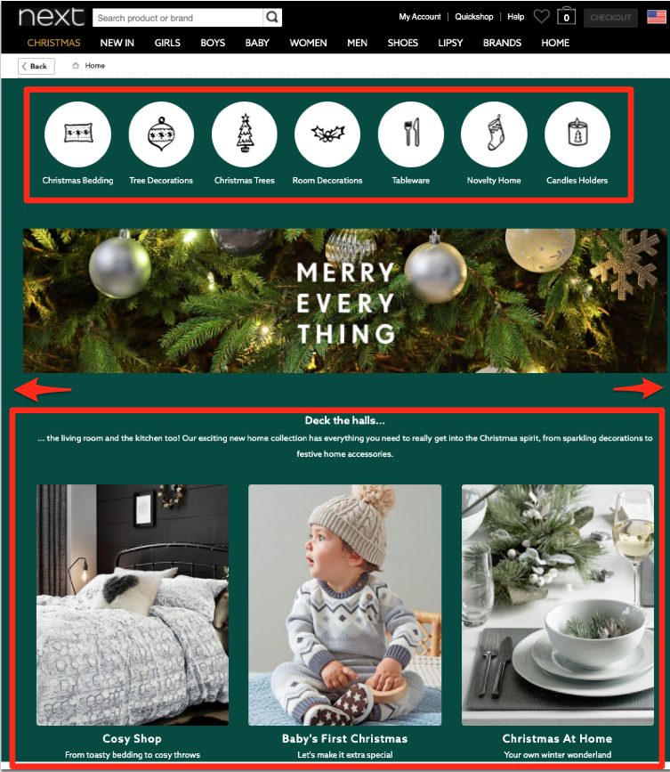
The once white background is now tinted a deep evergreen shade reminiscent of a Christmas tree. All the button icons reflect traditional Christmas items like ornaments and stockings.
You’ll also notice festive messaging that leads visitors to specifically themed pages — like the Cosy Shop, Baby’s First Christmas, and Christmas at Home — to help them find the perfect gifts.
Takeaway: Try making small yet effective changes to your website so visitors feel like they’re browsing different sections of their favorite store during Christmas versus shopping online from home.
7. Beyond Retro
Vintage Clothing brand Beyond Retro took a double holiday approach by promoting Halloween and winter festivities at the same time. You’ll see a Halloween banner on their main homepage slider and a Christmas tab in their top navigation:
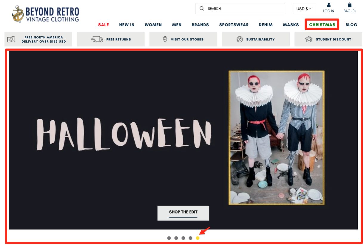
When visitors click each link, they beeline to separate holiday-themed pages:
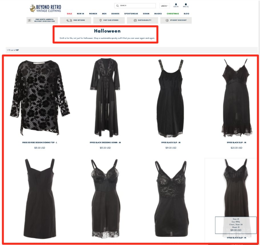
Halloween (pictured above) takes on a goth aesthetic featuring themed black dresses while Christmas (shown below) displays bright and cheerful holiday sweaters.
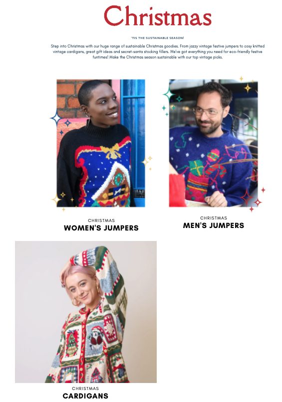
Takeaway: Organize your products by holiday-themed collections to give customers exactly what they’re looking for. Create separate pages for different holidays and jazz them up to match the theme. You’ll evoke the right feelings to encourage browsers to get in the spirit and make a purchase.
8. Old Navy
Big box retailer Old Navy always taps into the holiday cheer early. The brand starts promoting its matching seasonal pajama sets in October! But there’s a brilliant reason for this:
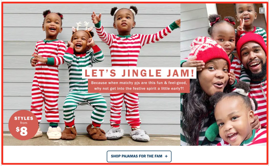
Old Navy knows many families take holiday card photos in matching PJ sets weeks before the season begins. So their campaign targets these buyers and encourages them to buy early with PJs starting as low as $8.
Takeaway: If your brand fulfills a seasonal niche, make sure to get your promotions out and in front of customers as early as possible. Show buyers what’s in it for them by doing so (i.e., lower prices, special discount code, etc.).
9. Zappos
Online shoe and clothing brand Zappos takes a page out of Old Navy’s book by offering shoppers matching holiday PJs for the whole family. Their messaging even reminds browsers to order early “in time for your holiday photo op.”
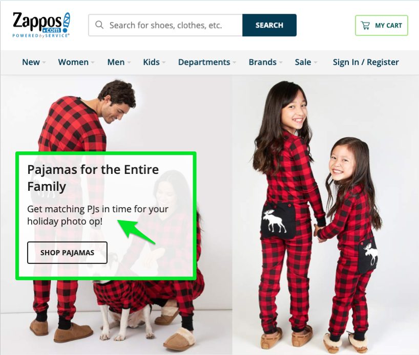
Takeaway: Think about ways to remind busy parents and shoppers to order seasonal items early so they can cross one more chore off their overflowing to-do lists.
10. Amazon Fashion
With so many gift-giving choices, Amazon Fashion helps shoppers find the perfect items by curating lists brimming with holiday ideas:
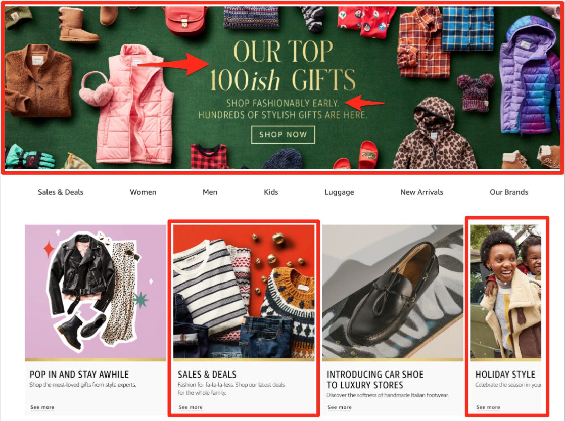
Their Top 100ish Gifts help people knock out their holiday shopping “Fashionably Early” with sales and deals for “fa-la-la-less” (catchy messaging!). And their Holiday Style Guide allows browsers to pick out something for themselves while they shop for gifts for others.
Takeaway: Try to organize your products into holiday roundup guides with different themes (such as by item type, interest, family relation, price, etc.). Promote this help early, and buyers will be able to find exactly what they’re looking for. And you’ll have a better chance at capturing their hard-earned dollars before another retailer has the opportunity.
Now, if your online fashion brand doesn’t have holiday-related items to promote, you’re probably wondering what you can do to boost online sales. Fortunately, the next set of examples will help steer you in the right direction:
7 Seasonal Call-Outs to Consider on Your eCommerce Site
These brands take advantage of seasonal call-outs to drive sales without promoting an obvious holiday theme:
1. RoseGold & Black
You don’t need pumpkins and goblins plastered all over your website to promote seasonal offerings, and that’s exactly what online accessory brand RoseGold & Black proves:
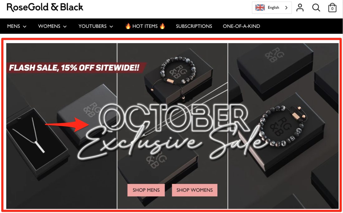
They use the official color of Halloween (black) in a sleek way to promote their exclusive October sale (pictured above). It’s not overtly Halloween-themed, but it still delivers the same vibes for customers.
Takeaway: Your team doesn’t have to go full throttle on Halloween hoopla or Christmas extravagance. You can use subtle hints for your holiday promotion that are just as effective.
The next few examples show you can evoke the upcoming cold-weather season without going overboard to do so:
2. LuLus
Women’s clothing brand LuLus features their Big Chill collection right on the homepage, with captivating copy: “It doesn’t get much cozier than this:”
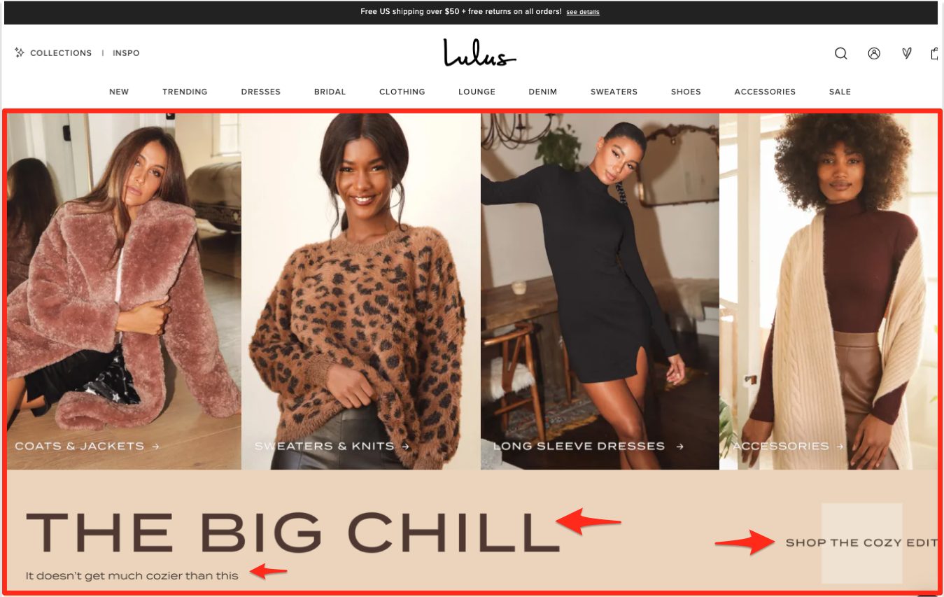
Similar to RoseGold & Black, LuLus’ team showcases their seasonal offerings in a much more sophisticated way than adding pumpkins and ghosts (which would be very off-brand).
Instead, they combine a warm, fall color palette with striking images of their cold-weather outfits. Their messaging also evokes that cozy, comforting mood of the season. LuLu’s stays true to their image and on-season without adding too much unnecessary flair.
Takeaway: Experiment with your website by changing out images and messaging to better reflect fall weather feelings and holiday cheer. You may notice an uptick in sales shortly after making this connection for buyers.
3. Johnnie-O
Johnnie-O, a men’s clothing line specializing in clean, sophisticated looks, also does a wonderful job of evoking the cold-weather season without losing their brand’s identity:
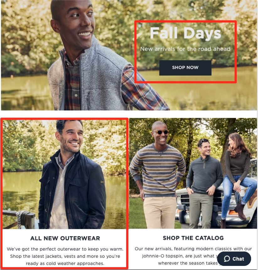
With their models posing in front of eye-catching fall backgrounds, their big, bold images show off their products “in the wild” and in-season. The messaging also connects their products with the time of year: the Fall Days and All New Outerwear collections are exactly what customers want during this season.
Takeaway: Come up with a list of seasonal keywords to weave into your website copy to stay relevant and current with what’s going on in your customers’ lives.
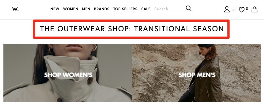
4. NET-A-PORTER
Instead of cornering one season, high-end retailer NET-A-PORTER helps its customers dress for that hard-to-pinpoint transitional season mark where the temperatures fluctuate:
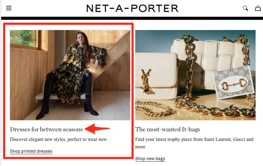
And as you scroll down their homepage, you’ll find their take on fall must-haves to eliminate the guesswork in what to wear:
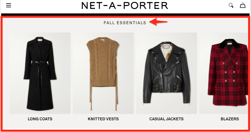
These steps help browsers find the perfect products to get through whatever season they’re in according to their unique style.
Takeaway: Brainstorm ways to help shoppers decide what they need during each season before they even know they need it.
5. W Concept
Along the same lines as NET-A-PORTER, W Concept gives visitors a roadmap to follow during seasonal changes:
This tactic works so well because it’s similar to what you’d typically see in a brick-and-mortar store during this time.
With the change of seasons comes a fresh update in product offerings, mannequin outfits, and window displays. But since people aren’t shopping in-store right now, this gives them expert advice on how to handle the transition via online orders.
Takeaway: Empower customers with ideas of what to do and buy during seasonal changes, and you’ll give them the confidence to make a purchase.
6. Linksoul
Linksoul, an online men’s clothing line that helps their customers go from the beach to the golf course, knows their buyers need help reducing decision fatigue. So their marketing team guides visitors towards what to wear when the temps start to drop.
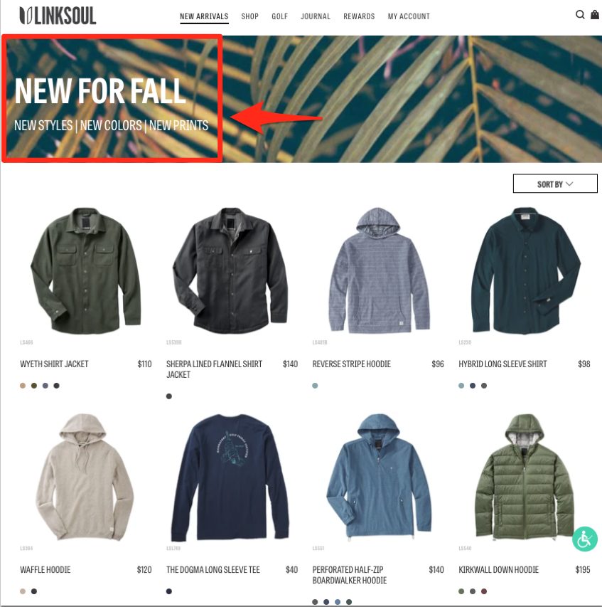
Their New Arrivals tab leads to a seasonal page titled “New for Fall,” which features new styles, colors, and prints perfectly tailored for the weather. This works well for two reasons:
- The “new” aspect grabs returning customers right away. They’ll be eager to browse new items they haven’t yet seen, which is both exciting and enticing enough to get people in a buying mood.
- It removes the guesswork and shortens browsing time. If guys are searching for fall pieces to add to their wardrobe, they won’t have to search all over the website to find them. All they have to do is click on the tab and see what they like from the curated selection.
And all this was done by merely updating the page title and CTA, along with curating the top pieces for colder weather.
Takeaway: Don’t overwhelm your browsers with too many options. Think about ways to make shopping easier for your customers. Shorter browsing times may lead to less decision fatigue and faster sales.
7. REVOLVE
REVOLVE is a popular online retailer for women’s clothing, and it also does a decent job of sending customers right to their latest seasonal collection:
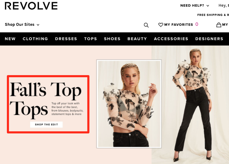
Like Linksoul, by explicitly telling customers where to go for fall looks, they make it much easier to browse and find the pieces they’re looking for. This opens the door for more conversions.
Takeaway: Think about which products you can include on a curated page of seasonal items. You can group these items by new, a shared trait, or seasonal popularity.
Now, let’s say your online fashion brand doesn’t have holiday offerings to promote. However, you still want to boost sales during a specific seasonal window. This next section is for you:
14 Expert Marketing Tips from Top Online Fashion Brands
You don’t have to use holiday-themed or season-specific strategies to improve sales. These 12 brands will give you plenty of ideas to run with all year long:
1. ThirdLove
ThirdLove, a trendy online undergarment retailer for women, knows that finding the right fit when shopping online can be a major challenge and frustration for customers. After all, when customers are unsure of how something will look on them, brands risk losing the sale.
To combat this, ThirdLove offers a virtual find-your-fit-in-under-60-seconds tool that’s as smart as it is easy to use:
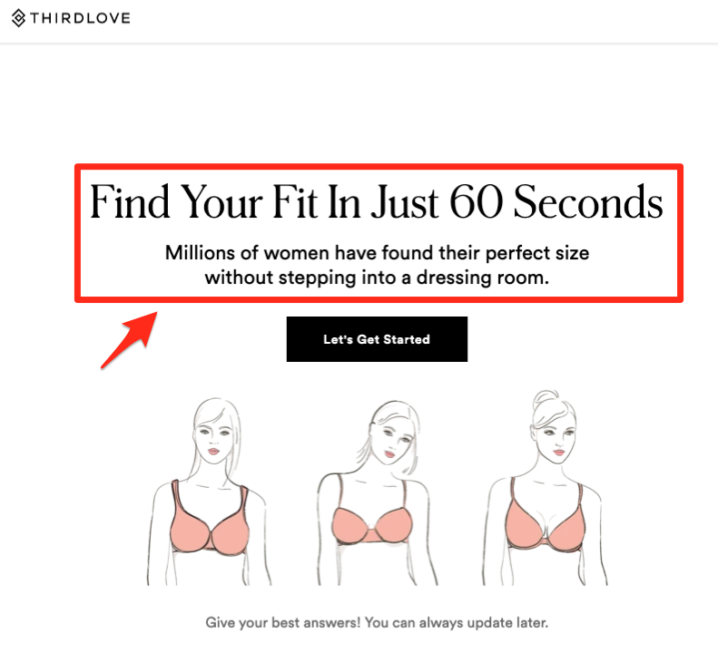
You’ll notice their messaging also promotes finding the right size without ever stepping foot into a dressing room — genius since they’re an online-only retailer.
While this tool may be a bit more complicated for your team to put together, it can live on your site for years to come and give customers more confidence to buy, making it worth the effort.
Takeaway: So many landing pages today look the same. Find ways to incorporate more interactive content like ThirdLove onto your pages.
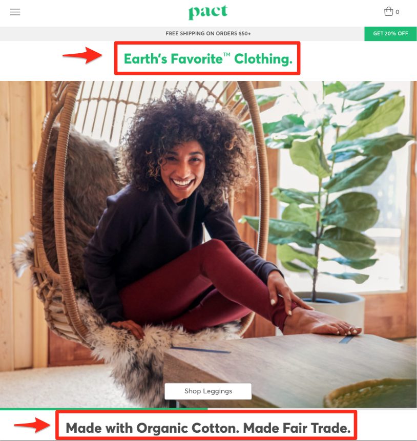
2. Pact
Does your brand stand for a specific cause? Organic and fair trade fashion brand Pact does. And they use their website to promote and share their sustainability efforts with like-minded customers:
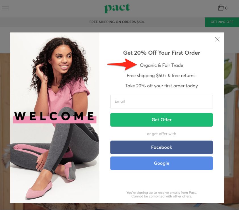
When browsers land on their website, they’re instantly greeted with a 20% off discount and free shipping. They also learn in the description that Pact clothes are both organically made and fair trade. This eco-friendly message is further reinforced throughout its homepage:
Takeaway: Try to update your messaging to show off the altruistic selling points your company uses to stand out from your competitors. Do you only use American-made materials? Are your products cruelty-free, sustainable, or free of oft-used chemicals?
While you may not be Earth’s Favorite Clothing brand like Pact, we’re pretty positive you can share something of value with your customers, which will go a long way.
3. Bombas
Growing sock brand Bombas also opts for the feel-good path, this time by promoting an item donated for every item purchased:
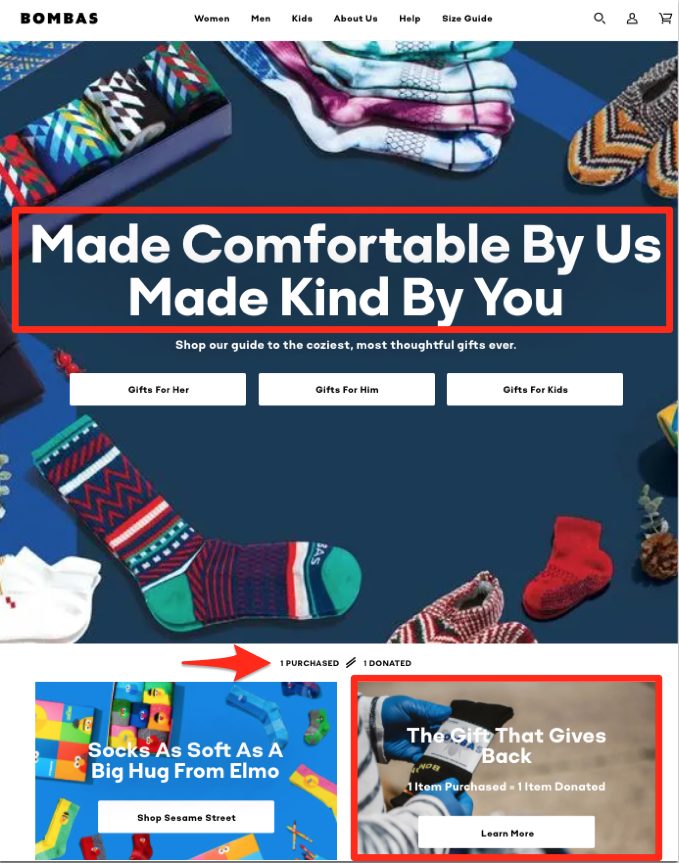
Their bold messaging of “Made Kind by You” helps customers realize that making a purchase through them also helps someone in need. This model made Tom’s shoe brand famous, and it’s steadily doing the same for Bombas.
We also really like their “Socks as Soft as a Hug from Elmo” messaging. Plus, they’re promoting their holiday gift guide for the “coziest, most thoughtful gifts ever” a few months ahead of the holidays.
Takeaway: Give customers a reason to feel good about purchasing from your brand, and you may find them more eager and quicker to do so.
4. Shady Rays
Polarized sunglasses line Shady Rays puts their unique selling points upfront on their homepage for browsers to see as soon as they land on their page:
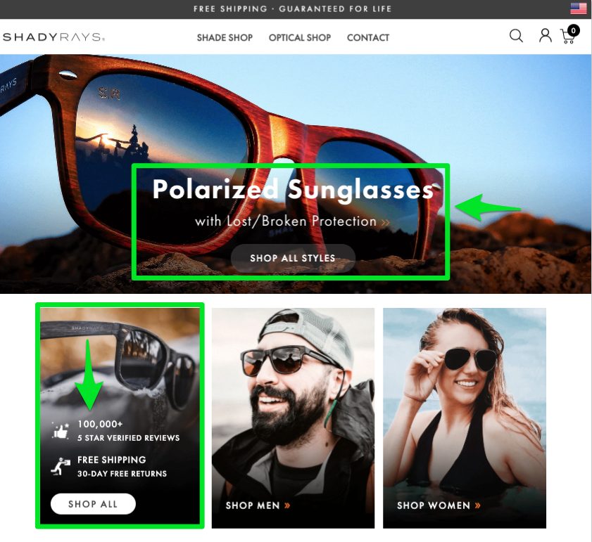
As part of their Lost or Broken sunglasses protection policy, they’ll send customers a new free pair anytime theirs breaks or goes missing. Customers simply pay a processing fee to get this amazing offer.
Shady Rays also proudly shows off the fact that they have 100,000+ 5-star reviews.
These two pieces of information are enough to convey that this is a trustworthy brand worth doing business with.
Takeaway: Add key ingredients like customer-focused company policies and reviews/testimonials to your eCommerce website, and you’ll have a much easier time converting on-the-fence browsers.
5. UNIQLO
Japanese-born clothing brand UNIQLO (which translates to “unique clothing”) added a fun feature to their website that lets new visitors spin for a special discount offer:
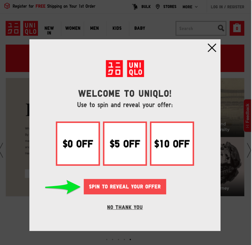
When users click that red button, the three boxes spin like a slot machine to reveal a potential savings of up to $10 off — that’s what we landed on when we gave it a shot.
Similar to the ThirdLove fit tool, this does require some extra coding, but it’s a fun and easy way to interact with your online customers. Not only that, the coupon code encourages visitors to make a purchase and save money while doing so.
Takeaway: Adding an interactive discount tool like this to your website is a great way to gamify the buying experience for your customers, which could lead to increased engagement.
6. Blenders Eyewear
Another popular polarized sunglasses brand, Blenders Eyewear, also has a Vegas-style spinner tool that greets new customers and rewards them if they enter their email address:
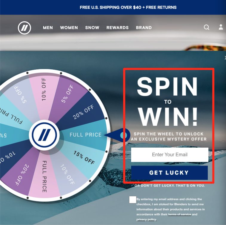
But that’s not the only reason to take notice of this brand. You’ll also see they’re using a new feature many eCommerce websites have yet to adopt:
Need help with your next eCommerce contest?
Book a free call to learn how our team of contest experts can help you create high converting email or social media contests today.
They’ve added a small pop-up message at the bottom of the page that comes up every few seconds to show who recently made a purchase, where they were from, and what they ordered. Here’s what that looks like:
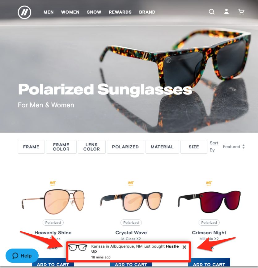
This is another example of social proof being used to help on-the-fence customers convert. Once they keep seeing other customers making purchases and taking items off the proverbial shelves, they’ll feel more comfortable and inclined to do so too.
Takeaway: Consider adding a feature to display more real-time social proof on your website, and don’t be surprised if your conversions and sales go up soon after.
7. True Classics
Men’s t-shirt brand True Classics also has an interesting yet simple approach online fashion brands can easily adopt for a boost in business:
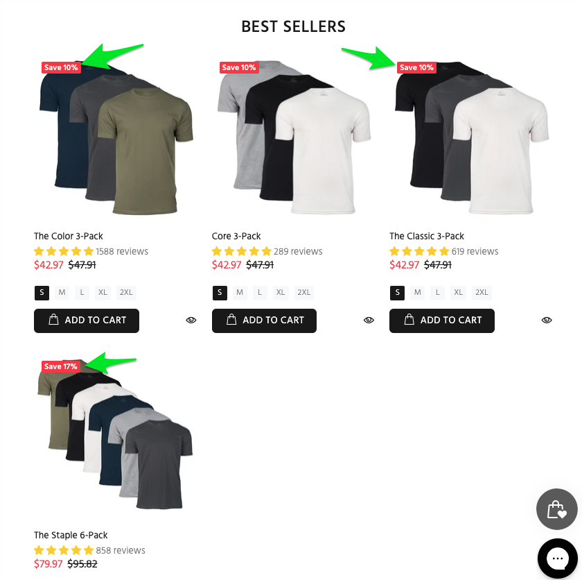
Instead of only selling t-shirts individually, they incentivize bundling to save money. This is similar to how insurance carriers try to get customers to bundle home and auto insurance together for a discount.
You’ll not only save your customers a few bucks but also help increase your sales. Customers who have a hard time deciding between colors can go with multiple options at once. This bulk convenience also allows customers to add multiple items to their cart without extending shopping time, something most would appreciate.
Takeaway: Think about whether your business can bundle goods together for a small discount. You may learn grouping certain items together helps those bundles fly off your virtual shelves.
8. Musier
Our next example from Parisian fashion line Musier is less about mimicking a marketing strategy and more of an aesthetic tip. You’ll notice in the image below that Musier uses a mix of three different photo styles on their homepage:
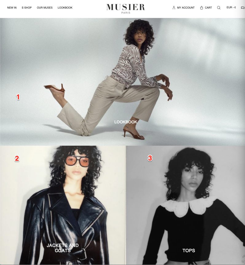
Option #1 is similar to what other modern fashion retailers use on their sites. But option #2 leans more vintage, and option #3 appeals to the arty, black and white fashionista crowd.
In theory, using different photo styles should appear like a jumbled, disjointed mess. However, they actually work really well together in practice. These various images look like they come straight off the pages of a fashion magazine. And they help speak to different buyers.
Takeaway: You don’t have to use the same imaging your competitors do to capture your target audience. Play around with vintage or black and white photos, or both, to achieve a high-end feel that better reflects your unique brand and customers.
The next brand applies this same strategy to menswear.
9. ESNTLS
Men’s clothing line ESNTLS doesn’t sell anything edgy or out there; it leans towards sophisticated, timeless basics. To capture this aesthetic, they opt for clean, modern website design:
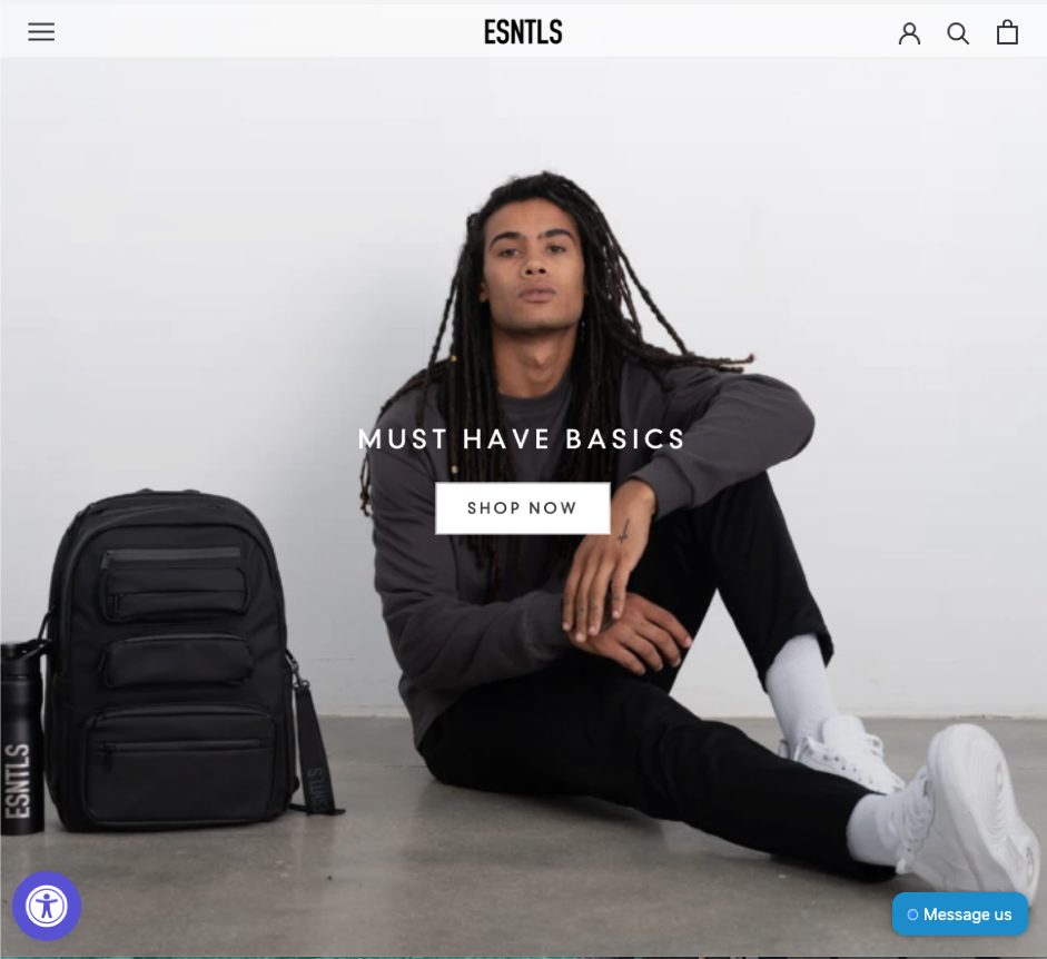
This pared-down website design provides a blank canvas for their basics to shine. If they took the opposite approach — going with a flashy website — their products wouldn’t stand out or hold their own.
Takeaway: Sometimes, less is really more. You don’t have to add all the seasonal bells and whistles to attract customers to your products. A clean, minimalist website design will help focus all attention on your offerings instead of distracting customers from making a purchase.
10. MODA OPERANDI
MODA OPERANDI, another high-end fashion website for women, uses their website space to highlight the next fashion trends. Buyers hoping to stay on the cutting edge regularly visit the site for up-and-coming merchandise:
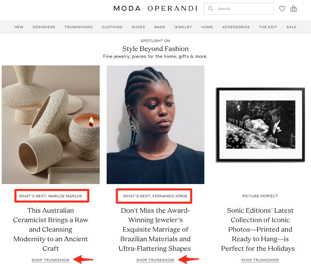
With their Shop Trunkshow links, customers can feel like they’re shopping for items right off the runway instead of on their couch at home.
Takeaway: If your brand consistently adds new products, give insiders a sneak peek to keep them interested and chomping for more. Put these fresh items at the top of your homepage and refresh this often so customers always find new goodies to add to their carts.
11. UNTUCKit
Clothing brand UNTUCKit, which, as the name suggests, offers casual shirts that don’t need to be tucked in, employs two strategies on their homepage you’ll want to take notice of.
First, their huge fall sale banner contains all the elements of an eye-catching CTA. It uses big, bold fonts, clearly showcases the product, and nails the sense of urgency with the messaging (“on sale for a limited time” and “shop now”):
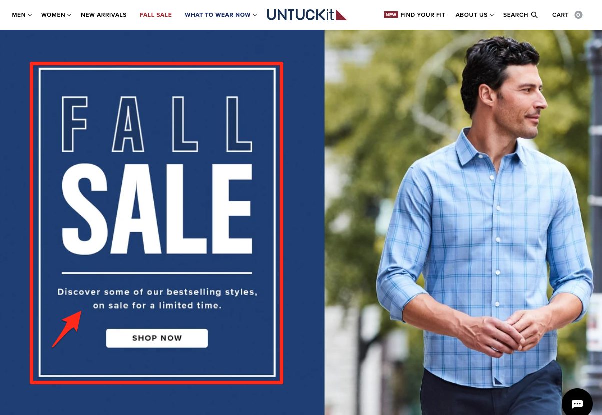
Similar to the holiday campaigns mentioned earlier, there’s also a Fall Sale link in the top navigation in a different font color (red) to help visitors easily find marked-down items fast.
But it’s the next feature that really helps this brand stand out:
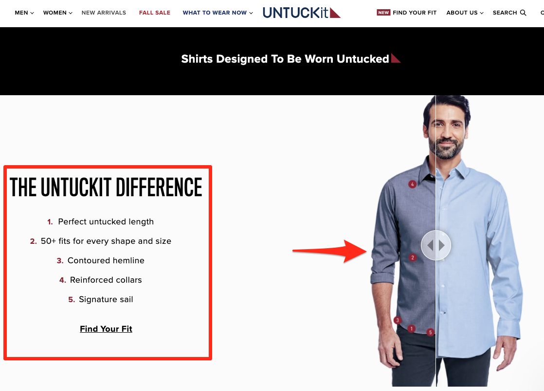
The team at UNTUCKit created a visual slider tool that shows off what makes their shirts different. Users can move the slider left and right to see what a typical collared shirt looks like compared to their untucked version. To the left of this image, they also highlight their unique selling points in a short numbered list.
Again, this does require extra effort to create, but it can position your brand as the standout to choose, making it worth it.
Takeaway: If your brand is continually compared to others on the market, you may want to consider creating a side-by-side comparison tool like this to prove why your product is the superior choice.
12. BONOBOS
Men’s clothing line BONOBOS shows that the right messaging can also separate your brand from your competitors:
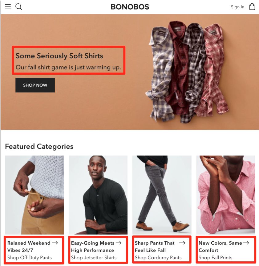
We specifically love all the phrases highlighted in the red boxes:
- Some seriously soft shirts
- Our fall shirt game is warming up
- Relaxed weekend vibes 24/7
- Easy-going meets high performance
- Sharp pants that feel like fall
- New colors, same comfort
While their marketing team doesn’t use any complex lingo to describe their clothes, their messaging connects with buyers and makes their clothes come to life.
Takeaway: See if you can emulate your messaging to fit how your target audience communicates. You’ll capture attention and boost engagement to encourage more sales.
13. MANGO
MANGO is a women’s fashion brand carrying everything from athleisure to ready-to-wear clothes for the contemporary woman. They’ve also launched a new teen’s line. But it’s not just their clothes that stand out; it’s the way they market them:
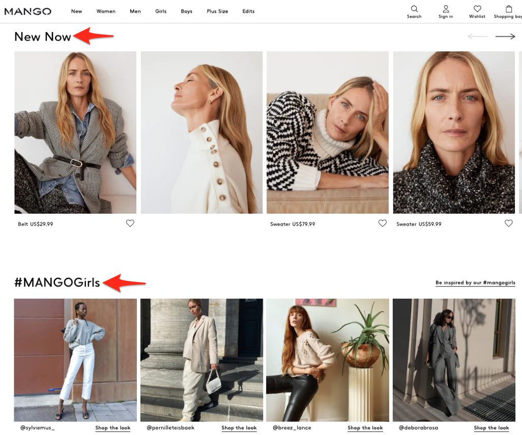
Similar to MODA OPERANDI, MANGO features a “New Now” section that draws fashionistas to the latest outfit drops. This is a stellar way that brands can drum up excitement for new products and capture recurring business.
Just below this section, visitors will see their #MANGOGirls series. This clever section features photos of their clothing “in the wild” as customers tag their outfits of the day on Instagram. New customers can see what MANGO’s clothes look like on real people — and shop the looks right from the images.
Takeaway: Ask your customers to tag your brand on social media, and then create a section on your website where visitors can browse and shop from this social proof.
14. Bershka
The last fashion brand on our list is a clothing and accessory line for men and women called Bershka. They completely upend what a traditional website menu and homepage should look like. And this gamble helps them stand out in a good way:
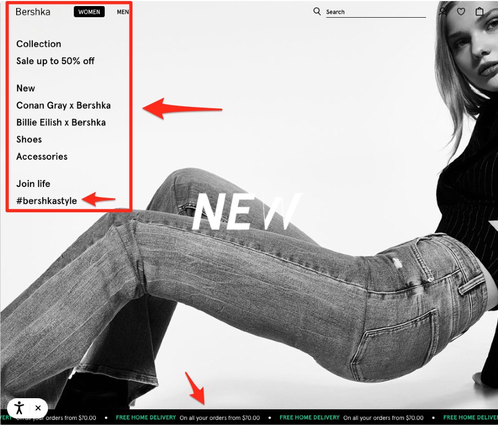
You’ll notice that all their menu links are stacked on the left-hand side instead of spaced out at the top. Their main image also scales the entire page from top to bottom, extending past where the typical navigation menu normally is. Visitors know they’re in for something different as soon as they land here.
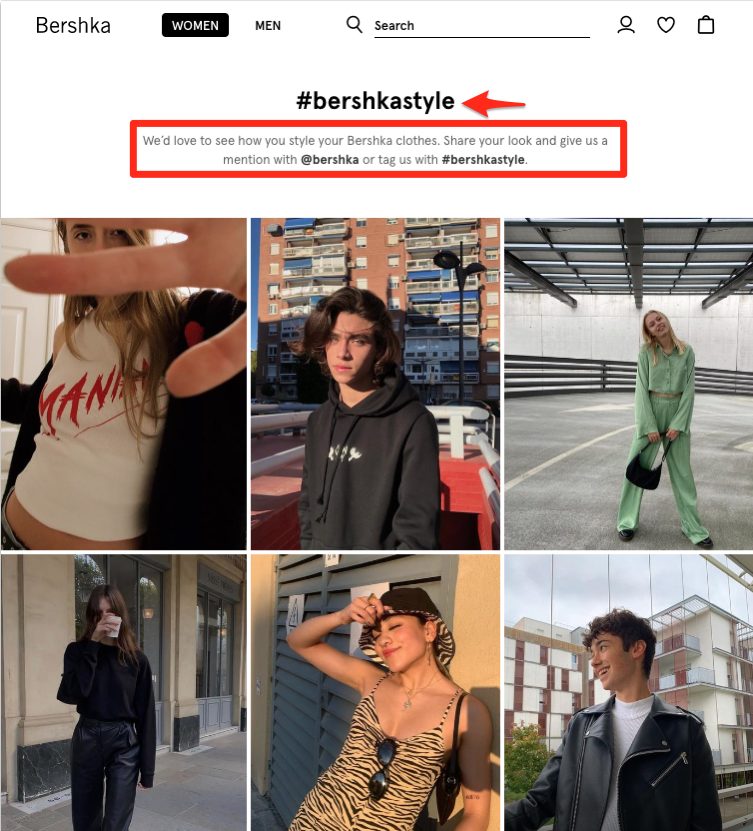
And similar to #MANGOGirls, Bershka also promotes its social media hashtag (#bershkastyle). Clicking this takes people to a wall of images straight from their customers’ Instagram accounts.
This is an excellent way to build a community. It also helps on-the-fence customers see what the clothes will actually look like on, which alleviates some of the pressure of buying online and wondering if things will fit right.
The last neat feature of this website is that the bottom of their homepage has an active scrolling ticker showing off their free home delivery promotion. Even though other brands may also offer this, Bershka conveys this information in a unique and exciting way so visitors pay attention.
Takeaway: Don’t be afraid to step outside the box with your website design. Think about new and novel ways to capture your visitors’ attention and convey messages they need to make a purchase.
While you may not be able to implement all these tips for your brand, just using a few will give your company the quick refresh it needs to stay relevant with potential and returning customers.
Final Thoughts on Using These Tips for Your eCommerce Fashion Brand
Despite the ongoing COVID-19 pandemic, there are plenty of ways to boost your eCommerce sales, as you’ve seen in this beast of a guide.
But before you run off and hand your team a list of 30+ ideas to try, it’s essential that you sit down and think about which could truly work for your business. Just because something works for these brands doesn’t make it a good fit for yours.
So instead of throwing every strategy at the wall and seeing what sticks, first identify ones that will help your customers. Make a list of your top picks, and then spend time brainstorming your choices with your team. You can also send them this guide and get their top picks too!
Choose a few ideas and see how your customers react. If it’s possible for your site, run A/B tests to see whether or not your new variations are seeing greater conversions. You can always adjust and make changes later, but it’s important to test these out first before you do. The right design, layout, and content can help you crush your sales goals this holiday season.
About the Author

Devin Pickell is a Growth Marketer at Nextiva. He combines his skills in content marketing, SEO, data analysis, and marketing strategy to meet audiences at the right moment in their journey. He has helped scale SaaS brands like G2 and Sphere Software and contributed to G2’s traffic growth of more than 1 million visitors per month.