
How do you know if your shopping cart design is performing at its optimum potential?
Look at your bottom line and ponder on these questions:
Are you making sales? Is your revenue where it needs to be? Better yet, ask yourself whether their buying journey is easy to go through or whether you’re creating confusion for them.
If sales, revenue, and simplicity isn’t where it needs to be, then it’s time to tear down the checkout process your customers go through.
Making sure customers complete their purchase is the number one purpose of shopping cart design. Bad design leads to high abandoned cart percentages and low sales conversion numbers.
Baymard Institute recently reported that the cart abandonment rate across the entire industry of ecommerce is 69.2%.
Your job as an ecommerce business owner is to work toward lowering your website’s cart abandonment rate as much as possible.
The following situations work against you in this area because some people:
- Compare prices
- Window shop
- Shop for gifts
The reason you want to focus on optimizing your shopping cart design is so that your core customers enjoy the process as they move through the product ordering process.
Here are some excellent examples of shopping cart pages that quite convincingly cater to customers’ tastes.
1. Make The “Add To Cart” Button Stand Out
You can’t help a customer check out until they’ve added items to their shopping cart.
Notice how easy it is to see the “add to cart” buttons at Harbor Freight:
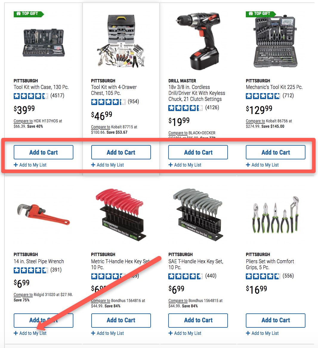
The “add to cart” button is uniform from item to item. There’s no doubt in the visitor’s mind what they need to do with any item they’re interested in adding to their cart.
Getting your visitor to click on the “add to cart” button is the first step toward bringing them in as a client. It’s a vital micro conversion inside your sales funnel.
Tip: If you haven’t done so already, you should set up event tracking so that you know your exact numbers in this area.
Another nuance to pay attention to is how Harbor Freight makes it simple for customers to add items to a Wish List.
Consider using this strategy to help customers save products they’re not yet sure about into their “list” area. This makes it more likely that they’ll come back to their Wish List, think about it and then officially add some of those items to their cart.
You can also use these Wish List best practices to encourage more sales:
- Encourage customers to share Wish Lists with family & friends via share buttons
- Let customers name their lists
- Allow customers to create more than one Wish List
- Use Wish Lists to customize PPC and email strategies
- Encourage visitors to use a Wish List when a product is out of stock
- Keep Wish Lists mobile friendly
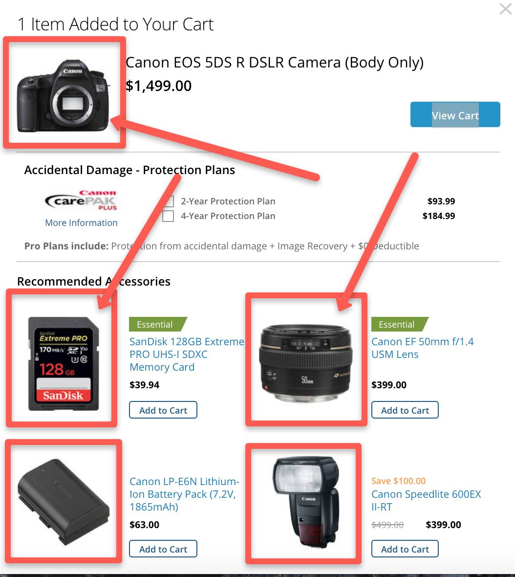
2. Use An Overlay
Staying with Harbor Freight, take a look at what happens when a customer makes an “Add to Cart” selection:
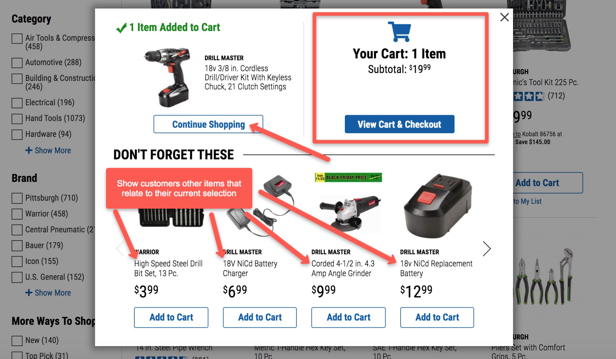
An overlay appears with three important pieces of information for customers:
Confirmation that the wanted item is now added to the cart (top left corner)
A summation of how many items are currently in the shopping cart (top right corner)
Immediate recommendations for other related items the customer may need
This is an effective way to use an overlay for other reasons as well.
It shows your customer how much their current subtotal is. This allows them to make a buying decision based on their budget.
Failing to use this information leads to confusion and frustration because your customer needs to physically click into the cart in order to understand whether they’re within the budget or not.
Additionally, this overlay style allows customers to either continue shopping immediately (top left corner) or add related items instantly to the cart (by clicking “Add to Cart” on one of the four recommended items).
Look at your shopping cart design flow and ask yourself if you’re using these types of “1-click” options so that your customers can get right back into shopping mode after adding an item to the cart.
Tip: Use overlays in other parts of your cart to optimize conversions. For example, you can use one to pop-up if a customer attempts to leave mid-purchase. Encourage them to stay and give them an extra 10% or 15% discount for doing so.
You might also offer them a personalized pop-up overlay to offer them a product tied to their browsing history.
3. Offer Free Shipping
Most online shoppers hope they can save on shipping at the end of their purchase decision. Nike makes it easy to get free shipping:
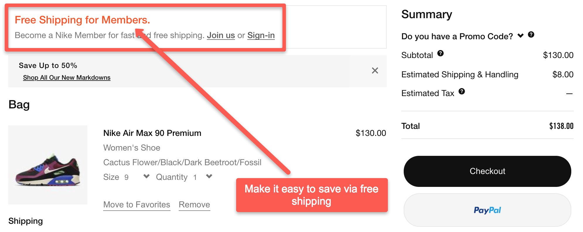
Notice how a customer can sign up as a member using an overlay so they don’t lose their current cart page:
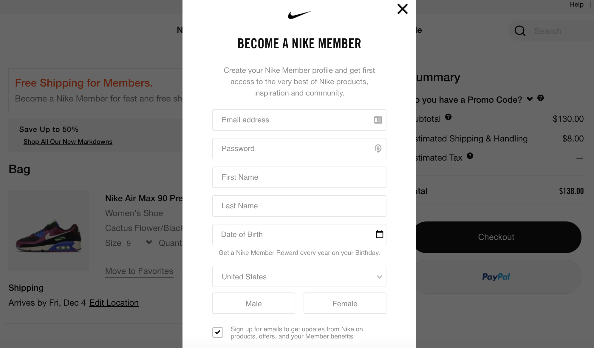
This strategy accomplishes the following:
Increases the odds that customers will sign up without feeling as though they’ll lose their cart
Provides those customers a big forward-momentum achievement (free shipping)
Provides Nike with follow-up information even if the customer abandons the current cart
Tip: You must know your margins so that you don’t lose money offering free shipping.
In order to understand your margins, you should know two numbers:
- Cost to ship the item
- Profit on that order
It might be hard to predict this information precisely for every order. However, you can look at your average order value (AOV) and the cost associated with shipping your most common products.
Use these estimates to provide an idea about whether you can remain profitable using a free shipping offer.
4. Allow Guests To Purchase
Don’t force new customers to create an account in order to make a purchase. That won’t be good for a long-term customer relationship. Offer both returning account customers and guests the ability to easily finish their purchase by having two options like Kohl’s does:
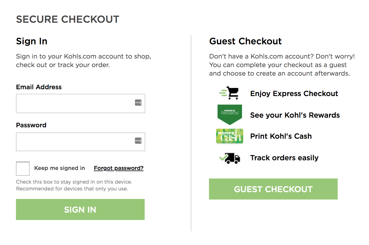
Some people are adverse to filling out account information prior to placing an order and will abandon the cart if asked to do so. In fact, 37% of customers abandon their cart when forced into this action.
Other customers in a hurry will appreciate the ability to quickly finalize their purchase and move on with their day.
Need help marketing your eCommerce store?
Book a free call to learn how our team of eCommerce experts can help you generate leads, boost traffic and drive MORE sales.
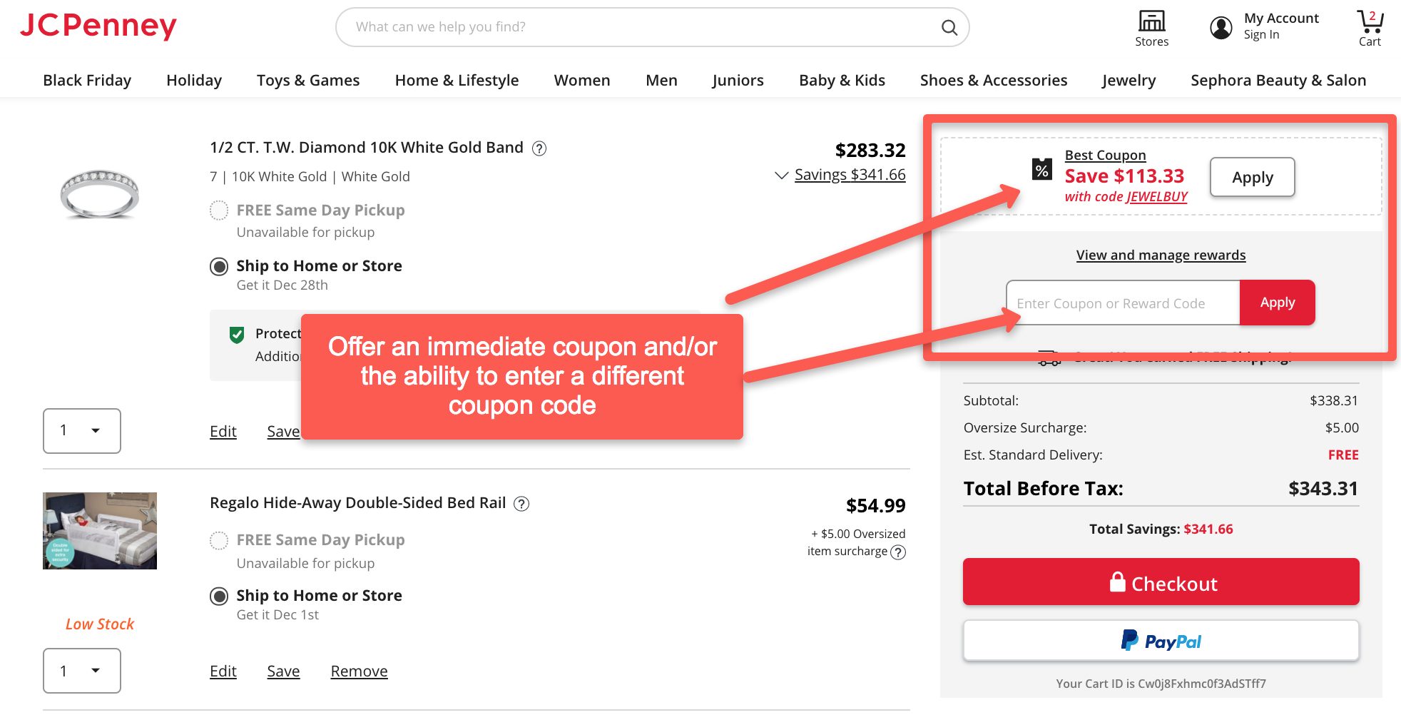
5. Make Customers Feel As Though They’re Getting The Best Deal
One of the most common reasons for abandoning a cart is when customers wonder if they’re getting the best price.
Use coupon deals and discounts to keep them glued to your brand like JC Penney does:
Harbor Freight goes a step further and adds in incentive for more discounts by spending a little more money:
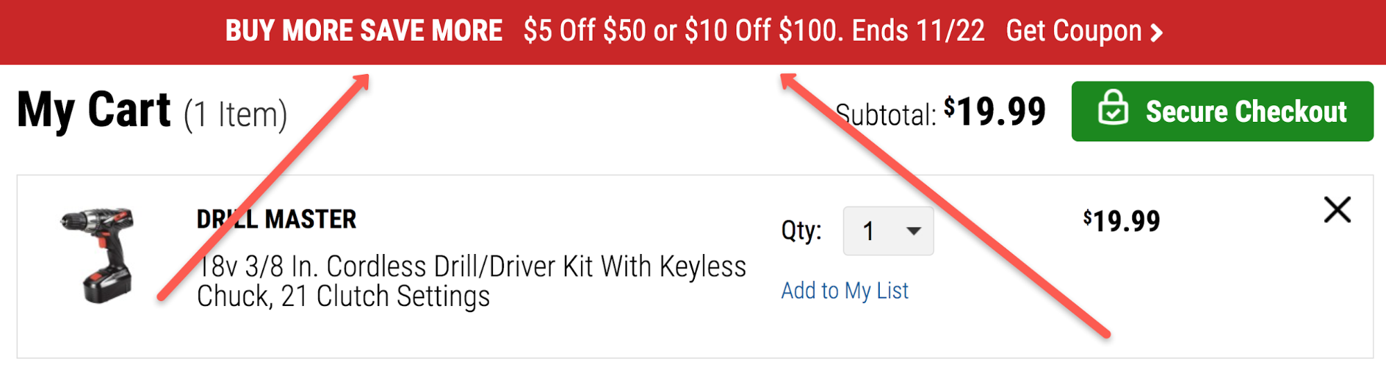
Use these discount and coupon strategies to keep your customers active on your website. It makes them feel good that you’re out for their best interests by offering them the best possible price and lessens the chances that they’ll look elsewhere for the savings.
Tip: Keep these best practices in mind when offering discounts and coupons:
- Create specific and clear goals
- Gain an understanding of your profit margins and LTV (lifetime customer value)
- Test different coupons & discounts across various customer segments
You can also use the following types of coupons and discounts:
- Date-specific discounts
- Student discounts
- Special discounts for subscribers or followers
- Win-back discounts
- Exchange discounts
- Milestone-specific discounts
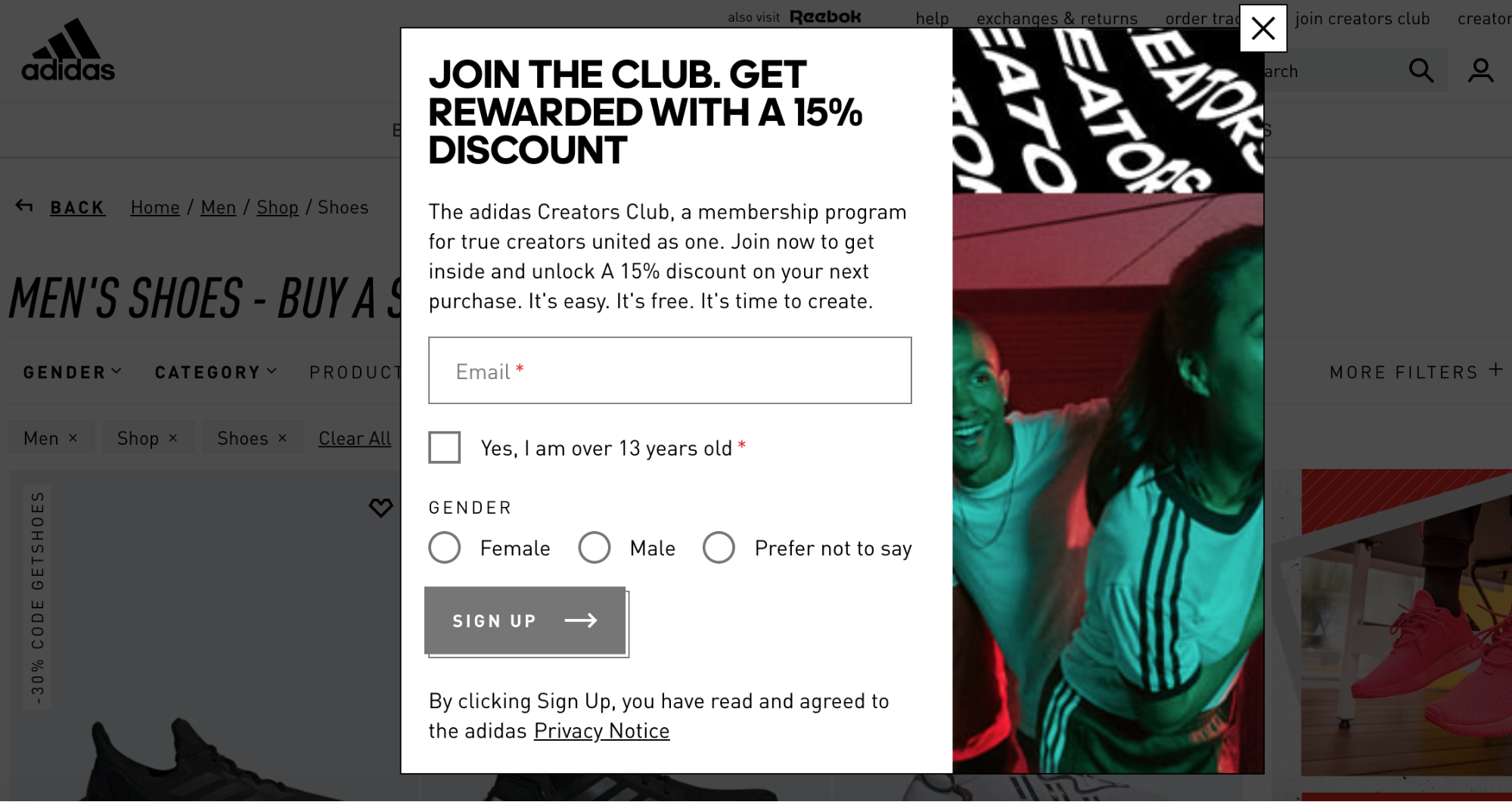
6. Keep Your Shopping Cart Page Clean & Use a Progress Bar
Don’t clutter your cart page with unnecessary distractions that slow the process down, confuse customers or cause them to abandon the cart.
This includes links to your social media accounts, navigation bar options or “continue shopping” buttons.
Notice how Adidas does it here:
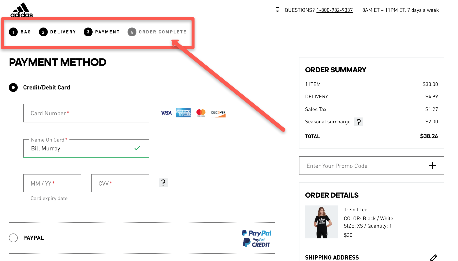
Nothing appears here except exactly what a customer needs to fill out in order to complete their purchase.
Much like using product roadmaps for businesses, customers want a clear site of where they’re going and have an idea of the end goal.
The big factor at play with the Adidas shopping cart is how they give customers a clear view of what stage in the buying process they’re currently on.
In the above example, they’re at Stage 3 of the four stages: Payment.
Use this method with your shopping cart design because it helps customers visualize how close they are to completing their purchase.
Tip: Make sure your progress bar is specific. The UX experience should make it clear each time a step has been completed so that the user knows the order was received or data was entered correctly.
Adidas did a good job in the example above by numbering each step. They also filled in each completed step or current step with a black circle, while future steps are still colored gray.
7. Use Call-To-Action Buttons That Stand Out
One of the most important aspects to effective shopping cart design is using buttons that pop out on the page and invite the click from customers.
Sales conversion numbers are directly impacted by how well your “Add to Cart” and “Checkout” buttons stand out.
Using red and orange colors typically works best like you see Sephora doing here:
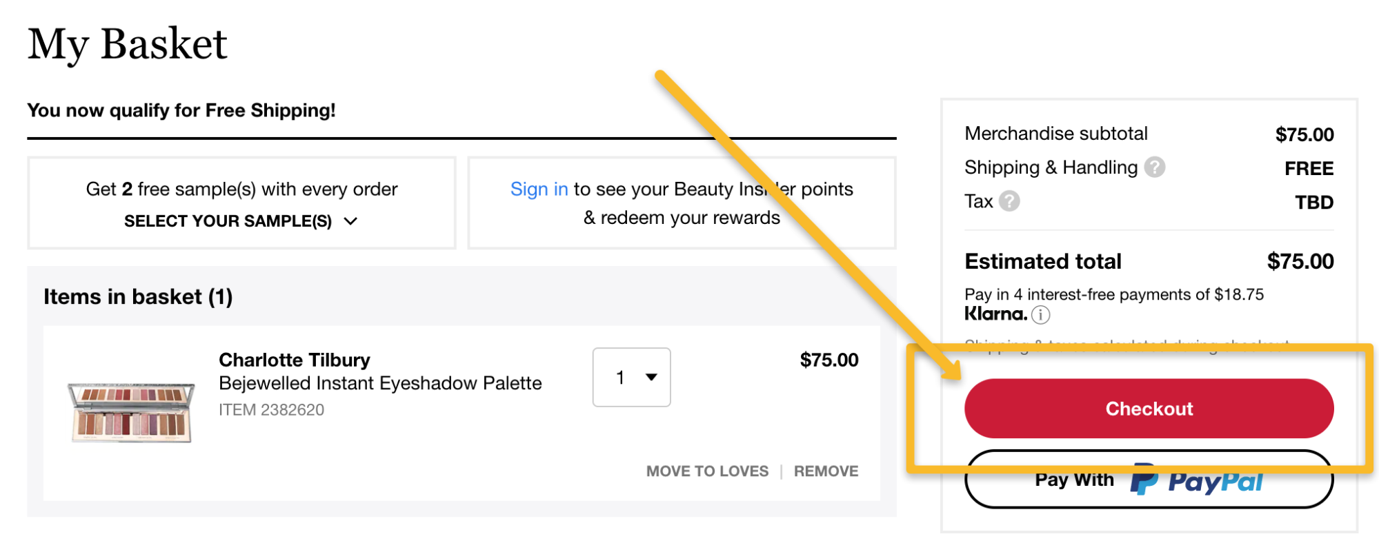
Notice how their “Checkout” button is visually the most attractive part of their Basket page.
Tip: Use proven call-to-action phrases to improve your conversions. For example, “buy now”, “join free” and “learn more” are proven phrases that help convert visitors to customers when used on your call-to-action buttons.
Help your mobile customers easily tap their call-to-action buttons by making each button fit the entire length of the mobile screen.
8. Use High-Impact Thumbnails
It’s obvious mages play a large part in closing online sales since your customers can’t touch the products they purchase.
So make sure you’re using high-impact thumbnails that help encourage the sale in the same way BHPhotoVideo does:
Amazon does an excellent job of this as well where visitors can roll their mouse over several thumbnails on the left side of the screen and see larger images appear at the right:
Do everything you can to improve how you’re visually sharing each product with website visitors so that they can be confident in making a buying decision.
Tip: Work to make your thumbnail images the proper file size so that they take up less space on your server. Smaller file sizes take less time to load and improve the experience for your website visitors.
A good rule of thumb? Keep your images to one to two MB each. PIXLR is an excellent tool that will help you accomplish this goal.
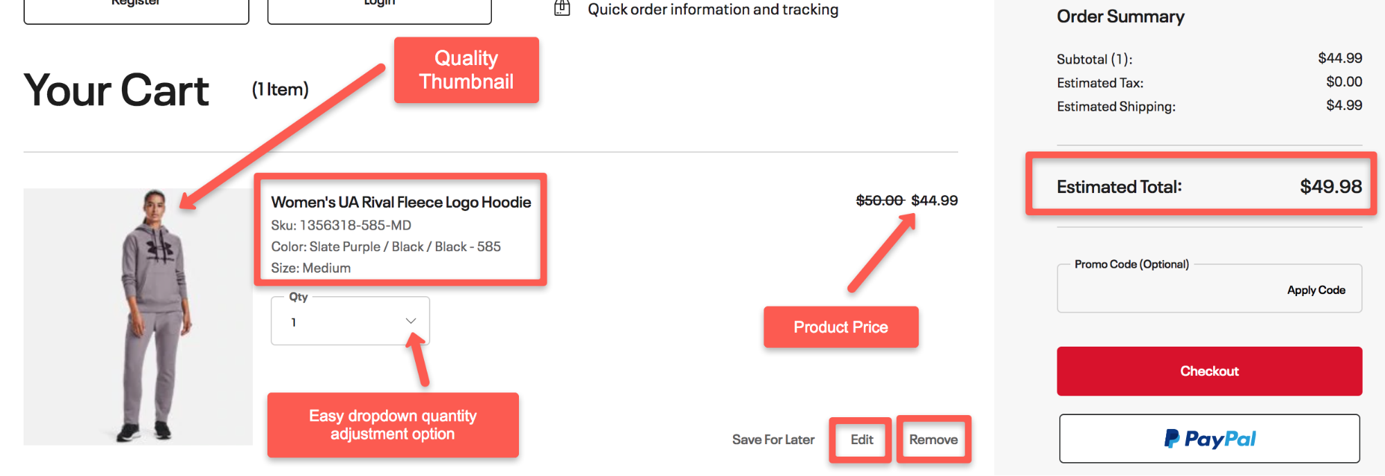
9. Create Detailed Product Summaries
Thumbnails aren’t the only vital element of creating an effective shopping cart experience. Product summaries play a huge role as well so make sure you detail everything about the products your customers choose to place in their carts.
This includes adding the:
- Exact name of the product
- Quantity
- Order or SKU number
- Option to remove the product
- Option to change the quantity
- Summary that includes color, size, capacity, etc
- Product price
- Total price
By the way, transparency about pricing is important throughout the entire cart journey. Make sure that there’s never a question in your customer’s mind as they’re navigating through your shopping cart process.
Keep a running tab of how much their subtotal is, the total amount and any shipping or tax fees. UnderArmour does a pretty good job with these tabs:
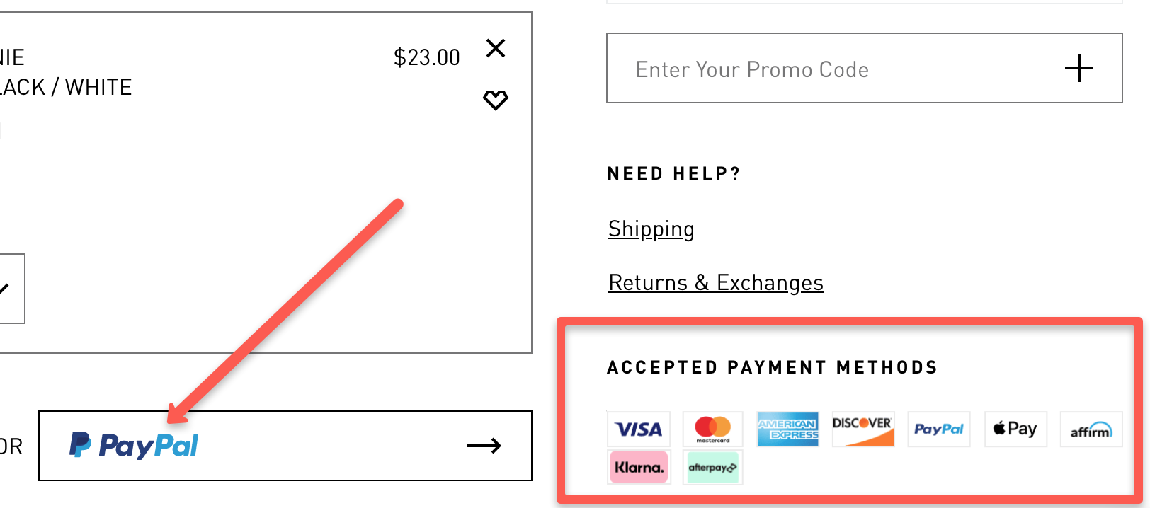
Other details to consider including with your product summaries are:
- Payment options
- Data privacy buttons
- Confirmation that wanted items are in stock
- Shipping pricing and delivery times
Notice how Adidas makes their payments clear on their shopping cart page:
Tip: Increase conversions by adding video to your product summaries. One of the biggest drawbacks to buying online is that customers can’t touch your products.
Videos provide a better experience when placed on product summary pages because it makes visitors feel like you’re giving them a personalized in-person demonstration.
Videos are a fantastic way to show off your products and make your shoppers feel like they’re getting an in-person demo. The other benefit is that you’ll achieve a 41% higher click-through-rate if your videos make it to Google’s search results page.
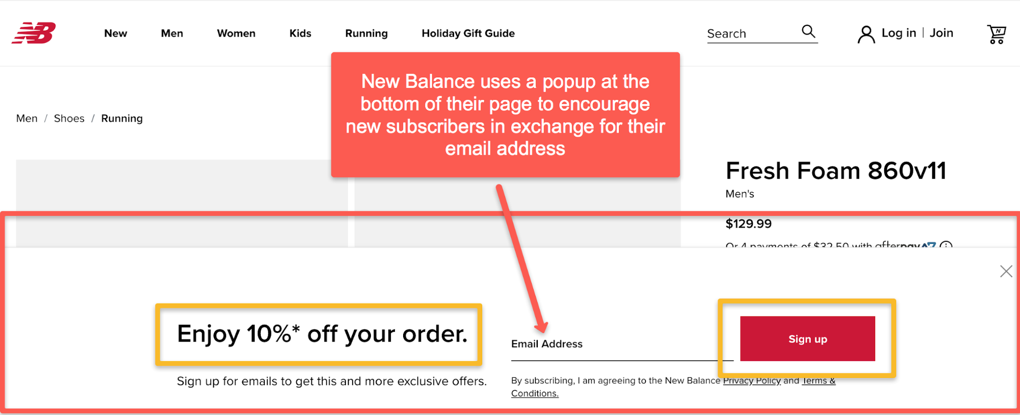
10. Use a Discount Offer To Build Your Email List
Some ecommerce sellers forget about the importance of building an email list. Although the average open rate for email marketing newsletters is 22.86%, the CTR is at 3.71% which potentially translates into a decent lump of revenue.
One effective way to add new subscribers is to offer a discount in the way New Balance does:
Adidas does something similar except that their popup is a Lightbox-type that overlays across the entire screen:
Another type of effective popup for capturing email addresses is an exit intent popup.
Consider that it’s a long shot that anyone about to leave your website is going to come back anytime soon.
Use an exit intent popup that triggers the moment a visitor indicates that they’re about to leave.
Offer them a very generous discount or a free shipping deal to keep them on your site and in the shopping mood.
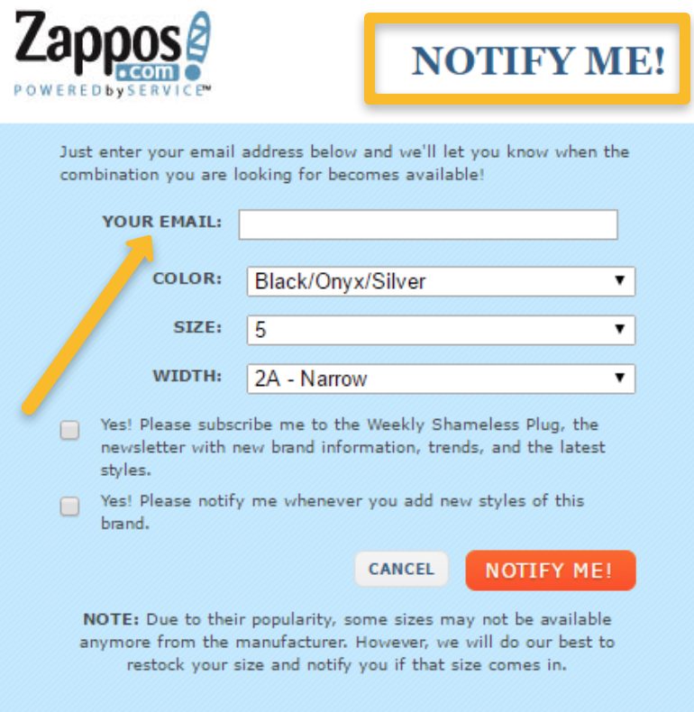
Tip: An under-used list building strategy is generating email subscribers when one of your items is out of stock. Don’t let people who were about to buy something leave your site because you don’t have the item.
Instead, offer them the opportunity to sign up for a future notification when the item is back in stock. There’s little chance that they’ll ever come back otherwise. Here’s an example from Zappos:
Need help with your next eCommerce email campaign?
Book a free call to learn how our team of marketing experts can help you create high converting email or social media contests today.
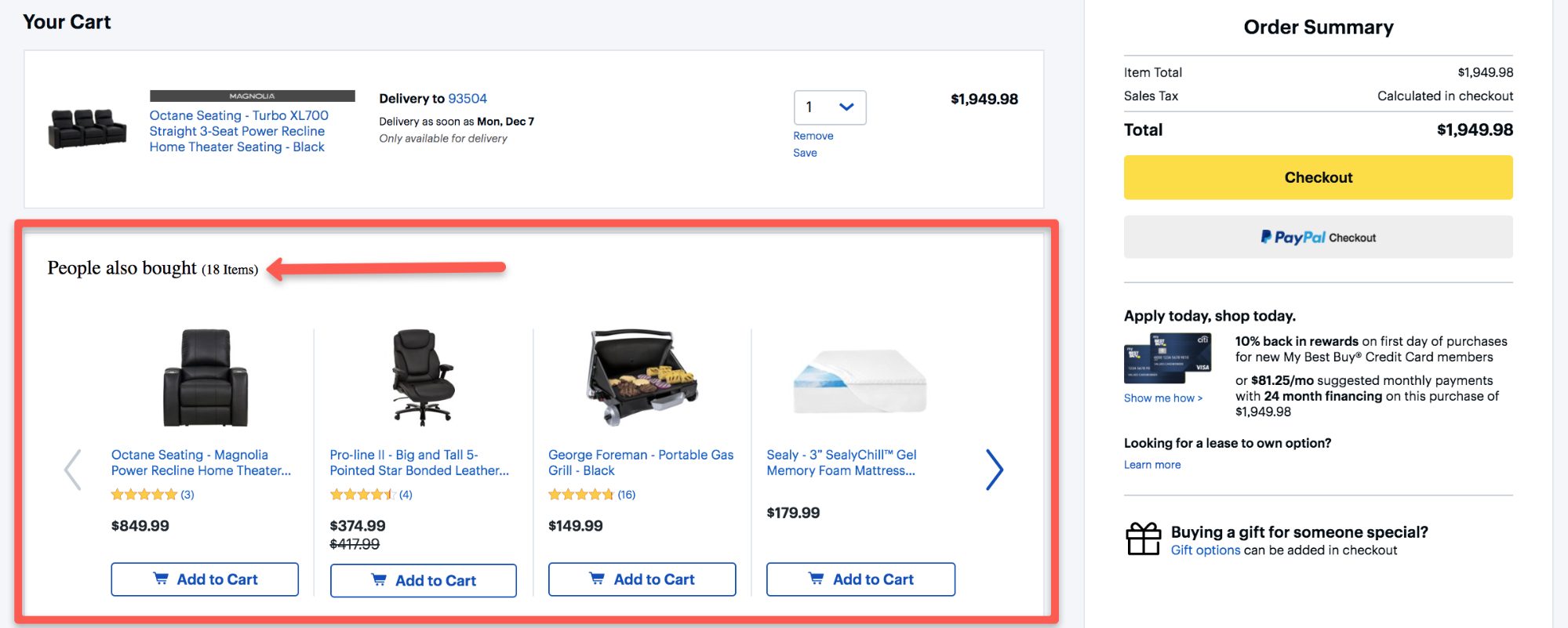
11. Use Cross-Selling Opportunities To Increase Sales
Don’t let extra profits slip through your fingers by neglecting to show customers other options that compliment their purchase or that other similar customers have bought.
For example, take a look at how electronics company Best Buy adds a “people also bought” section to draw customers into buying more:
BhPhotoVideo similarly adds a “recommended accessories” section to convince potential customers that they’ll need these other additional products in order to ensure they get the best experience:
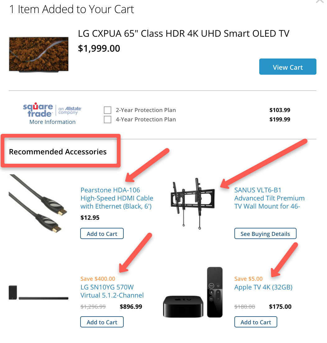
Tip: Maximize your cross-selling opportunities by keeping things relevant. You’ll increase conversions if you make sure that any related add-on product that you present is closely related to what the customer is already interested in buying.
For example, offering a custom canopy to shield their baby from the sun will likely interest a mom buying a wheeled baby carrier from you.
12. Keep Your Shopping Cart At Top Right
This may seem obvious but it’s worth mentioning.
Make sure to position the shopping cart icon that provides visitors their running tally of selected items at the top right of each page.
Here’s an example from Osmo:
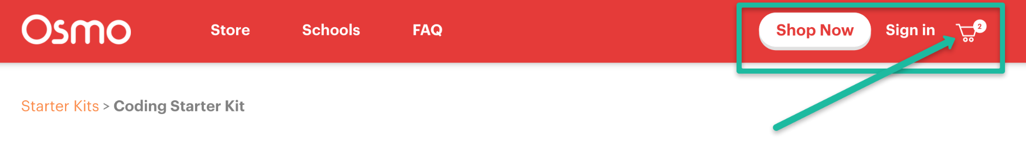
Amazon started this trend over 20 years ago and in all that time it has proven out to be the most effective area for this important icon.
Online shoppers are trained to look to the top right for how many items they’ve selected and where to click when they’re finally ready to check out.
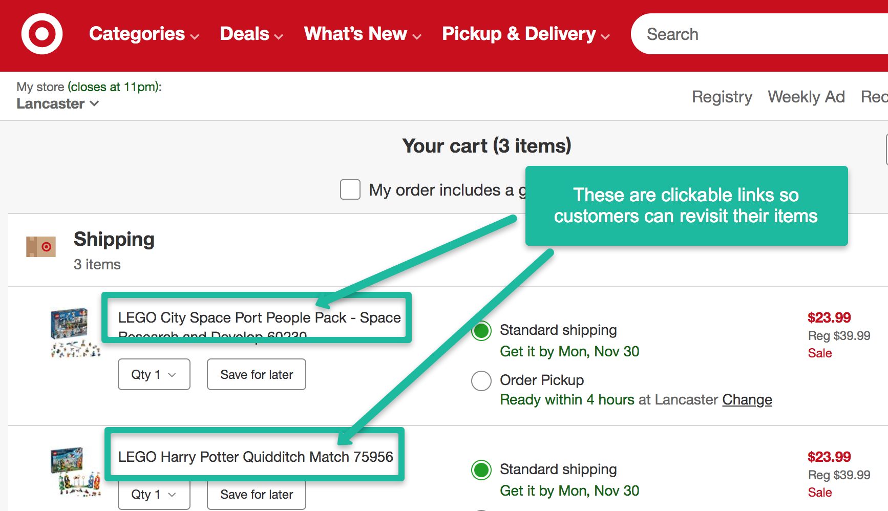
13. Provide Clickable Product Description Links
Make it easy for customers to revisit the products they’ve added to their cart.
You can do this by making sure each product title is clickable from the cart page back to the product’s full page description.
This is how Target does it:
Tip: Be intentional when writing product titles. Make your titles specific and clear so that they cause any confusion with shoppers. The process will also help when it comes to your search engine optimization efforts.
For example, if you’re selling jackets, then saying “Men’s Jacket” in the title isn’t going to be as effective as saying “Men’s EvaPOURation Omni-Tech Waterproof Jacket”.
14. Optimize Shopping Cart Design For Mobile Conversions
According to statistics, mobile commerce sales will reach $3.56 trillion in 2021.
What should you learn from this? Don’t ignore mobile customers.
Optimize your shopping cart design so that it’s easy for mobile users to make a purchase on their mobile devices.
With 72% of customers projected to only consume content via mobile by 2025, getting this part of your strategy right is critical.
This includes using the following elements:
- Easy-to-fill forms
- Easy-to-click buttons
- “Save for later” option
- Step-by-step checkout journey
- Uncluttered and simple look & feel
Tip: Present one clear Call-To-Action. You have limited space on a mobile device. Keep in mind that mobile users typically read from top to bottom. Keep all calls-to-action as clear and concise as possible in order to avoid any confusion.
In a previous tip, we mentioned using a button that spreads the entire length of the mobile screen. Make sure the CTA is written in a large, easy-to-read font and leaves no doubt about what you want your visitor to do.
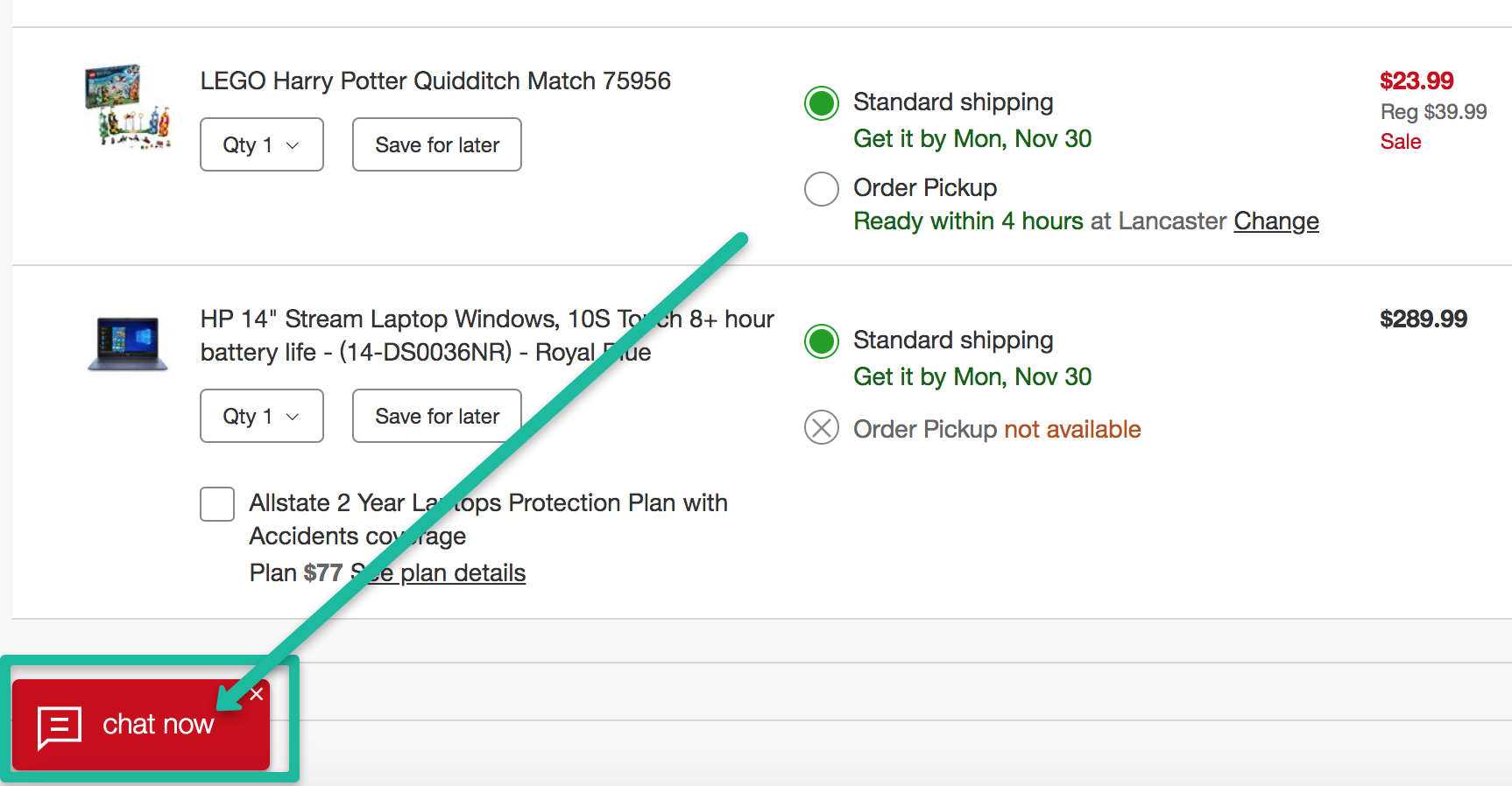
15. Offer Customers a Live Chat Feature
Never allow customers to abandon their carts because they’ve become confused or can’t get their questions answered in a timely manner.
You’ll create trust and save potentially lost sales if you provide a live chat option so that customers can get in touch with a customer service representative.
Here’s an example of Target employing this strategy:
Keep this in mind as well:
Chat conversations are saved and archived. This means you’ll accumulate a written record of customer conversations that provide invaluable data when it comes to improving the customer experience.
Improving your customers’ journey has proven to increase revenue up to 15% while also boosting customer satisfaction by around 20%.
Tip: Place the chat feature on all pages of your website. You might try to figure out which pages make the most sense when deciding where to place the chat box.
However, you never know when a visitor might decide that they need help. Placing it on all site pages means that your customers never become frustrated when they have questions.
Let’s recap all the ways you can use shopping cart design to increase your ecommerce business revenue.
- Make The “Add To Cart” Button Stand Out
- Use An Overlay
- Offer Free Shipping
- Allow Guests To Purchase
- Make Customers Feel As Though They’re Getting The Best Deal
- Keep Your Shopping Cart Page Clean, With Progress Bar
- Use Call-To-Action Buttons That Stand Out
- Use High-Impact Thumbnails
- Create Detailed Product Summaries
- Use a Discount Offer To Build Your Email List
- Use Cross-Selling Opportunities To Increase Sales
- Keep Your Shopping Cart At Top Right
- Provide Clickable Product Description Links
- Optimize Shopping Cart Design For Mobile Conversions
- Offer Customers a Live Chat Feature
Ready to start improving your sales conversion numbers?
Use these 15 shopping cart design tactics so that you know what to look for and how to identify what will work best inside your eCommerce business.
About the Author

Ricky Wang is an online entrepreneur and founder of rickywang.com. He provides digital guides, resources, and inspiration to help aspiring entrepreneurs and hustlers build and grow successful online businesses. You can connect with Ricky on Twitter and LinkedIn.