

Have you ever wondered why your traffic doesn’t convert into customers? The most common reasons include poor web design, slow loading speeds, and bad navigation on your website pages.
Website visitors land on a page and end up with tangled navigation, an absence of on-site search, and numerous messages without clear directions of where they can get the desired product or service.
The right calls to action (CTAs) will improve these situations.
A CTA is a link or button leading visitors to specific website pages or initiating a particular action. It’s like telling people where to click to get a product or another valuable action. For example, you can find CTAs on email subscription pop-ups, under product descriptions, or within ads.
In eCommerce, a CTA equals conversions. The better you configure them, the more people will purchase on your website. And there is a lot to consider here, from color to placement on the screen.
For this reason, we present this guide on eCommerce call-to-action best practices. You will find real-life examples explaining how brands leverage these buttons to increase sales and subscriptions. These ideas may show you what to change on your website, whether it’s a landing page, a home page, or a product page.
7 Tips Ecommerce Call to Action Tips for Higher Conversions
Ready to boost sales? Here are seven CTA tips you can apply to your online store, which will improve your eCommerce UX.
1. Use Clear Wording to Avoid Ambiguity
You may have noticed that particular wording travels from one website to another. There is a set of words and phrases online stores add to their pages because they work best.
People are used to such wording, so it takes little effort to understand the meaning behind the phrase. Even several seconds of hesitation may prevent people from converting, so shoppers may better react to familiar phrases.
What can you write on buttons to reduce a cognitive load on potential customers? These can be phrases like:
- Learn/Read More, which is among the easiest ways to encourage clients to stay on the website and see more content. Visitors don’t have to leave any details or add items to the cart, so this soft phrase may work well for home pages, product ads, blogs, etc.
- Join Now (generally accompanied by the word “Free” to additionally hook consumers). This button may invite readers to leave their email addresses to join the rewards program or receive offers in their inboxes before anyone else.
- Add to Wish List/Cart, allowing users to save items in a dedicated section where they can review the desired goods. This button may be the most important, thus, being the biggest and brightest on the page.
- Buy Now. Some online store owners decide to streamline the shopping process. This button removes some steps on the purchase journey, telling users they will proceed to the checkout page after clicking.
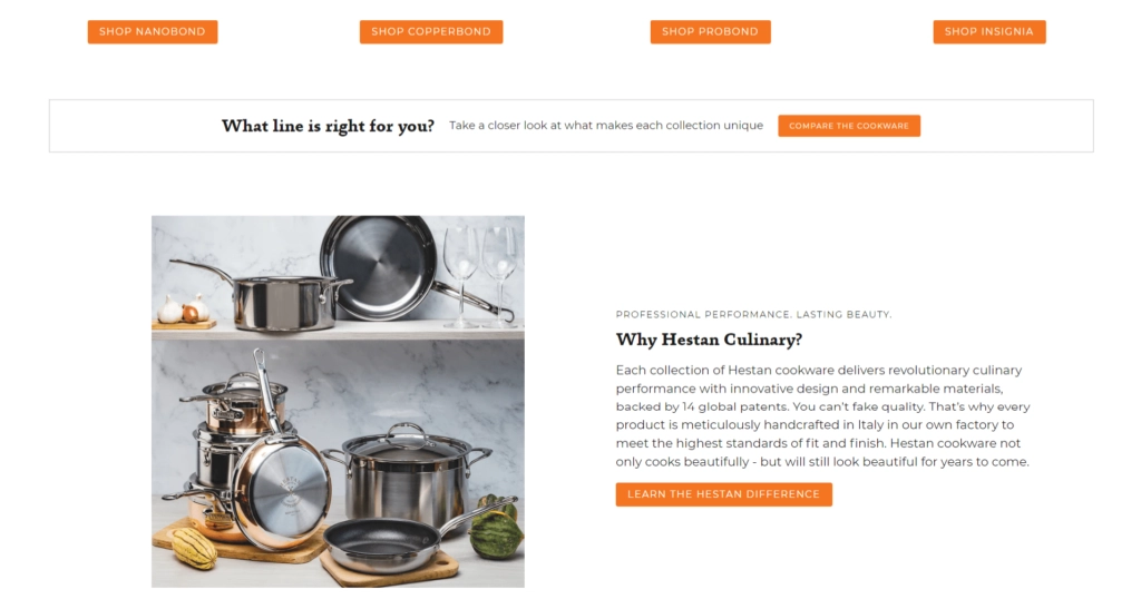
Here are some of the examples on the Hestan website, such as “Shop Nanobond”, “Compare the Cookware”, “Learn the Hestan Difference”, and others.
Consider the visitor’s place on the sales funnels to determine which button will perform best on this page.
For example, first-time visitors may omit the “Add to Cart” button on the home page. They need time to look through the catalog and compare goods, prices, and reviews. Email copies, in turn, may be a better place to insert these CTAs as subscribers are already familiar with the brand and its offers.
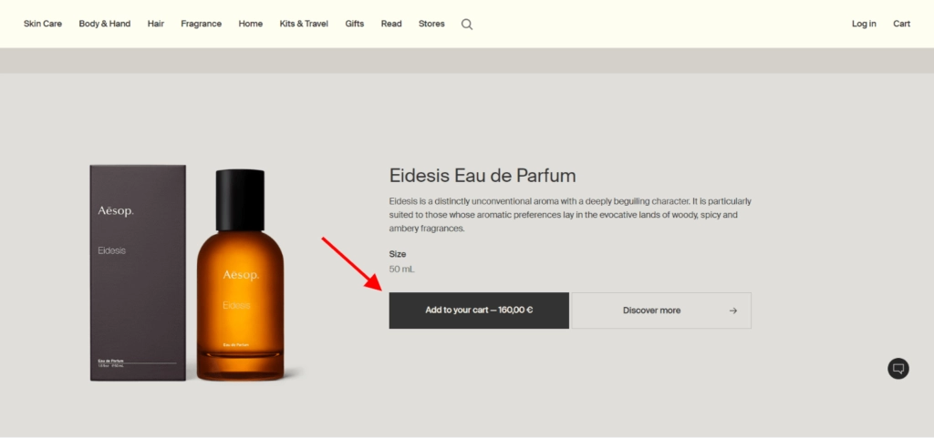
Another trick to enhance the eCommerce call-to-action wording is to address readers personally. This tactic is known as personalization. You may add personal pronouns, such as “Add to My Cart”, “Sign Me Up”, “Choose Your Perfect Mascara”, or similar to catch readers’ attention. According to a study, personalized calls to action outperform standard CTAs by 202%.
Below is an example of a customized CTA on an online store. Adding a personalized touch to the call to action makes website visitors feel more at ease. They have a sense of relatability with the brand, which increases trust.
2. Place CTAs Where They Will Get the Most Clicks
An excellent call-to-action button should be eye-catching enough to capture visitors’ attention immediately. If your button is small and there are a lot of other features on your website, it may be difficult for customers to see it.
Users may also assume something doesn’t exist if it’s not readily visible. They will be unable to take further action due to the lack of directions. That’s why you should stick to predictability. Put things where consumers would expect to find them.
For instance, a CTA should appear above the fold. This means it should take place on the upper part of the page for visitors to spot it without scrolling down after loading. This position has been shown to be the most effective and is likely to be the first thing your prospects will see when they visit your store.
Another website convention deals with product pages. Consumers expect to see one or two CTAs to the right of the product image and below a short description.
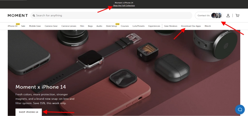
The Moment store includes all menu options at the top and a call-to-action button in a visible place. The hero image showcases the products, and the copy is short and to the point.
3. Mind the Button Hierarchy When Designing a Call to Action in Ecommerce
If there are multiple CTAs on the page, their relative importance should be clear. Secondary CTAs might lose their aesthetic appeal by becoming duller, smaller, or reduced to text links.
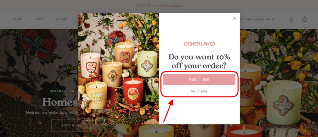
Case in point: the email subscription pop-up below. Positioning and contrast with the page of the “Yes, I Do” button make it clear that Otherland wants viewers to click on it. Even though “No, thanks” is the same size as the primary CTA, it comes as a ghost button and disappears in the background.
4. Ensure Clicking on a CTA Involves Little Effort
Potential clients should find it simple to interact with your company. People are more likely to click on a button that doesn’t oblige them to do anything complex. Additionally, you get a chance to direct them to a landing page and persuade them to buy something.
Encourage consumers to keep in touch with your brand by providing something of high value.
Everyone likes a gift or discount to save some cash, right? Offer customers these perks for something of low value or effort, such as following your business account on social media or signing up for email newsletters.
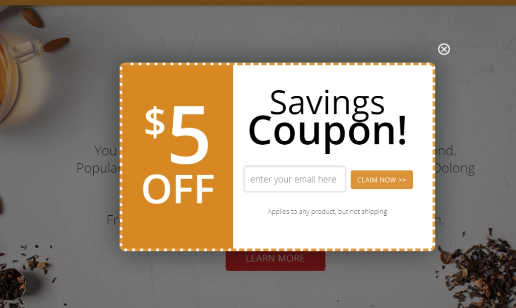
Below is an example of a low-risk offer. The Adagio store gives consumers $5 off after leaving an email address.
5. Instill a Sense of Urgency and Scarcity
Make the product available for a certain period, and you’ll skyrocket conversions. The limited offers create FOMO and a sense of high demand for the product. It’s a famous psychological effect, so online stores leverage it all the time.
You may choose different variants to leverage a sense of urgency or scarcity and display the information at various stages. Buttons like “Shop Now” generally appear on home pages. Texts like “Ends soon”, “Purchase until 9 PM”, or “Only three items left in stock” find their place on product pages.
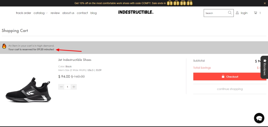
You may add these phrases to the cart page or write specific “The cart is reserved for 60 minutes” messages to speed up decision-making.
Check out how Indestructible Shoes leverages this strategy. The items in the cart disappear after 10 minutes.
6. Ensure the Right Size, Shape, and Color is Used
Does your call to action for eCommerce stand out from the page?
You should make the CTA visible depending on the layout and predominant colors. It should also indicate the ability to click. For example, you can place it in a standard rectangular or rounded form of a button or underline it as the typical pattern for links.
What color should you choose for the CTA? It all depends on the website’s color scheme. In most cases, green and red colors show the highest conversion rates, but you can pick other contrasting colors or align them with your branding.
Leaving some negative space next to the CTA helps highlight and make it more noticeable. Bear in mind the button size. It should be moderate and match well together with other website elements. Note that bigger CTAs are more likely to be seen by your prospects than smaller ones.
The chosen size also determines the website’s mobile-friendliness. So making links too small can harm mobile conversions. Smartphone users need larger buttons to be clickable from small screens.
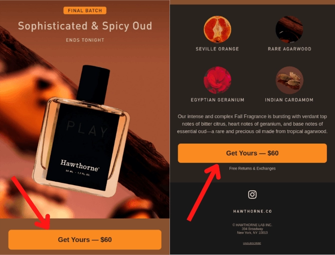
Below you can see how Hawthorne incorporates buttons in its email newsletter. The recipient can spot the button fast due to its contrast with the background and large size and even see the product price.
7. A/B Test to Find the Best Call to Action for Ecommerce
Uncertain about what will most appeal to your target audience? Do you feel like other options could bring more sales? Try different CTA buttons or links until you find the best one.
There isn’t a single conversion-boosting strategy that applies to everyone. But choosing buttons that are meaningful to visitors and represent your business is crucial.
Experimenting is the only way to be certain. Change the CTA’s copy, color, form, or positioning and run tests to determine the arrangement with the most conversions. A/B testing calls to action for eCommerce is one such example.
This testing relies on comparing two versions of one element. You have to pick only one aspect to test. Both versions should run simultaneously to avoid distorted results caused by seasonal fluctuations.
Suppose you show a round button to one audience and a rectangular one to another. The people’s reactions (for example, click-through rates) can illustrate the solution to keep. The experiment may take some time. The longer it takes, the more accurate conclusions you may draw.
3 Extra Tips to Improve an eCommerce Call to Action
Apart from CTAs themselves, there are other ways to maximize conversions. The tips below will help you appeal to more people as they come across CTA buttons.
1. Display Ratings and Reviews
People don’t always have the time and experience to decide on the product. Will this dress look well after washing? Will these shoes survive long-distance running? Trying to save energy, our brain picks the easiest path, such as social proof and authority.
That’s where ratings and reviews can help you boost conversion rates. Demonstrate the number of stars and comments on the goods in the product description. Callouts like “Bestseller” also encourage viewers to purchase.
Another way to build trust is to show special badges and awards. You can get them from popular magazines and associations proving your business’s high quality, sustainability, and popularity.
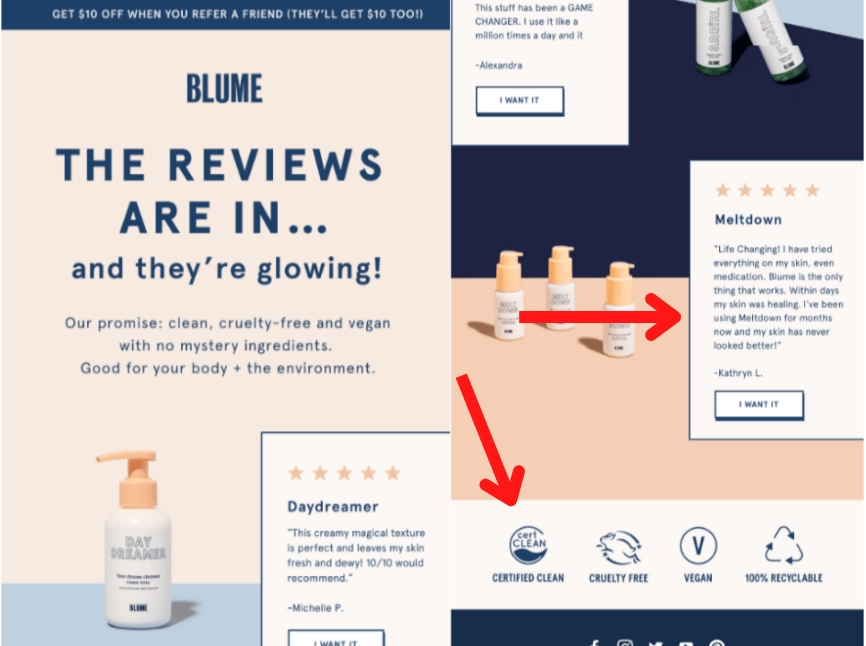
Take a glance at the screenshot of the Blume email newsletter below. The company sends a letter with real-life reviews to persuade subscribers to check the goods and includes eco-friendly labels to strengthen its principles.
2. Reduce Uncertainty
Prospective customers may hesitate to purchase due to certain risks. What if the product doesn’t suit them? What if they want to send it back? That’s where you should eliminate their doubts by offering clients the chance to eliminate risk.
Visitors will feel safer and more likely to take action on the page if they believe they can “undo” their activities, enhancing conversion rates. It can be options like “Buy now, decide later” or “It’s OK to change your mind” return policies. They allow shoppers to return products without any consequences if they regret buying them.
Display these promises to increase the number of clicks on an eCommerce call to action. These phrases may also symbolize confidence in your goods and services, streamlining the decision-making process.
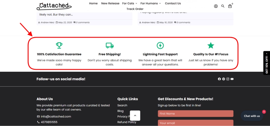
To illustrate what I mean, I provide a screenshot of the Cattached online store below. You can find all the needed information regarding their return policy and guarantee, which relieves point-of-action anxiety.
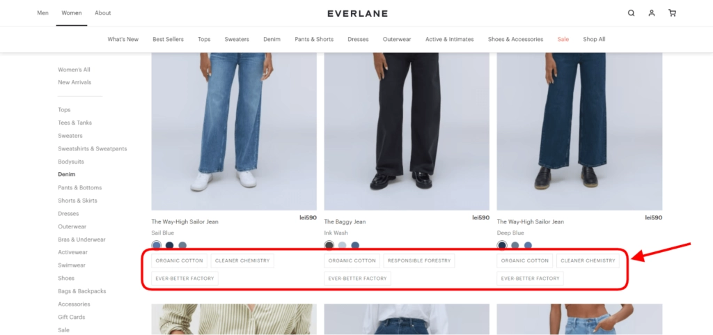
3. Show Additional Information Next to the Button
Extra information helps users get information without proceeding to other pages. In some cases, this strategy may boost conversions too. People may be sure of what happens after clicking the link without reading long walls of text. It can be a short footnote of fewer than 100 words.
Show price, availability, color, size, and quantity options. Or come up with something unique that you think can be a turning point when looking through products. Here is how Everlane implements this strategy on the product catalog page.
Anchoring may also help in this situation. This practice includes showing the product’s original price next to the reduced one. It’s similar to creating a sense of urgency. If users don’t act now, they may lose the opportunity to get the goods at a favorable price.
Major Takeaways
Calls to action in eCommerce are essential in your conversion rate optimization process. They determine whether buyers will reach the desired stage, complete a purchase, or get lost and abandon the cart. We’ve provided some tips to enhance your links and buttons.
But the bottom line is that no rule guarantees visitors will better respond to a particular option. You should do regular testing to find what resonates with the audience.
Good calls to action for eCommerce can improve the website metrics. They appear everywhere, from pop-ups and ads to shopping carts and checkout. Your task is to optimize them and enhance the website to see maximum return on investment.
___
Art Malkovich is Co-founder and Chief Executive Officer of Onilab, a full-service eCommerce agency focused on Magento. Being a Certified Magento Specialist and Master Project Manager, he keeps up to date with the latest trends in SEO, SaaS, B2B, and technology in general. Art is a business development professional with hands-on experience in eCommerce, Magento development, and migration.