

Are your weight loss product or service landing pages just not cutting it? Or are you out of ideas on how to optimize your landing pages?
In this article, I’ve thoroughly gone through thirteen landing page examples that are offering weight loss products and services, critiquing what’s good about them and what’s not. Hopefully you’ll be able to apply some of these best (and worst) practices to your own weight loss landing pages!
Let’s get to the details.
Dr. Bernstein Diet & Health Clinics
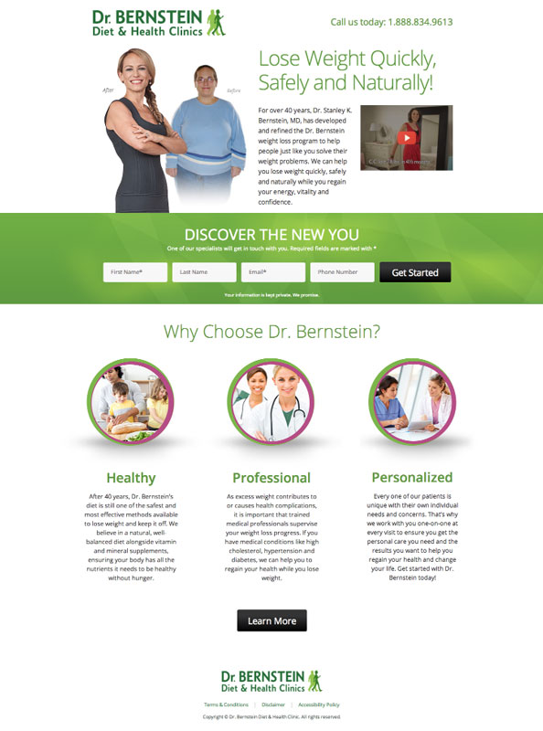
What I like:
The weight loss landing page’s color scheme. Green is a great color choice for weight loss products, as it is communicated as a calming color that also signifies positive actions (think, “green as in go”).
The benefit list. “Why Choose Dr.Bernstein?” outlines the benefits of their clinics in 3 different points that are described in less than 3 sentences which is ideal. It’s also great that the “Learn More” call-to-action (CTA) button below doesn’t take you away from this landing page, instead it expands on the current landing page so visitors don’t get distracted and bounce from the sole purpose of this page – to fill out the entry form.
The clear entry form. It’s above the fold and stands out well from the page without screaming at you. It only requires 4 form fields to fill out which is not an intimidating amount to fill out
The video. Videos are a great way to quickly and simply explain the benefits of your product or service. An added bonus is that 90% of users say that seeing a video about a product is helpful in the decision process. This particular video is less than a minute which is ideal for videos on landing pages.
Before & after photo. It provides a level of trust, similar to a customer testimonial or trust symbol. Trust factors are essential to have on weight loss landing pages
The other various trust factors. The phone number, logo and guarantee below the form field that people’s information will be kept private all attribute to the level of trust visitors to this page will feel. Seeing these various trust factors allows visitors to believe that this is a legitimate business.
The use of white space. This is a landing page design tactic that is often under-utilized. It’s really effective for adding emphasis to other landing page elements such as images, calls-to-action, entry forms, and more.
What I’d change or test:
The CTA button’s color. I would suggest testing red, or even the purple that surrounds the images under “Why choose Dr. Bernstein?” as these colors will contrast more with the landing page.
A customer testimonial. I would test putting it below the “Before & After” photo. By adding a customer testimonial (or at least a name) with the image would really drive trust and personalize the weight loss landing page even more.
Focusing on the benefits of their clinic. What does “healthy, professional, and personalized” really mean for their potential leads? What are they specifically getting out of those aspects of their business? This will prompt
For more info on how to use benefits on your landing pages correctly, check out this article.

CoolSculpting
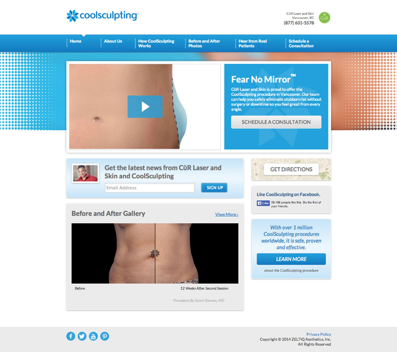
What I like:
The focal color of the landing page. Blue is a good color choice because it creates trust with the weight loss landing page visitor.
The value proposition. “Fear no mirror” is a good value proposition that makes people think about the benefit of the weight loss procedure.
The video. As mentioned above, videos are great to include on landing pages. This one is also less than a minute long (like the one mentioned above) which has proven to be the most dependable and high-converting length.
The trust factors. There are a few trust factors on this page – on the right side of the page, it’s mentioned that they’ve done over 1 million CoolSculpting procedures worldwide. This shows that they are a well-established business. There’s also a phone number and their location on the landing page which helps vouch for their legitimacy as a business.
What I’d change or test:
A more attention-grabbing or visually appealing image. I’d recommend including the face of one of the models – showing personality and facilitating trust between business and consumer.
The distracting amount of actions. Landing pages exist for the purpose of one step in the sales funnel. If I had to guess, I would say the focus of this landing page would (and should) be the silver “Schedule a Consultation” CTA button. Everything else simply distracts from that all-important “ask”.
The navigation bar at the top of the page. These bars are also a type of distraction you don’t want on your landing page. It prevents potential leads from taking the one desired action your landing page provides.
Change the color of the (call-to-action) CTA. In general, the silver/grey CTAs on this page blend into the background. I’d recommend testing a light green or even orange.
Garcinia Max
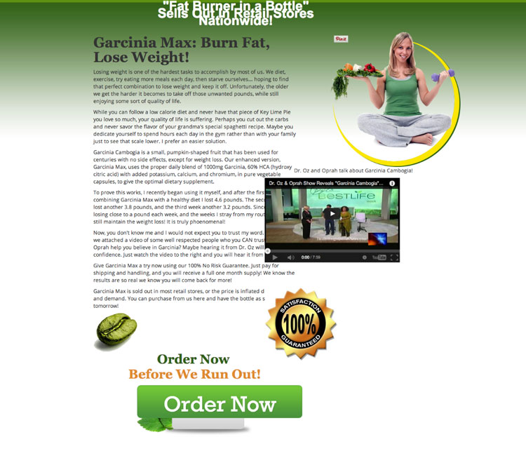
What I like:
The value proposition in the sub-headline. “Burn Fat, Lose Weight!” is clearly the value proposition, as it tells you the exact end-benefit of using the product.
The trust symbol. Trust symbols are hugely important in weight-loss business, as people can be very skeptical about whether or not the products actually work.
The large, encapsulated call-to-action (CTA). It’s great because it stands out well. A lot of the time CTAs are hard to spot on the landing page,
The pin-able image. Anything that makes a landing page easier to share on social channels can’t hurt. The more you can get your landing page out there, the better.
What I’d change or test:
The headline. Whatever is going on with the font is not good. It looks squished and it’s not easy to read.
The call-to-action (CTA) positioning. Sometimes the littlest tweaks can make all the difference on your landing page. I would test putting this CTA above the fold.
The video’s positioning. This video is clearly not in the right place. It’s on top of the text, blocking it off. I would fix this immediately as this kind of unprofessionalism does not reflect well on any business.
The paragraphs. Looking at all of this text bunched up like this would be one of the main factors that makes me bounce from this landing page. I would cut more than half the text and break up these wordy paragraphs them up into easy-to-consume bullet points and use bold text.
The CTA’s copy.* “*Order Now” has been known to make potential leads think more about the buying process as opposed to what they’re getting from the product. Try something a little softer that will tell them why they want or need the product, as opposed to just telling them to buy it.
The typos in the landing page copy. When I see typos on landing pages the first thing I think is carelessness. Grammatical errors and typos are unprofessional and they will affect your conversion rates.
ChefsPlate.com
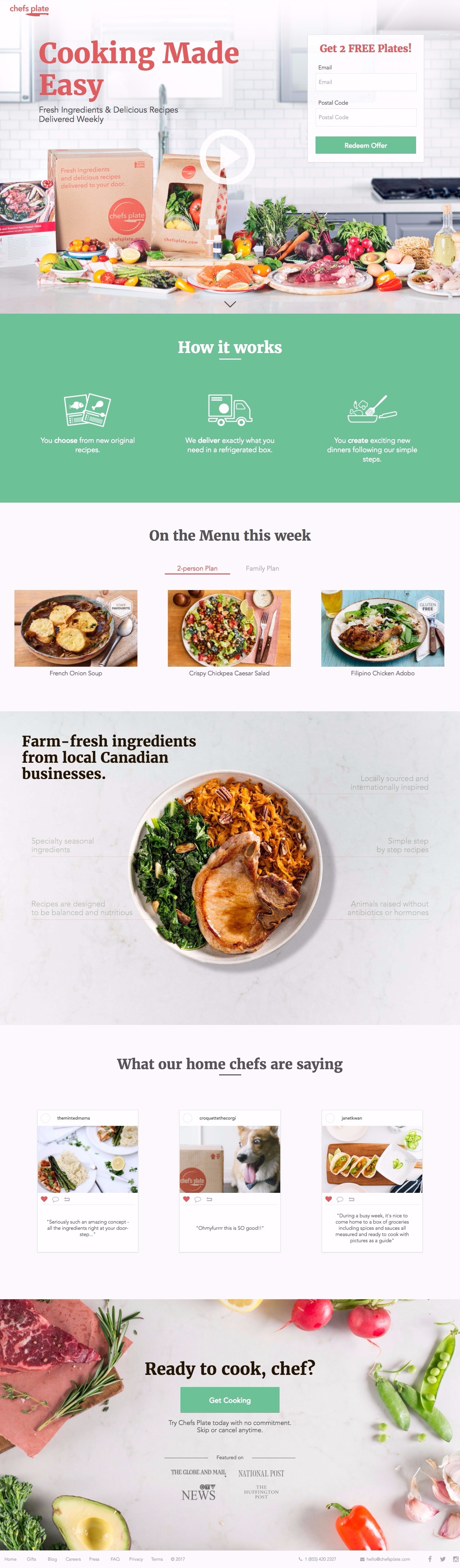
My critique of this weight-loss landing page:
- Modern and with great images and color, this is a beautiful weight loss landing page, and there’s very little I’d change.
- I love the images – making what they’re pitching look really appealing.
- I like the testimonials from chefs (I’d like to see some from customers, of course).
- I like the two CTAs – one at the top and one at the bottom – meaning visitors who scroll all the way to the bottom don’t have to scroll back up to convert.
Loseit.com

My critique of this weight-loss landing page:
- A beautiful and optimized page, I love the white space here, which drags the reader’s eye to the next section.
- If you’re going to promote an app, you need to do it with a modern landing page (none of these cobbled-together-style DIY ones). This page meets all the expectations of a modern weight loss landing page.
- What I like most is that middle section at the top there: “Numbers don’t lie! 52,962,117 pounds lost!” This is, essentially, a big, powerful customer testimonial. And they’re absolutely right about the “numbers don’t lie.” Wherever possible, use your customer’s results as evidence of the legitimacy of your weight loss plan. They’re way more trustworthy than you are yourself.
MediterraneanBook.com
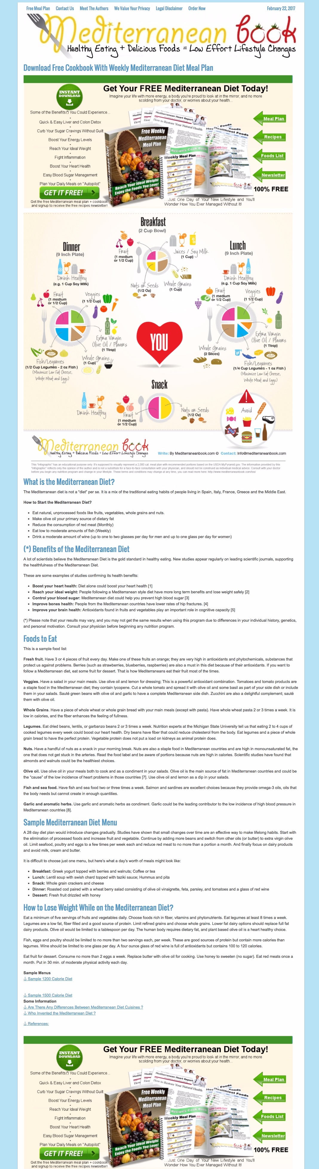
My critique of this weight-loss landing page:
- This page has way too much text in the middle section. The top is fun, colorful, and the bottom is equally so. But the education area in the middle makes visitors nod off. I’d make that an optional expandable section with “click here to learn more.”
- The copy in the top and bottom sections is a bit squished together. A bit of padding to the text would go a long way to make these sections a bit more professional-looking.
YogaDownload.com

My critique of this weight-loss landing page:
- While there’s something to be said for gving your weight loss landing page’s visitors every piece of information they could possibly need (especially when you’re selling something outright) it should really be done with the option to “expand and read.” Currently the text on this page is a bit overwhelming in its volume.
- The whole “Program Items” section could be an optional expand which isn’t visible when you first arrive on the page.
Winnie & Katt

My critique of this weight-loss landing page:
- I like its simplicity. I like its clear and visible text. I like the contrasting colors (no hiding anything here) and the the directional cue (arrow).
- I love the headline. I like that it’s a question, and one which echoes what a lot of page visitors are saying to themselves. This headline is, already, a point in this provider’s favor when it comes to competitive comparison.
ApexGarcinia.com

My critique of this weight-loss landing page:
- This page is bright, sunny, and the colors (red, light green and yellow) direct your attention where they want it to go.
- I like the directional cue, directing attention towards the form and CTA button.
- I like the use of video – the information contained in those two videos (as well as validation, as one of them is a high-profile interview) couldn’t possibly be contained in this landing page without overwhelming the visitor with text.
- Four CTA buttons is totally okay, so long as they have the same destination.
Exantediet.com

My critique of this weight-loss landing page:
- This is a really great landing page. It’s modern, give a lot of information without overwhelming the visitor and makes the diet plans look appealing with great images and specific details.
- The free ebook is an unnecessary distraction, and is likely reducing conversion rates on the “start now” conversion goal.
- The nav bar at the top of the page is also a distraction. Any link which isn’t a conversion link distracts from conversion rates.
- The bottom footer links, as well, aren’t helping anything. I’m about 99% sure this is a page embedded within their existing WordPress theme which has both the nav bar and bottom footer always visible. I’d recommend you create a new theme in your site which doesn’t have the nav bar and footer on which to host your weight loss landing pages.
ReadyForaChange

My critique of this weight-loss landing page:
- I like the step-by-step process, which makes it very clear about what’s expected from visitors.
- I’m not a big fan of the 2004-looking CTA buttons or font, but I really like the before and after photos and the testimonials. As I said above, your weight loss landing page visitors are far more likely to trust your previous customers than they are to trust you. By definition, you’re a biased source of information when it comes to how awesome your business is.
Orangetheoryfitness.com

My critique of this weight-loss landing page:
- The hero image (the woman at the top) is an inspiring and energetic one that I like. A challenge with weight loss landing pages is that it can be tough to find models who look like your target market. If you can’t get “before and after” shots of your customers, an inspiring, powerful woman like the one above is almost as good. This page has both.
- Good use of video, which is able to communicate information far faster than text possibly can.
- I like the benefit list at the top. Bullet-points, like these ones, are far more readable than paragraph text, and less overwhelming to your weight loss landing page visitors..
Egencia.com

My critique of this weight-loss landing page:
- I really like the infographic-style of this landing page – the education side of it.
- My criticism is that the form is at the bottom of the page. Any landing page optimizer knows that less than half of your visitors will ever scroll to the bottom of your page. This is a serious problem if your form is down there. It’s also a challenge to get correct conversion rate/analytics for a page like this one. You say “out of 100 people who saw the page, only 12 converted.” But that’s not actually true, because you have no idea how many of those 100 even saw the form!
- I do like the color scheme.
Conclusion
So there you have it – hopefully from these landing page examples you’ve learned a few things that you should (and shouldn’t) be doing. Remember to always A/B testthese practices, because you never really know what little tweaks will increase your conversions.
If you want to learn more about landing pages, check out a few of these other helpful articles:
- Landing Pages: The Fundamentals and Conversion Principles
- The Wishpond Landing Page Dictionary: 30 Terms You Need to Know
- Landing Pages: Using the Language That Converts
- How to A/B Test your Landing Page to Maximize Conversions
- Landing Pages: Optimizing your Landing Page for Lead Generation
What do you think of the above landing pages and practices? Have you found success implementing any of the above tactics?
Feel free to share your experiences in the comments below.