

The ability for one to collect information over the internet is as old as the internet itself. For as long as there’s been digital communication, there’s been people using it to collect information. We call it a web form.
Everything that’s free, fun, or valuable on the internet has a web form blocking access to it. Try signing up for a free Wishpond trial account and you’ll need to complete a web form first. Web forms are, for better or worse, an eternal part of the internet experience.
But as common as they are, web forms are often a forgotten piece of the entire customer experience. A marketer will happily spend time crafting landing page copy or weighing design options, but then slap on the default form as an afterthought.
Think about it. Anyone who wants to engage with your digital marketing campaigns will pass through the web form at some point. Campaign performance relies on visitors filling out your form. So why publish a campaign with a subpar web form? Why spend all the time planning the perfect campaign and not optimize the form?
Before you hit publish, let’s review your web form. Let’s make sure your web form is optimized for maximum conversions.
In this article we’ll talk about 7 web form design best practices every website needs to follow to maximize their campaign performance.
Optimize your website to generate more leads with Wishpond’s all-in-one marketing tools and automation. Click here to get started.
Why should I optimize my web form design?
A form is the main way you generate and learn about new leads. It’s where your page goes from being purely informational and changes into a business tool. Optimizing your web form’s design will encourage more visitors to complete your form and can be a great source for adding to the top of your sales funnel.
Think about it this way,
- Lets say your current web form is seen by approximately 1000 visitors each month.
- Presently, you’re only getting 10% of those visitors to fill out your form to sign up for your services.
- The average value of a person signing up is $20 meaning that you’re seeing a monthly revenue of $2000.
- Say that your form’s conversion rates increase by 50% (of 10%), this means your new conversion rate will be 15%.
- The change in your conversion rate each month will increase your revenue to: $3000. Over the course of a year this is over $12000!
Given this, you can see why it’s so important to improve your conversion rates.
Let’s start designing!
#1: Use Directional Cues to Guide the Visitor to Your Form
Directional cues are signals that tell someone to complete an action. You can guide visitors to your form using directional cues such as photos, shapes, videos or text. Here are some visual ways you can draw visitors to your form.
1.) Use an image of a person looking at your form
Humans are social creatures and so we tend to be drawn to what others are looking at. You can use this human trait to direct visitors to your form.
Have a person or group :
- Looking at your form with their eyes or head
- Pointing to the your form with their hands or bodies
- Holding your form
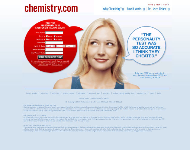
I like the way Chemistry.com uses this concept. The girl directs the visitors attention to the sign-up form with her eyes. They take this further by contrasting the form to the rest of the page using a red background.
To improve conversion rates Chemistry.com should remove the second bubble. It currently looks too cluttered and takes away from the directional focus of the girl.
2.) Use arrows
Our whole lives have been driven by shapes and symbols directing us where to go and which paths to follow. The most influential of these symbols is the arrow – nothing says look here like an arrow does.
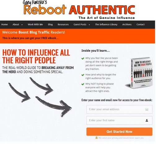
Reboot Authentic (below) uses three arrows to direct the visitor’s focus to the lead-capture form.
In order to make the arrows more effective Reboot Authentic should change the color. By using different colored arrows (say blue) they would stand out better against the orange on the rest of the page.
#2: Use Contrast to Make Your Form Stand Out
Using contrast helps different parts of your web form design stand out so the visitor easily knows what to focus on. Knowing what to contrast can be the hardest part. If you’re having trouble creating online forms that convert, check out Wishpond’s easy online forms.
So, how does contrast work?
Contrast makes an object distinguishable through:
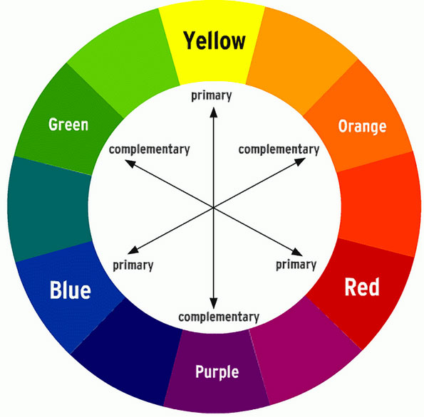
- Color – If you place a primary and complementary color together it will make your object stand out
- Brightness – if you place a light colored object on top of a dark colored background it will stand out more – the reverse is true.
- Object Limitation – limiting other objects/text in the same visual view will focus the visitors attention.
There are some great techniques that I use that have had a big impact on my forms’ conversion rate. Here are a couple that you can use:
1.) Limit objects in the same visual view as your form
This encourages a visitor to focus on a specific area of your page through the reduction of content. There just needs to be enough blank space to make the most important elements, like your form stand out.
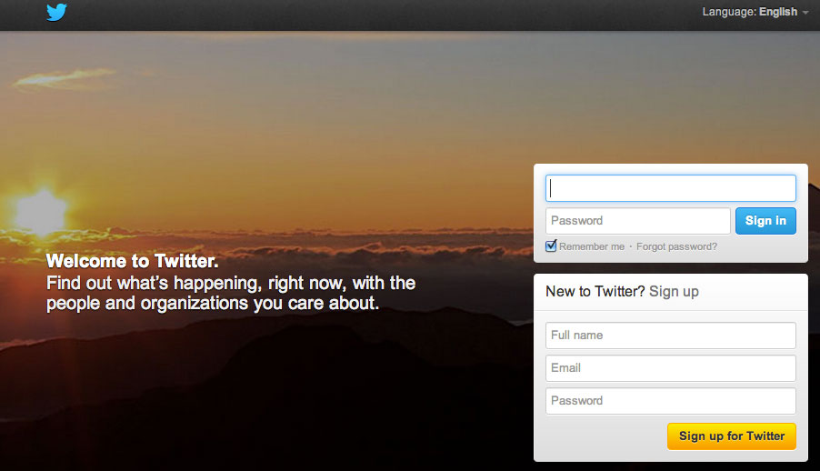
Twitter does a fantastic job of this on their sign in/up page below. They have kept the amount of information on the page to a minimum so that your eye is instantly drawn to the form.
2.) Use complementary colors on your form to make it stand out against your page
Another way to make your form stand out is to use contrast. Using a light form against a darker background draws the eye directly to the web form – the reverse is also true. Twitter has a great example of this (see above), as does Salesforce (below). The bright blue of the form stands out from the white background so that it’s the first thing a visitor sees.
#3: Make Your Form’s Call-to-action (CTA) Button Stand Out
A CTA button is the final action a visitor will take on your form before they’re directed to another page. It’s critical to get this portion of your form right and let the visitor know what will be happening when they press that button – it has to stand out. Both the button’s text and appearance are equally important, lets see why.
Make your button text an action :
Please, never leave the default text of “Submit” on your button. The best practice for your button text is to tell your visitors exactly what will happen when they press “submit”.
Think of it as a sentence starting with the phrase, “ I want to …”
- “ Subscribe For My Newsletter ”
- “ Start My Free Trial Today ”.
Underneath or inside your button support your CTA with additional information – such as time frames or quantities. This clarifies any confusion a visitor may have. Following the examples above,
- “you will be receiving one newsletter per week” – this clarifies how many newsletters they will be getting
- “this is a 14-day trial” – quantifies how long you have to try out the product before it isn’t free anymore
Making your button as clear as possible allows the visitor to make an informed decision.
Focus on making your button stand out against your form using these principles:
- Contrast. If your web form design is dark make the button light – the opposite is true. So long as your button jumps out of the form, the color you choose isn’t as important.
- Make your button look like a button. You can do this by having it appear 3D or using a rollover effect. When a visitor has their mouse above your button make it change color or look pressed.
- Size. Your button should be as big as possible. This allows two things: it will be easy to find and will give you to the option of adding data.
- Directional Cues. Guide visitors to your button with arrows, shapes and text.
Pingdom does a great job of attracting visitors to their CTA.
- The button text tells me that it’s a “Free signup” and clarifies the message with the text above saying that “no credit card is required”
- The light green color of the button contrasts nicely from the black background of the form
- An arrow guides my attention to the CTA
#4: Make Your Form Title Easy to Understand
An effective form title does two things:
- Tells the user what they get for completing the form
- Tells them the benefits of the thing you are giving them
Think of the title as an action statement starting with “by filling out this form I get…”
Underneath provide the benefits – let the visitor know what they get for signing up.
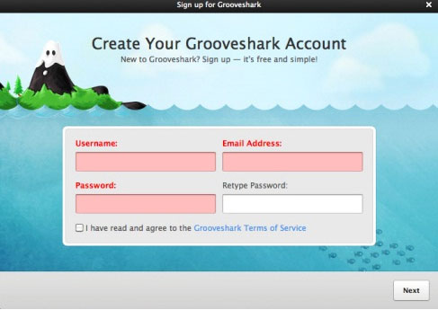
Lets see what Grooveshark does right:
- They tell the visitor that they can create a Grooveshark account with this form
- It follows by saying that it’s free and simple to sign up – two great benefits.
#5 : Make Your Form Easy to Use
Clearly show visitors what they need to fill out in your web form design. Straightforward fields encourage conversion by decreasing the time it takes for a visitor to complete it. You can easily create your own forms using Wishpond’s Flexible Templates & Form Fields.
Follow these steps to ensure visitors know what is needed so they don’t have to re-submit:
- Use specific labels. If you just say “name” it doesn’t tell me whether you want my first, last or whole name.
- Give an example. If a field is confusing or unclear show a visitor the format needed. For example your Postal Code field would show: A1B 2C3
- Be clear if a section is mandatory with an asterisk or by spelling out the word. If you use an asterisk have a legend stating it means mandatory.
- Provide a shortcut to sign up. Add a button to your web form that allow a visitor to sign up/in with a social media account.
You could try something like this:
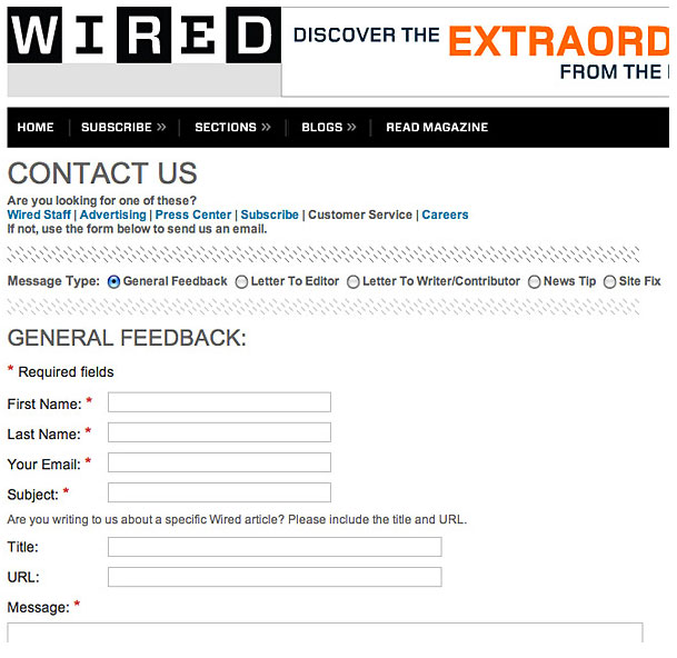
Wired has a great general feedback form.
- They provide specific labels beside each field describing exactly what they are asking for.
- They clearly mark with a red asterisk (and legend) which fields are mandatory.
- They clarify with a sub header above “Title” and “URL” clarifying what they are looking for.
#6: Keep The Number of Fields to a Minimum
The current average attention span of a human being is less than a goldfish . This means that the quicker you can get a visitor to complete your form, the better. Create web forms with Wishpond.
You can accomplish this in a couple of ways:
- Limit the amount of form fields. A recent study found that by decreasing the number of form fields from four to three it increased conversion by 50%.
- Space the form across several screens. What should I do if I NEED to have tons of fields? Spread the form across multiple pages showing only one or two fields on each page.
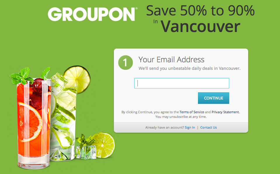
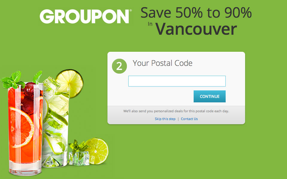
Groupon uses this concept effectively below:
- They space their sign up form across two screens, asking only one question per page.
- The first screen asks for an email address and adds value by stating that they offer [unbeatable daily deals].
- The next screen asks only for a postal code – not the entire address which is unnecessary until the billing screen.
#7: A/B Test Your Web Form Design
A/B testing is a great way to optimize your web forms. You will test your original form against a changed form and see which one converts better. This testing will help you to figure out what is working and what needs to be improved. You can easily A/B test your forms with Wishpond.
Why is A/B testing my form important?
You won’t know what works best until you test.
For example, changing the CTA at OfficeMatch.com from, “Order Information and Prices” to “Get Information and Prices” increased their increased their conversion rates by 14.79%.
Remember, what works on one web form may not work as well on yours. You have to test out your own forms with your own visitors to ensure that you are getting the conversion you deserve.
How do I test?
You will have two versions of your web form’s design:
Form A – Your current web form’s design (Control)
Form B – Your changed web form /what you are testing (Variable)
You will only be changing one item each time you A/B test. For example you could change the color of the CTA button from Blue (Form A) to Red (Form B)
Next you run the test as follows:
- Each time a visitor comes to your webpage they will be shown either Form A or Form B.
- You can split how often you want a visitor to see each type of form – for best results I recommend going 50/50 sending half of the traffic to Form A and the rest to B.
- You will be able to see which web form design is best by at which form had the highest number of conversions.
To make sure your results are not based on chance I recommend following these guidelines during testing:
- Run your test for a minimum of one week as conversion rate will change based on time of day and day of week.
- Make sure at least 100 visitors have completed each version of your form.
Conclusion
Creating a web form is easy. Creating a great web form that gets results can be a little more challenging. I am glad I could share my secrets of web form design with you.
Do you have any tips, thoughts or suggestions on how to design better web forms? Please comment below.
Read more about web form design:
- Optimizing your Landing Page Form Fields for Conversion
- 7 Facebook Contest Examples (Great and Terrible) Critiqued (with Best Practices)
- 7 Landing Page Call-to-Action Formulas for Higher Conversions
P.S. Wishpond’s Facebook Contest Apps make it easy to create sweepstakes, photo contests, Instagram hashtag contests & more. Looking for inspiration? Check out 25 Creative Facebook Contest Ideas You Can Use Today.