
Are you making the most of your blog? Do you generate leads and build your email list with optimized Calls-to-Action (CTAs)?
Your blog is an important part of your marketing sales funnel.
With SEO optimized blog posts, your articles are often the first pages that unique visitors (and potential customers) have with you. If you’re smart, you know this, and you’re integrating lead generating CTAs that are optimized for conversions into your blog.
There are tons of ways to encourage a reader to connect further with you so that you can start to nurture relationships and ultimately gain the sale.
In this article, I’ll show you how nine leading businesses do it and give you tips on how you can start building a successful email list too.
Blog Lead Generation CTAs: Marketing Blogs
I’ve segmented the examples into two industry sectors: marketing and retail. Online marketing related blogs are on the cutting edge of lead generation tactics. Here’s seven of the best digital marketing blog CTAs.
Lead Generation Tip #1: Blog Subscription
Canva is one of the hottest graphic design sites for social media image making. The Canva Bloggives tips and tutorials.
One of the CTAs on their article pages is for a blog subscription.
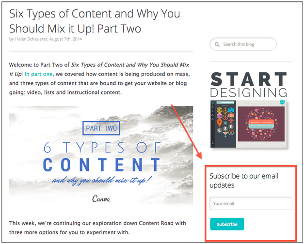
What I like about the CTA:
- The copy is written in a simple, friendly and straightforward tone. It uses the third person plural of “our” to create the feeling of a community and uses the term “email” instead of a more wordy term like “blog subscription”.
- The ask is minimal. All Canva wants is an email and in exchange people will get updates of content they want for their own marketing benefits.
- The CTA is minimally designed, which is in keeping with the Canva brand and tends to appeal to a designer’s (amatuer or professional) eye. The blue “subscribe” button stands out well.
- It’s well placed as a sidebar near the top of the article, and directly beneath an eye-catching colorful CTA to sign-up for the platform.
What I don’t like about the CTA:
- I personally would prefer to know more about the email updates, particularly the frequency. They could include “weekly” or “daily” in the offer so readers know how many emails to expect before converting.
Lead Generation Tip #2: Newsletter
NewsCred is a leading content marketing agency. The NewsCred blog gives cutting edge tips on the best types of content that readers love.
The main CTA on their blog is to subscribe to their newsletter.
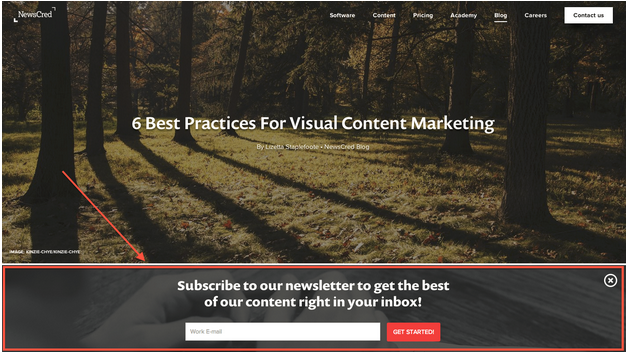
What I like about the CTA:
- The CTA placement is a pop-up that starts just above the fold and stops just under the large visually appealing blog header. Pop-ups are some of the best converting CTA’s as they break through reader fatigue and get noticed on your page.
- The ask is for a newsletter, which is a small step for readers to take their relationship to the next level.
- The copy is a bit lengthy, but would appeal to their market of journalists and marketing and PR professionals. The career element is further emphasized with their ask a “Work Email”.
- The red CTA button stand out against the dark grey background.
What I don’t like about the CTA:
- The copy could be streamlined to include the specific type of content (not just “the best of our content”), and they could be more specific as to how many emails to expect in a week. (Their readers are like you and me – who get hundreds of emails in day – setting expectations can help to increase conversions.)
Lead Generation Tip #3: Ebook download
Bitly is a link shortener and clickthrough tracking system. The Bitly blog gives tips on analytics and online marketing.
The main CTA on their blog pages is an ebook download:
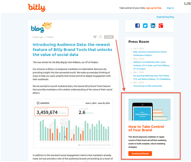
What I like about the CTA:
- The ask is highly relevant to the blog theme. The ebook is about building a brand online. People reading this blog would want to know more about this subject.
- The design is simple, with a flat image at the top and a contrasting, branded colored CTA at the bottom.
- The header is clear and reiterates the title of the book.
- The copy describes how the converted reader will benefit from downloading the content.
What I don’t like about the CTA:
-
The CTA button is below the fold, so readers have to scroll down the page in order to see it. It would be more effective to immediately see the action ask to get visitors interested as soon as they land on the page.
-
The header could be more enticing, or worded in a question format to provoke action. For example it could be written: “Do you Want to Take Control of Your Brand Online?”
Lead Generation Tip #4: Guide download
Conversion XL is a cutting edge conversion agency. The Conversion XL blog has top content about all things online marketing.
One of the CTAs on their blog pages is for an A/B testing guide and a newsletter sign-up.
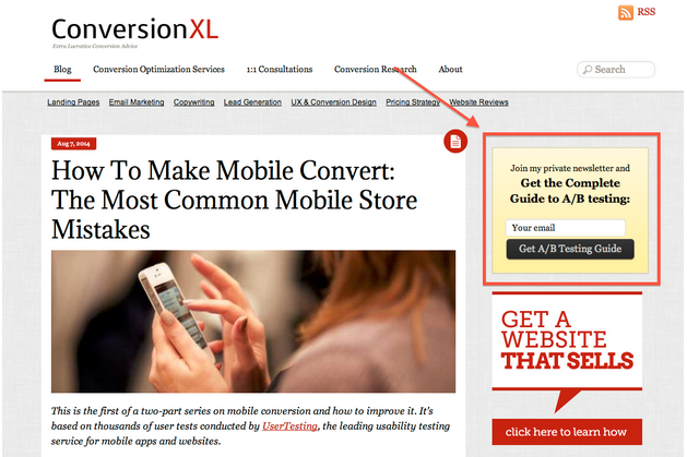
What I like about the CTA:
- The offer is for a highly relevant topic and is a small step ask for readers who are likely already interested in A/B testing, additionally it is upfront about being a newsletter subscription too (instead of just sending out regular updates, people who convert know they’ll be getting regular updates).
- The CTA is in a color contrasted box which draws visitors attention immediately after clicking on to the page.
- The design is simple, with the large black CTA button prominent.
- The copy offers exclusive content by using the term “private”.
What I don’t like about the CTA:
- The CTA could be tested in a positioned lower on the page to see if conversions increase the further people read.
- The CTA could be in a scroll or timed pop-up to increase conversions through better visibility.
Lead Generation Tip #5: Membership Promotion
Marketing Profs is a top online marketing site. The Marketing Profs blog has cutting edge tips on modern marketing best practises.
One of their blog CTAs is a promotional enticement to become a Marketing Profs member.
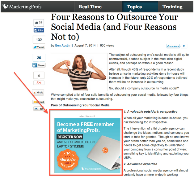
What I like about the CTA:
- The offer is creative and incentivizing the conversion of becoming a “member”. The promotion gives away a free sticker for your laptop (or wherever) that resonates with their marketing audience.
- The copy is excellent by using scarcity tactics such as “limited edition” and emphasizes the word “free”.
- The actionable ask (“register now”) is highlighted in a black box to contrast it with the light blue background.
- The CTA is well positioned within the article itself. This can draw the readers attention to it as they are scanning through the content.
What I don’t like about the CTA:
- It has the look and feel of an old-school advertisement, and is even labelled as ad. This likely decreases conversions for lacking a feel of authenticity and inducing a feel of paid promotions within their own site.
Lead Generation Tip #6: Free Course Registration
Copyblogger is a top blog and resource for all and anything related to online copywriting. The Copyblogger blogshares well written articles on content marketing and how to improve your writing skills.
One of their current CTAs is for their 20-part internet marketing course.
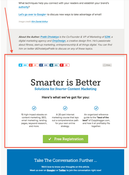
What I like about the CTA:
- The design is large with lots of whitespace. This makes it easy to read and is inviting to click through with a conversion.
- The copy is personally toned with the line “here’s what we’ve got for you” and strong usage of personal pronouns.
- The CTA has three compelling lists of benefits, each spaced out for ease of reading online.
- The CTA button of “free registration” is in a contrasting color, making it visually clear what the action ask is.
- The check marks on the CTA add a positive appeal for readers – and is in theme with acing a comprehensive course.
What I don’t like about the CTA:
- While I do like that the CTA is at the bottom of the article – so that only people who are interested enough to complete the blog post (and more likely candidates to convert) will see it, I think a smaller CTA closer to the top of the blog article would increase conversions by getting visitors to immediately think about registering as they are reading the article.
- A scroll or timed pop-up would be effective too.
Lead Generation Tip #7: Free Trial
Crazy Egg is the number one source of heatmaps (that show how visitors read your website pages). The Crazy Egg blog delivers rich content about online conversions and marketing.
The blog has multiple CTAs, one of which is a free trial.
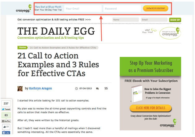
What I like about the CTA:
- The header CTA clearly states the offer, the length of the free trial and what the minimum monthly fee starts at.
- The CTA is subtle and doesn’t distract from the readership experience on the blog itself.
- It is at the top of the blog and gives visitors the immediate offer of getting something for free. Although a first time visitor is not likely to convert immediately, it presents the idea quickly that the free trial option is available, which likely increases conversions in the long run.
- The CTA button is in a contrasting yellow, and the action is to “show me my heatmap”, not “sign up now” or “start your free trial” (for example). This clever wording keeps the reader in mind and tells exactly what they will get with a free trial.
What I don’t like about the CTA:
- It’s a bit presumptuous to have such a bold ask at the top of a blog article. Generally a free trial ask comes later in the marketing sales funnel.
- There are too many CTA’s on this page – with a free newsletter sign up, and a free ebook CTA in the right hand sidebar. The free trial CTA is a bit of a distraction.
Blog Lead Generation CTAs: Retailer Blogs
There are a number of large and forward-thinking retailers who use lead generating CTAs on their popular blogs. I wanted to show you two of the best ones.
Lead Generation Tip #8: Blog Subscription
WalMart is the number one retailer. The WalMart blogpublished articles related to consumer lifestyles and the WalMart brand.
One of their blog CTAs is to subscribe to their blog feed.
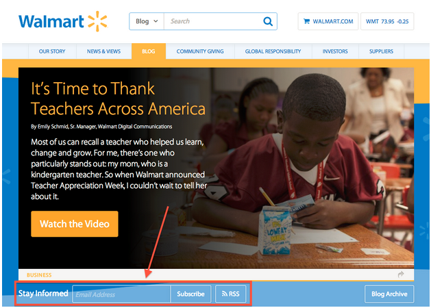
What I like about the CTA:
- It’s easy for readers to sign-up, with only one form field of an email address (there is no name or other information required).
- The ‘header’ of “stay informed” is written in friendly and simple copy. The two words both show subscriber benefits (of being informed) and give a direct request.
- The CTA copy is “subscribe”, which is a common term, recognizable to their large and diverse consumer base.
- The RSS symbol gives the potential lead a good idea of how often they would be getting a new email, as it implies that they’re signing up for a straight blog feed and would be getting an email each time a blog article is published.
- The CTA is subtle and non-invasive for a reader.
What I don’t like about the CTA:
- The CTA could be more prominent by including a contrasting color with the ‘subscribe’ button or ‘RSS’ symbol. This would increase conversions by drawing the reader’s attention to it.
Lead Generation Tip #9: Product Related Tips and Coupons
Whole Foods is the number one organic grocery store chain. The Whole Foods blog publishes articles about healthy lifestyles and recipes.
The main CTA on their blog is to sign up for their newsletter.
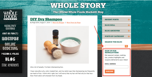
What I like about the CTA:
- The header of the CTA is clear for readers to sign up for their newsletter.
- In addition to just a newsletter, subscribers will get tips on recipes, cooking, products and coupons. These added benefits are smart to include to increase conversions. It shows the consumer how the newsletter can make their lives easier.
- The sign-up is simple, requiring just an email.
- The orange colored CTA button is prominent to viewer’s eyes, and draws attention to the subscribe button.
- With the CTA on the sidebar, it can be viewed as the reader is skimming through the article of interest.
What I don’t like about the CTA:
- The ask could be more distinguished from the other sections in the sidebar. A line on the top and bottom would enclose the CTA and make it slightly more obvious.
Conclusion
Your blog is a great opportunity to generate leads and begin the lead nurturing sales funnel. Try out a few of these tips to increase conversions for your own business blog.
Further reading:
- 7 CTA Mistakes Killing Your Conversion Rate
- Should you Use Pop-Ups?
- 5 Ways to Use Pop-Ups on Your Website
- 5 Exit Pop-Ups You Need to Know About
- 5 Examples of Entry Pop-Ups Done Right