Landing pages have the length of this sentence to grab a visitors’ attention. If the visitor is bored or confused by your landing page there’s a good chance you’ve lost a potential lead – and quite likely to your competition.
So how do you make sure that you’ve created a page visitors will love? Why by testing it of course! Through testing, you can figure out what’s working and what’s not so you can capture those leads.
What is A/B testing?
A/B testing is when you have two versions of a page running against each other. You take your original landing page and change one element of it. Then you run version A (your original) against version B (the altered). You do this by having both pages live and diverting 50% of traffic to each page. The goal is to see which elements you can change that will lead to a higher amount of conversions.You can easily A/B test your landing pages with Wishpond
Simple right?
In my article I’ll show you the elements i’ve tested to make my conversions soar. Change, test and repeat each of these 6 elements and your landing page will be capturing more leads and customers than ever before.
Lets get optimizing!
1.) Test The Images You Use
The only way to know that you’ve chosen the right image is to test that it’s working. You might think you’ve chosen the perfect image but did you know that using an image incorrectly can distract from your call-to-action (CTA)? I am going to outline some things you should think about when choosing an image and why you should be testing it.
As social creatures, we’re attracted to, and focus on, what other humans are doing.
This means that when you have an image of a person on your page a visitor will feel inclined to follow and/or mimic the person in the image. So, if your image is of a person looking straight ahead then a visitor will likely focus on the person’s eyes or face, instead of your call to action.
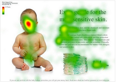
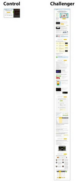
The example below shows an image of a baby originally looking directly ahead. The colors on-top represent eye-tracking data that is based on where people spend the most time with their mouse. The red represents the largest amount of clicks and green represents the least. As you can see by the red cluster, the largest amount of attention is focused on the babies face rather than the headline.
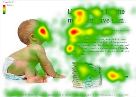
However, when the image is altered (below) to have the baby turned and looking towards the content, it will draw the visitor to focus on more than just the image. This will lead to higher conversions because the visitor will be looking at your call-to-action.
Any image you have on your landing page should direct visitors to your call-to-action. You could try using different images of your product by itself or being used by a person or group of people.
2.) Test Your Copy Length
Copy is the written content on your landing page. It guides a visitor to buy your product or service. In this section I will discuss how testing will ensure you have the best copy length for your landing page.
So, is short or long copy better? Too much copy and the visitor might get bored, not enough copy and the visitor might not know what you’re selling. As a general rule, shorter copy is good for simple, easy-to-understand ideas. It keeps your visitor hooked and gets the message across quickly. Longer copy provides a way to explain all details so a visitor knows exactly what you’re selling.
The example below is taken from an A/B test conducted with CrazyEgg, a visual website analytics provider. They found that when they increased the length of their copy, they had a 30% increase in conversions.
When designing a landing page you need to ensure you’ve answered any and all objections.
Ask yourself these three questions on any landing page to determine copy length:
-
Are you clearly describing how your product or service works? This doesn’t always have to be explained with words, especially if it’s a simple concept. You could use a video or an image to display the same information it would take 1000 words to explain. If you want to use words, try displaying this information in a pop-up. This will keep your visitor on the page instead of having to navigate elsewhere for the information. In the pop-up you can describe your products features, just make sure you’re not putting your call-to-action in the pop-up.
-
Have you shown the visitor what your unique selling point is? You should be able to show a visitor why they should choose your business over another’s. Is your product cheaper? Better? Faster? Figure out what makes you unique and display it in a list of benefits.
-
What are your benefits and what kind of pain does it alleviate? Clearly show how your product is special with a list of benefits. If your product is confusing and/or you think it’s absolutely necessary you could also include the features. For example, if you had a hair loss medication you could draw them in by asking, “Want to look young again? Use my product and you will have a full head of hair within 30 days.”
So long as you’ve answered any objections a visitor may have, it doesn’t matter how long (or short) your copy is.
3.) Test Your Pop-ups
First off, if you’re not using pop-ups on your landing pages stop everything you’re doing now and add them. Why? The addition of a pop-up to the example below increased conversions by 63%! Did you know that you can easily create pop-ups with Wishpond?
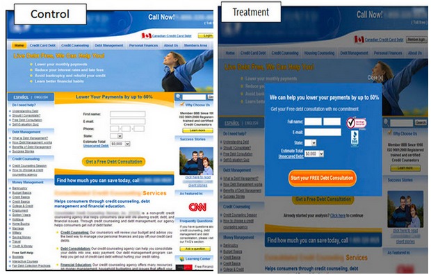
What’s a pop-up? It’s a box that is used to stop a visitor in their tracks and eliminate competing information. The visitor is forced to complete an action before continuing by either signing up, clicking-through or pressing an exit prompt. The eye is also drawn to it because the screen surrounding the pop-up is dimmed making it the center focus.
-
You can test out a few things with your pop-ups:
-
When should I use a pop-up? There are 5 types of pop-ups that you can use: click, scroll, timed, exit and entry. The first two are based on what the visitor does, the last three are in your control. I recommend using a combination of click, scroll and exit. However, a different combination might work best for you.
-
How many pop-ups should I use? Always have at least one, two is optimal, three or more can be overwhelming.
-
How should I use my pop-ups? Place a “Download Now” call-to-action below your ebook with a pop-up showing how they get it
Try running an exclusive-contest and say, “Enter Here and You Could Win a Free One-year Trial of my Product.”
Offer a special promotion as a customer is leaving such as, “Get 50% off of [your product] for a limited time only.”
Make sure you’re not spamming anyone who has already been to your page or has signed up as a lead. Try to keep it at a maximum of three pop-ups per week.
4.) Test Your Headline
A good headline can be the difference between a bounce and a conversion. Therefore it’s crucial you test this part of your landing page. When creating your headline keep your Unique Selling Proposition (USP) in mind. It should always solve a problem your customer is having, not just say how great your company is.
Evaluate if your headline is clearly telling visitors what your landing page is about. 80% of people that visit your landing page will read the headline but only 20% go on to read the body. If your headline doesn’t grab their attention, your visitors will most likely bounce without reading anything else.
A great headline should be unique, specific, useful and communicate a sense of urgency. There is never a perfect version of a headline so testing a few simultaneously is your best bet.
Here are some ideas of variations on headlines you can try:
-
Put it in the form of a question.
-
Mention a benefit that they would get from using your product or service.
-
Use loss aversion – tell people they will miss out if they don’t check out your offer
-
Add a dollar amount to your headline, show people how much they can save/gain with your product.
-
Play with words like “shop, get, save, book now and free”
-
Sometimes creative isn’t better – the headline needs to be obvious and straightforward enough for every visitor to immediately understand.
5.) Test Your Call-To-Action Button
Landing pages are created around a single marketing goal: the call-to-action. Your call-to-action is what will draw your visitors to buy or sign-up for your product or service. It’s the last thing a visitor does on your landing page, but should be the first thing they’re drawn to.
Here are some things you can test:
- Change the text of your CTA.
If you just write “submit” it isn’t telling the visitor what happens when they press your button. Let them know what they’re doing. You can do this by using an action word or explaining how they can do an activity better: “Start Growing a Better Lawn Today.” vs. “Sign Up”
- Personalize your CTA.
Use the word “my” instead of “your”. It helps to drive focus to the emotional side of the brain – I want this product because it’s all for me. [Example] “Get Your Quote” vs. “Get My Quote”
- Put your CTA in the form of a question.
Generally when someone searches for something on Google it will be in the form of a question (at least in their mind). Its best to use a rhetorical question. You could say, “Want to Stop Losing Hair?” If the visitor is looking for anti-hair loss products this is clearly something they would like to do.
- Change the color/size of the button.
Test which color and size works best. It will vary based on the rest of your page.
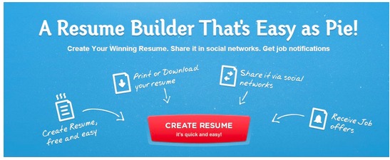
For instance, Resume Builder’s call-to-action (below) is great for a number of reasons:
- The entire landing page is working together to draw the visitor to the CTA.
- The sub-headline reinforces the CTA by using similar wording. They use “Resume, Easy and Create” in the headline which are also in the CTA.
- The list of benefits are broken up nicely and each one directs the visitor with an arrow to the CTA
- The red color of the button contrasts nicely from the blue background of the page and the odd shape makes it stand out against other buttons online.
6.) Test Using (different) Testimonials
Testimonials can be the deciding factor in whether someone will purchase your product or not. Credible testimonials have shown to significantly increase conversion, as they’re the social proof that your product is worth buying. 63% of consumers say
that they’re more likely to purchase from a site when there are product ratings and reviews.
You can add text, pictures and videos based on how you want to use them. Always ask your customers if they are willing to have their name, title and picture below a text testimonial. If you can get a video even better, it may strike an emotional chord.
Test your testimonials like this:
-
How many should I have on my landing page? Try having a different number of testimonials – sometimes one will work but maybe you’ll need more.
-
Which media-type should I use? If you have the resources, try making a video or take photos of actual people that have used your product – not just stock photos.
-
How long should it be? Try using short snippets of their testimonial or the whole thing. You could also include the option of “read more” where if the visitor wants to read the whole testimonial, they can.
-
Should I edit it? Try changing the text that leads up to your testimonials. If you just have testimonials thrown into your landing page they might not be sufficient to explain why they’re there.
Conclusion
A/B testing various elements of your landing page is essential to increasing conversion. If you try out even one element i’ve described above I promise you will see an increase if your conversion rates.
Want to learn more?
- 25 Tips to Optimize Landing Page Conversions
- How to A/B Test your Landing Page to Maximize Conversions
- Landing Pages: The Fundamentals and Conversion Principles
- 7 Landing Page Mistakes that are Costing you Conversions
- Landing Pages: The Science Behind Designing for Conversion
Written by Samantha Mykyte