Do you have a large Facebook following?
Perhaps you’re trying to build a large following?
The custom Facebook tab allows owners to create their own custom landing pages right on their Facebook page. Facebook landing pages have no limits in regards to content – contests, customer support, events, lead generation, the choice is completely up to you.
To get the most out of your Facebook landing page, experiment with these 38 Facebook landing page ideas, tips, and examples.
1. Focus on Visitor Intent
When constructing your Facebook landing page, focus on the intent of your visitors. What are you helping them accomplish? Are you redirecting them back to your website? Are you entering them into a giveaway?
Knowing the intent of your visitors helps you serve their needs much more efficiently.
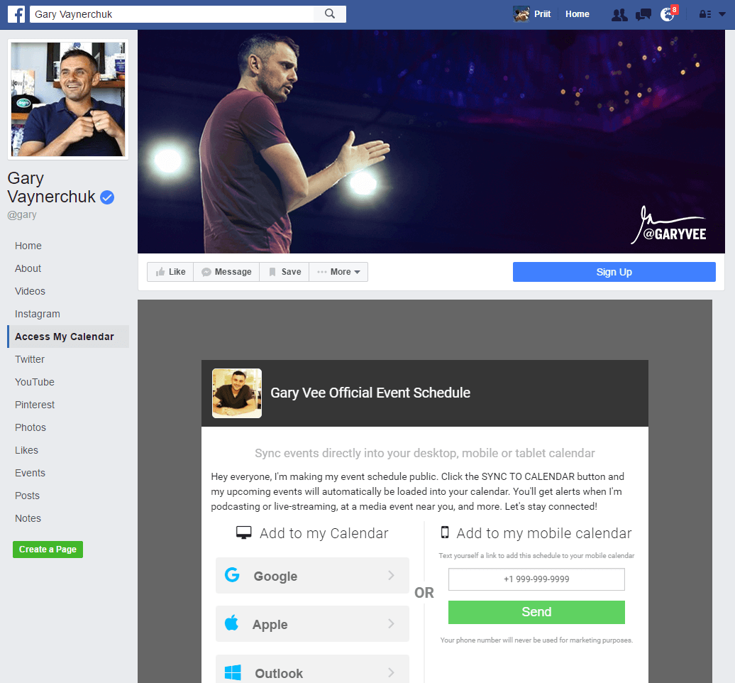
For all-star entrepreneur Gary Vaynerchuk, giving his fans access to his event schedule is top priority. He uses his landing page to meet the intent of his Facebook page visitors — getting the latest Gary V news.
2. Keep Visual Design Consistent
It is important to have congruent branding and visual design across all of your web properties. This way the design of your Facebook landing page will be immediately recognizable. Consistency means using complimentary colours, fonts, and images.
Malibu Rum sticks with their caribbean flare right down to their Facebook landing page. The opt-in landing page keeps the brand’s playful design and creates a comfortable experience for visitors.

3. Optimize for Mobile Devices
If you haven’t heard, half of all web traffic is now from mobile devices. Year after year this is becoming more apparent and not being prepared is basically a death sentence.
The simple solution to this is to make sure your Facebook landing page is mobile responsive, meaning it can adapt to any screen size. Employing a landing page building platform (like Wishpond) automatically makes your landing page mobile responsive.


4. Optimize for Speed
Upon landing on your Facebook landing page you literally seconds to hook your visitor’s attention and convince them to convert. The quicker your page loads the less likely your visitor is to bounce elsewhere.
A few ways to optimize for speed is to lower image sizes, reduce the length, reduce the number of graphics and colours, and avoid embedded content. Better software will produce a faster loading landing page so it helps to test drive each one first.
5. Leverage Contrasting Design
Contrasting design elements can be a powerful tool to direct user attention. Contrast can be used through colour or size. Important elements on the landing page, like the form or CTA, should be heavily contrasted from the rest of the page. This could be done, for example, by increasing its size or by making the background much darker than the form fields.
6. Keep Things Simple
Don’t overcomplicate things. Don’t overcrowd your landing page with unnecessary copy or flashy design elements. Provide only what is needed (according to visitor intent remember?).
A restaurant menu with 100 choices causes undue stress compared to a menu with 10 choices. Your landing page should act the same way.
You couldn’t get much more simple than MailChimp’s Facebook landing page. Their bare bones landing page only includes 4 elements: a logo, headline, form field, and CTA. The benefit is clear and opting in couldn’t be easier, what more could you want?

7. Match Headlines with Ads
When running ads to your Facebook landing page, say for a giveaway or contest, it’s important to match your headlines. For example, “Enter to win a $100 giftcard!” should be included on the ad and at the top of your landing page. This is so that the visitor isn’t confused after clicking and being redirected elsewhere.
Congruence plays a big role here. If a visitor clicks expecting to enter into a contest, being presented with a free ebook can lead to confusion and an eventual bounce.
8. Match Images with Ads
Just like you matched headlines, your landing page and ad image should also match. The image you used to advertise your contest for example, should be immediately recognized so that your visitors know that they’re in the right place. I should see the photo of the awesome prize package you’re giving away in your ad and on your landing page.
9. Keep CTA Above the Fold
Keeping your CTA above the fold ensures that everyone will see it regardless if they scroll downwards or not.
The CTA can get lost on a Facebook landing page packed with colour and visuals. Make converting as easy as possible for your visitors by sticking your form fields and CTAs above the fold.
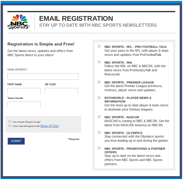
10. A Single Conversion Goal
The paradox of choice states that “more possible avenues does not simply complicate a person’s decision, but demotivates them from making it at all.” When presented with a variety of options (e.g. buttons to click) a visitor is more likely to bounce than to make a decision and convert.
Help make the decision easy for your visitors. Provide them with only one choice. This way they can either choose to accept your offer or reject it.
Links back to your website to see a blog post or share your Facebook page for example, only distract your visitor and detract from your main conversion goal.
This NBC Sports Facebook landing page has only one conversion goal: sign visitors up for the NBC Sports newsletter. If NBC Sports included other CTAs it would distract from an already lengthy registration process.
11. Use a Directional Cue
Using a directional cue is a subtle way of saying, “look right here!” to your visitors. Visual cues like arrows pointing towards a CTA button directs a visitor’s gaze to an area of importance.
Let’s imagine a visitor lands, reads the headline, subheadline, list of benefits, then wonders what’s next? A directional cue will naturally lead them onto the form and hopefully end in a conversion.
Images can also work as visual cues for visitors. The guy in the example below is looking directly at the landing page CTA. The way his gaze is positioned naturally leads your eyes in the same direction.

12. Encapsulate the Form
To help increase the contrast of your Facebook landing page encapsulate your form and CTA. A bright background colour or thick border are a couple of ways to increase the contrast of your conversion goal.
In the example below, adding the dark blue background around the form area contrasts it with the rest of the page. It’s a subtle yet powerful way to bring more attention to your most important element.
13. Run a Social Media Giveaway
Gather together a big prize package, decide on a fun way to engage your audience, and promote your very own social media giveaway right on your Facebook page. A social media giveaway still ranks as one of the best ways to quickly grow your following and collect leads for your business.
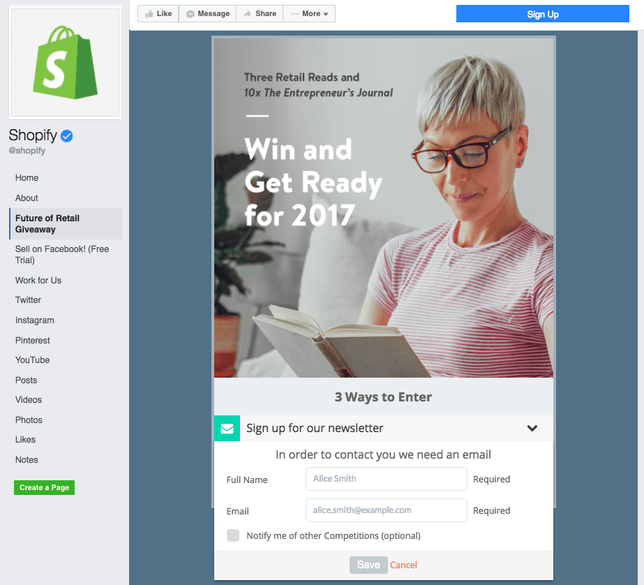
14. Information Hierarchy
When organizing the information on your Facebook landing page make sure it follows proper information hierarchy. This entails using design and copy to display what areas should attract the most attention.
The headline for example, should be large and contrasted to grab attention and communicate what the page is about. The subheadline should then be smaller and describe further details. By following a hierarchy elements on the landing page should descend by importance.
Take a look at Shopify’s Facebook landing page and the information hierarchy it uses. The headlines lend detail therefore are the largest elements on the page. The headlines and background image hook the reader and lead them down towards the form.
15. Follow the AIDA Copywriting Formula
Stuck organizing the information on your Facebook landing page? Follow the tried and true AIDA copywriting formula.
AIDA stands for:
- Attention. Hook a visitor’s attention with a compelling headline or image.
- Interest. Capture their interest by speaking directly to their problems.
- Desire. Explain the benefits of your solution to create desire.
- Action. Tell them what to do with a strong call-to-action.
16. Follow the PAS Copywriting Formula
Much like the AIDA copywriting formula, the PAS copywriting formula provides a framework for organizing the information on your Facebook landing page.
PAS stands for:
- Problem. Address the problem you’ve set you to solve.
- Agitate. Dig into the problem and elaborate on why it sucks.
- Solve. Become the hero and present your solution.
17. Employ Social Proof
You’re more likely to visit a restaurant with positive online reviews than one with negative reviews. Even with the possibility of those reviews being fake or biased, your decision will still be swayed. That’s the power of social proof.
Testimonials, social sharing, and reviews are just a few of the ways you can use social proof to your advantage.
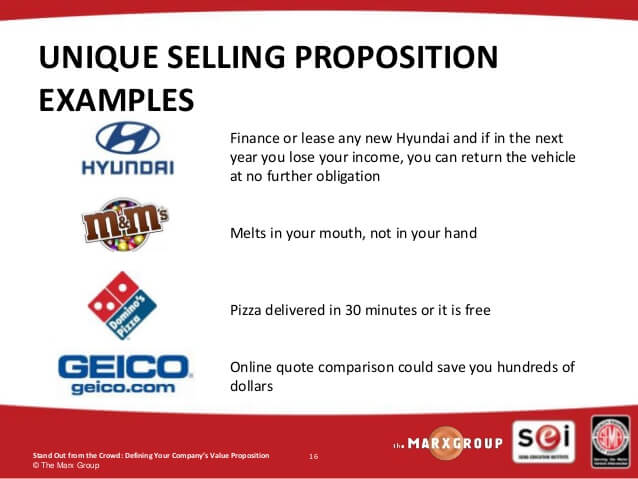
18. Clear USP
A strong and refined USP or unique selling proposition should not be forgotten in the landing page building process. Your USP is what defines your business and what separates it from your competition. Make your USP the star of your landing page.
If a visitor cannot determine why they should pick you over a competitor then you’ve not communicated your USP.
Most assume that a USP should focus on trying to be the best but they’d be wrong. Instead, focus on being the best at something no one else is even attempting.
Domino’s isn’t competing to be the best pizza according to its USP. It’s competing to be the best pizza that is free if not delivered in 30 minutes.
19. Use Numerals Instead of Numbers
When it comes to writing headlines use numerals (20,000) instead of numbers (twenty thousand). Why? Large numbers always attract attention. This applies to percentages, prices, and any sort of data.
20. Trust Symbols
Trust plays a big role in determining if a visitor decides to convert on your offer or not. Signals on the page either add trust and credibility or detract from it. No offer, no matter how valuable it is, will convince a visitor to convert if they think their information won’t be protected.
When dealing with sensitive information consider adding secure transaction logos to your landing page.

21. Clear List of Benefits
Clearly communicate what your business brings to the table. It might sound obvious but visitors won’t convert if they’re confused about what you’re offering. Don’t assume your visitors have the smarts to figure it out themselves.
Listing out your benefits and features is crucial. Online Marketing News uses this Facebook landing page to collect newsletter subscribers right on their Facebook page. If you’re curious as to why you should subscribe they include a long list of benefits.

22. Two-Step Opt-In
Instead of placing a form field on your Facebook landing page, try a two step opt-in instead. A two step opt-in requires visitors to click a CTA button first then fill out a form. Studies have shown that a two step opt-in process converts better and at a higher quality than a single step.
Why is this?
Once a visitor clicks your CTA button they’ve begun the opt-in process — they’re invested. Once someone has started a process they’re far more likely to complete it. This is referred to as the Zeigarnik effect. A single step opt-in does not require a decision to be made by the visitor thus it is often ignored. There is no investment by the visitor.
From your Facebook landing page have your CTA send visitors back to your website or a separate form where they can complete the second step of opting in.

23. High Value Lead Magnet
This might sound obvious but the value of your lead magnet should match or exceed the information you’re asking for. Asking for even just an email isn’t as easy as it once was. There must be an equal exchange of value before anything is accomplished.
If you’re Facebook landing page is low on conversions look at what you’re offering. Is it being communicated clearly? Is your lead magnet providing enough value to your visitors? Are you asking too much of them?
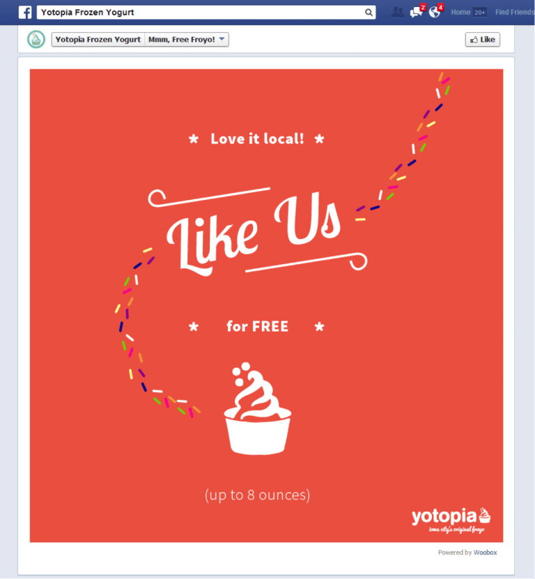
24. Giveaway Free Stuff
Giving away free stuff is a no brainer for easy lead generation and fan engagement. To get new visitors through the door a free gift can be just the thing to do it.
Yotopia tempts visitors with a free frozen yogurt to grow their Facebook presence. Their simple yet elegant Facebook landing page is built to convert leads by way of free frozen yogurt. Once a lead is collected they’re sent a coupon for free yogurt by email.
25. User Generated Content
If you’re having trouble demonstrating trust and credibility, the use of user generated content might be just what you need. Experiment with user generated content on your Facebook landing page to encourage your followers to participate. Knowing that others are participating in a contest in their area for example, is enough to persuade others to join.
Coors Light features a fan gallery on their Facebook landing page to promote their social giveaway. Real images of real fans builds trust amongst others who are contemplating participation.

26. Create Tabs for Different Purposes
As we mentioned above, a Facebook landing page should only have one conversion goal. Too many choices make for lower conversions. To solve this problem it’s best to create multiple Facebook custom tabs each for a different purpose.
A custom Facebook tab as dynamic as it is, can be used for many different landing pages. Contests, FAQs, video, the choice is really up to you. Just be sure that each tab only serves one purpose.
27. Leverage Visuals
A picture says a thousands words goes the old saying. Whenever possible, instead of words, leverage visuals. Online readers have incredibly short attention spans and can decide to bounce from a page within seconds.
Eye catching visuals work to hook a reader’s attention. Images, videos, infographics are only a few examples of elements that help keep and move attention down the page.
Visuals are used in every section to powerful effect on this Nutella Facebook landing page. Each section is bright and eye catching, begging to be explored further. Instead of large blocks of text, let images do the talking for you.

28. Urgency
When it comes to actually claiming your offer there must be a sense of urgency. To light the proverbial fire under your visitors they must be aware that your offer won’t be around forever. Urgency will create action.
One of the many ways you can create urgency is with a deadline or a countdown timer. Many of the contests and offers Wishpond has helped create include a countdown timer. This way visitors know that the opportunity is limited.
Cake Bake & Sweets Show ran a baking contest for its fans right on its Facebook page. To create urgency on the page they included a countdown timer right on the entry page. To be included in the giveaway, participants had to meet all contest rules before the clock reached zero.

29. Scarcity
Scarcity is created when demand exceeds supply of a certain product/service. You’ve likely seen scarcity at play, especially during the holidays (e.g. Black Friday, Christmas) when the demand for goods sky rockets. To include an element of scarcity on your Facebook landing page include a supply counter. If hosting a webinar for example, the total number of seats left creates the feeling of scarcity. Unless visitors register immediately they stand to lose their seat to someone else.
30. Complementary Colours
The power of colour is often lost in the fold when creating a Facebook landing page. Like stellar copywriting, colour can have a powerful effect on the overall feeling of your landing page. For the most appealing and user friendly Facebook landing page use colours that are complementary to one another
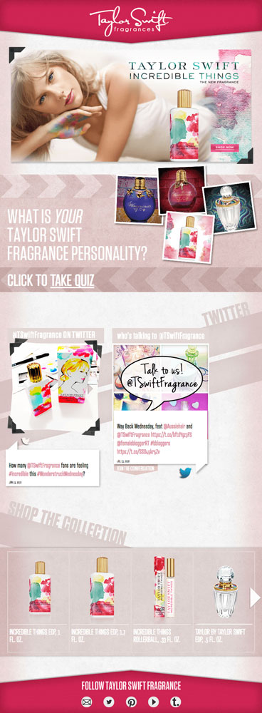
Everything about this Taylor Swift fragrance Facebook landing page is meant to appeal to her audience. The colour scheme complements her new products and her overall brand. Taylor Swift’s choice of colours communicate a consistency throughout all of the products she offers across her brand. Keep things consistent throughout your own brand by using complementary colours.
31. Less Form Fields
To improve your conversion rate reduce the number of form fields on your Facebook landing page. Conversion studies show that the less form fields you require, the higher the conversions. But what if you need more information you ask?
Only collect the information you absolutely need at your first touch point with your visitors. An email for example, gets the lead through the door first. More information can be collected later on as you develop the relationship.
32. Step-by-Step
To reduce conversion friction for your Facebook landing page visitors, include step-by-step information. A lot of conversions are lost to hesitations. The ambiguity of the process can hold back visitors from converting. By listing out exactly what the process involves it can clear up many of the questions your visitors have.
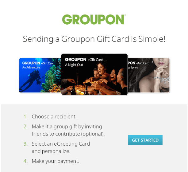
Groupon lists out the process of sending a Groupon gift card for visitors. The 4 steps take out much of the confusion of a digital gift card.
33. Use Checkboxes
Instead of time consuming drop-down lists, try using checkboxes instead. If you only have a set amount of answers in your form make it easier for your visitors with checkboxes. It will speed up the opt-in process and remove much of the headache for your visitors.
34. Create a Prize Package
When it comes to creating a prize for your contest or giveaway on your Facebook landing page, create a prize package instead of one single prize. This way it will appeal to a wider range of people. Listing the total prize package value also makes the incentive more appealing.
35. Tie the Prize Back to Your Business
When selecting a prize package make sure it ties itself back to your business. You’re not just giving away free stuff after all!
To do this, include something like a gift card or a product from your business. It will ensure that only those interested in your business/niche will enter to win. This way you’ll have repeat business or a new customer and reviewer for your product.
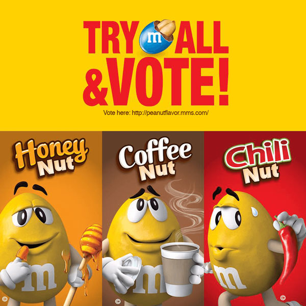
36. Run a Vote Contest
In terms of uses for your Facebook landing page, a vote contests is a fun way to engage your fans. Anyone and everyone can join in on the fun and have their say in your next business initiative.
M&M’s used their Facebook landing page to have their fans vote for their next M&M flavour. It allowed all of their fans to participate and have their say.
37. Use it for Navigation
For those new to your business, a Facebook landing page can be used as an introduction or navigation portal. Those coming for a Google search for example, are often lead to your Facebook page first. Give them a hand by filling a Facebook landing page with helping information, links, or copy.
Yelp does just this by using their Facebook landing page to redirect visitors to helpful areas of their business. Visitors can visit the blog, look at careers, sign up for the newsletter, or download their app. It all works in part of their customer success loop.

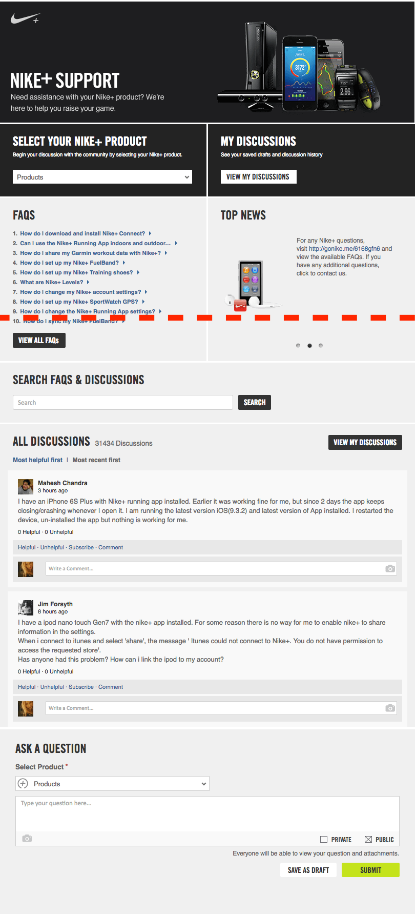
38. Support Your Fans
The fact that you can engage with your Facebook fans right on your custom landing page make it a great forum for support. Users can leave comments and questions from their Facebook profiles and receive direct support from you.
Nike uses their Facebook landing page to provide support to all the Nike fans around the world. The page features FAQs and news for those looking for more information.