
Ready to boost your landing page conversion rates? Our guest writer offers five essential triggers to consider when crafting your landing pages.
When it comes to making a conversion, a business’ landing pages are its greatest assets.
They allow you to quickly convey the benefits of what you offer while also collecting valuable information from your customers. This helps you to make more conversions down the line.
Of course, there’s a right way and a wrong way to create a landing page. If you’re looking to boost your landing page conversion rate, read on for some handy tips on creating a productive landing page for your website.
1. Economic Use of Language
It’s likely that a website’s landing page will have a significant amount of text on it. If that’s the case for you, it’s important to think about the form that text will take. That’s because a landing page’s written content can do a lot of heavy lifting.
The headline is typically the first thing a visitor to your landing page will see, so it needs to grab their attention from the offset. While your approach to headline writing will be shaped by your business, it should instantly highlight your unique selling point.
It’s also a good idea to use any relevant keywords in your headline, as this increases your chances of attracting your target audience. Keeping it short is often a good strategy as well.
You should keep any other written content on your website similarly brief. You can write paragraphs, of course, but (as in other writing types) it’s best to keep these short. A maximum of four sentences per paragraph is a good strategy.
In many cases, your paragraphs can be even shorter than this. This article asking ‘what is hosted VoIP’ explains its feature with paragraphs of two sentences—three max. Breaking down written content like this is rarely a bad strategy.
This landing page from DoorDash has a great headline example. It’s broken down into simple, effective chunks, which immediately convey the benefits of working for the company.
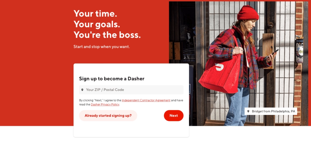
Of course, the headline isn’t the only piece of text on the page. Short sentences further down the page flesh out DoorDash’s service offering, touching upon subjects like payment, promotions, and basic employee requirements. FAQs and other links give visitors the site as much or as little information as they need and are likely to positively influence your landing page conversion rate.
2. Understanding Your Reader’s Problems
People come to a landing page because they hope it’ll solve a problem they’re having. Identifying that problem (and offering a solution) is an essential component of landing page design.
Try to figure out how people describe the problem they’re having, as using the right words will make your landing page more resonant. (This is where things like small business SEO come into play.) You may also want to touch upon emotions like fear in the language you use. Identifying worst-case scenarios (and implying you can solve or mitigate them) can be a good way of drawing in an audience.
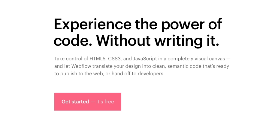
This landing page from Webflow quickly identifies a key problem amongst its visitors. It identifies a problem—anxiety about writing code—and allows readers to sidestep it.
Scrolling down the page shows how this works in practice. By working with Webflow, the page says, the practice of web page design becomes much more intuitive.
3. Offering Testimonials
Of course, a business isn’t always the best salesperson for their own products. We often look to other customers or authorities to learn whether a business is worth it’s salt. If you have any industry connections you can leverage, reach out to them for a testimonial on your business’s strengths.
Ultimately, though, customers are often more effective in attracting new business. Their opinions are more trustworthy to other customers, provided they go into sufficient detail. Try to highlight customer statements that specifically describe why you’re so good to work with.
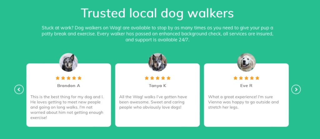
Some businesses may also have a greater demand for customer testimonials than others. Wag! is a business that offers dog-walking services—which is naturally a highly emotive subject for dog owners. That’s why its website has several positive testimonials, reinforcing this is a service you can trust to look after your pet.
If you’re running low on testimonials, you might want to use your other communication channels to get them. Social media can be a good way to reach out to customers for stories of their experiences. You might also want to offer some kind of incentive for leaving a review or testimonial—like a discount on a future purchase, for instance.
4. Providing a Special Offer
A good way to encourage customers towards a purchase is to offer them some kind of bonus. There are a couple of different approaches you can take to this concept.
The first option is to provide them with something for free and provide it immediately. Typically, some kind of personal information (like an email address) is required in exchange. Businesses will, in turn, offer a white paper or some other resource that demonstrates your credibility.
Offers like these are ideal for businesses with expensive or long-term service offerings, where customers move relatively slowly down the sales funnel. They allow you to build credibility slowly and prevent customers from feeling rushed into a major business decision.
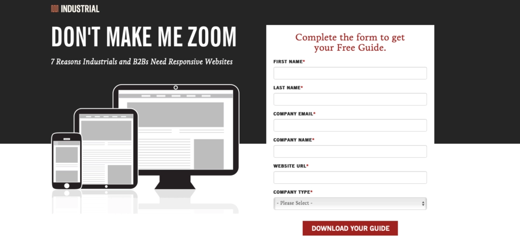
Industrial Strength Marketing has a good example of this idea. It offers a guide to mobile-friendly web design in exchange for company details—increasing the chances of a customer doing business with them later.
While this kind of gated content is often a compelling incentive, it’s not the only one you have to work with. The second option is some kind of limited-time deal; something customers can only get for a brief period. These kinds of offers can be added to a purchase above a certain price threshold and are great for encouraging low-stakes consumer purchases.
You may want to turn up the heat a little, metaphorically speaking, by pairing this type of offer with a countdown timer. This reinforces the idea the offer is only available for so long.
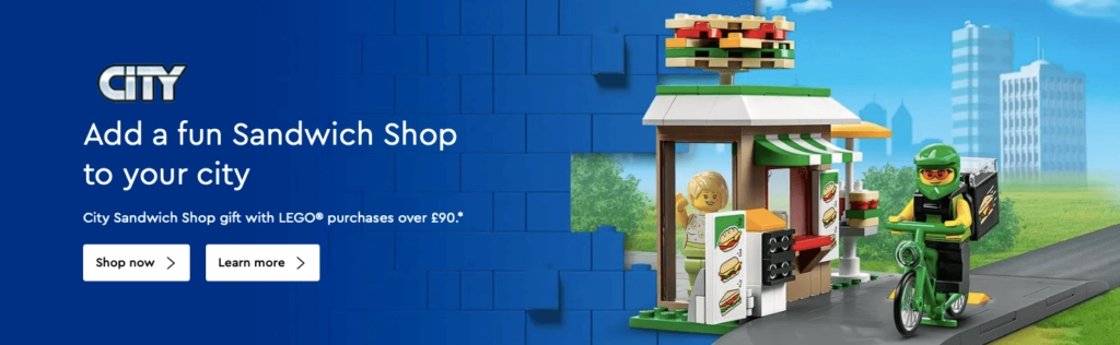
This kind of offer can be found on retail sites like LEGO.com. Shoppers on the site can sometimes receive gifts with orders over a certain threshold. Offers like these are also advertised on the home page, giving customers an additional incentive to buy now.
5. A Clear Call to Action
With these kinds of elements in play, it’s time for your customers to make that conversion. But what does your call to action look like? All these triggers are useless if a customer can’t easily close the deal.
A lot of the time, this literally means making a link that’s easy to notice. Create a button in a contrasting color that sticks out from the web page surrounding it. You should choose an easy-to-read font for the button text and make this text a little bigger than the text around it.
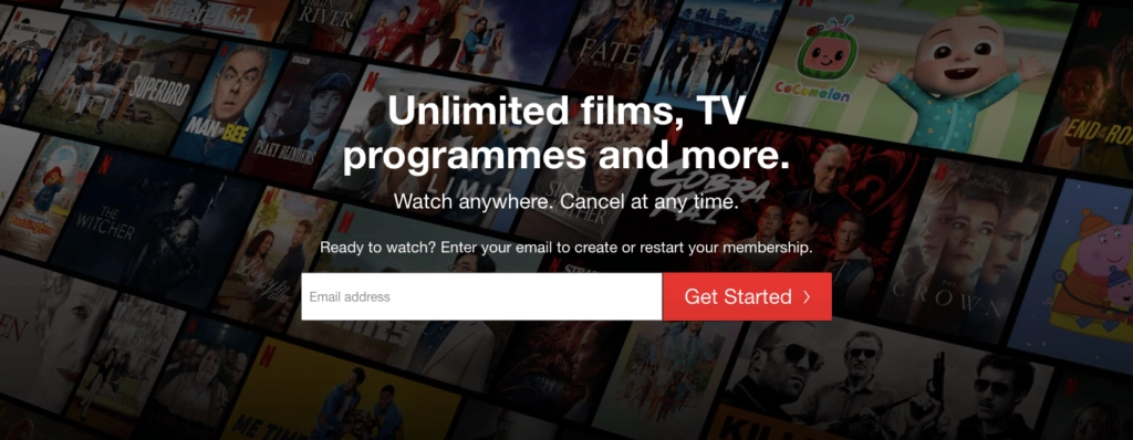
Netflix’s call to action is noticeable, even on a landing page that’s rather busy in terms of visuals. There’s little here to interact with, so people are immediately drawn to the call to action in place here.
This kind of brevity is a good rule of thumb for copywriting, more generally. Brushing up on copywriting tips and strategies never hurts during the process of creating (or refining) a landing page.
In addition to making the button attractive, you should also encourage people to click on it. Have it animate when someone moves their cursor over it, for example.
Once you’re happy with the button’s design, it’s time to think about the button’s position on the web page. Try to research the paths your customers take across your landing pages and place your call to action in a place that is likely to receive attention.
If you’re unsure how best to do this, a good rule of thumb is to ensure your call to action isn’t competing for attention with other page elements. This means leaving plenty of white space around the button and using images that are relatively unobtrusive.
This landing page for Microsoft Teams Voice is a good example of these ideas. The color scheme on most of this landing page is subdued, but the call to action is bright and immediately noticeable.
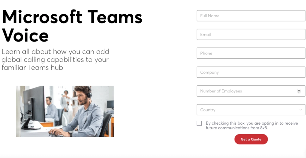
Finally, make sure customers understand what will happen when they click on the button. In these examples, the call to action text is ‘Get Started’ and ‘Get a Quote.’ This is important because it signals to customers that they’re just taking the first step. They aren’t going to (or shouldn’t) be put on the spot to buy something just yet.
Closing the Deal
Use your understanding of your customers to guide your headline and other text, and pair them with testimonials from other customers. You should also consider incentives to convert and make sure the call to action is easy to find. By doing this, you stand a good chance of significantly boosting your conversion rates.
___John Allen is a driven marketing professional with over 14 years of experience, an extensive background in building and optimizing digital marketing programs across SEM, SEO, paid media, mobile, social, and email, with an eye to new customer acquisition and increasing revenue