
Does it matter which color your business logo is? Is there actually going to be an effect if your Facebook advertising campaign employs blue and silver vs. red and black?
This article will explore the science and psychology behind Facebook advertising. I’ll provide you with real-world examples of current Facebook Ads and give you concrete, meaningful takeaways that could mean the difference between a successful ad and a flop.
What is color psychology and why should I care?
Color Psychology is the exploration of the impact of color on perceptions, reactions, and emotions. In advertising and marketing terms, it’s used strategically to increase interaction, elicit a desired reaction, and create a specific feeling related to your brand or product.
Color taps into the most unconscious part of our brain. We see the color red and we get more excited – our heartbeat, completely subconsciously, starts beating faster. We see the color green and are reassured (this is, genuinely, because green indicated water and life to primitive man).
Think about how long any given Facebook user is looking at any given part of their News Feed. We’re talking seconds before their eyes move on to a more appealing image, another tab they have open, or (in the case of the guy who almost hit me this morning) the car in front of them.
More experienced advertisers will know that it is often the little things that have the biggest impact:
- Changing the color of a CTA button on your website’s landing page from light green to yellow, for instance, can increase conversion rates by 14.5%.
- Adding a colored border around your Facebook Ad image can double its CTR.
- Purple is the favorite color of 23% of women, and 0% of men
- Contrasting the color of two links within a single image can increase conversion rates by 60%
While there is no “best color for conversion”, there are preferred colors, and colors that we know create an emotional or psychological response in a majority of people. Many of these responses are influenced by location, so remember that everything in this article is based on findings within North America, the UK, Western Europe and Australia.
The Colors
Blue:
Blue is, across both genders and all age-groups, most people’s favorite color (35% of women and 57% of men). It is said to create the sensation of trust and security. Lighter blues are calming while darker blues denote professionalism and sincerity.
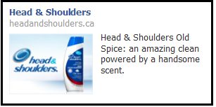
Head & Shoulders banks on blue with their Facebook Ad below. Their target audience is both genders and all age groups, so they’re tapping into a solid and reliable color, and focusing on optimizing their copy for click-through.
How you can use it:
- I recommend using blue as your primary color only if you’re including accents of oranges, reds or yellows.
- Blue is used by many of the largest computing companies (think IBM, HP, Dell, Facebook) because it symbolizes intelligence, efficiency and logic. If your business wants to communicate these emotions, consider blue as well.
- Solely using blue and white will cause your Facebook Ad to blend into the current color scheme of Facebook itself and users won’t see it.
- If you’re selling food, don’t use the color blue as many people associate it with illness and mold. Blueberries being a notable exception, there is very little blue in nature, and, in tests, people often refuse to eat perfectly healthy food that’s been dyed blue, or feel genuinely ill after doing so.
Green:
Associated with wealth as well as environmental subjects, green is the easiest color for the eye to process. Green also signifies positive action (think,’green means go’) and affirmation.
Green and teal have also been associated with shoppers on a budget. It’s also the second and third most popular color among men and women respectively.
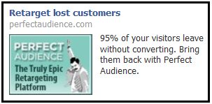
Perfect Audience.comuses a pale green in their Facebook Ad below.
How you can use it:
- The main goal of color in advertising is to drive a certain emotion or simply to attract the eye. The pale green that PerfectAudience.com has used above doesn’t attract the eye and creates a complete lack of urgency or direction.
- Stronger, darker or more vibrant greens are very effective as they contrast well, yet don’t create the pushiness of colors like orange and red.
- Test the use of teal with a special offer, discount code, or coupon ad.
Something to ponder: Black is associated with mourning in the western world while white (the color of bones) is the color of death in many Eastern countries, and black (the color of soil) signifies life. Japanese women wear white to their weddings not to signify purity, but to signify the death of their relationship with their own family.
Purple:
Associated with calm, femininity, and wealth, purple is the second most popular color among women, at 23%. Interestingly, as women get older, their liking for the color purple increases. On the other hand, purple is the favorite color of 0% of the male population.
Fb-Gorilla.com uses a purple border below. I recommend the use of borders if your image is dull or, as is the case with this one, doesn’t have an existing square edge. However, I would have recommended red or orange instead of purple,

How you can use it:
- I’d recommend using purple only if your target demographic is women, as it’s men’s second-least-favorite color (behind only brown)
- If your Facebook Ad talks about increasing profits or ROI, use green or purple to communicate wealth
- If your target demographic is aged 60+ use only purple, white or blue
Red:
The color red is associated with passion, excitement and urgency. It’s a dangerous color in advertising, as many people associate red with negativity and mistakes. However, it attracts the eye better than any other color and gives the impression that time is passing faster than it is (as it causes our heart to beat faster) causing us to act when we otherwise wouldn’t.

How you can use it:
- I don’t recommend using red as your Facebook Ad’s primary color. People find too much of the color intimidating, forceful, and pushy.
- I recommend using red to draw attention to parts of your ad, like around a Call-to-Action, value proposition or as a border
- Red is extremely useful to use in contrast with other, more professional colors like dark grey, blue and green.
Black:
Powerful, sleek and intellectual, black signifies permanence, sincerity and sophistication. While black can, like red and orange, be a dangerous color if used too much, it can communicate professionalism and sophistication when used in conjunction with a strong, clear white (avoid greys or tans, as they’ll wash out your message).
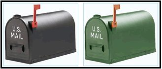
An article I found while researching for this post included an interesting question. Which of these mailboxes looks heavier?
AdBeat.com uses black and white below in an attempt to communicate intelligence. Would a dark blue background have been more effective?

How you can use it:
- Black should be used if your company is looking to create a sincere brand profile. If you want to promote your business as fun and engaging, I’d steer clear of black as a primary color.
- If you are looking to create a fun and engaging business persona on Facebook, use hues of orange, red, green or blue with black text, as you run the risk of clashing colors with other colors (including white).
Orange:
Eye-catching, bright and sunny, orange is one of the most popular colors for landing page Calls-to-Action. While a good tone and amount of orange is seen as warm and inviting, too much has been associated with naivete and a lack of professionalism.
Wishpond uses a strong orange background with white text in the Facebook Ad below. This works very well to draw the eye to the ad, and the green ebook image really stands out (see Contrast below).

How you can use it:
- I’d recommend something very similar to what Wishpond has done above. The use of three bright colors is extremely effective at grabbing a user’s attention.
- Orange is one of the best and most eye-catching colors available to Facebook Advertisers, use it around calls-to-action, and as a border around a non-eye-catching product.
Contrast
Contrast is essential when working with Facebook Ads. The human eye is naturally attracted to contrasting color. This can have either negative or positive effects depending on the color. For instance, we associate yellow and black with poison (think tree frogs, hornets, the symbol for radioactivity, etc).
Contrasting your Facebook Ad’s colors intelligently can have a huge effect on its success.
Let’s take a look at one of the most popular case studies in recent years:
In 2010, Paras Chopraran a four week multivariate tests that is often used as an example of the power of color contrasting. For four weeks he tested the performance of 12 different combinations of a Call-to-Action and descriptive link:

Option 10, with the largest contrast in color, hue and size (as well as the word Free) generated a 60% improvement in conversion rate, with a 99% confidence rating.
For more on A/B Testing your Facebook Ads for success, read my recent article How to A/B Split Test your Facebook Ad.
Shades and Tints
Studies show that men prefer bright colors significantly more than women, while women have a strong preference for soft colors. It is essential you keep this in mind when targeting your Facebook Ad. The Facebook Ads below were on my News Feed (hockey jerseys) and my colleague Krista’s (Quiet Jasmine Sleep Serenity Febreze).
After this, shades and tints are a somewhat tricky creature. For instance, there are more than 300 recognized shades of red. Which one means aggression and negativity and which warmth and excitement? I recommend internally testing your colors (with colleagues), and then A/B testing them over the course of your Facebook Ad campaign.
Conclusion
That concludes part one of this two part exploration into the psychology of Facebook Ad success. My next article will discuss image psychology, so watch out.
Hopefully you’ve learned something about color psychology, and how influential it can be in Facebook Advertising. Remember to test your shades and hues, and remember some of the most effective colors will fail when text is added.
Further reading:
- How to A/B Test your Facebook Ads to Maximize ROI
- The 9 Facebook Ad Mistakes that are Hurting your Click-Through-Rate
- 6 Facebook Ad Image Best Practices that will Send your Click-through-Rate to the Moon
- 7 Value Proposition Formulas to Boost Conversion on Ads and Landing Pages
Have you ever had a seemingly inexplicable increase in conversion rates you can now put down to color? Start the conversation below!
P.S. Wishpond’s Facebook Contest Apps make it easy to create sweepstakes, photo contests, Instagram hashtag contests & more. Looking for inspiration? Check out 25 Creative Facebook Contest Ideas You Can Use Today.