
You’ve practiced your webinar for hours.
Every slide has been refined. Every speaking point laid out in your mind.
You’re driving tons of targeted traffic to your registration page via email, social, advertising, and even an exit popup on your blog.
But no one is registering.
Your conversion rate refuses to leave the single digits.
As marketers, you and I know how depressing it is.
But where did you go wrong?
You know the best marketers have conversion rates on their webinar registration pages of 30, 40, even 50%.
With the right knowledge base and this 3-step formula you can do it too.
Strategy Briefing
The Standard GoToWebinar landing page results in a miserable 4-6% conversion rate for webinar registration.
Consider the fact that a GoToWebinar landing page isn’t mobile responsive and requires visitors to provide their first and last name. This seriously hurts your chance at registrations.
But you shouldn’t be using the standard GoToWebinar landing page. Instead you should be using a registration page that uses conversion-centered design.
Doing so can increase your conversions by around 750%.
What is a conversion-centered design?
A conversion-centered designed registration page is one that converts. It implements the proven techniques that other marketers are using to convert visitors into leads at a rate you can only dream of.
Helpful Analogy
Imagine your registration page is like how you invite someone to a party.
Do you say “Come any time on Friday, or maybe Saturday. If you could bring your own food and drink that’d be great. And I haven’t actually invited anyone else so dunno if anyone will show up. Bye.”
Or do you, instead, frame it like this…
“So yeah, Friday at 8pm. I’ll have nibbles and we’re doing make-your-own cocktails, so everyone needs to bring a small bottle and we’ll mix it up! That stunning girl from accounting is going to be there, as well as the whole hilarious sales team. Bring your friends!”
Which party would you go to?
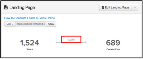
We’ve been running webinars for years now and analyzed the elements that led to our last registration page (for our webinar “How to Generate Leads and Sales Online”) converting visitors at 45.24%.
Follow this 3 step formula and you’ll find similar results:
- Create a sense of urgency by limiting availability
- Show credibility by introducing the host
- Make visitors curious with exclusivity
1. Create a Sense of Urgency By Limiting Availability
“Implementation of urgency principles has proven to increase online sales by 332% by eliciting an immediate action.”
– ConversionXL
Use urgency and scarcity to convince visitors to register now.
Urgency drives people to say yes before they’ve analyzed every factor for and against a decision.
But as Michael Fortin states “Never pressure people to PUSH them into purchasing. Instead, use pressure to PREVENT them from procrastination. There is a fundamental difference between the two.”
Helpful Analogy
Urgency is like when you’re browsing plane tickets online and the website says “Only 3 seats remaining at this price.” It makes you want to buy right away because you know those seats will be snapped up by other passengers in no time.
Psychology of Urgency:
Studies show that urgency engages an area of the brain known as the striatum, one of the most important areas in decision-making. When the striatum senses urgency, it engages the action-selection circuitry, which encourages a person to make a decision quickly, and further polarizes the differences in expected value.
In a landing page, a sense of urgency shortens the deliberation process and motivates a visitor to make a decision about the product. As long as most of the evidence shows that the product will be useful, the visitor will be more likely to click.
Real World Example
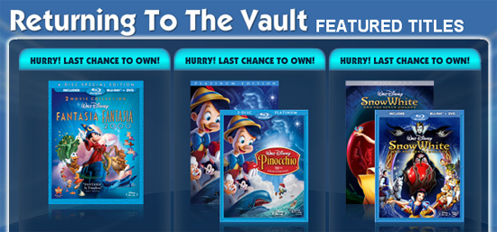
How Disney creates urgency:
Disney creates urgency by releasing classic films for short periods of time. They then “lock them in the vault” for multiple years at which point they can’t be bought anywhere.
Disney could sell their films year round, but they choose to limit the time available to increase their value. Knowing that they’re only available for a short period of time makes fans more inclined to buy while they can.
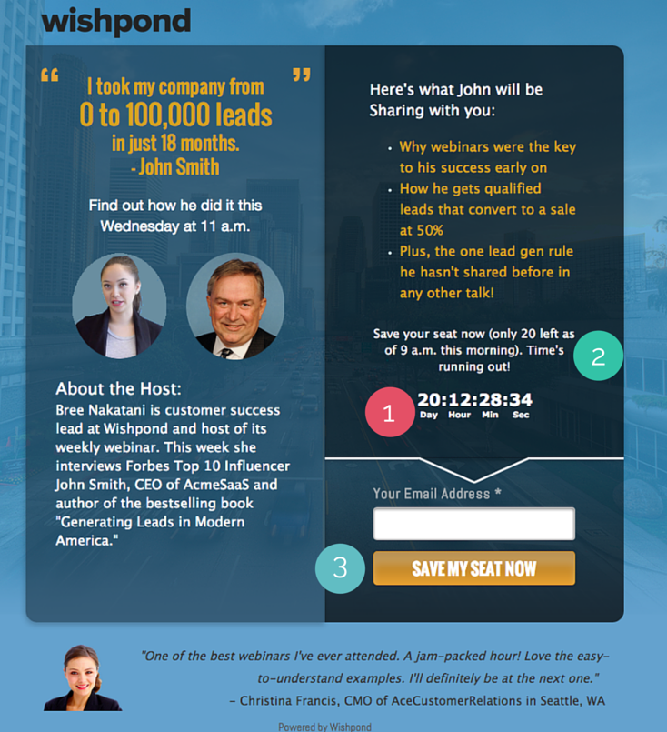
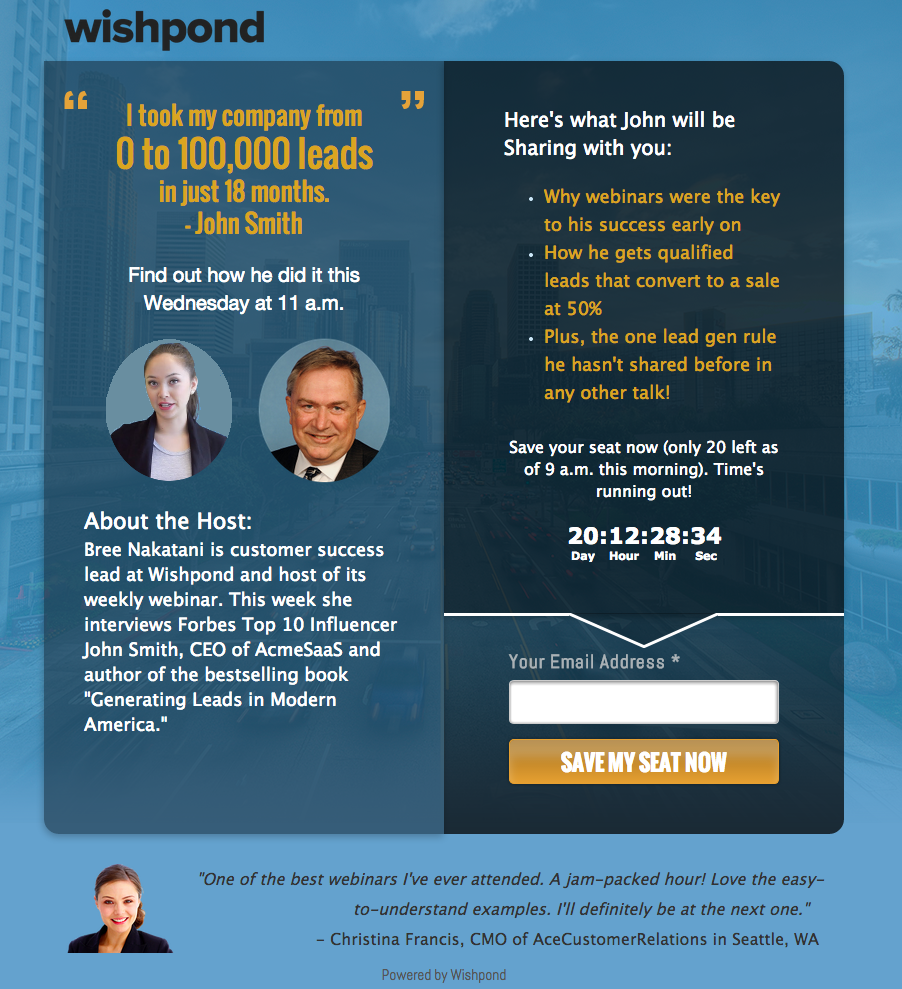
1. Use a countdown timer to encourage immediate signups.
- Counting down to the end of registration and the start of the webinar pressures participants to register. It also creates anticipation leading up to the start of your presentation. Adding a countdown timer has been proven to increase conversions by 147%.
2. Count down the number of spots remaining for your webinar.
- Counting down the number of spots remaining provokes your page visitor to take action. The principle of scarcity increases people’s desire (think the economic principle of supply and demand).
3. Convey urgency through your CTA copy.
- Your call-to-action needs to encourage immediate action. Try out one of our formulas (below), such as “Save My Seat Now.”Make your sign-up call-to-action (CTA) an obvious feature of the page. It should stand out clearly as where visitors need to click to convert. As Beth Morgan of Marketing Nerdistry states “Make sure the CTA is displayed in a visually distinct, centralized, and obviously buttony-looking button. Don’t make people guess at what they should click on.”Place your CTA above the fold of the page. Visitors shouldn’t need to scroll to register. Use a bright contrasting color for your button to grab visitors attention, increasing the chance of immediate conversion.
Boost your webinar’s appeal by showcasing the credibility of your host(s)
A webinar’s success is built on the credibility of the person speaking.
Unless your visitors think you (or your webinar host) are worth listening to, they won’t register.
It’s like applying for a new job. You have to convince your potential employer you’re worth an interview within the first 5 seconds of them reading your cover letter. If you can’t, you’ll end up in the massive pile of “No’s” on the office floor.
Credibility Do’s and Don’ts
Do…
State job title and years of experience
You need to show your expertise in the webinar subject area. Stating your experience gives you more credibility, making people more likely to register.
Include a recent picture of yourself
A picture makes your bio more believable and relatable. People like to be able to link a face to a name.
Show your own successes
Featuring a case study puts the proof in the pudding (so to speak). You’re far more credible if you can prove that your advice has worked before for yourself or (perhaps more importantly) people like your page visitors.
Don’t
State irrelevant facts
Give them a quick glimpse of you and your experience. Tailor your bio to their needs and the topic of the webinar. You should only be giving them information that will entice them to attend.
Come across as superior
You want to show your expertise without coming across as pompous. Make your accomplishments known, without making registrants feel inferior.
Hide your face and personality
Familiarity breeds trust. This is the opportunity to be personable and welcoming. Don’t shy away from showing who you are.
1. Use statistics to show value and legitimacy in your title
As Rand Fishkin states “Don’t just tell people that you’re an expert, show them that you’re an expert. Demonstrating this expertise helps build trust and credibility.”
Use high profile clients, dollar amounts or specific stats from case studies to show how your strategy leads to true results.
Amy Porterfield does this for all of her webinars. For example for her Facebook tips webinar she said “Let me show you how I got a business 30,000 likes in the first year.”
2. Discuss awards and accomplishments to create a compelling host bio
- Include a recent photo of yourself and a small blurb about you or your expert guest host. You need to establish expertise in this subject area.
- Remember to tailor the bio to fit with the topic of the webinar. Mention any recognizable awards or honors that will add to your authority. If you have published ebooks or articles, this is the place to mention it. You want potential registrants to feel that they would be stupid to miss out on hearing what you have to say.
3. Endorse your credibility with social proof.
A testimonial from an attendee from a previous webinar is a great way to entice registrants and increase conversions.
79% of people actually trust online reviews as much as personal recommendations. Include the past participant’s full name, photo, and city or job position if applicable. Your customer testimonials are far more credible when coming from real, relatable people.
For more on creating an optimized customer testimonial, click here.
How to show value and legitimacy on your registration page:
Formula 1: “Learn why [high profile person/recognized brand name] consults with me”
Formula 2: “Find out how [your webinar’s subject] increased my client’s [desirable outcome] from [low number] to [high number] in [short period of time!]”
Formula 3: “Get the inside scoop on the strategies [your company] used to go from [low number] to [high number].”
Get an customer testimonial email template by clicking here
3. Create a sense of urgency to register by using exclusivity
Entice potential registrations to sign up by creating curiosity.
Offering your visitor something they haven’t seen before and can’t get elsewhere. This is a fantastic way to communicate value and encourage a conversion over your competitors.
All your competitors are doing webinars (often on the same exact topics). You need to do something that’s exclusively yours. Convey this in your headline and benefits section to make your webinar unmissable.
Your webinar registration page is like a movie trailer. It creates curiosity and gives a sneak peek of what to expect. Be sure your page is Hollywood quality; full of explosions, intense one-liners and a glimpse of something amazing.
Words to Use on your Page that Create Exclusivity:
- “On-the-Inside”
- Insight
- Secret
- Private
- Exclusive
- “Never talked about”
5 Headline Formulas that Create Exclusivity
- “How I [did something awesome for my business] and took [a part of my business] from [low number] to [high number].”
- “The marketing strategies [recognizable brand name] [hired/consulted/paid] me for.”
- “The ___ tips I use every day that I have never told anyone.”
- “How I [achieved a goal] with [strategy]”
- “Get exclusive [new statistics/case studies/sector report] before anyone else.
1. Convey exclusivity through a compelling headline.
- The difference between a good headline and a bad headline can be hundreds of registrants. You need to convince registrants to sign up by conveying exclusivity in your headline.Why should visitors give you an hour of their precious time?
Your headline should be what intrigues potential registrants to find out more. On average, 80% of people will read headline copy, but only 20% will read the rest of your page. Craft a unique headline. Make it intriguing and make it specific.
2. Offer a list of benefits potential registrants will only gain by attending your webinar.
- When writing your benefits list think like your target customer:
- What difficulties are they encountering?
- How do your strategies solve the problems they’re facing?
- What can you offer interested visitors without revealing everything?
- You want to tease potential registrants by giving them a glimpse of what to expect. People are compelled to satisfy their craving for more. This makes them more likely to register and actually attend.
Conclusion
By optimizing your webinar registration page you can expect to see conversion rates of 25-50% on your webinar registration page. Compare that to the 4-6% you’re probably getting now.
Ready to get started on your webinar registration page?
Use the tutorials and resources below to transform your webinar registration page.
- How to Create a Customer Testimonial that Converts
- Video: How to Create a Webinar Registration Page with Wishpond
- How to Ask For a Customer Testimonial Email Template
- The Follow Along Webinar Registration Page Worksheet
– Written by Claire Grayston
Claire is a digital content marketer at Wishpond. When not racking her brain for new content, you’ll find her hiking or snowboarding the local mountains or cozied up in bed watching a sappy rom-com.