

It’s no mystery why people find website popups annoying.
They’ll pop up at the wrong time. They’ll contain an irrelevant offer. Their design will be so confusing that it’s easier to close the browser than deal with it. The thing is, all of these are easily fixable mistakes.
In fact when used at the right time and in the right way, a website popup is an extremely effective marketing tool.
Ready to have the least annoying (and highest converting) website popups on the Internet?
Check out these 7 popup mistakes and how to fix them.

1.) Your call-to-action (CTA) button isn’t clear
You need to clearly communicate what will happen when a person presses your call-to-action button. It’s the last action a person takes before converting into a lead so it must communicate exactly what will happen when a visitor press it.
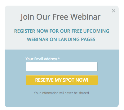
Below is a clear example of how your CTA should look on your popup. As you can see, the call-to-action button says “Reserve My Spot Now!” It’s easy for people to know that by entering their email address they’ll be reserving their spot in the webinar.
Say you were using a website popup to give away a free ebook. If you simply use the word “Submit” on your call-to-action button, you’re not communicating why they should be filling out their information on your popup. Instead go with the button text, “Get My Free Ebook” or something similar.
Top tip: Using urgency in your button text will help encourage the person to act now instead of later. You can create urgency by using keywords like “Now” or “Today.”
Here are some example offers matched with CTA button text:
- Webinar: “Save My Seat Today”
- Subscription: “Join The Fastest Growing Network of Singles”
- Coupon: “Get My 20% Off Coupon”
- Free Trial: “Start My Free Trial Now”
2.) There’s no clear way to exit your popup
If you don’t have a clear way for visitors to exit your popup, people will get annoyed and there’s a good chance they’ll leave your website never to return. Your popup is there to prompt someone to complete an action, not force them to.
Here are some ways you can make you can make it easy for visitos to exit your popup:
- Place a clearly marked “X” button in the top right corner of your popup.
- Provide a statement like “Close Window” that tells the user what the button or anchor text will do.
- Use Wishpond’s strategy, in which clicking anywhere except the popup itself will close it.
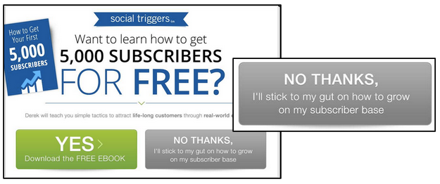
- Show them a negative option as a call-to-action button. Below is an example of how this looks on a popup. As you can see you can either download the ebook (positive CTA) or go with your gut and not download the ebook (negative CTA).
3.) You have a bad offer on your popup
If your offer is bad, no amount of design or copy is going to convince people to stick around and convert. Your offer needs to be relevant, exciting and worth as much as their valuable lead information.
Here are some ideas of what you can offer people in your website popup to convince them to convert:
- A discount or coupon. If a visitor comes to your price or product page and tries to bounce before converting there’s a good chance that the reason is the price. You can combat this by offering a discount, coupon code, or offer.
- Free content. Offer visitors your newest ebook. A great way to make the offer as relevant as possible is by matching the ebook to the content on the page they were visiting. Say they’re on your blog reading about how to create a holiday meal. You could offer an ebook on creating a meal for any occasion.
Looking to add popups to your website? Check out Wishpond’s Free Shopify Popup Builder App and Free WordPress Popup Builder App.
4.) You’re triggering your popup too soon
You don’t want your website popup to appear before a visitor has had a chance to see what your site is about. This will more likely annoy them than intrigue.
There are five types of popups you can use and two that let you choose when they pop up – scroll and timed. A scroll popup is one that is triggered once a visitor gets a certain percentage of the way down the page. A timed popup appears on your page after a visitor has been there for a certain amount of time. If you trigger either too early it can be annoying, but trigger it too late and no one will see it.
We’ve found best results on our blog when we’ve used a scroll popup (triggered at 50% of the page)
5.) The Call-to-Action Banner on your website looks different from your click popup
On your website you have the option of adding sidebar or top banners that contain click popups. Using a click popup is less invasive because the visitor has chosen to see your popup. One of the mistakes that I most often see is when the banner (the thing someone clicks to see your popup) looks different than your click popup (the modal window that pops up.
If people who click your banner are shown an inconsistent design or different text they may get confused and think it’s spam. To avoid confusion keep the design and text of your banner and popup the same.
You need to keep the following items consistent between your banner and click popup:
- Your headline: Your headline should communicate the same value by using the same text.
- Your call-to-action button: Should keep the same design and the same button text.
- The colors and design: If you use a black background on your banner your website popup needs to be the same color.
Here’s a great example (below) from the Wishpond blog. On the left is the banner image and on the right is the popup. As you can see in the background, headline and call-to-action remain consistent on both the banner and popup. Only two things change when you go from the banner to the click popup – the “What you’ll learn” section is removed and an email address field is added.

6.) You’re asking for too much information in your popups form
Depending on the type of website popup you’re using there’s a good chance you’re asking for too much lead information, which deters people from converting. Generally it’s a good idea to ask for as little information as necessary and ask for more further down your sales funnel.
Usually an email address is all that you should ask for on your popup – especially if it’s a forced one (entry, exit, timed or scroll). However, if you have a click popup you could get away with asking for more.
You can ask for more information on a click popup because they’ve taken the first action by clicking your banner containing the offer. It’s way less invasive and they’ve made the first move. On this type of popup you could include between two and four form fields. This is all you can really ask for in a top-of-the-funnel form.
7. You haven’t A/B tested your popup
If you don’t test out your website popups you’ll never know what’s working and what isn’t. Not A/B testing your popups could be the reason why people think they’re so annoying. You need to have an appealing, direct and informative popup to if you want them to convert.
How does A/B testing work?
It involves changing one element of your popup and testing the new variation of your popup against the original.
Try A/B testing the following on your popup:
- The headline: Change the text. It can be one word or the entire headline. For example if you were getting someone to sign up for your webinar you could test the headline “Save Your Seat in Our Webinar Next Saturday” or “Join Our Free Online Live Event December 8th”
- The “What you’ll learn” section: Change the text. You can play around with the number of sections you’d like to include. If your popup is for an email you can write
- The amount of form fields: See if there’s an optimal number. You can play around with making fields mandatory or not.
- The CTA button: Test both its text and design. You can try testing a red CTA button against a green one.
If you A/B test popup variations you will see massive changes in their conversion and click-through-rates. If you aren’t already testing your popups on a regular basis, you’re a step behind.
Conclusion
A website popup shouldn’t be killing your conversion rate – it should be taking them to the moon! If you iron out these simple mistakes you’ll not only increase your conversion rates but trump your competition.
Which popup mistakes do you see most often? Share in the comments below.
If you have Shopify or use WordPress, check out Wishpond’s Free Shopify Popup Builder App and Free WordPress Popup Builder App.