

As soon as you build your website you start investing money, time, and energy in the creation of high-quality content your audience will consume. There’s a lot of motivation behind creating those articles, videos, podcasts, etc., but the thing that will turn that motivating purpose into business is a landing page.
Landing pages can be very tricky since they’re a fusion of hard science, creativity, and artistry. They are an important part of your storytelling, but also the most fragile one since you have to pay strict attention to almost everything – from the colors of your clickable buttons to the words you use. It’s hard enough to make them perfect on a desktop, and doing it on mobile may even be trickier mainly due to the smaller screen size.
And you do need a perfect mobile landing page. The number of your visitors who are connecting from their phones is increasing – almost 50 percent of them open emails on their devices, and 60 percent of Twitter usage and Facebook traffic also happens there. All your content could (and should) be optimized for mobile, but its purpose is only to make your visitors want to take action. Your landing page is what enables them to take it. Furthermore, a cleverly built landing page will also bring you better organic ranking since Google tracks things such as engagement and bounce rate. That will significantly decrease your wasteful spending on ads such as paid search. And last, but not the least, your landing page is the foundation for the long-lasting relationships with loyal customers.
Although we’ve mentioned it’s tricky to make mobile landing pages, that doesn’t mean it’s impossible. All it takes to move their conversion needle are some design tweaks and the right thought process. The important thing to be aware of is that there’s no one-size-fits-all methodology. It’s all about the smart combination of different strategies, so we’re gonna take you through 8 of them which will surely give your mobile landing page the desired boost.
1. Redesign Instead of Responsive
Where most people make mistake is when they simply make their desktop website responsive to mobile devices. While using responsive web design has some undeniable benefits, you need to be aware that your mobile and desktop visitors are like two essentially different species. Their ways in which they want to use your site are different, and so are their goals and motivations.
Desktop ones usually have more time and a 10 times bigger screen, so they’re able and willing to look around your site in search of what they need. Some of them may even be willing to scroll to the very bottom of your page, even if it’s a long one.
With mobile users, the situation is quite the opposite. People usually use mobile devices when they have only one goal in mind. They’re browsing for it on a much smaller screen, and seeing it’s crowded with useless information is a big turn off. If they sense that the search will take forever they’ll simply give up.
This is why responsive web design won’t work for your landing page. You need to design a completely separate one for your mobile users so you can tailor it to what they need and want. Mobile is not a mold into which your desktop design can fit.
2. Give Colors a Purpose
Colors in design are not just eye candy. Many designers will just make sure that they pick the color scheme which mashes with the brand’s vibe. But colors are also a powerful tool which can capture more customers, especially on landing pages where that counts the most.
We’ve already mentioned that small screen size makes any irrelevant information much more irritating, so you have to provide your visitors with clues which will lead them where they want to go. The colors you choose can be amazing visual clues, especially when it comes to your call to action buttons. A nice big colorful button can instantly show them where to buy, sing up, or learn more. But this doesn’t mean that you simply need to paint your buttons in bright, vivid colors – that can actually seem too aggressive. Instead, use contrasting colors that will make those buttons stand out on the page. You can also use color psychology to affect your visitor’s emotions.
Strong visual cues will boost your conversion rate since they’ll provide easy-to-find information. On the other hand, if everything is too monotone and cluttered your visitors will just bounce.
3. Stay Above The Fold
On mobile devices, putting all the information you want your users to know will always seem like a lot. There’s no way around it, but you can ask yourself do they really need all of it in the beginning? If you don’t want them getting a finger cramp, you mustn’t put any information they really do need at the bottom of a landing page, especially if it’s a miles-long one.
You can get out of this situation by utilizing the newspaper concept called above the fold. It is quite a simple one – really important news needs to appear on the top half of the newspaper, meaning above the point where it was folded. This concept can easily be translated to a mobile landing page, where the fold is the bottom of the page which can’t be seen without scrolling.
So take your information, trim it down to just what they’ll need right away, and make a concise point. The rest can go at the bottom of the page or even on other pages which they’ll find on the navigation bar if they need it.
4. Escape The Frozen Loading Bar
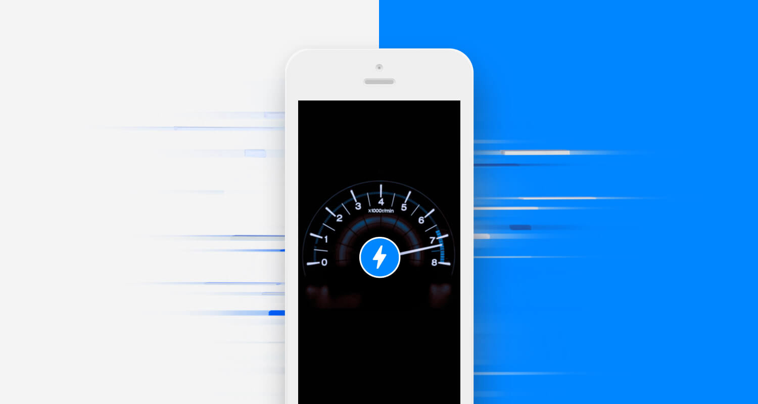
We’ve already pointed out the differences between mobile and desktop users, one of them being that mobile ones will simply not wait for your pages to load. The appearance of a frozen loading bar will mark the end of their patience and presence with it. You might think that the average loading time of 15 seconds is perfectly fine, but you must consider the fact that the increase from 1 to 10 seconds leads to the increase of 123 percent of the likelihood of the visitor bouncing.
This is why your loading time shouldn’t be more than 3 seconds – everything longer than that increases the likelihood of bouncing to 53 percent. You should do everything you can to decrease your loading time, and you’ll find the easiest way in our next strategy.
5. Take it Easy With Imagery
People often think they need tons of images or videos to make their page exciting and interesting, so this strategy might seem counterintuitive. But the fact remains that every image loading slows down your loading time. You have the choice of colors to make your landing page visually pleasing, so you can keep it simple with just a few images, or maybe none at all.
If your business presentation absolutely can’t live without video, make sure it’s short, captioned, and stay away from autoplay. People usually get frantic trying to find the auto-play video before it blasts their eardrums or eats up all their data. Most of them won’t even sit through the whole video, and even the part they’ll watch will be on mute.
You need to keep in mind that your visitors might be on slow wifi or none at all. Imagery is actually quite unnecessary for your landing page – if they want to see your portfolio, they can find it on a different page.
6. Pay Attention Where Your Leads Are
One of the most important questions to ask yourself is what are you using your landing page for? When you know the purpose of the landing page, you should be aware of how it relates to the position of your leads in your sales funnel. Effective digital marketing is not only about crafting keywords, but it’s also about how you use them. If you’re constructing a general landing page for first-time leads you should use general keywords since they’re more likely to be searching with those. On the other hand, if your leads will get to your mobile page further down the funnel you’ll need long-tail keywords which will make you show up in searches that are more specific.
7. Tear Down The Wall of Text
Even when the text doesn’t seem too long when you’re writing it, it can quickly become unmanageable on mobile devices. A short-looking headline with a bigger header size could easily take up the entire mobile screen. Words are powerful tools, but not if they form the first chapter of your business autobiography on your landing page.
That’s why all information needs to be simplified, easy to find and skim. Break your text into manageable topical pieces with subheaders, provide small bursts of information with bullet points, and let your reader’s eyes rest with generous spacing. And don’t forget to incorporate white space into your design – nothing increases comprehension better than the simple increase of space on the margins and between the lines.
8. Avoid Big Talk
We can all get carried away in our desperate attempts to make visitors convert. There are many words you should avoid on your landing page, but the ones that boost your own ego are the worst. It’s actually one of the most common mistakes – words such as ‘totally’, ‘better’, ‘best’, etc. are actually completely vague. What does it mean that your products are ‘the best’ – by what standard? Or that your company is ‘totally innovative’? The best you can get is to sound pretty puzzling and suspicious.
That’s why you shouldn’t litter your site with this kind of meaningless and vague language – be direct, descriptive, and clear instead. Even if you can back up all that big talk, it’s still better to explore other ways or words to communicate customer value. The best way to truly stand out from the crowd is to spell out your advantages and benefits concisely and specifically.
As we’ve said, it’s all about the smart combination of these strategies. Designing a completely separate mobile landing page will prepare the terrain, thoughtful use of colors will decrease the need for imagery and thus increase your loading time. The careful choice of words will eliminate the wall of text and enable you to stay above the fold. And never forget that mobile and desktop users are not the same and thus need to be treated differently.
About the Author

Nick Brown is a blogger and a marketing expert currently engaged on projects for GWM SEO Brisbane agency. He is an aspiring street artist and does Audio/Video editing as a hobby.